I just realized that I fixed that a while back... but never posted any results
Lots of really great ideas.
However, I think a logo should be simple, symmetrical and easily identifiable. There should be symbolism but not to the point that it's only symbolism.
Based on those criteria I think the above quoted are my favourite. I don't know if I like the hockey player the best (and the idea to change the silhouette to famous Flames poses) or the flame with the Calgary Tower in the middle.
Regardless, AMAZING job by everyone.
__________________ "Calgary Flames is the best team in all the land" - My Brainwashed Son
The Following User Says Thank You to Maritime Q-Scout For This Useful Post:
However, I think a logo should be simple, symmetrical and easily identifiable. There should be symbolism but not to the point that it's only symbolism.
Based on those criteria I think the above quoted are my favourite. I don't know if I like the hockey player the best (and the idea to change the silhouette to famous Flames poses) or the flame with the Calgary Tower in the middle.
Regardless, AMAZING job by everyone.
I think all of Split98's designs are much more simple and effective than all of the CP speech bubble mashups that people are trying to create.
I think people are trying to be too smart with their logos. Split98 is not.
However, I think a logo should be simple, symmetrical and easily identifiable. There should be symbolism but not to the point that it's only symbolism.
Based on those criteria I think the above quoted are my favourite. I don't know if I like the hockey player the best (and the idea to change the silhouette to famous Flames poses) or the flame with the Calgary Tower in the middle.
Regardless, AMAZING job by everyone.
Thanks!
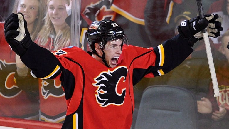
The Flames poses is gonna be a toughie. Personally, I thought I had chosen a distinct Monahan, but enough people have seen it as generic that it kinda demonstrates that the image isn't yet an iconic image of the Flames.
Someday it might be, as the double arm freeze seems to be Monahan's celebration of choice:
So, while it may become 'classic Monahan' I can see that we aren't there yet.
The next option is 'The Gaudreau':
Which is such a cool image... but as has been pointed out, it's been heavily linked to BC.
The next most memorable Gaudreau is this:
But 2 guys hugging doesn't lend to a clean logo... and removing Colborne would make it less recognizable.
But his celebrations will definitely lead to a great image someday:
Beyond that, the current Flames regime hasn't really done anything iconic yet.
I also don't want to bring in Lanny, Kipper, Iggy or Fleury as it just loops us back to the past. If we had gone with the player as the logo, the next idea I was going to propose was 'honour weeks' or something to that effect.
So far, with balance, appearance and symbolism the Monahan has really only been the only thing I could find to represent the current regime. It's my personal favourite of all of them, but I am definitely open to any other image someone can put forward that speaks to the 2014 Flames.
The Following 2 Users Say Thank You to Split98 For This Useful Post:
The speech bubble idea combined with a puck/cp/hockey vibe is the kind of representative logo you want for a message board/fan community.
Speaking of the speech bubble.. Just for fun, before I submitted my proposal (page 4) I was playing with the idea of creating sort of a talking puck-smiley where C and P would represent eye and ear with the flame as negative space forming the mouth and nose. I admit I wasn't patient enough to polish that design, here's what I had so far (note: it's not a real submission hence the spoiler tags)
So far, with balance, appearance and symbolism the Monahan has really only been the only thing I could find to represent the current regime. It's my personal favourite of all of them, but I am definitely open to any other image someone can put forward that speaks to the 2014 Flames.
This could possibly get into the same difficulty as the image of the Calgary Tower, the source photo that you used to create the silhouette is owned by someone so we'd probably need permission to use it, and I don't know about the implications of using a specific player's image as well, so might be better for the player to be more abstract and not identifiable.
Not just your stuff, anyone that's making logos should keep in mind that any source material that isn't created from scratch could involve getting permission or purchasing an image (unless they're already licensed under creative commons or something). Would hate to have to reject a good option because of copyright.
__________________ Uncertainty is an uncomfortable position.
But certainty is an absurd one.