08-04-2014, 11:48 AM
|
#161
|
|
Draft Pick
|
Quote:
Originally Posted by FireItUp

|
This.
|

|

|
|
08-04-2014, 12:23 PM
|
#162
|
|
Farm Team Player
Join Date: Apr 2014
Exp: 
|
Some very fine A/W by all
|
|
|
|
|
08-04-2014, 12:34 PM
|
#163
|
|
Franchise Player
Join Date: Aug 2007
Location: Ontario
|
Quote:
Originally Posted by doctajones428

How about 'The Johnny'? I do love that Monahan celebration though |
'The Johnny' would actually be pretty damn cool too.
|
|
|
|
|
08-04-2014, 12:35 PM
|
#164
|
|
Franchise Player
Join Date: Aug 2007
Location: Ontario
|
Quote:
Originally Posted by playmaker
Split98: your idea may be great but the concept is IMHO too busy. Here's my quick edit - perhaps you should get rid of the wordmark and make it more contrast so that the logo remains recognizable in small scales. If you like my proposal, I can provide the image in better quality and the vector SVG format as well for further editing.
 |
That could definitely work too
|
|
|
|
|
08-04-2014, 12:52 PM
|
#165
|
|
Franchise Player
|
Quote:
Originally Posted by saXon
|
I think think looks like a great logo for a mobile site.
Quote:
Originally Posted by FireItUp
|
Sorry to be that guy... I like the concept, but it sorta looks like a dick. With the P towards the middle, I guess you could sorta argue a middle finger...
I like the CP ones. The Monny one is great too. My only gripe is that the stick often looks either like a golf club or lacrosse thingy. Makes it too easy for someone to shop in something else to troll us.
An idea I had was to see a net from above, which the arc is the "C" and the cross bar is the line for the "P" and the puck coming from the top right finishes off the "P". However, I have not the artistic ability nor technology know-how to do a nice pic and also not to make the "P" look like a golf club and how not to allow the mesh to make it messy and confusing.
Last edited by DoubleF; 08-04-2014 at 12:54 PM.
|
|
|
|
|
08-04-2014, 12:58 PM
|
#166
|
|
Franchise Player
Join Date: Jun 2006
Location: Calgary, Alberta
|
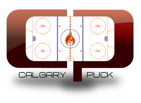
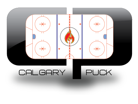
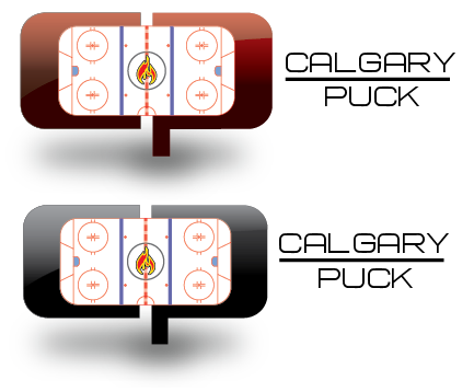
Quote:
Originally Posted by alltherage
Recolour without the blue/grey
 |
This is my favourite right now. Very sleek.
|
|
|
|
|
The Following 2 Users Say Thank You to Joborule For This Useful Post:
|
|
|
08-04-2014, 01:00 PM
|
#167
|
|
Franchise Player
|
Probably won't be easy to do, but does anyone one else think that maybe a tribute to Peter Maher might be worthwhile to consider?
Maybe a CP -Yeah baby (Smaller "yeah baby")?
Hmm... on second thought, just reminds me of Austin Powers...
|
|
|
|
|
08-04-2014, 01:03 PM
|
#168
|
|
ALL ABOARD!
|
Yeah Baby! is Austin Powers.
YEAH BABY! is Peter Maher. Sometimes with more E's and A's.
|
|
|
|
|
08-04-2014, 01:52 PM
|
#169
|
|
Celebrated Square Root Day
|
Alltherage is all the rage.
|
|
|
|
|
08-04-2014, 02:04 PM
|
#170
|
|
First Line Centre
|
Quote:
Originally Posted by doctajones428
How about 'The Johnny'? I do love that Monahan celebration though
|
While I love this shot, this is BC Johnny, not Flames Johnny.
If any silhouettes are to be used, I would prefer Flames shots.
|
|
|
|
|
08-04-2014, 02:14 PM
|
#171
|
|
Ass Handler
Join Date: Feb 2011
Location: Okotoks, AB
|
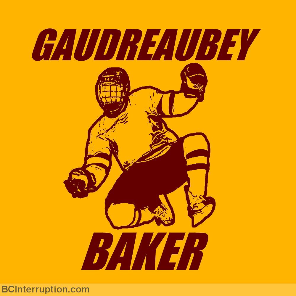
The Gaudreau silhouette has already been used, no thanks.
Last edited by StrykerSteve; 08-04-2014 at 03:08 PM.
|
|
|
|
|
08-04-2014, 02:41 PM
|
#172
|
|
Lifetime Suspension
|
Quote:
Originally Posted by playmaker
Split98: your idea may be great but the concept is IMHO too busy. Here's my quick edit - perhaps you should get rid of the wordmark and make it more contrast so that the logo remains recognizable in small scales. If you like my proposal, I can provide the image in better quality and the vector SVG format as well for further editing.
|
Needs contrast around the outside to balance the inside. Add a black ring outside the yellow ring perhaps.
|
|
|
|
|
08-04-2014, 02:54 PM
|
#173
|
|
Scoring Winger
|
Quote:
Originally Posted by Chill Cosby
That looks fantastic. The blue was fine, but having white in it's place gives it just a touch more simplicity.
Bravo!
|
I agree. The white really "makes it pop"
|
|
|
|
|
08-04-2014, 03:44 PM
|
#174
|
|
Franchise Player
Join Date: Jul 2003
Location: Djibouti
|
Quote:
Originally Posted by alltherage
Recolour without the blue/grey
|
I'll start by saying that this is my favorite so far.
However, I'd like to see some variations of the "cp" font; I'm not in love with that one.
|
|
|
|
|
The Following 4 Users Say Thank You to Mike F For This Useful Post:
|
|
|
08-04-2014, 07:19 PM
|
#175
|
|
First Line Centre
Join Date: Jul 2009
Location: Calgary
|
Quote:
Originally Posted by fatso
I've said it before, but damn there are some talented people on this site. All of these designs are fantastic! The real winners here are all of us who get to see your work. Keep sharing!
|
Have to say the same! I was involved in the decision making process for a volunteer run national organization for website and logo redo. Cool to be a part of it and learned a ton.
To see the talent here and the quick time in which it's done, cool to see.
|
|
|
|
|
08-04-2014, 08:05 PM
|
#176
|
|
Lifetime Suspension
|
Can't wait to find some time to contribute some designs. Love the bubble/puck logo without the blue, though. Looks sharp.
|
|
|
|
|
08-04-2014, 11:20 PM
|
#177
|
|
Franchise Player
Join Date: Mar 2002
Location: Auckland, NZ
|
Quote:
Originally Posted by djsFlames
Can't wait to find some time to contribute some designs. Love the bubble/puck logo without the blue, though. Looks sharp.
|
Me too. Don't have the proper software at home, so I'm starting my design tomorrow at work (who really works anyways these days, am I right?)

|

|
|
|
The Following User Says Thank You to Muta For This Useful Post:
|
|
|
08-05-2014, 08:34 AM
|
#178
|
|
Lifetime Suspension
|
Quote:
Originally Posted by playmaker
Split98: your idea may be great but the concept is IMHO too busy. Here's my quick edit - perhaps you should get rid of the wordmark and make it more contrast so that the logo remains recognizable in small scales. If you like my proposal, I can provide the image in better quality and the vector SVG format as well for further editing.
|
This is great, but what makes it so great is that you can change the player silhouette every year from iconic plays that happened the previous season. Leading up to what will hopefully be a stanley cup being lifted silhouette.
|
|
|
|
|
The Following 2 Users Say Thank You to Burke Salad For This Useful Post:
|
|
|
08-05-2014, 11:02 AM
|
#179
|
|
Franchise Player
Join Date: Mar 2002
Location: Auckland, NZ
|
Here's my contribution:

I have two other versions that will be modifications of this one: one with the flames on the top of the logo, and one with the flames on the left side of the logo (similar to the Flames logo).
|
|
|
|
|
The Following 51 Users Say Thank You to Muta For This Useful Post:
|
4oh3,
89loobjob,
Bandwagon In Flames,
bluck,
bluejays,
Cali Panthers Fan,
Chill Cosby,
corporatejay,
Da_Chief,
Dion,
edn88,
FLAMESRULE,
Flaming Choy,
ForeverFlameFan,
foshizzle11,
GreatWhiteEbola,
GreenHardHat,
Homeslice,
Icon,
Itse,
jayswin,
Joborule,
JT45,
klikitiklik,
Kolbe31,
Lanny_McDonald,
M*A*S*H 4077,
Machiavelli,
Mattman,
Mazrim,
Mike F,
mile,
MolsonInBothHands,
Monahan23,
Neeper,
nfotiu,
OldDutch,
OutOfTheCube,
Pierre "Monster" McGuire,
redforever,
Redliner,
roberts10,
shutout,
SuperMatt18,
t0rrent98,
the2bears,
TjRhythmic,
Ulrith,
Winsor_Pilates,
Yrebmi,
zuluking
|
|
08-05-2014, 11:06 AM
|
#180
|
|
Franchise Player
Join Date: Jun 2009
Location: Thunder Bay Ontario
|
Maybe it's just me but the whole oval of the C and the P makes it look too much like something about race car driving. At first glance, they don't look like they have anything to do with hockey.
__________________
Fan of the Flames, where being OK has become OK.
|
|
|
|
 Posting Rules
|
You may not post new threads
You may not post replies
You may not post attachments
You may not edit your posts
HTML code is Off
|
|
|
All times are GMT -6. The time now is 09:39 PM.
|
|