Whoever is handling design elements of the 2012 games has some very strange ideas. First the logo, then the mascots.
Yeah. I don't know how some of this stuff gets through any sort of screening process. Don't forget that seizure-inducing video that accompanied the logo unveiling.
The mascots are mostly for the kids, so why make something that kids are probably going to be afraid of?
I like the Olympics though, so still looking forward to the show London will put on.
The Vancouver mascots were great. Even if you didn't like them, they were cute and girls and kids liked them. These amoebas are horrible. To really represent England I expected something pastey white with crooked, yellow teeth.
And to all the UK reporters that trashed the games in Canada, suck it. These mascots are horrendous, not even kids would find them cute or fun.
I say Teletubbies meets cyclops. My friend was reminded of that lamp thing from Pixar.
Vancouver's mascots looked more like Hello Kitty got it on with Keroppi than anything Vancouver...ish, but at least they were cute and kids loved them.
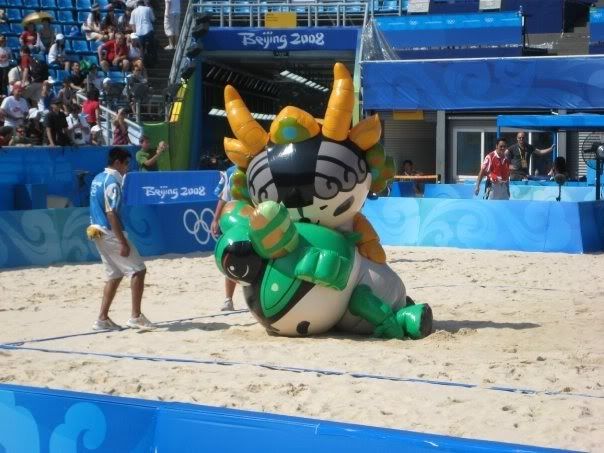
However, round one was the bus during the 2008 Closing ceremonies!
That was kinda weird to see in person when it came out.
Though I'm hoping they'll do better than Vancouver's "oops we killed some poor sap but it's totally his fault - damn Olympic tourists" and the "ummm I know we begged the IOC for bailout money but we couldn't be bothered to test this contraption thingy before it screwed up in front of the entire world."
Quote:
Originally Posted by The Ditch
I thought the Beijing mascots were well thought out. These London ones are just terrible, what were they thinking.
The people they had in the suits were pretty funny too. The orange one knocked the green one down during a side-out break crowd competition promo. Walked over and humped him from behind and just walked away. Kinda like the equivalent of the Halo tea bagging in an inflatable suit.