 09-25-2013, 11:55 AM
|
#981
|
|
Franchise Player
Join Date: Mar 2002
Location: Calgary
|

Quote:
Originally Posted by Jimmy Stang

If I remember correctly, when the red jersey was re-introduced back in '03 or whenever it was, the number and name were both black. It was very brief, however, because the black-on-red of the name was particularly hard to read for broadcasters, so they changed the name to white but kept the number black.
I'm not sure exactly how many games the name was black-on-red, but I think that's how it happened. Maybe someone else can remember better?
Regardless, I do agree that the name and number should both match on this latest example. Just make it red text and that's a pretty nice shirt.
|
Black logo on front, black numbers, black namebar, fit the theme and look like they wanted to complete both the jersey and the uniform. Putting white on there threw the whole design off.
It looked really good, and for the first month or two after the change, the Fan Attic would still do the black letters if you requested.
When the Flames changed their jerseys in 2007, they should've gone at least to white numbers to match the name.
According to Getty Images, The Flames had it on for the Nov 22 2003 win vs Chicago, but on December 2 vs SJ, the name bar was white. They played 2 games in between there at home, so it basically lasted for just over a month of the season.

Last edited by browna; 09-25-2013 at 11:59 AM.
|

|

|
|
09-25-2013, 12:32 PM
|
#982
|
|
Franchise Player
|
Quote:
Originally Posted by doctajones428
Saw these on Icethetics yesterday:

WANT |
Not bad at all. Very clean, and I like how the design and colors pop on the white jersey. The red reminds me a bit of the old Panthers jerseys; I'd be curious to see what a black logo/numbers would look like.
|
|
|
|
|
09-25-2013, 12:36 PM
|
#983
|
|
Franchise Player
Join Date: Aug 2007
Location: Ontario
|
Quote:
Originally Posted by FusionX
I really really liked the cream jersey idea when it first came out but when I watched the first preseason game and saw the white of the jersey on the white of the ice, I started thinking that perhaps the cream colour wouldn't look nearly as sharp in use. Still unlikely that those are the the new jerseys but the designer has been mysteriously absent since the unveiling... too busy giving input on design production and sworn to secrecy?!
|
There is a white version too. The 'singed white' (I went there) is more of a dream, the white is more realistic. The crisp white does look pretty good still.
And I wish I was involved in the Flames design! Would be a career dream come true!
|
|
|
|
|
09-25-2013, 12:59 PM
|
#984
|
|
First Line Centre
|
Quote:
Originally Posted by tvp2003
I'd be curious to see what a black logo/numbers would look like.
|
Black logo:

|
|
|
|
|
The Following 4 Users Say Thank You to nixon45 For This Useful Post:
|
|
|
09-26-2013, 05:54 PM
|
#985
|
|
Franchise Player
Join Date: Mar 2004
Location: Chilliwack, B.C
|
Rather go back to original red gold and white, but I could live with the uniform above, kills the current joke the Flames wear.
|
|
|
|
|
09-27-2013, 01:00 PM
|
#986
|
|
Scoring Winger
Join Date: Jul 2011
Location: at home
|
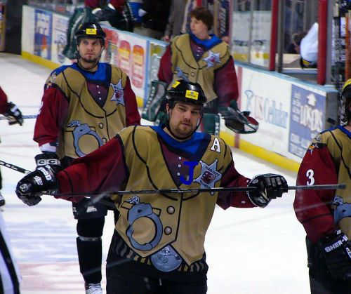
my post from 'ken king please read' thread, I think its more appropriate here ...
Quote:
Originally Posted by Dr. Pepper
Just posting here to have all concepts in the same place:
 |
Bastian's concepts are absolutely flawless (maybe except of colors which seem to be a bit faded). I proposed similar concepts few month ago but didn't realize how brilliant the broad yellow stripes look on red jersey (combined with white lettering), truly fantastic work on those two.
I'd say the third black jersey should be in a similar style, perhaps introducing a cowboy theme in our alternate logo. This is the clipart I found at rivalart and my quick edited proposal for the third uniform. Note the clipart is not mine and far from being suitable for the logo (it's here just to carry the idea a bit further)


|
|
|
|
|
09-27-2013, 01:22 PM
|
#987
|
|
Franchise Player
Join Date: Mar 2002
Location: Waterloo, Ontario
|
LOL...that is horrible. Minor league stuff...like Peewee minor
|
|
|
|
|
The Following 6 Users Say Thank You to Cheese For This Useful Post:
|
|
|
09-27-2013, 01:25 PM
|
#988
|
|
Franchise Player
Join Date: Feb 2006
Location: Section 222
|
Well at least it's not the worst cowboy hockey themed jersey I have ever seen...
__________________
Go Flames Go!!
|

|
|
|
The Following 12 Users Say Thank You to Rhettzky For This Useful Post:
|
BurningYears,
calgaryred,
chalms04,
doctajones428,
etc,
handgroen,
Jimmy Stang,
Mattman,
Rubicant,
SixtySix,
SportsJunky,
Table 5
|
|
09-27-2013, 01:26 PM
|
#989
|
|
#1 Goaltender
|
Quote:
Originally Posted by Cheese
LOL...that is horrible. Minor league stuff...like Peewee minor
|
you're a minor
|
|
|
|
|
09-27-2013, 01:32 PM
|
#990
|
|
Lifetime Suspension
|
Kill that cowboy with extreme prejudice
|
|
|
|
|
The Following 2 Users Say Thank You to TurnedTheCorner For This Useful Post:
|
|
|
09-27-2013, 01:41 PM
|
#991
|
|
Crash and Bang Winger
Join Date: Jul 2009
Location: Vancouver, BC
|
Quote:
Originally Posted by playmaker
|
So it is settled, we're going with 'The Cowboy' as the main logo. Let's get this thread closed up.
|
|
|
|
|
09-27-2013, 01:56 PM
|
#992
|
|
Farm Team Player
Join Date: Jul 2010
Exp: 
|
I absolutely hate the "cartoon" logos. The best ones are the simple and understated. Detroit, Toronto, Montreal, Calgary, all great examples of fantastic logo's.
Florida, San Jose, stuff like that, just no thank you. (IMO the horse fell into this category too, was never a fan).
|
|
|
|
|
The Following User Says Thank You to D-Red For This Useful Post:
|
|
|
09-27-2013, 02:39 PM
|
#993
|
|
Lifetime Suspension
Join Date: Oct 2012
Location: Halifax
|
^ Perfect example of that was turning Ottawa's great logo into a 3D cartoon.
|
|
|
|
|
The Following 3 Users Say Thank You to $ven27 For This Useful Post:
|
|
|
09-27-2013, 02:46 PM
|
#994
|
|
First Line Centre
Join Date: Oct 2009
Location: Calgary
|
Quote:
Originally Posted by browna
|
The piping on that version of the jersey, and no flags looks so much better.
|
|
|
|
|
The Following 2 Users Say Thank You to RM14 For This Useful Post:
|
|
|
09-27-2013, 02:55 PM
|
#995
|
|
Scoring Winger
Join Date: Mar 2010
Location: Cowtown
|
So I have some info....
Red
November
"Calgary" across the front....
|
|
|
|
|
09-27-2013, 02:57 PM
|
#996
|
|
Lifetime Suspension
|
Quote:
Originally Posted by iggyformayor
So I have some info....
Red
November
"Calgary" across the front....
|
HAVE YOU SEEN IT? TELL US MORE.
We already had word of the Calgary text, and the fact it was coming early November, but it being red is.... positive.
|
|
|
|
|
09-27-2013, 02:58 PM
|
#997
|
|
Scoring Winger
Join Date: Mar 2010
Location: Cowtown
|
I haven't seen it unfortunately, but it will be first worn by the team in early November and then will go on sale about a week after.
|
|
|
|
|
09-27-2013, 02:59 PM
|
#998
|
|
Franchise Player
Join Date: Apr 2008
Location: CGY
|
Quote:
Originally Posted by iggyformayor
So I have some info....
Red
November
"Calgary" across the front....
|
Can think of anyway this won't be terrible
|
|
|
|
|
09-27-2013, 03:03 PM
|
#999
|
|
Scoring Winger
Join Date: Mar 2010
Location: Cowtown
|
Yeah I wasn't thrilled when I was told... It also means another 3 years before we'll see another one.
|
|
|
|
|
The Following User Says Thank You to iggyformayor For This Useful Post:
|
|
|
09-27-2013, 03:18 PM
|
#1000
|
|
#1 Goaltender
Join Date: Jan 2009
Location: Calgary
|
Well, hopefully it's not as terrible as it sounds, because it sounds terribly bad.
|
|
|
|
 Posting Rules
|
You may not post new threads
You may not post replies
You may not post attachments
You may not edit your posts
HTML code is Off
|
|
|
All times are GMT -6. The time now is 12:50 PM.
|
|


