 01-16-2015, 03:57 PM
|
#41
|
|
First Line Centre
Join Date: Oct 2009
Location: Calgary
|
Quote:
Originally Posted by CliffFletcher

Dallas is a good example of how you don't need black in every frickin jersey to look good.
|
Dallas's colors are Green, Black, & White...

|

|

|
|
The Following 5 Users Say Thank You to RM14 For This Useful Post:
|
|
|
01-16-2015, 04:36 PM
|
#42
|
|
#1 Goaltender
Join Date: Jul 2014
Location: Northern Crater
|
Quote:
Originally Posted by RM14
|
Black with those jerseys worked, I've never liked black on any others we've had but man those 04 jerseys were beauties. God those jerseys were amazing, why did they scrap them again? Our current set is junk 
|
|
|
|
|
01-16-2015, 04:57 PM
|
#43
|
|
Franchise Player
|
Quote:
Originally Posted by RM14
Dallas's colors are Green, Black, & White...
|
Whoops. For some reason I thought the redesign was more radical. Anyway, at least the Stars uniforms aren't mostly black anymore.
__________________
Quote:
Originally Posted by fotze
If this day gets you riled up, you obviously aren't numb to the disappointment yet to be a real fan.
|
|
|
|
|
|
The Following User Says Thank You to CliffFletcher For This Useful Post:
|
|
|
01-16-2015, 05:59 PM
|
#44
|
|
Crash and Bang Winger
Join Date: Aug 2011
Location: East of the Rockies, West of the rest
|
This site is way more comprehensive and focuses on the entire strip rather than just the logo, but is worth a look anyway.
http://nhluniforms.com/
|
|
|
|
|
The Following 3 Users Say Thank You to hurtin_albertan For This Useful Post:
|
|
|
01-16-2015, 09:32 PM
|
#45
|
|
Farm Team Player
Join Date: Apr 2006
Exp: 
|
Quote:
Originally Posted by the_only_turek_fan
The Flames need to get rid of black from all jerseys/logos.
|
No?
__________________
Ole Yeller
|
|
|
|
|
The Following 2 Users Say Thank You to S. Yelle For This Useful Post:
|
|
|
01-17-2015, 01:04 AM
|
#46
|
|
First Line Centre
Join Date: Jan 2011
Location: Fort St. John, BC
|
Quote:
Originally Posted by RM14
Dallas's colors are Green, Black, & White...
|
I still can't get over how beautiful those jerseys are. I have one signed by Jordie and Jamie Benn hanging in my closet, yet the pictures still stun me
|
|
|
|
|
The Following User Says Thank You to doctajones428 For This Useful Post:
|
|
|
01-17-2015, 07:30 AM
|
#47
|
|
First Line Centre
|
The 2004 black flaming C is one of my favorite jerseys. Black shouldn't always be out of the picture.
|
|
|
|
|
The Following 2 Users Say Thank You to starseed For This Useful Post:
|
|
|
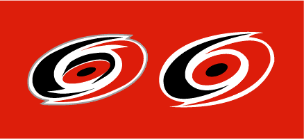
01-17-2015, 08:15 AM
|
#48
|
|
Franchise Player
Join Date: Oct 2001
Location: Kalispell, Montana
|
Quote:
Originally Posted by the2bears
Carolina's logo is incredibly bad.
|
Agreed. On the other hand, I think their secondary logo is fantastic. They should go with it permanently.
__________________
I am in love with Montana. For other states I have admiration, respect, recognition, even some affection, but with Montana it is love." - John Steinbeck
|
|
|
|
|
01-17-2015, 09:18 AM
|
#49
|
|
Franchise Player
Join Date: Aug 2007
Location: Ontario
|
The Senators have crashed and burned from a great look.
Imagine this on the ice today:

|
|
|
|
|
The Following 4 Users Say Thank You to Split98 For This Useful Post:
|
|
|
01-17-2015, 09:24 AM
|
#50
|
|
Lifetime Suspension
|
Visually the Oilers logo just looks better.
|
|
|
|
|
01-17-2015, 09:25 AM
|
#51
|
|
Franchise Player
Join Date: Nov 2003
Location: Calgary, AB
|
Quote:
Originally Posted by Displaced Flames fan
Agreed. On the other hand, I think their secondary logo is fantastic. They should go with it permanently.
|

|
|
|
|
|
The Following 2 Users Say Thank You to Tyler For This Useful Post:
|
|
|
01-17-2015, 09:32 AM
|
#52
|
|
Franchise Player
Join Date: Aug 2007
Location: Ontario
|
Quote:
Originally Posted by Tyler
|
Fantastic might be a bit of an overstatement, but it is better.
The triangle is filler, hockey sticks and pucks are usually cheats, and the stick itself is too much of a focus.
Yet still... with all of that, it manages to be better than their primary.
|
|
|
|
|
The Following User Says Thank You to DionTheDman For This Useful Post:
|
|
|
01-17-2015, 09:43 AM
|
#54
|
|
Franchise Player
Join Date: Feb 2006
Location: Calgary, AB
|
Quote:
Originally Posted by Split98
Fantastic might be a bit of an overstatement, but it is better.
The triangle is filler, hockey sticks and pucks are usually cheats, and the stick itself is too much of a focus.
Yet still... with all of that, it manages to be better than their primary.
|
The triangle represents the "Research Triangle" in the Raleigh-Durham region.
I like the use of the stick in this logo because it isn't just a case of "here's an animal holding a hockey stick because we're a hockey team named after that animal".
__________________
Turn up the good, turn down the suck!
|

|
|
|
01-17-2015, 11:02 AM
|
#55
|
|
Franchise Player
Join Date: Aug 2007
Location: Ontario
|
Quote:
Originally Posted by getbak
The triangle represents the "Research Triangle" in the Raleigh-Durham region.
I like the use of the stick in this logo because it isn't just a case of "here's an animal holding a hockey stick because we're a hockey team named after that animal".
|
Oh cool, I never knew the triangle had any meaning besides 'this looks better'
And I just played around with the stick. A bit thinner and in black looks a lot better. It was just bugging be being such a huge focus.
But you're right, most of the irritation comes from logos of animals literally just playing the sport they're representing.
|
|
|
|
|
01-17-2015, 11:26 AM
|
#56
|
|
Franchise Player
Join Date: Aug 2007
Location: Ontario
|
Also, simplifying it looks loads better:
|
|
|
|
|
01-17-2015, 11:53 AM
|
#57
|
|
Crash and Bang Winger
Join Date: Jan 2011
Location: Calgary, AB
|
Quote:
Originally Posted by DionTheDman
Preds totally should've switched to this one.
 |
The Sabretooth Gopher? LOL
|
|
|
|
|
The Following User Says Thank You to Flamescat For This Useful Post:
|
|
|
01-17-2015, 11:54 AM
|
#58
|
|
Franchise Player
Join Date: Jul 2010
Location: Calgary - Centre West
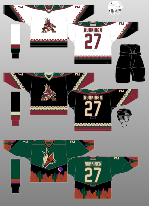
|
I want to see the top two jerseys make a comeback (could go either way where the green jersey is concerned). I find the new ones kind of boring.
__________________
-James
GO FLAMES GO.
|
|
|
|
|
01-17-2015, 12:51 PM
|
#59
|
|
Not the 1 millionth post winnar
Join Date: Aug 2004
Location: Los Angeles
|
Quote:
Originally Posted by DionTheDman
Preds totally should've switched to this one.
|
Cat afraid of a puck. Great plan.
__________________
"Isles give up 3 picks for 5.5 mil of cap space.
Oilers give up a pick and a player to take on 5.5 mil."
-Bax
|
|
|
|
|
The Following User Says Thank You to Flashpoint For This Useful Post:
|
|
|
01-17-2015, 01:27 PM
|
#60
|
|
Franchise Player
Join Date: Mar 2002
Location: Calgary
|
Quote:
Originally Posted by TorqueDog
I want to see the top two jerseys make a comeback (could go either way where the green jersey is concerned). I find the new ones kind of boring.
|
Phoenix is wearing the second one (yes, Phoenix, as it will be the original Phoenix secondary logo on the shoulders) on March 5th vs Vancouver.
|
|
|
|
 Posting Rules
|
You may not post new threads
You may not post replies
You may not post attachments
You may not edit your posts
HTML code is Off
|
|
|
All times are GMT -6. The time now is 07:41 AM.
|
|


