 11-23-2014, 08:21 AM
|
#1001
|
|
Franchise Player
Join Date: Nov 2009
Location: Kelowna, BC
|
Quote:
Originally Posted by Caged Great

Does anyone know where you could get the light one of this custom made, I know BC-Chris can do it, but I don't want him to get in any trouble.
Just an awesome jersey.
|
there are many places that will custom make that jersey - the problem is the number you'd have to get produced - you can't get just one jersey... and becuz it's custom they aren't cheap
__________________
"...and there goes Finger up the middle on Luongo!" - Jim Hughson, Av's vs. 'Nucks
|

|

|
|
11-23-2014, 07:20 PM
|
#1002
|
|
Farm Team Player
Join Date: Apr 2006
Exp: 
|
Quote:
Originally Posted by bc-chris
i'm just waiting for rbk to make the totally blank thirds available and then i plan on doing this - and i will post pics
|
I think this jersey idea would be great to be honest - can't wait to see it.
__________________
Ole Yeller
|
|
|
|
|
11-23-2014, 07:55 PM
|
#1003
|
|
Franchise Player
Join Date: Nov 2009
Location: Kelowna, BC
|
rbk didn't release a blank of the flames third for this year, so i'm hoping by the start of next season - booooooo rbk!
__________________
"...and there goes Finger up the middle on Luongo!" - Jim Hughson, Av's vs. 'Nucks
|
|
|
|
|
11-23-2014, 09:51 PM
|
#1004
|
|
Farm Team Player
Join Date: Jun 2014
Exp:
|
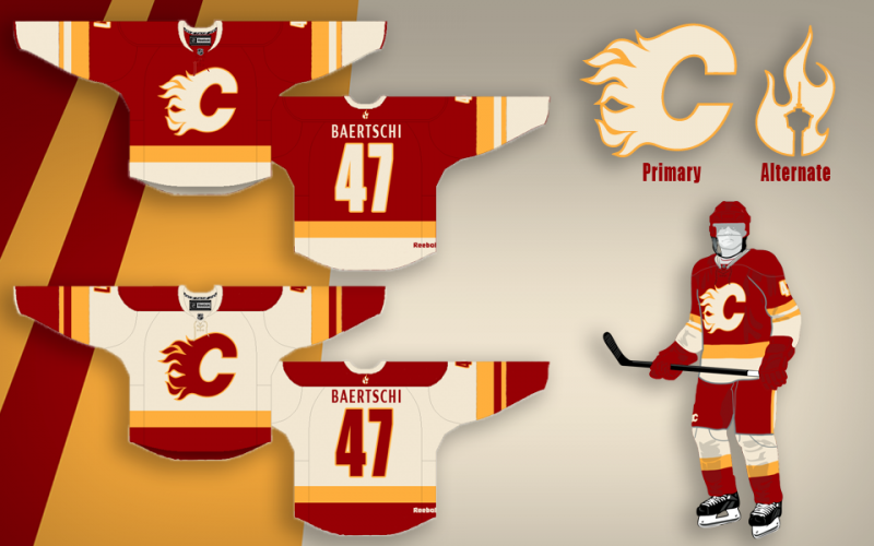
I wanted to throw my design in the ring.
Wanted to keep it simple and clean.

|
|
|
|
|
The Following 3 Users Say Thank You to BoomBoom For This Useful Post:
|
|
|
11-23-2014, 09:55 PM
|
#1005
|
|
Lifetime Suspension
Join Date: Jan 2010
Location: Calgary
|
We don't need a jersey redesign. The team is playing well.
Get rid of the current home and aways and replace them with retro red and retro whites from the 80s.
Keep the third jersey we use now.
|
|
|
|
|
11-23-2014, 10:14 PM
|
#1006
|
|
First Line Centre
Join Date: Mar 2013
Location: YYC
|
Quote:
Originally Posted by 1stLand
Get rid of the current home and aways and replace them with retro red and retro whites from the 80s...
|

Quote:
Originally Posted by 1stLand
...Keep the third jersey we use now.
|
It was going so well....
__________________

|
|
|
|
|
The Following 4 Users Say Thank You to Mattman For This Useful Post:
|
|
|
11-24-2014, 08:13 AM
|
#1007
|
|
Farm Team Player
Join Date: Apr 2006
Exp:
|
Quote:
Originally Posted by kunkstyle
Nooooooooooooo.
|
Why not?
__________________
Ole Yeller
|
|
|
|
|
11-24-2014, 08:22 AM
|
#1008
|
|
Lifetime Suspension
Join Date: Jul 2003
Location: Calgary, Alberta
|
Quote:
Originally Posted by BoomBoom
I wanted to throw my design in the ring.
Wanted to keep it simple and clean.
|
Sign me up for this one.
One suggestion. Maybe use yellow to outline the Flaming C and the Letters/Numbers.
|
|
|
|
|
11-24-2014, 08:44 AM
|
#1009
|
|
Franchise Player
|
Quote:
Originally Posted by S. Yelle
Why not?
|
Loved them at the time, just seems dated now though.
I'd rather see a slight tweak to the retros and make them full time, or something entirely new vs going back to the 04. Not new enough to look like a new design, not old enough to be vintage. Goes against popular opinion but I've got zero desire to go back to the 04s. I also don't have the hate-on for the new jerseys that lots seem to have.
|
|
|
|
|
11-28-2014, 04:48 PM
|
#1010
|
|
Farm Team Player
Join Date: Apr 2006
Exp:
|
Quote:
Originally Posted by kunkstyle
Loved them at the time, just seems dated now though.
I'd rather see a slight tweak to the retros and make them full time, or something entirely new vs going back to the 04. Not new enough to look like a new design, not old enough to be vintage. Goes against popular opinion but I've got zero desire to go back to the 04s. I also don't have the hate-on for the new jerseys that lots seem to have.
|
It doesn't make any sense to tweak the retros though. They are were just fine the way they were.
All the crazy piping, stripes, and flags on our current jerseys make it way too busy and too minor league-ish.
__________________
Ole Yeller
|
|
|
|
|
11-28-2014, 05:22 PM
|
#1011
|
|
Franchise Player
Join Date: Nov 2003
Location: Calgary, AB
|
Quote:
Originally Posted by bc-chris
i'm just waiting for rbk to make the totally blank thirds available and then i plan on doing this - and i will post pics
|
After further review, I think the deep neckline design makes this difficult. That's probably why the logo is the way it is. Kind of dumb.
I whipped this up in 5 seconds. Had to trim the neckline.

Don't hate it, but don't love it either.
|
|
|
|
|
11-28-2014, 06:23 PM
|
#1012
|
|
Backup Goalie
Join Date: Sep 2012
Exp:
|
Quote:
Originally Posted by DrDangles92
I still think these are wicked.
Just move the Flame/Calgary Tower logo to one of the shoulders and it'd be perfect.
 |
I first saw these on CP close to two years ago. I have been an avid flames fan since 1990. Yet I have never loved a flames jersey enough to want to purchase one. These jerseys are still the sharpest I've seen and I would gladly purchase a home and away if they came into production. They have a retro-ish look to them but are truly original. The debate is over IMO.
The suggestion to move the tower to the shoulders is the icing on the cake. Applause to the designer and this suggestion.
|
|
|
|
|
01-16-2015, 12:02 PM
|
#1013
|
|
Powerplay Quarterback
Join Date: Feb 2011
Location: Sydney, Australia
|
Would people hate to see a new logo besides the flaming C? The obvious thought is that our captain would have the flaming C and the A's would be the old Atlanta logo as it is now.
|
|
|
|
|
01-16-2015, 12:10 PM
|
#1014
|
|
First Line Centre
Join Date: Oct 2011
Location: The Armpit of BC: Trail
|
Quote:
Originally Posted by Scoutski
Would people hate to see a new logo besides the flaming C?
|
Yes.
__________________
Disregard any and all THANKS I give. I'm a dirty, dirty thanks-whore.
|
|
|
|
|
The Following 12 Users Say Thank You to Trailer Fire For This Useful Post:
|
bc-chris,
Fire,
handgroen,
heep223,
IamNotKenKing,
Mazrim,
N26,
Reaper,
redflamesfan08,
RM14,
undercoverbrother,
You Need a Thneed
|
|
01-16-2015, 12:20 PM
|
#1015
|
|
Powerplay Quarterback
Join Date: Apr 2004
Location: Behind the microphone
|
Quote:
Originally Posted by Scoutski
Would people hate to see a new logo besides the flaming C? The obvious thought is that our captain would have the flaming C and the A's would be the old Atlanta logo as it is now.
|
Yes.
__________________
Fireside Chat - Official Podcast for the C of Red
New Episode Weekly! Listen Now: FiresideChat.ca
|
|
|
|
|
The Following 5 Users Say Thank You to Iceman90 For This Useful Post:
|
|
|
01-16-2015, 12:22 PM
|
#1016
|
|
First Line Centre
Join Date: Oct 2011
Location: Winchestertonfieldville Jail
|
Quote:
Originally Posted by Beer-gut Murray
I first saw these on CP close to two years ago. I have been an avid flames fan since 1990. Yet I have never loved a flames jersey enough to want to purchase one. These jerseys are still the sharpest I've seen and I would gladly purchase a home and away if they came into production. They have a retro-ish look to them but are truly original. The debate is over IMO.
The suggestion to move the tower to the shoulders is the icing on the cake. Applause to the designer and this suggestion.
|
Yes this jersey is absolutely awesome, especially the home version.
|
|
|
|
|
01-16-2015, 12:23 PM
|
#1017
|
|
Lifetime Suspension
|
Quote:
Originally Posted by Scoutski
Would people hate to see a new logo besides the flaming C? The obvious thought is that our captain would have the flaming C and the A's would be the old Atlanta logo as it is now.
|
Flames should just go to a pic of scorch as their new logo.
|
|
|
|
|
01-16-2015, 12:23 PM
|
#1018
|
|
Lifetime Suspension
Join Date: Sep 2007
Location: blow me
|
Nm
|
|
|
|
|
01-16-2015, 12:31 PM
|
#1019
|
|
Franchise Player
Join Date: Aug 2007
Location: Vancouver
|
Quote:
Originally Posted by Scoutski
Would people hate to see a new logo besides the flaming C? The obvious thought is that our captain would have the flaming C and the A's would be the old Atlanta logo as it is now.
|
I honestly wouldn't be too against an Alternate logo for an Alternate jersey. The "tower flame" in the above Split98 design I think would be cool.
However, while the Atlanta A works great for the assistants, the flaming C as the captian's badge has been tried and it looks terrible. Just terrible.
__________________

|

|
|
|
01-16-2015, 01:03 PM
|
#1020
|
|
Lifetime Suspension
Join Date: Nov 2014
Location: NB
|
Quote:
Originally Posted by Scoutski
Would people hate to see a new logo besides the flaming C? The obvious thought is that our captain would have the flaming C and the A's would be the old Atlanta logo as it is now.
|
Flaming c as captain is bad, Flaming A is good though. However, yes. I wouldn't mind a new logo, not a big fan of our current logo.
|
|
|
|
 Posting Rules
|
You may not post new threads
You may not post replies
You may not post attachments
You may not edit your posts
HTML code is Off
|
|
|
All times are GMT -6. The time now is 08:41 AM.
|
|


