Part II!
24. Winnipeg Jets
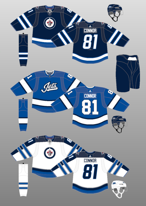
Winnipeg is the only team in the NHL to still use italic numbering on a jersey. Make of that what you will. Despite being a relatively new design, the Jets' uniforms strike me as very dated and bland. They're not "bad" by any means, but they're certainly a disappointment, especially when compared to the much more visually pleasing designs their precursor franchise wore in the 1980s. As it stands, they're just another boring blue team. I find the arm striping on the home and especially the road jersey looks out-of-place and overbearing.
And this is all to say nothing of the alternate uniform, which squanders a fantastic base colour choice with a groan-inducing crest that wouldn't look misplaced on a double-A baseball field. Move over, Montgomery Biscuits.
23. Washington Capitals
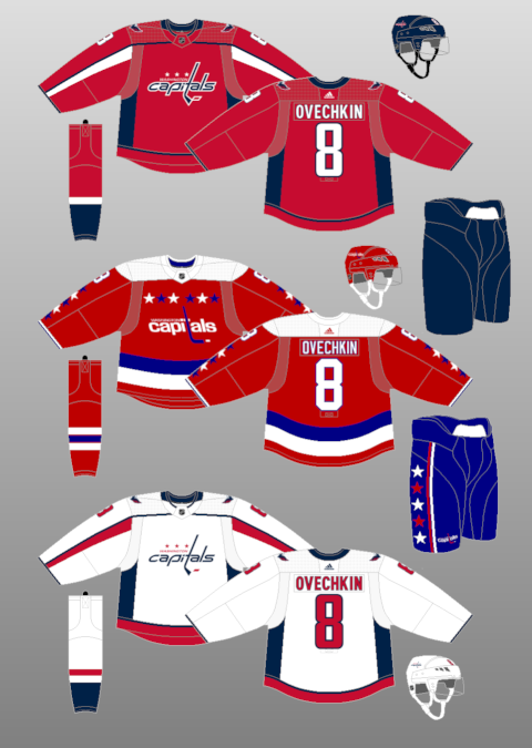
I can respect Washington's design team for trying an updated approach to their classic '70s and '80s uniforms, but in some cases, "classic" doesn't mean "great." Washington's heritage uniform is certainly easier on the eyes than their home and away sweaters, both of which feel muted, dull, and almost afraid to replicate the personality exuded by the franchise's biggest star. Again, enough of the navy blue, already!
I feel Washington would be far better-served by going back to
these uniforms, which are unique, vibrant, actually have real logos and, sadly, disappeared following the Great Eight's first two seasons with the club.
22. Vancouver Canucks
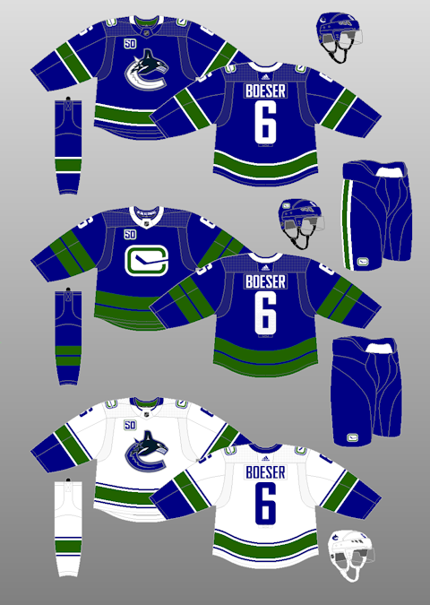
Joining the club of "teams with far better designs in their arsenal," the Canucks are currently rolling with their worst-ever designs and it's sad to watch. To me, the Canucks always looked at their best in the 1990s, when they wore their flying skate logo and mixed yellow and red into a primarily black uniform. Nowadays, all those colours are gone, and while the green is a nice, unique touch, I actually think there might be a little too much of it. I'd love to see a bit more white in there to make the blue and green contrast more. As it stands, all three uniforms just look flat. I especially dislike the huge green stripes and the massive white collar on the alternate.
Heck, I even preferred the Canucks' look when their main accent colour was red instead of green. I thought that showed up better as a contrast on the uniform, and I thought it presented the opportunity to do more unique things from a design perspective. But now... blah.
21. Colorado Avalanche
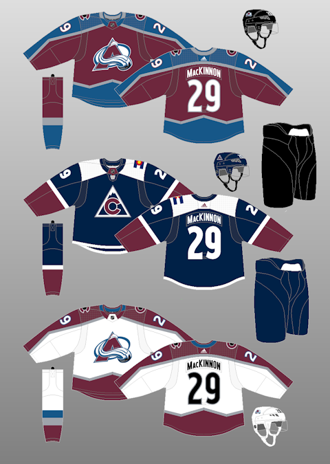
I just don't get why people adore the Avs' alternate jersey so much. I think it's hideous. While I actually prefer the shade of blue to the colour they usually wear on their primary uniforms, I think the sqaured-off shoulder yoke looks terrible, the asymmetrical flag(!!!!!) on the shoulder is wildly out-of-place, and the triangular logo is unsuitable for a professional sports team. It looks like it belongs on the back of a U.S. dollar bill.
That said, I feel like the navy blue, the purple, and the white on the alternate provide great visual flair, in contrast to the painfully muted tones of the primary uniforms. I love the striping, but the colour scheme is woefully miscast and flat. Use the same striping and bring the colours over from the alternate, and we've got a winner. Well, not the winner. But close to it.
20. Los Angeles Kings
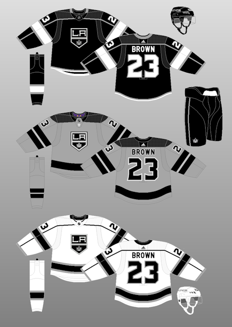
Ok, let's put the grey one aside for now.
These jerseys will be iconic because they saw two Cups, and while they're not bad, I think they're pretty unremarkable. I think there's nothing wrong with a greyscale colour scheme, but I would like to see a mockup of these jerseys with minimalist purple accents in there. The Kings have a so-called "purple pass" afforded to them by the aesthetics of regality that allows them to wade into those dangerous design waters freely where other teams might be deterred. While I get their current designs look very professional and streamlined... I want to see them lean into a new feature for a new era of Kings hockey. With so many electric young prospects coming through the Kings' pipelines, the time is perfect to experiment with a small infusion of something new and fun into the unform.
Anyhow... regarding the grey jersey, I think it's bad. But I respect the attempt at trying to make a grey jersey a thing. It's hard to make a grey anything look good. I don't particularly like the shade they chose, though, and I think to make it work they should have gone darker and maybe played with the shade of black, as well. This is one of the only instances where I think
reducing contrast would have helped out with the design. I'd love to see a uniform that's ALL dark grey with only the most minimal purple and white accents, similar to the San Jose Sharks' third uniform. Now that could pop.
19. New Jersey Devils
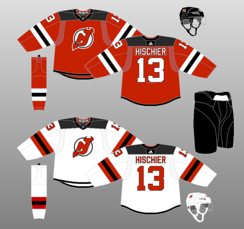
I just yawned a bit.
In 2017, New Jersey messed with something that worked for decades. Their old uniform design looked clean and prim, with classic waist and arm striping and a nicely-rounded shoulder yoke. The logo (which they still use) worked great in tandem with all that. It was a really solid design and likely would have placed in the top-10 of this list.
Now, the waist striping is gone, and the new arm striping looks almost swollen in comparison to what it replaced. And worst of all, they decided to square off the shoulders. Three substantial downgrades, enough to put it in the third quarter of this list.
Now that Lou is gone, I wonder if we'll see a crazy Devils third at some point in the future? Maybe even a black uniform? Only time will tell.
18. Toronto Maple Leafs
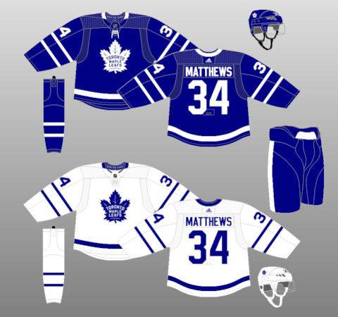
From a design standpoint, there's not a lot here. The new ornate Leafs logo is cool, although I haven't decided whether or not I like it better than its predecessor. The new numerical font is pretty slick.
...
*crickets*
It's blue and white. It's a classic look. But, truthfully, I find it a little bland. I get it's a somewhat iconic and timeless look, and there's nothing bad or offensive about it, but I find it hard to get excited about a uniform with such pedestrian design elements. I genuinely don't have anything to talk about. And in a league blessed with some truly excellent designs, the Leafs being nothing more than "good" forces me to punish them more than I'd maybe like to.
17. Ottawa Senators
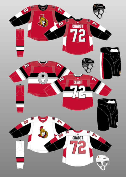
First of all, it should be noted that Ottawa is reportedly reverting to a design
similar to this next season. For this post, I'm just sticking with what is current. But I do prefer the classic design by a fair amount.
That said, I think the Sens' current threads vastly outstrip the quality of their hockey. The logo is good and I like the blocks of contrast that surround the body colour, particularly on the white uniform. I think that works far more effectively as a method of contrast than the old Reebok-standard piping that killed many a great uniform design. I also really like the letter and number font on the main uniforms.
The real star of the Sens' set is the alternate jersey. The rendering here doesn't do the silver justice. It shines in-person and is one of my favourite design elements on any NHL jersey. I think silver is a criminally underutilized colour in the NHL so I'm glad the Sens have leaned into it on their "O" jersey instead of the beige they used before. I have a feeling that this alternate will stick around even when the old 2D Senator designs are reintroduced next year, and adopting that kit will move Ottawa into the top-5 on my list.