Now that Seattle's garb is out, I'm going to take a look at all 32 home/away/alt kits in the NHL and come up with
the 100% correct list a subjective take on which teams dress the best.
You get the picture... let's start with #32.
32. Anaheim Ducks
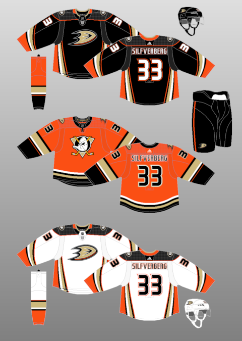
Look, it's just awful. The jade and eggplant Mighty Ducks kit was a look that toed the line between classic and fun. I will say that these uniforms are better than the weird script logo-adorned jerseys they wore when they won the Cup in 2007, but that doesn't make them good. The striping up the side is one of my least favourite parts of the Flames' current set and it's even worse here. It just seems dated and bland. And for a team with as ridiculous a name as the "Ducks," that's a cardinal sin.
The orange alt feels like a relic from 2006. It's a disappointing half-measure that brings back only the worst part of the jade/eggplant jerseys: the logo.
31. Tampa Bay Lightning
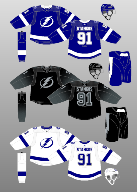
"Lightning" is such a cool name for a team, so it's a shame that the Tampa Bay NHL franchise has
never worn a cool jersey. The closest they've come is probably their new gradient jersey, pictured above, but it's still not enough to make up for their pitifully bland home/away set. When(?) they won the cup in 2004, their logo was weirdly cartoonish and the uniform was a dull black and white combination. Now... it's somehow worse.
I think the alternate is a decent-enough template to go off of for a future set, but I'd love to see a couple splashes of colour put in there to make it really pop. Maybe an electric blue or maybe even a fiery yellow. Anything would be better than the cookie-cutter and yawn-inducing blue-and-white kit they wear on the regular.
30. Buffalo Sabres
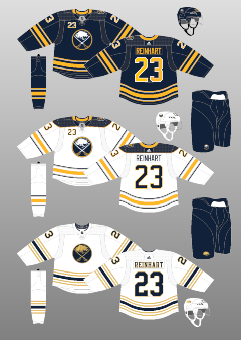
I might be one of five people in the world who dislike the Sabres' 50th-anniversary alternate uniform. I think the striping is too busy, although the intricate logo is an upgrade. But... man, that home jersey might be the most outdated uniform in hockey. The front numbers haven't been cool since the NHL Guardian Project was announced. Silver, a fantastic and underutilized accent colour, makes little more than a cameo in the predominantly yellow waist and arm striping. The asymmetrical shoulders don't help matters (yes, I know it's a one-year-only patch... still, put it on both sides!). And the boring old navy body colour suits the team's play perfectly.
Maybe the '80s royal blue coming back will look better? But the thing that sucks about Buffalo's jerseys, especially its home jersey, is how reliant they are upon one shade of blue and yellow per design. Add some new colours in there! Put in some accents that pop instead of the washed-out silver next to the yellow! Try something new!
29. Edmonton Oilers
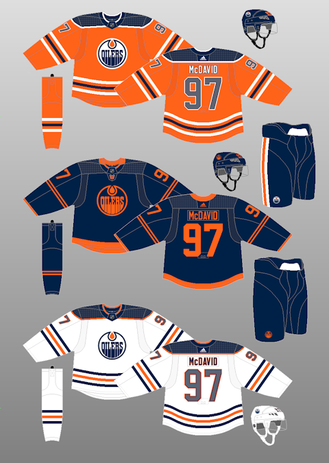
The white jersey is fine. I actually think it looks a bit better with the navy shoulders instead of the bright blue. No complaints.
The dark blue jersey is pretty cool. As a novelty, it works. Maybe it would be better with a bit of white in there, but, as it stands, it's a neat-enough attempt at something new. It pops on the ice.
The orange jersey is cataclysmically bad. The shade of orange is blinding. The waist and arm stripes resemble something from a Walmart jersey. The navy blue stripe, in particular, is so washed out by its white neighbours that it actually looks black. The colours in the logo don't appear to match the stripes at first glance. It's a discombobulated mess of a jersey, made worse by how the Oilers already wore a far superior orange alternate uniform in 2016-17 that they needlessly discarded after just one season. Seriously, if the Oilers went back to their 2016-17 set of uniforms, it would be a massive upgrade and they would likely place in the top-10 of this list. As it stands, the orange jersey alone is enough to tank their rating.
28. Florida Panthers
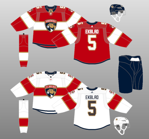
When these uniforms were first revealed, I liked them quite a lot. But I've grown to strongly dislike the logo (it looks like it belongs on a car) and I find the stripe behind the logo a weak attempt at replicating the Canadiens' design. Seriously, why did the Panthers
ever go away from
these gorgeous sweaters? All three of them are great, especially the blue one. The Panthers used to stand out with a really unique red/yellow/navy colour scheme and a menacing logo. Now, they're just another red and white team that seems almost ashamed of their past yellow and blue accents, hence their vastly reduced and dulled presence on the current uniform.
27. Nashville Predators
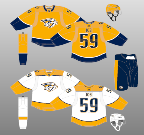
I don't have a lot to say here. Nashville gets points for being the only team in the NHL to use yellow as the primary colour on their home jersey, but they lose points for having it be basically their only colour. Was there a ration on stripes when Adidas took over the NHL's jersey designs? Pittsburgh's yellow jersey works way better than this one because the Penguins' design team knows that yellow is a colour that needs to be countered with strong contrasting design elements. But Nashville's main jersey just lets it run wild with only a half-hearted splatter of navy at the waist. Even then, that hardly counts: low waist design elements often become lost in the pants, and, wouldn't you know it, Nashville's pants are the same colour as that waist stripe.
Basically, it's yellow overload. I'd be wholeheartedly behind a yellow Preds jersey design that actually incorporates some, er, design. But, as it stands, there's nothing here. And don't get me started on the atrocious square shoulder yoke on the white jersey. Nothing ruins a jersey quite like a square shoulder yoke. Just keep the yellow running down the arms!
26. Dallas Stars
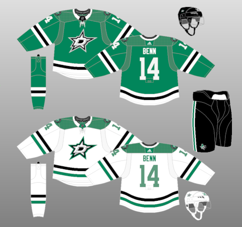
Once again, I applaud Dallas for leaning back into green as their main colour. I still maintain that
the uniforms preceding these ones as the Stars' mains are the most half-assed design in NHL history.
But I have to take a lot of points away from the Stars because they have one of the best uniform designs in NHL history tucked away in their vault, and, for some reason, they have refused to return to it since the Reebok Edge plague took over league.
These jerseys are truly awesome. They're distinctive, unique, and they look great on the ice. I seriously cannot comprehend the thought process that led Dallas' higher-ups to go to a meeting with Reebok back in 2007 and say, "yeah, let's take away this star design on the front of our jersey and replace it with the word "Dallas" in a stock font."
I don't hate the bright green on Dallas' current jerseys and I think the logo is just ok, but the striping and especially the white waist on the green jersey is just so bland and pedestrian. I'd love to see how it would look if the new logo was put in the star jersey template from the early 2000s -- maybe even with the shade of green updated to their updated one. It would probably look a hell of a lot better than the mediocre design they wear today.
25. Calgary Flames
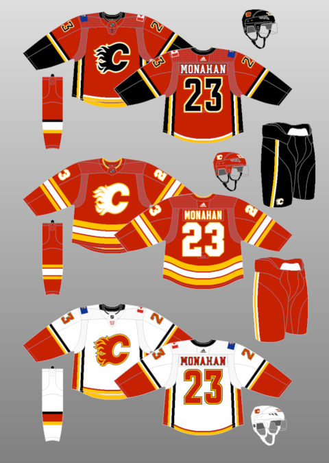
I loathe the Flames' current home and away jerseys. The side striping feels out-of-place. The flags should have been axed in 2009. I'd actually prefer ads on the shoulders. I'd rather think about drinking a Pepsi than groan at the idea of the Flames calling themselves "Canada's team."
These current monstrosities have lasted thirteen seasons (yes, I'm lumping the mutated Adidas version in with the original Reebok Edge redesign). The Flames' 2004 red design, which improves upon bascially every element from the Adidas/Reebok jerseys, only lasted three seasons. Here's hoping that, one day, the 2004 design (or something evocative of it) sees the light once more.
I have no issue with a black "C" on a Flames jersey. I think the black "C" looks great. But the rest of the jersey is a scattered mess. The only saving grace for this kit is the gorgeous retro design, which, along with its white counterpart, is mercifully supplanting the flag jerseys as the home/away set beginning next season. Hopefully the Flames' design team can come up with a more cohesive and less busy design featuring the black "C" as an alternate uniform in the future.
Part II coming tomorrow.


