 10-08-2019, 10:16 AM
|
#2681
|
|
Powerplay Quarterback
Join Date: Nov 2014
Location: Calgary, AB
|
Quote:
Originally Posted by Dr. Pepper

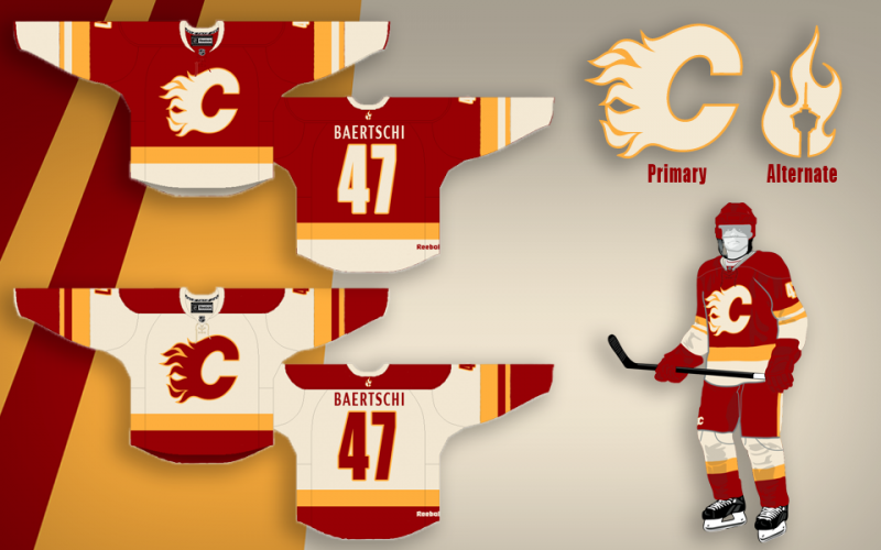
Always excited when this thread pops up! I'm obviously in the minority with this, but I've always thought the flames classic red uniforms were just too much red. And the stripes were too simple. I know I know, blasphemy! But man-o-man, the classic white (and now 2019 heritage jersey) - is a thing of beauty. I'd love to see it just simply inverted into a red jersey version. I love the 5 stripe pattern. Much better than the 3 wide stripes on the classic red. And it needs a yoke to break up the red. Anyhow - with that said - I thought these were a pretty cool concept that somewhat shows that idea:
  |
I wouldn't mind seeing these with the rounded shoulder yoke. That might be a winner.
|

|

|
|
10-08-2019, 10:29 AM
|
#2682
|
|
First Line Centre
Join Date: Oct 2002
Location: Calgary
|
Quote:
Originally Posted by SmoggyFlamesFan
I wouldn't mind seeing these with the rounded shoulder yoke. That might be a winner.
|
The Atlanta Flames actually had similar striping on their jersey the first year they were in the league before switching to the style seen on the current red retros. I think the current look is better.

|
|
|
|
|
10-08-2019, 11:35 AM
|
#2683
|
|
Franchise Player
Join Date: Aug 2007
Location: Ontario
|
 Jersey Ideas - Ken King please read
Quote:
Originally Posted by Dr. Pepper
Always excited when this thread pops up! I'm obviously in the minority with this, but I've always thought the flames classic red uniforms were just too much red. And the stripes were too simple. I know I know, blasphemy! But man-o-man, the classic white (and now 2019 heritage jersey) - is a thing of beauty. I'd love to see it just simply inverted into a red jersey version. I love the 5 stripe pattern. Much better than the 3 wide stripes on the classic red. And it needs a yoke to break up the red. Anyhow - with that said - I thought these were a pretty cool concept that somewhat shows that idea:
|
I really like this concept, and definitely leaned towards matching patterns myself a few times when playing around.
But a big part of what makes the 2020-21 jersey so fitting for the Flames is in the contrast with yellow. Its dulled and dominated with black, and muted on white - but the palette is vibrant and hot with yellow on red. On this white jersey, you lose the yellow - and it can become a red and white jersey on the ice
Love the concept, just my $.02 on something Ive bounced around a bit
Definitely love the too much red on the whites though! I love teams that can still look the part in their whites... while still clearly being the team in white
|
|
|
|
|
10-08-2019, 01:20 PM
|
#2684
|
|
Crash and Bang Winger
Join Date: May 2009
Location: Calgary
|

Quote:
Originally Posted by Split98
I really like this concept, and definitely leaned towards matching patterns myself a few times when playing around.
But a big part of what makes the 2020-21 jersey so fitting for the Flames is in the contrast with yellow. Its dulled and dominated with black, and muted on white - but the palette is vibrant and hot with yellow on red. On this white jersey, you lose the yellow - and it can become a red and white jersey on the ice
Love the concept, just my $.02 on something Ive bounced around a bit
Definitely love the too much red on the whites though! I love teams that can still look the part in their whites... while still clearly being the team in white
|
First off - you are royalty in this thread. Mad respect for the concepts you've done in the past.
I'm totally in love with the retro whites that just got released. Only thing I think could add to it would be a thin yellow outline on the shoulder yoke (but then again I may hate it when I see it - tough to say).
That being said - I'm dying to see a concept showing just a mirror of that white retro: shoulder yoke, 5 stripes - just a mirror of it with a red base instead of white.
__________________
The Doctor is in
|
|
|
|
|
10-08-2019, 01:54 PM
|
#2685
|
|
Franchise Player
Join Date: Aug 2007
Location: Ontario
|
Quote:
Originally Posted by Dr. Pepper
First off - you are royalty in this thread. Mad respect for the concepts you've done in the past.
I'm totally in love with the retro whites that just got released. Only thing I think could add to it would be a thin yellow outline on the shoulder yoke (but then again I may hate it when I see it - tough to say).
That being said - I'm dying to see a concept showing just a mirror of that white retro: shoulder yoke, 5 stripes - just a mirror of it with a red base instead of white.
|
Wow thanks! That's big-time from the name we see every time we jump in here. I always think of this thread as the impetus for a lot of fun projects - so thank you for thinking to try and reach King in 2012. He's slow to action, but I think he got the memo!
And you're talking to a fan of yoke-trim for sure:

Working on this design, I think it does add quite a bit to the update. Similar to the Flames, we were looking to re-ignite the brand-era fans identify with and that stroked yoke added a lot of maturity to the design.
But yet... I've done the same on a few Flames concepts, and yet I'm torn. In one moment I love it, and in the next it's too much. In both cases... they're gorgeous
|
|
|
|
|
The Following 2 Users Say Thank You to Split98 For This Useful Post:
|
|
|
10-08-2019, 04:00 PM
|
#2686
|
|
Pent-up
Join Date: Mar 2018
Location: Plutanamo Bay.
|
Quote:
Originally Posted by SmoggyFlamesFan
I wouldn't mind seeing these with the rounded shoulder yoke. That might be a winner.
|
With a yellow outline as Split98 did with London’s.
|
|
|
|
|
10-08-2019, 04:01 PM
|
#2687
|
|
Scoring Winger
|
Quote:
Originally Posted by TheRealPepman

Just randomly thought about doing this today. Thoughts, guys?
Image credit to Chris Creamer for the original picture. |
My mom always said... if you cant say anything nice.....
|
|
|
|
|
The Following User Says Thank You to rhino For This Useful Post:
|
|
|
10-08-2019, 04:06 PM
|
#2688
|
|
Powerplay Quarterback
Join Date: Nov 2014
Location: Calgary, AB
|
Quote:
Originally Posted by rhino
My mom always said... if you cant say anything nice.....
|
Unpopular opinion here, but I think these are frickin awesome.
|
|
|
|
|
The Following 2 Users Say Thank You to SmoggyFlamesFan For This Useful Post:
|
|
|
10-10-2019, 12:00 PM
|
#2689
|
|
Scoring Winger
|
Quote:
Originally Posted by SmoggyFlamesFan
Unpopular opinion here, but I think these are frickin awesome.
|
It may be unpopular but it is your opinion. Your opinion is wrong but it is yours. 😂
|
|
|
|
|
10-20-2019, 11:51 AM
|
#2690
|
|
Scoring Winger
Join Date: Jul 2018
Location: 403
|

Thoughts? I was inspired by this jersey.
|
|
|
|
|
The Following 5 Users Say Thank You to TheRealPepman For This Useful Post:
|
|
|
02-25-2020, 09:28 AM
|
#2691
|
|
Crash and Bang Winger
Join Date: May 2009
Location: Calgary
|
In love with these! Would love to see them just inverted to a red base
Quick little thread revival - I'm just so in love with these throwback road unis! Made even better now with the subtraction of the classic regina crest. (eww) The only thing I'm at a loss for is the pants don't look quite right with those stripes - don't know if it's better with just solid red or some other stripes or what...

I would so appreciate someone with talent to create a home uni with this pattern just inverted to a red base. And to be clear - that's NOT what the throwback reds are right now. They have different striping pattern and thicknesses, no yoke, etc. I personally think the throwback reds are just too much red - they look like they are wearing lumberjack pajamas:

I totally get it that some of you disagree - and you think the throwback reds are perfect... Totally get that - and I don't hate them... I just would like to tinker...
__________________
The Doctor is in
|
|
|
|
|
The Following User Says Thank You to Dr. Pepper For This Useful Post:
|
|
|
02-25-2020, 09:35 AM
|
#2692
|
|
Pent-up
Join Date: Mar 2018
Location: Plutanamo Bay.
|
Quote:
Originally Posted by Split98
So I think I'm finally pretty happy with the concept. After playing around with the nameplate font, I found that I really did just love the clean (though Coyote's-esque) simple sans font. I also still never dug adding the extra band to the waist and included here is the neck-placement alternate logo that would be a great place if Reebok does end up allowing their branding relocation. I also retained the tie-ups, but decided on a jersey coloured thread to blend while keeping the (IMO) great look of a tie-up. Blends, avoids the clutter that bothered some people and adds that classic tie-up touch.
Thanks a lot for the positive response guys, this was definitely something I've had a ton of fun working on. |
Quote:
Originally Posted by Dr. Pepper
Quick little thread revival - I'm just so in love with these throwback road unis! Made even better now with the subtraction of the classic regina crest. (eww) The only thing I'm at a loss for is the pants don't look quite right with those stripes - don't know if it's better with just solid red or some other stripes or what...
I would so appreciate someone with talent to create a home uni with this pattern just inverted to a red base. And to be clear - that's NOT what the throwback reds are right now. They have different striping pattern and thicknesses, no yoke, etc. I personally think the throwback reds are just too much red - they look like they are wearing lumberjack pajamas:
I totally get it that some of you disagree - and you think the throwback reds are perfect... Totally get that - and I don't hate them... I just would like to tinker... |
Something like Splits above? (Image is missing, but you get the idea)
|
|
|
|
|
02-25-2020, 10:54 AM
|
#2693
|
|
First Line Centre
Join Date: Mar 2013
Location: YYC
|
Quote:
Originally Posted by Split98
So I think I'm finally pretty happy with the concept. After playing around with the nameplate font, I found that I really did just love the clean (though Coyote's-esque) simple sans font. I also still never dug adding the extra band to the waist and included here is the neck-placement alternate logo that would be a great place if Reebok does end up allowing their branding relocation. I also retained the tie-ups, but decided on a jersey coloured thread to blend while keeping the (IMO) great look of a tie-up. Blends, avoids the clutter that bothered some people and adds that classic tie-up touch.
Thanks a lot for the positive response guys, this was definitely something I've had a ton of fun working on. |
It's been 7 years and I still love this concept so much with the full white/cream bottom of the red jersey!
I know this was the first thread that lead me onto CP and I just wanted to thank everyone for their creative contributions! This thread is always so much fun and I look forward to seeing new things!
__________________

|
|
|
|
|
The Following 7 Users Say Thank You to Mattman For This Useful Post:
|
|
|
02-25-2020, 11:30 AM
|
#2694
|
|
Pent-up
Join Date: Mar 2018
Location: Plutanamo Bay.
|
Quote:
Originally Posted by Mattman
It's been 7 years and I still love this concept so much with the full white/cream bottom of the red jersey!
I know this was the first thread that lead me onto CP and I just wanted to thank everyone for their creative contributions! This thread is always so much fun and I look forward to seeing new ’threads’!
|
Fyp
|
|
|
|
|
02-25-2020, 11:38 AM
|
#2695
|
|
GOAT!
|
Quote:
Originally Posted by Dr. Pepper
Always excited when this thread pops up! I'm obviously in the minority with this, but I've always thought the flames classic red uniforms were just too much red. And the stripes were too simple. I know I know, blasphemy! But man-o-man, the classic white (and now 2019 heritage jersey) - is a thing of beauty. I'd love to see it just simply inverted into a red jersey version. I love the 5 stripe pattern. Much better than the 3 wide stripes on the classic red. And it needs a yoke to break up the red. Anyhow - with that said - I thought these were a pretty cool concept that somewhat shows that idea:
|
I don't know why I'm only seeing these now, but my OCD thanks you! Finally a perfect inversion!
|
|
|
|
|
02-25-2020, 02:23 PM
|
#2696
|
|
Crash and Bang Winger
Join Date: May 2009
Location: Calgary
|
What I want to see
Sorry for the confusion. All I want to see is a straight up, replace all red with white, and white with red, inverted jersey based on the current throwback whites - minus the regina game patch:

__________________
The Doctor is in
|
|
|
|
|
The Following User Says Thank You to Dr. Pepper For This Useful Post:
|
|
|
02-25-2020, 02:55 PM
|
#2697
|
|
Farm Team Player
Join Date: Oct 2014
Exp: 
|
I love the Heritage Whites and our Retro Reds. Hopefully we make them our jerseys full time next year. If so, Ill buy one of each.
Sent from my iPhone using Tapatalk
|
|
|
|
|
The Following 3 Users Say Thank You to DrDangles92 For This Useful Post:
|
|
|
02-25-2020, 02:59 PM
|
#2698
|
|
Franchise Player
Join Date: Dec 2003
Location: Sector 7-G
|
Quote:
Originally Posted by Dr. Pepper
Quick little thread revival - I'm just so in love with these throwback road unis! Made even better now with the subtraction of the classic regina crest. (eww) The only thing I'm at a loss for is the pants don't look quite right with those stripes - don't know if it's better with just solid red or some other stripes or what...
I would so appreciate someone with talent to create a home uni with this pattern just inverted to a red base. And to be clear - that's NOT what the throwback reds are right now. They have different striping pattern and thicknesses, no yoke, etc. I personally think the throwback reds are just too much red - they look like they are wearing lumberjack pajamas:
I totally get it that some of you disagree - and you think the throwback reds are perfect... Totally get that - and I don't hate them... I just would like to tinker... |
What if we did what the KC Chiefs do and use white pants with the home reds and red pants for the away?
|
|
|
|
|
02-25-2020, 06:39 PM
|
#2699
|
|
All I can get
|
Quote:
Originally Posted by Dr. Pepper
I would so appreciate someone with talent to create a home uni with this pattern just inverted to a red base. And to be clear - that's NOT what the throwback reds are right now. They have different striping pattern and thicknesses, no yoke, etc. I personally think the throwback reds are just too much red - they look like they are wearing lumberjack pajamas:
|

|
|
|
|
|
The Following 7 Users Say Thank You to Reggie Dunlop For This Useful Post:
|
|
|
03-05-2020, 10:24 AM
|
#2700
|
|
Franchise Player
Join Date: Aug 2007
Location: Calgary
|
Found these over twitter of some concepts
https://twitter.com/user/status/1235354128618008576
better view of the flames

__________________

|

|
|
|
The Following 2 Users Say Thank You to Nammer403 For This Useful Post:
|
|
 Posting Rules
|
You may not post new threads
You may not post replies
You may not post attachments
You may not edit your posts
HTML code is Off
|
|
|
All times are GMT -6. The time now is 02:04 PM.
|
|


