icethetics with an update this week. Sharks with new unis. Pretty slick, gotta say. Also like those original Carolina jerseys, should be the primary home and they should have never switched. They won the cup in them; how can you change it? tsk tsk. Also I am technologically incompetent so you'll have to copy / paste the link lol
Not a fan of the Sharks new uniforms. I have always liked the teal but the whole uniform feels like too much of a good thing. They had a great jersey when the first Reebok uniforms were released when they had full striping and added the orange piping. Its the same for me as when the Avs went to the blue pants. Maybe a more cohesive look, but the black pants added a nice contrast to some bright and non traditional hockey colours.
Hurricanes jerseys are great though.
The Following User Says Thank You to the-rasta-masta For This Useful Post:
icethetics with an update this week. Sharks with new unis. Pretty slick, gotta say. Also like those original Carolina jerseys, should be the primary home and they should have never switched. They won the cup in them; how can you change it? tsk tsk. Also I am technologically incompetent so you'll have to copy / paste the link lol
Not a fan of the Sharks new uniforms. I have always liked the teal but the whole uniform feels like too much of a good thing. They had a great jersey when the first Reebok uniforms were released when they had full striping and added the orange piping. Its the same for me as when the Avs went to the blue pants. Maybe a more cohesive look, but the black pants added a nice contrast to some bright and non traditional hockey colours.
Hurricanes jerseys are great though.
Agree 100%. Those Sharks unis with black pants would be unreal.
Hurricanes should have a) never left those reds, b) stop using uniforms without the primary logo (neither their home / away has the logo on it this year?) and c) keep the uni they won the Cup in.
They also have that unique Hurricane flag striping too.
Not a fan of the Sharks’ new uniforms. I have always liked the teal but the whole uniform feels like too much of a good thing. They had a great jersey when the first Reebok uniforms were released when they had full striping and added the orange piping. It’s the same for me as when the Avs went to the blue pants. Maybe a more cohesive look, but the black pants added a nice contrast to some bright and non traditional hockey colours.
Hurricanes’ jerseys are great though.
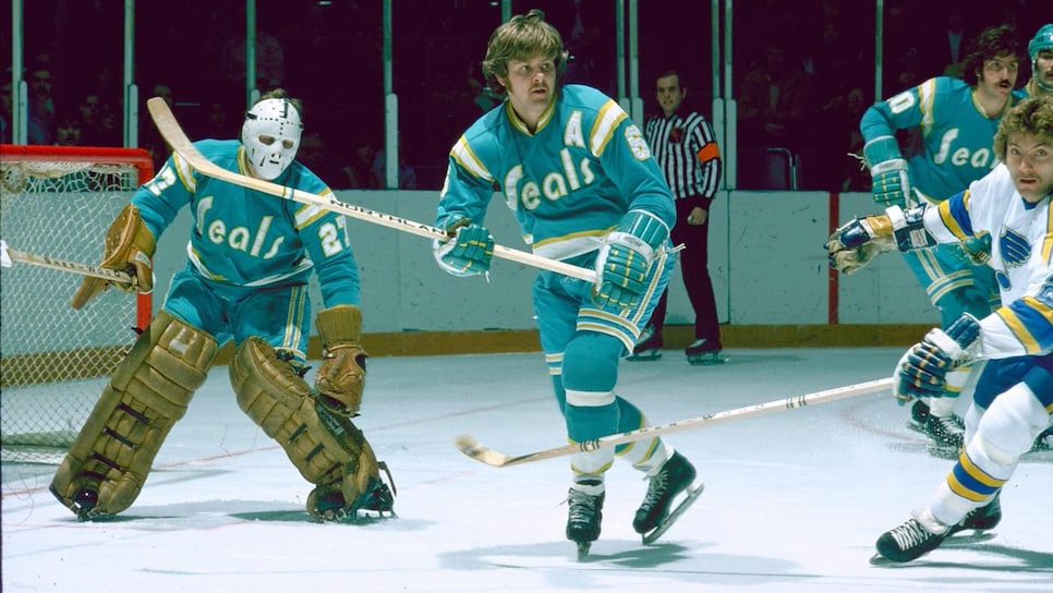
Really? I like the all teal. Reminds me of this:
More teams should go with a one solid colour for jersey and pants/socks. The Flames look great in all red. Black pants look a bit too generic for me.
The Following 4 Users Say Thank You to blankall For This Useful Post:
Generally speaking, I actually find that most teams nail their initial / first concepts and should just leave them alone. Do the special / unique stuff for third jerseys.
But so many teams just fumble around in the dark. If the Sharks just kept their original uniform it would have been fine. It looks awesome. Same for Carolina, Minnesota, etc.
The Following User Says Thank You to Mr.Coffee For This Useful Post:
Isn't everyone doing reverse retro this year though? Not exactly an alternate uniform imo.
The Blasty is going to be the alternate, and another jersey is going to be the Flames reverse retro. Rumours are it is a black version of the 90s pedestal jersey.