 03-29-2020, 05:30 PM
|
#21
|
|
Crash and Bang Winger
Join Date: Nov 2007
Location: Canadian Airlines Saddledome
|
Quote:
Originally Posted by Bingo

Love it Scorp ... and appreciate the effort.
I wish we could launch a poll with masks in pictures, but the software won't do it.
|
Shoot, I didnt consider that. One option is I could make a blog post or something elsewhere and do the pictures and post the link on here. Ive certainly got the time. Im open to what you pals think! I dont think I can let the idea of ranking Cooper, CCM and JOFA combos go to waste...
|

|

|
|
03-29-2020, 05:31 PM
|
#22
|
|
Owner
Join Date: Dec 2001
Location: Calgary
|
Quote:
Originally Posted by Tabaracci_31
Shoot, I didnt consider that. One option is I could make a blog post or something elsewhere and do the pictures and post the link on here. Ive certainly got the time. Im open to what you pals think! I dont think I can let the idea of ranking Cooper, CCM and JOFA combos go to waste...
|
You could post 15, and respondents have to "quote" the mask they like the best in a reply?!
|
|
|
|
|
The Following User Says Thank You to Bingo For This Useful Post:
|
|
|
03-29-2020, 05:58 PM
|
#23
|
|
Franchise Player
Join Date: Dec 2005
Location: back in the 403
|

Quote:
Originally Posted by Tabaracci_31
Out of curiosity, what was the consensus when the Flames switched to the pedestal jerseys? Had they announced they were making a change the season before? I was just getting into hockey at that point and dont really remember.
|
At the time I think they were well received - my 12 year old self at least wanted, and got, a Trevor Kidd one the Christmas after they switched to that - but I think they went stale fast, especially as we came out of the crazy new jerseys period of the late 90s. Probably didn't help the Flames went from contender to the dark, Young Guns era basically as soon as they switched. Which is when ol' Blasty basically supplanted it, and the new, then home whites that carried over into the 04 era.
I think in recent years with all the 90s nostalgia that they're looked at well again, if even in an ironic 90s way. I wouldn't be surprised if they eventually make a 3rd jerseys or even throwback night return (but Blasty would be first, going by public sentiment).
|
|
|
|
|
The Following User Says Thank You to Sainters7 For This Useful Post:
|
|
|
03-29-2020, 06:03 PM
|
#24
|
|
First Line Centre
|
I like number 3 the best still. i have the #12 LOOB in that style. classic
|
|
|
|
|
03-29-2020, 06:20 PM
|
#25
|
|
Resident Videologist
Join Date: Mar 2002
Location: Calgary
|
Quote:
Originally Posted by Bingo
You could post 15, and respondents have to "quote" the mask they like the best in a reply?!
|
Or have the first 15 posts one mask option each, and you thank the post you're voting for.
|
|
|
|
|
The Following 5 Users Say Thank You to AC For This Useful Post:
|
|
|
03-29-2020, 06:23 PM
|
#26
|
|
First round-bust
Join Date: Feb 2015
Location: speculating about AHL players
|
Or, simply, you have a thread with a poll with 15 options all labelled "1-15," and then in the OP you post pictures of 15 masks each labelled with a number.
|
|
|
|
|
The Following User Says Thank You to TheScorpion For This Useful Post:
|
|
|
03-29-2020, 06:27 PM
|
#27
|
|
Franchise Player
|
Your list makes no sense to me. The ones you have at the top are too similar to the current ones for the ranking to work.
I'd put the retros at the top, then the pedestals, then the current ones and the 2000s jerseys in whatever order, then all the alternates, with the "Calgary" western font at the bottom and I guess the heritage jerseys second last.
__________________
"The great promise of the Internet was that more information would automatically yield better decisions. The great disappointment is that more information actually yields more possibilities to confirm what you already believed anyway." - Brian Eno
|
|
|
|
|
The Following User Says Thank You to CorsiHockeyLeague For This Useful Post:
|
|
|
03-29-2020, 06:41 PM
|
#28
|
|
First round-bust
Join Date: Feb 2015
Location: speculating about AHL players
|
Quote:
Originally Posted by CorsiHockeyLeague
Your list makes no sense to me. The ones you have at the top are too similar to the current ones for the ranking to work.
|
With all due respect, I think you're dead wrong. The only similarities between the uniforms I have ranked dead last and the ones I have first are that they're red and white, they have the Mission: Impossible font, and, of course, the Flaming C. Everything else couldn't be more different. I'm not sure if you actually read the reasoning I gave (it's a pretty long post, so I don't blame you); in case you didn't, I'll condense it for you.
The Reebok Edge jerseys are messy, jumbled, and resemble cheap knockoffs of the '04 jerseys that came before them.
- They needlessly introduce asymmetrical shoulder patches, one of which is blue
- They took away the dynamic waist striping from the '04 jerseys
- They clutter up the front and back with ugly vertical piping
- They overstayed their welcome for almost a decade, and the basic idea for the jersey continued into the Adidas uniforms, which are also awful. I docked points for making me have to look at them for so long without changes.
Meanwhile, the '04 jerseys are clean and modern with contrasts. Nothing about them is busy, nothing about them looks silly*, and the shoulder patch is in line with the colour scheme. The waist striping almost looks like the mountains, or even a fiery volcano. But... they only lasted for three seasons, God knows why.
The reason I have the Reebok Edge jerseys so low is that they took a brilliant concept introduced in the 2004 jerseys and bastardized it.
*Depending on what you think about the shoulder patch
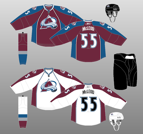
The same thing can be said about the Colorado Avalanche jerseys:
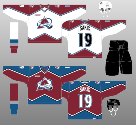
The top jerseys are what the Avs wore when they won the Stanley Cup in 2001. They're some of my favourite jerseys in all of sports. The striping is cool (it also looks like mountains!), the front is clean, and the shoulder patch works with the colour scheme of the jersey.
The bottom jerseys retain the same colour scheme, logo, and lettering, but they completely ruin it with terrible striping and a complete lack of personality. What used to be a clean-looking uniform now looks overly busy and the template resembles a default create-a-team jersey from NHL 13.
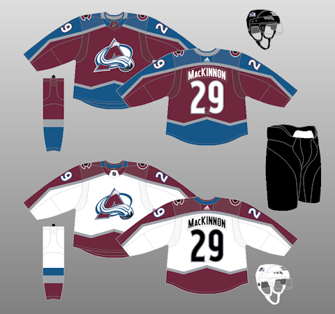
Edit: the Avs are also a good example of how those old jerseys can be beautifully repurposed for the Adidas template. Look at these: they're awesome.
Last edited by TheScorpion; 03-29-2020 at 06:55 PM.
|
|
|
|
|
The Following 4 Users Say Thank You to TheScorpion For This Useful Post:
|
|
|
03-29-2020, 06:59 PM
|
#29
|
|
First Line Centre
Join Date: Mar 2010
Location: Section 120
|
I think home and away should be a combo.
1/2. Retro white and red
3/4. 2004 Home and away
5/6. 90s diagonal Iginla rookie era
7. Horse
8. Third jersey that says Calgary
9. Everything post-2004 jersey blends together, so those home/away
10. Ronald McDonald Heritage Classic
|
|
|
|
|
The Following 2 Users Say Thank You to Bourque's Twin For This Useful Post:
|
|
|
03-29-2020, 07:00 PM
|
#30
|
|
Crash and Bang Winger
Join Date: Nov 2007
Location: Canadian Airlines Saddledome
|
Quote:
Originally Posted by Sainters7
At the time I think they were well received - my 12 year old self at least wanted, and got, a Trevor Kidd one the Christmas after they switched to that - but I think they went stale fast, especially as we came out of the crazy new jerseys period of the late 90s. Probably didn't help the Flames went from contender to the dark, Young Guns era basically as soon as they switched. Which is when ol' Blasty basically supplanted it, and the new, then home whites that carried over into the 04 era.
I think in recent years with all the 90s nostalgia that they're looked at well again, if even in an ironic 90s way. I wouldn't be surprised if they eventually make a 3rd jerseys or even throwback night return (but Blasty would be first, going by public sentiment).
|
Hah! We’re not so different, you and I...I wanted a Kidd (or Tabaracci, they were both like superheroes to me then) jersey and my parents, in a shrewd move that I didn’t understand at the time, got my last name and #31. In conclusion, I’ll get to work on this mask list. You guys are all so rad!
|
|
|
|
|
The Following 2 Users Say Thank You to Tabaracci_31 For This Useful Post:
|
|
|
03-29-2020, 07:01 PM
|
#31
|
|
First round-bust
Join Date: Feb 2015
Location: speculating about AHL players
|
^ I was always partial to Chad Johnson's masks.
|
|
|
|
|
03-29-2020, 08:58 PM
|
#32
|
|
Franchise Player
Join Date: Mar 2004
Location: Chilliwack, B.C
|
Quote:
Originally Posted by Bourque's Twin
I think home and away should be a combo.
1/2. Retro white and red
3/4. 2004 Home and away
5/6. 90s diagonal Iginla rookie era
7. Horse
8. Third jersey that says Calgary
9. Everything post-2004 jersey blends together, so those home/away
10. Ronald McDonald Heritage Classic
|
This is all correct
Sent from my SM-G930W8 using Tapatalk
|
|
|
|
|
The Following User Says Thank You to calgaryred For This Useful Post:
|
|
|
03-29-2020, 09:08 PM
|
#33
|
|
Franchise Player
Join Date: Jan 2013
Location: Cape Breton Island
|
I think the heritage 80s jerseys are a pretty big fad right now. they're nice, yes, but, i agree that the best were the 04 style red and whites. on the modern style better fitting jerseys they'd look fantastic.
the redesign was so unnecessary
|

|
|
|
The Following 3 Users Say Thank You to White Out 403 For This Useful Post:
|
|
|
03-29-2020, 09:26 PM
|
#34
|
|
Franchise Player
Join Date: Oct 2006
Location: San Fernando Valley
|
I would say my list would be more or less identical with the retros and Koho's switched. The current jerseys are just awful and need to go.
|
|
|
|
|
03-29-2020, 09:46 PM
|
#35
|
|
Franchise Player
Join Date: Feb 2006
Location: Calgary, AB
|
I suspect/hope they would have gone full retro in the playoffs this year with a full-time switch next season. As such, I hope that whenever hockey returns, we will have seen the last of the flags.
__________________
Turn up the good, turn down the suck!
|
|
|
|
|
The Following User Says Thank You to getbak For This Useful Post:
|
|
|
03-29-2020, 10:04 PM
|
#36
|
|
Franchise Player
Join Date: Dec 2011
Location: Calgary
|
My rankings would be
1. 80’s white
2. 80’s red
3. 04 red
4. 04 white
5. Black horse head
6. Red pedestal
7. White pedestal
8. White adidas
9. Red adidas
10. 2011 Heritage Classic
11. White Reebok edge
12. Red Reebok edge
13. Cowboy should we wordmark abomination
Typing this list made me realize how many awful uniforms we’ve had over the years. I’d say only 4/13 of them are truly great jerseys, the horse head is decent, and the rest are pretty awful.
|
|
|
|
|
The Following 3 Users Say Thank You to Matty81 For This Useful Post:
|
|
|
03-29-2020, 10:55 PM
|
#38
|
|
First round-bust
Join Date: Feb 2015
Location: speculating about AHL players
|
I agree with your take on the pedestals, especially the red one (I actually own one that's signed by Iginla!). Those shoulders really are awesome and I like the red arm numbers.
|
|
|
|
|
The Following User Says Thank You to TheScorpion For This Useful Post:
|
|
|
03-30-2020, 03:50 AM
|
#39
|
|
Backup Goalie
Join Date: Dec 2017
Location: Enemy territory
Exp: 
|
I want the Flames to go back to the 04 jerseys. It just looks so good and better than the retros in my opinion. I find the retros are to bright for my eyes.
|
|
|
|
|
The Following User Says Thank You to FlameX For This Useful Post:
|
|
|
03-30-2020, 10:43 AM
|
#40
|
|
Franchise Player
Join Date: May 2016
Location: ATCO Field, Section 201
|
I like the Calgary Script Jersey. The Yellow highlights, and straight lines look sharp ( the same could be said about the 'retros'. I think that it is a jersey that will age well. In ten years or so people like the retro look. The same can't be said about the Rebok or Addidas jerseys.
|
|
|
|
 Posting Rules
|
You may not post new threads
You may not post replies
You may not post attachments
You may not edit your posts
HTML code is Off
|
|
|
All times are GMT -6. The time now is 04:06 PM.
|
|


