First of all -- yes, the rest of the hockey cards are coming. Quarantine is a cruel mistress and I've been sort of exhausted, depressed, and demoralized over the last few days. Not really the right mindset for coming up with fun and creative new designs.
This post is an attempt to get my creative juices flowing once more. Here we go.
***
Since their move to Calgary in 1980, the Flames have taken the ice wearing over a dozen different uniform designs. Some have been near-universally renowned. Others, reviled. A select few have polarized fans and media alike.
Today's goal is to appraise the quality of each and every one of these uniform designs. These rankings are entirely subjective and I welcome your own responses.
13. Reebok Edge home reds (worn 2007-2017)
This jersey saw the introduction of the infamous shoulder flags. The Canadian flag on the left shoulder is only mildly distracting -- it's red and white, which fits, although it looks a little odd in the context of the overall colour scheme without a black outline or something.
The primarily blue flag of Alberta on the right shoulder? Man, it's just terrible. Set right next to the vibrant red body of the uniform, it clashes worse than any other NHL design element in recent memory.
This uniform also discarded the clean, slightly diagonal hemline design of the 2004-era CCM/Koho reds in favour of adopting the Reebok Edge-standard waist-to-armpit piping that manifested itself in roughly half of the league's other jersey designs. By the time the Flames finally discarded this jersey in 2017, they were among the final holdouts still using that much-maligned, distracting design element.
I have nothing else to say about this jersey. It's awful.
Rating: 2/10
12. Adidas home reds (worn 2017-present)
Yes, these jerseys got rid of the piping... but they inexplicably kept the flags, extending their needless reign to over a dozen years and counting.
The lettering on the back of the uniform is no longer italicized. I'm not here to tell you if that's a bad thing. Personally, I don't like it -- I was a fan of the old italic lettering, it was a nice holdover from the '04 run and reminded me of the horse head jersey. But that's just my opinion, and I'm not going to say the new lettering is better or worse. It's just different.
I just find these jerseys somehow plain and yet too busy at the same time. There are weird stripes all over the place and the flags are immensely distracting, but the hemline is barren compared to the dynamic diagonal striping of the CCM/Koho-era home reds. Red and black can be done so much better -- and it has been.
Rating: 3/10
11. Reebok Edge road whites (worn 2007-2017)
10. Adidas road whites (worn 2017-present)
Not a lot to say here that hasn't already been said. I like the red lettering a bit more than the white/black combo on the home kit. I think the flags are a bit less distracting when they're set against a white background. As was the case with the home jerseys, the Adidas jersey gets the nod here because of the lack of piping.
Rating: 3.5/10
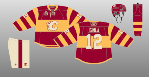
9. Reebok Edge Heritage Classic (worn 2011)
Also known as the Ronald McDonald jersey, there was huge demand for these when they were first announced -- authorities discovered and seized tons of counterfeits leading up to the outdoor game against Montreal in February 2011 where these were worn.
As a one-time uniform, these do okay. But the beige pants and logo are very peculiar for a Flames jersey. The gold and burgundy resemble hot-dog condiments past their expiration date.
Give it 20 years, though, and these will be cult classics.
Rating: 4/10
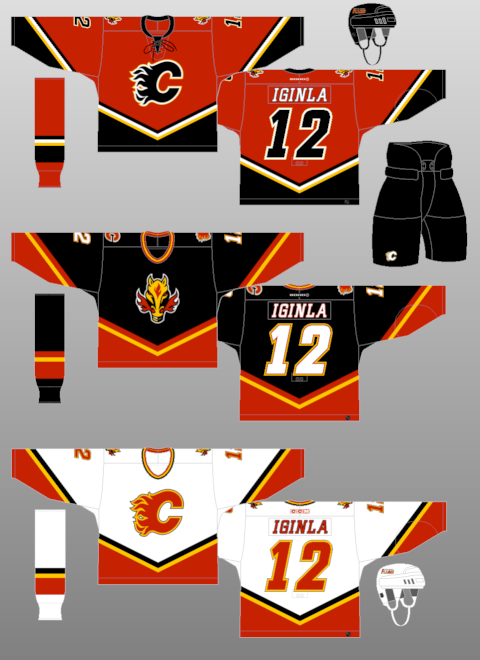
8. Reebok Edge red alternates (worn 2013-2016)
These uniforms will always possess a certain
je ne sais quoi for me -- I own two of them, and I was in attendance when Sam Bennett scored four goals against Florida wearing this jersey*. That said, they very much feel like something designed by committee.
Where to start? The logo is not a hockey logo. It looks like something a single-A baseball team would wear. The inclusion of the flaming C underneath the script almost reads like an apologetic nod -- "we know, this is what should be here."
The lettering is fine, but the design of the numerical font is inexplicable. I don't know what thought process compelled the Flames' design team to approve
this #5 when it's clearly just an upside-down #2. It looks amateurish.
The shoulder yoke feels forced, unnecessary, and almost like a half-measure. Just go all the way down the arms, dudes! It only covers the collarbone and it winds up looking like something from a Walmart edition of a New Jersey Devils sweater.
That said, I do think the shoulder logo is cool. It's maybe a little too busy for my liking, and I don't think it would be a great main crest by any means, but as a shoulder patch, it's creative and meaningful. And it's not blue. I also prefer the waist striping on these jerseys to the main Reebok Edge kits, but that's not a high bar to surpass.
*Yes, I was at the Bennett four-goal game. I went with my dad. We were at the FanAttic over by the east entrance to the Dome before warmups and, after a sudden, inexplicable brainwave, I decided to make a bet with my father. The terms? If Sam Bennett scored four goals that night, hed have to buy me a #93 jersey. I have no idea why I decided to make that specific bet, and I swear upon all things holy that this is a true story. You better believe I still have that jersey.
Rating: 4.5/10
7. CCM home whites (worn 1995-2000)
The pedestals are fun throwbacks but they're also very silly. This was the introduction of black into the Flames' colour scheme, but it was done very sparingly. While using red and black as the main colours on a Flames jersey (with yellow solidly in the background) results in something that looks distinctly "Calgary" and in-line with other franchises like the Stampeders. But having red, yellow, and black all to the same degree (more or less)? It vaguely resembles the German national team.
I've positively referenced the diagonal striping on the 2004-era uniforms a couple of times, but this jersey takes the whole notion of diagonals and cranks it up to 11. The arms are covered in diagonal accoutrements leading up to the cuffs of the gloves. Those diagonal elements continue onto the pants.
And then, there's the pedestal itself. Considering that the Flames hadn't won a playoff series for six years when they adopted these jerseys, I'm not sure who thought it was the right time to put the logo up on a pedestal, but... alas. It's definitely unique. Your mileage may vary.
This jersey also introduced the idea of diagonal font on a Flames jersey. I actually kind of like this font but I definitely prefer the one used on the horse head/Reebok Edge uniforms.
(Fun fact: shop.NHL.com continued to use this font when customizing Flames jerseys for over a decade after the pedestals were discontinued, resulting in a glut of inaccurate Reebok Edge and '04-era jerseys with the wrong font being churned into existence through the online marketplace. You still see
these hodgepodges at the 'Dome to this day.)
Rating: 5/10
6. CCM road reds (worn 1995-2000)
I don't have much to add that I haven't already mentioned, except that I prefer the shoulder and arm design on the red pedestal jersey. The red jersey has a white shoulder yoke that transitions into black in time to match the black gloves, while the white uniform has a red yoke all the way. That said, I'm not a huge fan of this iteration of the white flaming C. I find the yellow outline to be a little garish.
Rating: 5.5/10
5. Koho black road/alternate (worn 1998-2006)
This jersey was, for a long time, the only Flames sweater to depart from the classic flaming C crest on the front. It did so in favour of a stylized horse insignia with a particularly warm case of the sniffles. This logo was long a subject of intense ridicule from fans both in Calgary and league-wide but it has enjoyed a recent increase in popularity, likely from those who grew up with it.
Black is a fascinating colour for a Flames jersey and I think it's a shame that it's only been used as the basis for one design. That said, the one black Flames jersey is an excellent Flames jersey. This one introduced the diagonal waist striping pattern later seen on the 2004-era jerseys, and it looks tremendous. It's not distracting, but it's also not boring.
When 2004 finally rolled around, the Flames had red, black, and white jerseys all using the same template, and it looked fantastic. Furthermore, each of these jerseys had different main accent colours. In the case of this jersey, the main accent is white, and it looks great.
Something unique about this jersey is that it's the only Flames sweater to have a primarily yellow crest. To a casual fan, this might come as a surprise -- isn't fire, generally speaking, mostly yellow? But the relative simplicity of the Flames' logo design means that, if it were to be coloured yellow, it would probably look overpowering. Yellow is a dangerous colour in design -- it's bright and can stick out to a jarring extent, particularly if there isn't another colour for it to work with. But the Flames' logo design doesn't allow for any such complementing to happen. There's a main colour, and then there are the outlines. That's it.
The horse head, however, is a much more ornate design. There's the head, obviously, but there's also the nose fire. That opens up an opportunity for a multi-colour logo, one where yellow can be liberally used and red can act as an effective contrast. There's some black in there, too. The concept of the logo (why is that horse breathing fire?... is it a dragon??) is slightly absurd, but the execution is gorgeous and unique.
I always kind of liked the red flaming C as a shoulder patch, and when I was a kid, I tried making a mock-up of a black jersey with that logo as the main crest. It doesn't work nearly as well as the horse head. Some might say that having the primary logo on the shoulder makes this jersey look like it belongs in the AHL, but... you know what, it just looks good. I don't have a scientific explanation for it.
Finally, this jersey introduced the
Mission: Impossible font to Flames jerseys, and it looks great! I miss it. I hope they bring it back someday.
Rating: 7.5/10
4. "Retro" reds (worn 1980-1994, 2009-2013, 2016-2017, 2018-present)
I'm lumping all of these together. Yell at me if you want, but it's my list and I don't think there are enough tangible differences between these designs to warrant different entries for each one, all tied at fourth.
These are really great jerseys and were such a breath of fresh air when they were reintroduced in 2009.
They look like a fire truck! It's awesome. The striping is great, the colours are bright and vibrant, and the lettering is simple and sharp. It's a terrific uniform and I don't think anybody would complain if they became the primary threads next season, as expected.
So many legends have worn these. Lanny, MacInnis, Nieuwendyk, Jarome, Gaudreau, Nilsson... unless you're a huge Val Bure fan, chances are your favourite Flame of all time has skated in this jersey. It's basically the Flames'
"jersey of record." These were the jerseys to get covered in champagne in the post-Cup celebrations in the Forum.
They're simple. They're timeless. They're... only the fourth-best jerseys the Flames have ever worn. (Sorry).
Rating: 9/10
3. "Retro" whites (worn 1980-1994, 2019-present)
In theory, I should hate these. I dislike shoulder yokes that only cover the collarbone. The striping doesn't look like it came from a fire engine. "Yellow outlines on a white jersey" is a phrase that makes me shudder.
But... my god, it works. This is a clean, gorgeous, and classic jersey that avoids the one main pitfall of its red counterpart: the McDonald's colour scheme. Without black, the retro reds are a tiny bit
too vibrant,
too colourful.
The whites, though, look a little more mature. They're simultaneously classic and classy. They even look a bit preppy -- in a good way. You could probably get away with wearing one of these to a semi-formal gathering. They look a little like something a talented aunt would crochet for her extended family.
...OK, I can't do this anymore. Look, this is the most subjective opinion on this list. I have no justification for this particular ranking other than "I think it looks nicer." If I had a choice between buying this jersey or the red retro, I'd buy the white one nine times out of 10.
Let me try again. The white jersey offers subtle contrasts and looks more distinguished... I guess. Sure.
Rating: 9.5/10
2. Koho/CCM whites (worn 2000-2007)
These jerseys follow the template introduced by the horse head and they absolutely rule. They're everything a modern Flames jersey should be. They use black sparingly, but effectively, and the contrasting ability that this one colour offers does wonders towards creating a delightful design.
I've always found the diagonal waist stripe to resemble the westward mountains. If that was the designers' intent, I think it's a gloriously subtle nod to the geography of Calgary and its surrounding area. I love it and I hope it comes back in the future.
The sentimental value of this jersey is off-the-charts. Think of all the huge moments from 2004 that took place in this uniform. Montador's OT winner, Saprykin capitalizing on the Shift, Gelinas' dagger against the Canucks... there are more. That doesn't really have anything to do with the quality of the design, but... it's a subjective list. Heck, Giordano scored his first two goals in this sweater. Memories like that colour your perception of things. I didn't watch the 2004 run and I still feel that additional appreciation.
There's not a lot else to say here that I didn't say in the horse head entry. The Mission: Impossible font shines. Continuing a trend with the template, this jersey has its own main accent colour, red, and it looks awesome and cohesive. The horse head on the shoulders is, for lack of a better word, badass.
Please bring these back!
Rating: 9.9/10
1. Koho/CCM reds (worn 2003-2007)
It is honestly criminal that these beautiful jerseys were only worn for three seasons before being cast aside in favour of the truly awful Reebok knockoffs. This jersey is gorgeous in every way. The red and black complement each other like Gaudreau and Monahan, peanut butter and jam, or Australians and a scrape of vegemite.
While the pedestals may have introduced black into the Flames classic red silks, these uniforms married red with black more effectively than any hockey jersey seen before or since. Remember how I said the diagonal striping on the white jersey looks like the mountains? On this jersey, it looks like a frickin volcano, ready to burn up the opposing team before they can get across their own blue line.
The piping is gloriously absent, allowing the red to encompass the front and back of the sweater unimpeded by distraction. The flags are nowhere to be found. This jersey is like a volcano, remember. What kind of volcano would stop in the middle of shooting out fire to spit out water fluoridated by the well-meaning folks from the Alberta legislature? One sponsored by Reebok Edge, probably.
Once again, the trend of one primary colour/one main accent colour continues. In this case, the main accent is black, albeit with one minor discrepancy: the font for the players names is white. This was not originally the case, however; when these uniforms were first unveiled, the lettering was black to match the numbers (you can still see people wearing this version of the jersey at the Dome), but the colour was changed to white after complaints that nobody could tell Lombardi from Lowry or anyone else, for that matter.
The idea of having three jerseys follow the same unique template is so smart and I wish the Flames had utilized that template for more than just two seasons (2003-04 and 2005-06). It looks so good in retrospect and recent iterations of the flaming silks look so bland and uninspired in comparison.
In short: this is the cream of the crop.
Rating: 10/10