 08-01-2018, 02:06 PM
|
#2161
|
|
First Line Centre
Join Date: Oct 2009
Location: Calgary
|
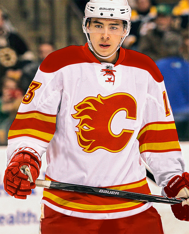
No thanks. Looks like a practice jersey logo. The original is much better.
|

|

|
|
08-01-2018, 02:08 PM
|
#2162
|
|
Pent-up
Join Date: Mar 2018
Location: Plutanamo Bay.
|
Quote:
Originally Posted by Scary Eloranta

Red throwbacks for home, the 04's (without horse head) for thirds, and one of these for road. I think that would make the majority happy?
  |
I really appreciate the uniqueness of these. Also this image is awesome! Well done. Definitely the red shoulders of the two.
|
|
|
|
|
08-01-2018, 02:15 PM
|
#2163
|
|
Franchise Player
Join Date: Feb 2007
Location: Calgary, AB
|
Quote:
Originally Posted by RM14
No thanks. Looks like a practice jersey logo. The original is much better.
|
Im confused...that stripping pattern pretty much is the original.
|
|
|
|
|
08-01-2018, 02:18 PM
|
#2164
|
|
First Line Centre
Join Date: Oct 2009
Location: Calgary
|
Quote:
Originally Posted by SuperMatt18
I’m confused...that stripping pattern pretty much is the original.
|
talking just the logo (and numbers).
|
|
|
|
|
The Following User Says Thank You to RM14 For This Useful Post:
|
|
|
08-01-2018, 02:25 PM
|
#2165
|
|
Franchise Player
Join Date: Feb 2007
Location: Calgary, AB
|
Quote:
Originally Posted by RM14
talking just the logo (and numbers).
|
Sorry missed the logo qualifier - I don’t mind it but yeah the extra red stripe isn’t really required.
I’d love to see what the white shoulders would look like with the recoloured shoulder patch from the 3rds
Last edited by SuperMatt18; 08-01-2018 at 02:33 PM.
|
|
|
|
|
08-01-2018, 02:46 PM
|
#2166
|
|
All I can get
|
I highly doubt there will ever be a white third jersey, throwback or otherwise, for the obvious reason that thirds are usually worn at home.
|
|
|
|
|
08-01-2018, 02:56 PM
|
#2167
|
|
First Line Centre
|
Hoping for a full retro set. get rid of all the black on both home and away.
Black on the jerseys I've always thought is just tacky and the retro look is way better
|
|
|
|
|
The Following 2 Users Say Thank You to The Boy Wonder For This Useful Post:
|
|
|
08-01-2018, 02:57 PM
|
#2168
|
|
That Crazy Guy at the Bus Stop
Join Date: Jun 2010
Location: Springfield Penitentiary
|
Quote:
Originally Posted by Scary Eloranta
Red throwbacks for home, the 04's (without horse head) for thirds, and one of these for road. I think that would make the majority happy?
|
By far the best white retro concept I've ever seen. Either one is perfect. Not too much red, classic simple design.
Except now I'm infuriated that we've had #### jerseys for 15 years and probably will for 15 more.
|
|
|
|
|
The Following 4 Users Say Thank You to Cecil Terwilliger For This Useful Post:
|
|
|
08-01-2018, 03:35 PM
|
#2169
|
|
Powerplay Quarterback
|
Quote:
Originally Posted by RM14
No thanks. Looks like a practice jersey logo. The original is much better.
|
I thought it needed something to make it bolder but maybe all it needed is the gold border to be thicker. Always thought the gold outline got lost a bit in the original - and even more so on the white C.
|
|
|
|
|
The Following User Says Thank You to Scary Eloranta For This Useful Post:
|
|
|
08-01-2018, 03:49 PM
|
#2170
|
|
First Line Centre
Join Date: Oct 2002
Location: Calgary
|
Amazing. I think the one with the red shoulder yokes looks more complete. Obviously true to the original jersey as well.
|
|
|
|
|
The Following 2 Users Say Thank You to the-rasta-masta For This Useful Post:
|
|
|
08-01-2018, 04:30 PM
|
#2171
|
|
Franchise Player
Join Date: Dec 2011
Location: Calgary
|
I really don’t like the extra red outline on the logo. Red C with a singular yellow outline only. Other than that, they’re perfect.
|
|
|
|
|
08-01-2018, 04:35 PM
|
#2172
|
|
First Line Centre
Join Date: Oct 2009
Location: Calgary
|
Quote:
Originally Posted by Scary Eloranta
I thought it needed something to make it bolder but maybe all it needed is the gold border to be thicker. Always thought the gold outline got lost a bit in the original - and even more so on the white C.
|
I see what you are saying. Slightly more gold might be the answer.
|
|
|
|
|
08-01-2018, 04:38 PM
|
#2173
|
|
First Line Centre
Join Date: Oct 2009
Location: Calgary
|
These whites look pretty slick. Pretty much what Eloranta did above.
|
|
|
|
|
The Following 26 Users Say Thank You to Scary Eloranta For This Useful Post:
|
BigDogg,
calgaryred,
Cecil Terwilliger,
Dion,
drewtastic,
Flamesfan2010,
GoFlamesGo,
handgroen,
jayswin,
lambeburger,
mac_82,
Mr.Coffee,
MrButtons,
N-E-B,
Party Elephant,
PepsiFree,
Poe969,
red sky,
Rejean31,
RM14,
Scroopy Noopers,
socalwingfan,
Split98,
Star-Lord,
SuperMatt18,
TurdFerguson
|
|
08-01-2018, 05:56 PM
|
#2175
|
|
Franchise Player
Join Date: Jun 2006
Location: Calgary, Alberta
|
Yaaaaaaas.
|
|
|
|
|
08-01-2018, 06:06 PM
|
#2176
|
|
That Crazy Guy at the Bus Stop
Join Date: Jun 2010
Location: Springfield Penitentiary
|
Unbelievably sexy jersey. 
|
|
|
|
|
08-01-2018, 06:10 PM
|
#2177
|
|
First Line Centre
|
So I guess all the fans should campaign to KK that we all want the black C, vertical piping, hideous blue flags, and then maybe he will go with the retros?
|
|
|
|
|
08-01-2018, 09:29 PM
|
#2178
|
|
#1 Goaltender
|
Amazing what a subtle change does to that jersey. A slight tweak and I didn't realise how much of a difference it makes.
|
|
|
|
|
08-01-2018, 09:54 PM
|
#2179
|
|
Franchise Player
Join Date: Oct 2001
Location: Flames fan in Seattle
|
This thread is getting fun again
__________________
|
|
|
|
|
08-01-2018, 10:45 PM
|
#2180
|
|
damn onions
|
Quote:
Originally Posted by Scary Eloranta
So I guess more like this then huh?
 |
Awesome Scary. Now what would it look like if the collar was gold / yellow (keep shoulders red just collar yellow like the new Adidas style, I think it goes halfway kinda).
Also numbers not italicized but keep the font. Haha sorry nitpicky but if I had any skill Id do it on my own.
|
|
|
|
|
The Following User Says Thank You to Mr.Coffee For This Useful Post:
|
|
 Posting Rules
|
You may not post new threads
You may not post replies
You may not post attachments
You may not edit your posts
HTML code is Off
|
|
|
All times are GMT -6. The time now is 11:26 PM.
|
|


