Sure, some of the intricacies of the tailoring have changed as the NHL has switched between jersey providers. But let's not mince words: for good reason, this design hasn't changed for nearly 40 years. The red jersey is great but I slightly prefer the white one (I kinda like white jerseys better in general). I just like the white body with the red arms more than I like the straight red.
Worst:
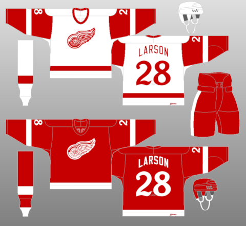
Worn 2014
Sorry, but beige doesn't belong on a Red Wings jersey, especially not at the expense of white. This jersey looks like a bowl of oatmeal with way too many strawberries on top. The asymmetrical shoulder patch is distracting and the fake-looking old-timey logo and number fonts are just ugly. Sure, I get that they were going for "vintage," but it doesn't look genuine. It doesn't look like anything the Red Wings would ever have worn outside of a fake "retro" event.
Weirdest:
Worn 2016
I don't know what the hell that logo is supposed to be. A D with wings, I guess? It kind of looks like a Flaming "C" knockoff when you think of it that way. Anywho, this is a Stadium Series jersey, which I guess makes the comically oversized numbers a little more reasonable, but out of context, they look absurd. Imagine buying one of these, putting it on, and the number extends half the length of your arm. Also, is that a wordmark on the collar? Wut?
The diagonal stripe behind the logo makes the uniform look like it belongs on a football pitch which, I guess, close enough this was for the Stadium Series. Still, definitely very weird.
You were off on Detroit's best jersey by one year: 1982-83
Note three key differences: the number typeface, which is what I assume the Winter Classic jerseys were throwing back to, looks elegant and classy, unlike the dull, collegiate 'block' style adopted in the '83 off-season.
Also, crucially, 82-83 was the last year the Red Wings logo would both be alternately-colored (red with white highlights on the white home jersey, white with red on the red) and have a contrasting outline around the main body of the logo, giving it pop it's been lacking for almost 40 years.
I know the image is small, but even teeny-tiny you can see the difference:
Finally, the positioning of the white stripe on the red jersey is along the bottom, creating a frame to the jersey, instead of being slightly raised as in the 1984-'87 jerseys. The white-on-bottom look would return in 1987-88 and remain consistent to today.
The Following 2 Users Say Thank You to driveway For This Useful Post:
I don't quite understand how anyone can consider our jersey with black C the best. Black is the color of something that has burnt. Also, it has very little contrast on red background hence isn't very recognizable. Just imagine Red Wings' home uniforms with black logo - does that make any sense?
Worst:
Our away white are much worse. Like I cringe when I have to watch them play on the road.
We should be able to wear our RED jerseys all the time unless another team is wearing red.
Just like the Winter Classic with Detroit/Toronto that one year, it looks fantastic full Red on Blue
The Following User Says Thank You to MrMike For This Useful Post:
Detroit is one of those teams that even their worst jersey is still pretty darn good, especially compared to the rest of the league.
some teams just don't have bad jerseys and the wings are one of those rare teams.
We should be able to wear our RED jerseys all the time unless another team is wearing red.
Just like the Winter Classic with Detroit/Toronto that one year, it looks fantastic full Red on Blue
It seems to me I used to remember seeing that all the time when I watched games when I was litt......no wait, that was in the table top rod hockey games.
Actually, in the expansion season (my expansion season 1967, yes I know I'm a hundred years old), they did it occasionally just so fans could see the uniforms and I think it looked fine too
The Following 2 Users Say Thank You to bobbylouie For This Useful Post:
I'll be back doing this shortly, have been working lately!
__________________
"This has been TheScorpion's shtick for years. All these hot takes, clickbait nonsense just to feed his social media algorithms." Tuco
The Following 2 Users Say Thank You to TheScorpion For This Useful Post:
I feel like Dallas is so strange... they could have some awesome designs but screw it up all the time. That black uterus jersey is just... like that literally might be the worst jersey ever made and that’s saying something
I can't believe one of the most iconic jerseys has yet to see this thread. Some would call it great, some would say weird, and others worst, but nothing says Vancouver like these:
The Following User Says Thank You to Eric Vail For This Useful Post: