|
View Poll Results: Are you happy Blasty is back?
|
|
Yes
|
   
|
275 |
72.56% |
|
No
|
  
|
104 |
27.44% |
 10-25-2020, 03:21 AM
|
#201
|
|
Franchise Player
Join Date: Sep 2011
Location: The toilet of Alberta : Edmonton
|
Quote:
Originally Posted by Beaviwi


I'm not a huge fan... |
Nightmare fuel. Love it.
__________________
"Illusions Michael, tricks are something a wh*re does for money ....... or cocaine"
|

|

|
|
10-25-2020, 08:03 AM
|
#202
|
|
Some kinda newsbreaker!
Join Date: May 2004
Location: Learning Phaneufs skating style
|
|
|
|
|
|
The Following 15 Users Say Thank You to sureLoss For This Useful Post:
|
dammage79,
Flamezzz,
foofighter15,
GreenLantern2814,
greyshep,
Jetfire,
Mass_nerder,
Playfair,
Puppet Guy,
Rhettzky,
Scroopy Noopers,
sec304,
underGRADFlame,
VilleN,
Winsor_Pilates
|
|
10-25-2020, 11:31 AM
|
#203
|
|
First Line Centre
Join Date: Oct 2002
Location: Calgary
|
Quote:
Originally Posted by Beaviwi
I'm not a huge fan...
|
The back of the Jersey with the Flaming C on the shoulders looks so good. That 04 jersey style should just be reserved for the Flaming C in the front. Would be a much better 3rd jersey than the plan they have to keep the Red Flag jersey this year.
I do like the look of the Black Blasty jersey, however the Blasty logo in itself has always looked a bit cartoonish/unfinished to me. I think it is partly to do with the giant white outline around it. I think if they cleaned the logo up and modernized it a touch, it could look cool.
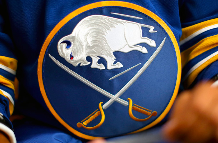
The league has seen some cool logo treatments in recent years with embroidered finishes really making them pop. I wonder if removing the white outline (or thinning it out, possibly a different colour to make it pop still?), and then doing some of the cool embroidery similar to the new Sabres logo would be pretty cool for Blasty? See below for what I mean with Sabres logo.
|
|
|
|
|
The Following User Says Thank You to the-rasta-masta For This Useful Post:
|
|
|
10-25-2020, 11:48 AM
|
#204
|
|
Franchise Player
Join Date: Nov 2009
Location: Section 203
|
The Flames fourth jersey was revealed on twitter yesterday.
 https://twitter.com/S7Dsn/status/1320120996687298560
__________________
My thanks equals mod team endorsement of your post.
Quote:
Originally Posted by Bingo
Jesus this site these days
|
Quote:
Originally Posted by Barnet Flame
He just seemed like a very nice person. I loved Squiggy.
|
Quote:
Originally Posted by dissentowner
I should probably stop posting at this point
|
|
|
|
|
|
The Following 4 Users Say Thank You to squiggs96 For This Useful Post:
|
|
|
The Following 10 Users Say Thank You to Beaviwi For This Useful Post:
|
|
|
10-25-2020, 12:05 PM
|
#206
|
|
Scoring Winger
Join Date: Jul 2011
Location: at home
|
Quote:
Originally Posted by Beaviwi

Just swapping the position of Blasty and the C makes for a compelling reverse retro! |
Yeah, I did the same earlier in this thread yet using retro font with no outline and most importantly no outline on the flaming C as IMHO it makes it too thick and kinda destroys its beautiful shape. I like what you did there with A though. Comparison:
|
|
|
|
|
The Following 2 Users Say Thank You to playmaker For This Useful Post:
|
|
|
10-25-2020, 12:23 PM
|
#207
|
|
First Line Centre
Join Date: Oct 2002
Location: Calgary
|
Quote:
Originally Posted by Beaviwi
Just swapping the position of Blasty and the C makes for a compelling reverse retro!
|
Love it. Only thing would be to just use the retro font instead of the italics and it's a keeper.
|
|
|
|
|
10-25-2020, 12:26 PM
|
#208
|
|
First round-bust
Join Date: Feb 2015
Location: speculating about AHL players
|
Nah, the italic font was such a big part of those old sweaters. Taking it away would rob them of a lot of their charm, imo.
__________________
"This has been TheScorpion's shtick for years. All these hot takes, clickbait nonsense just to feed his social media algorithms." Tuco
|
|
|
|
|
The Following 4 Users Say Thank You to TheScorpion For This Useful Post:
|
|
|
10-25-2020, 01:53 PM
|
#209
|
|
Powerplay Quarterback
Join Date: Dec 2009
Location: Tokyo, Japan
|
Quote:
Originally Posted by TheScorpion
Nah, the italic font was such a big part of those old sweaters. Taking it away would rob them of a lot of their charm, imo.
|
I think the retro font on any of the early-2000s jersey styles will look terrible. Unfortunately, that seems like something the team would do and kind of blow this sort of thing. Hopefully that doesn't happen.
|
|
|
|
|
10-25-2020, 02:37 PM
|
#210
|
|
Franchise Player
|
The Sabres HAVE to do a Goathead jersey for this, right?
Man I would buy that so fast.
|
|
|
|
|
10-25-2020, 03:13 PM
|
#211
|
|
Franchise Player
Join Date: Feb 2007
Location: Calgary, AB
|
If some of the trends continue (Kings Chevron in purple gold, Duck Wild Wing in Orange)
My guess is the Sabres will have a blue and yellow Buffalo head jersey, and Flames will have a Blasty jersey with no black but retro colours.
|
|
|
|
|
10-25-2020, 08:31 PM
|
#212
|
|
Powerplay Quarterback
Join Date: Dec 2009
Location: Tokyo, Japan
|
Quote:
Originally Posted by SuperMatt18
If some of the trends continue (Kings Chevron in purple gold, Duck Wild Wing in Orange)
My guess is the Sabres will have a blue and yellow Buffalo head jersey, and Flames will have a Blasty jersey with no black but retro colours.
|
That sounds bad. Maybe it's a good thing we're keeping the red flag jersey so that black is still part of our current colour palette and they can use it for the Blasty.
|
|
|
|
|
10-26-2020, 07:54 PM
|
#213
|
|
Powerplay Quarterback
|
had to spoiler it as the image was too large. not mine, found it on IG from a guy name Saturnstyles_. He's got a lot of cool concept jerseys for NHL teams.
|
|
|
|
|
10-26-2020, 08:52 PM
|
#214
|
|
Franchise Player
|
Wouldn’t it be the height of irony if our Reverse Retros turn out to be those cream-and-burgundy numbers that have been floating around for seven years.
__________________
Mom and Dad love you, Rowan - February 15, 2024
|
|
|
|
|
10-26-2020, 09:25 PM
|
#215
|
|
Pent-up
Join Date: Mar 2018
Location: Plutanamo Bay.
|
Quote:
Originally Posted by t0rrent98
had to spoiler it as the image was too large. not mine, found it on IG from a guy name Saturnstyles_. He's got a lot of cool concept jerseys for NHL teams.
|
I removed my thanks because the additional flame on the bottom left, where there wouldnt be one in the C, is too much to handle for me... overall I really like the concept.
|
|
|
|
|
10-27-2020, 08:33 PM
|
#216
|
|
Crash and Bang Winger
Join Date: Jul 2010
Location: GB
|
I felt inspired the other night after seeing some of the concepts in this thread so I thought I'd throw my hat into the mix and have some fun with these 3rd/4th jersey concepts.
Credit to Beaviwi for the White Blasty concept, that was my inspiration for throwing these together.


Last edited by BigDogg; 10-28-2020 at 12:53 AM.
Reason: broken image links
|
|
|
|
|
The Following 29 Users Say Thank You to BigDogg For This Useful Post:
|
3thirty,
AustinL_NHL,
Beaviwi,
bluejays,
Burning Beard,
CroFlames,
drewtastic,
flizzenflozz,
Funkhouser,
GreenLantern2814,
handgroen,
Hi-Psi,
jkflames,
JonDuke,
lazypucker,
MikePatton,
MisterJoji,
Plaedo,
roberts10,
Sandman,
Scroopy Noopers,
sec304,
Slacker,
Stillman16,
SuperMatt18,
Tabaracci_31,
Tkachukwagon,
VilleN,
Vinny01
|
|
10-27-2020, 08:48 PM
|
#217
|
|
Backup Goalie
Join Date: Jul 2016
Location: Calaway Park
Exp: 
|
Quote:
Originally Posted by Beaviwi
I'm not a huge fan...
|
Can you invert the red and black on Blasty?
|
|
|
|
|
10-27-2020, 09:17 PM
|
#218
|
|
Franchise Player
Join Date: Sep 2005
Location: Toronto, Ontario
|
Quote:
Originally Posted by BigDogg
I felt inspired the other night after seeing some of the concepts in this thread so I thought I'd throw my hat into the mix and have some fun with these 3rd/4th jersey concepts.
Credit to Beaviwi for the White Blasty concept, that was my inspiration for throwing these together.


 |
Wow, that white jersey looks clean and simple. Wish there were more concepts like it.
|
|
|
|
|
The Following User Says Thank You to bluejays For This Useful Post:
|
|
|
10-27-2020, 10:50 PM
|
#219
|
|
Franchise Player
Join Date: Feb 2007
Location: Calgary, AB
|
I don't have the photo shop skills others have on here but I think this is going to be a red blasty jersey using only retro colors.
Something like this.

The logo probably isn't right as that's more difficult to guess as what they might do to recolor the logo, but I think the jersey will follow this pattern with it being mostly red, and then with the white and yellow striping at the bottom. If one of our more skilled graphic designers wants to give something like this a shot then that would be awesome.
No inside info here but just based on some tweets from Ryan Popowich about how "Red, Yellow, & White" are the Flames colors in regards to why we don't have a black jersey, and based on some of the leaks of other teams having their jerseys re-done in the current colorways makes me think this will be a retro colored Blasty jersey.
|
|
|
|
|
The Following User Says Thank You to SuperMatt18 For This Useful Post:
|
|
|
10-28-2020, 12:47 AM
|
#220
|
|
Crash and Bang Winger
Join Date: Jul 2010
Location: GB
|
I tried to tweak Blasty as best I could. As many others have discovered, it's a tough colour pallette to convert the logo to. Without introducing a darker shade of red it's hard to nail a good look.


|
|
|
|
|
The Following 21 Users Say Thank You to BigDogg For This Useful Post:
|
3thirty,
AustinL_NHL,
badger89,
Beaviwi,
CroFlames,
davidus_49,
drewtastic,
FleurysOTGoalCelebration,
Gondi Stylez,
GreenLantern2814,
Hi-Psi,
Jetfire,
JonDuke,
MikePatton,
MisterJoji,
Plaedo,
Sandman,
sec304,
SuperMatt18,
Tkachukwagon,
VilleN
|
 Posting Rules
|
You may not post new threads
You may not post replies
You may not post attachments
You may not edit your posts
HTML code is Off
|
|
|
All times are GMT -6. The time now is 11:47 PM.
|
|


