 12-02-2021, 06:43 PM
|
#2841
|
Participant  |
Quote:
Originally Posted by FBI

Why is the V so tiny compared to the ILLE
odd
Also the two S's are different sizes, wtf?
|
Likely designed to mimic an old screen printed poster from Hatch Show Print, if I had to guess:
https://shop.hatchshowprint.com
|

|

|
|
12-02-2021, 09:07 PM
|
#2842
|
|
Franchise Player
Join Date: Jun 2006
Location: Calgary, Alberta
|
Quote:
Originally Posted by Dr. Pepper
This really does need to be the 3rd they cycle back to every couple/three years or so...
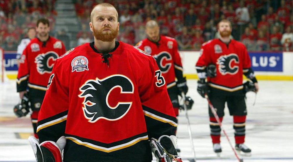 |
####. What a sick photo. Is there a higher resolution of this?
|

|
|
|
The Following 2 Users Say Thank You to Joborule For This Useful Post:
|
|
|
12-02-2021, 10:27 PM
|
#2843
|
|
A Fiddler Crab
Join Date: Jan 2007
Location: Chicago
|
That Smashville jersey is dope, y'all are some philistines.
|
|
|
|
|
The Following User Says Thank You to driveway For This Useful Post:
|
|
|
12-02-2021, 10:31 PM
|
#2844
|
|
Franchise Player
Join Date: Feb 2006
Location: Calgary, AB
|
__________________
Turn up the good, turn down the suck!
|
|
|
|
|
12-03-2021, 08:53 AM
|
#2845
|
|
Lifetime Suspension
|
Remove the Smashville bull#### and they'd look incredible. That logo is awesome and love the colours
|
|
|
|
|
12-03-2021, 09:00 AM
|
#2846
|
|
Taking a while to get to 5000
|
It looks dumb but I guarantee they'll sell a crap ton in Nashville. Fans are probably going to love it.
|
|
|
|
|
12-03-2021, 10:22 AM
|
#2847
|
|
#1 Goaltender
Join Date: Jan 2009
Location: Calgary
|
That Smashville jersey might be top 10 for worst jerseys in NHL history.
|
|
|
|
|
The Following User Says Thank You to _Q_ For This Useful Post:
|
|
|
12-03-2021, 01:19 PM
|
#2848
|
|
Crash and Bang Winger
Join Date: May 2009
Location: Calgary
|
Quote:
Originally Posted by Joborule
####. What a sick photo. Is there a higher resolution of this?
|
Just came from a Google search for the 2004 jersey. Here, I think this one is higher res:

__________________
The Doctor is in
|
|
|
|
|
12-27-2021, 08:57 PM
|
#2849
|
|
Scoring Winger
Join Date: Jul 2018
Location: 403
|
|
|
|
|
|
The Following 2 Users Say Thank You to TheRealPepman For This Useful Post:
|
|
|
12-27-2021, 09:22 PM
|
#2850
|
|
Franchise Player
Join Date: Jul 2010
Location: Barthelona
|
Do we not have the Blasty 3rd anymore?
I finally came around to it by the end of the season last year.
__________________
Quote:
Originally Posted by snipetype
k im just not going to respond to your #### anymore because i have better things to do like #### my model girlfriend rather then try to convince people like you of commonly held hockey knowledge.
|
|
|
|
|
|
12-27-2021, 09:44 PM
|
#2851
|
|
First round-bust
Join Date: Feb 2015
Location: speculating about AHL players
|
Quote:
Originally Posted by Mass_nerder
Do we not have the Blasty 3rd anymore?
I finally came around to it by the end of the season last year.
|
That was part of the Adidas Reverse Retro program, which was only for the 202021 season. Teams were not allowed to use their RR jerseys in 202122. The Flames only have two uniforms this season.
Blasty printed money for the Flames and there's nothing that would prevent them from using it as an alternate in 202223 and beyond.
__________________
"This has been TheScorpion's shtick for years. All these hot takes, clickbait nonsense just to feed his social media algorithms." Tuco
|
|
|
|
|
The Following User Says Thank You to TheScorpion For This Useful Post:
|
|
|
12-27-2021, 10:25 PM
|
#2852
|
|
Lifetime Suspension
|
If they printed money could we get a Blasty Jersey with sidewalks and solar panels so Murray Edwards can stop being such a ####?
|
|
|
|
|
The Following User Says Thank You to FormerPresJamesTaylor For This Useful Post:
|
|
|
12-27-2021, 10:31 PM
|
#2853
|
|
All I can get
|
I imagine they'll do something different within the colour palette. The whole Retro thang is...... getting a little.... old, no?
The original unis are back, they dabbled with a variation on the Blasty...
|
|
|
|
|
12-28-2021, 12:29 AM
|
#2854
|
|
First Line Centre
Join Date: Sep 2007
Location: Regina
|
Quote:
Originally Posted by Dr. Pepper
Just came from a Google search for the 2004 jersey. Here, I think this one is higher res:
|
This is the best jersey the Flames have ever worn. And its not close !
|
|
|
|
|
The Following 5 Users Say Thank You to jlh2640 For This Useful Post:
|
|
|
12-28-2021, 09:22 AM
|
#2855
|
|
Jordan!
Join Date: Jul 2009
Location: Chandler, AZ
|
Quote:
Originally Posted by Reggie Dunlop
I imagine they'll do something different within the colour palette. The whole Retro thang is...... getting a little.... old, no?
The original unis are back, they dabbled with a variation on the Blasty...
|
The Flames going full retro is an Edmonton thing to do. Bring black back and make new modern uni's or just bring back the 2004 design.
My Flames fandom dwindling can be pinpointed to the horrible flag designs. Bring back Blasty full speed on the shoulders and as alternate please.
|
|
|
|
|
12-28-2021, 09:32 AM
|
#2856
|
|
Franchise Player
|
Quote:
Originally Posted by jlh2640
This is the best jersey the Flames have ever worn. And it’s not close !
|
…the retro set is the best jersey set and it’s not even close. The retro gear is on par with other classics around the league.
I love that the retro set is our standard. That should be the baseline. We never change from those being our normal set, and then cycle in 3rd/4th/5th/6th jerseys whenever you want but keep the retro set as the standard.
|
|
|
|
|
The Following 38 Users Say Thank You to ComixZone For This Useful Post:
|
AC,
Barnet Flame,
Bingo,
calgaryred,
CroFlames,
Dion,
DrDangles92,
drewtastic,
Fire,
FleurysOTGoalCelebration,
foofighter15,
FormerPresJamesTaylor,
Funkhouser,
Fuzz,
GreenHardHat,
handgroen,
Howie_16,
IamNotKenKing,
Jimmy Stang,
Joborule,
lambeburger,
Mass_nerder,
Mazrim,
moncton golden flames,
N-E-B,
nixon45,
Number 39,
Plett25,
redflamesfan08,
Rhettzky,
schooner,
Scroopy Noopers,
Tabaracci_31,
The Fisher Account,
TheGingerbeardMan,
TurdFerguson,
You Need a Thneed,
Zarley
|
|
12-28-2021, 09:55 AM
|
#2857
|
|
Franchise Player
Join Date: Mar 2002
Location: Calgary
|
Quote:
Originally Posted by Jordan!
My Flames fandom dwindling can be pinpointed to the horrible flag designs.
|

|
|
|
|
|
The Following 3 Users Say Thank You to browna For This Useful Post:
|
|
|
12-28-2021, 10:20 AM
|
#2858
|
|
Powerplay Quarterback
|
Quote:
Originally Posted by ComixZone
the retro set is the best jersey set and its not even close. The retro gear is on par with other classics around the league.
I love that the retro set is our standard. That should be the baseline. We never change from those being our normal set, and then cycle in 3rd/4th/5th/6th jerseys whenever you want but keep the retro set as the standard.
|
Post of the year for 2021 and it isn't even close.
|
|
|
|
|
The Following User Says Thank You to Howie_16 For This Useful Post:
|
|
|
12-28-2021, 10:30 AM
|
#2859
|
|
Crash and Bang Winger
Join Date: Nov 2007
Location: Canadian Airlines Saddledome
|
Quote:
Originally Posted by Jordan!
The Flames going full retro is an Edmonton thing to do. Bring black back and make new modern uni's or just bring back the 2004 design.
My Flames fandom dwindling can be pinpointed to the horrible flag designs. Bring back Blasty full speed on the shoulders and as alternate please.
|
It’s not just Edmonton who went back to their “retro” set. Look at Pittsburgh, Toronto, the Islanders, Philadelphia and Buffalo to name a few. There’s a reason for that: those jerseys are amazing. Obviously not everyone is going to agree, but all those teams did a great job revitalizing their classic designs. The best part is that Edmonton managed to screw things up by introducing the pylon orange jersey and the hideous (IMO) dark blue jerseys.
|
|
|
|
|
12-28-2021, 01:07 PM
|
#2860
|
|
Franchise Player
Join Date: Sep 2008
Location: Calgary
|
Quote:
Originally Posted by Jordan!
The Flames going full retro is an Edmonton thing to do. Bring black back and make new modern uni's or just bring back the 2004 design.
|
How about a new design with the proper (aka “retro”) colour palette? Black had nearly three-decade run that was probably a couple of decades too long already.
Save the black for thirds, special occasions, and other gimmicks, but the original colour palette with a new design for the primaries has the potential to be amazing.
|
|
|
|
|
The Following User Says Thank You to Jimmy Stang For This Useful Post:
|
|
 Posting Rules
|
You may not post new threads
You may not post replies
You may not post attachments
You may not edit your posts
HTML code is Off
|
|
|
All times are GMT -6. The time now is 07:07 PM.
|
|


