 02-26-2021, 09:17 PM
|
#1721
|
|
aka Spike
Join Date: Sep 2004
Location: The Darkest Corners of My Mind
|
Quote:
Originally Posted by getbak

|
Sorry, at work and on my phone, but here's the Facebook page of his mask guy:
https://www.facebook.com/14783778529...5443297870155/
|

|

|
|
The Following User Says Thank You to CMPunk For This Useful Post:
|
|
|
08-05-2021, 12:21 PM
|
#1722
|
|
First Line Centre
Join Date: May 2012
Location: The Kilt & Caber
|
Looks like JBo (Jordan Bourgeault), who painted Carey Price's mask last year will be doing Markstrom's mask this year. If you're on Instagram, give him a follow, he'll post progress videos. Can't wait to see what it looks like!
|
|
|
|
|
The Following 6 Users Say Thank You to Nyah For This Useful Post:
|
|
|
08-05-2021, 04:22 PM
|
#1723
|
|
Farm Team Player
Join Date: May 2015
Location: Calgary
Exp: 
|
Quote:
Originally Posted by Nyah
Looks like JBo (Jordan Bourgeault), who painted Carey Price's mask last year will be doing Markstrom's mask this year. If you're on Instagram, give him a follow, he'll post progress videos. Can't wait to see what it looks like!
|
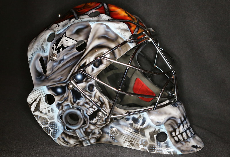
I can confirm this, JBo is a good friend of mine. Great local artist and great dude. He bounced some ideas off me. Looks like they might go with classic Kipper skull, with modern touches.
|
|
|
|
|
The Following 10 Users Say Thank You to Big Erned Nevergivn For This Useful Post:
|
|
|
08-05-2021, 05:53 PM
|
#1724
|
|
Franchise Player
|
Quote:
Originally Posted by Big Erned Nevergivn
I can confirm this, JBo is a good friend of mine. Great local artist and great dude. He bounced some ideas off me. Looks like they might go with classic Kipper skull, with modern touches.
|
That would be awesome! I miss kippers skulls. They were very good at scaring pucks away from the net.
|
|
|
|
|
08-06-2021, 01:12 AM
|
#1725
|
|
Franchise Player
|
Quote:
Originally Posted by Big Erned Nevergivn
I can confirm this, JBo is a good friend of mine. Great local artist and great dude. He bounced some ideas off me. Looks like they might go with classic Kipper skull, with modern touches.
|
Tell him not to use any inverted Cs.
__________________
Mom and Dad love you, Rowan - February 15, 2024
|
|
|
|
|
08-06-2021, 07:47 AM
|
#1726
|
|
Farm Team Player
Join Date: May 2015
Location: Calgary
Exp:
|
Quote:
Originally Posted by GreenLantern2814
Tell him not to use any inverted Cs.
|
I texted him, turns out an inverted "C" of realistic fire is currently part of the design. Any ideas on what should take its place on the opposite side of the proper C? Flaming Blasty anyone??? haha
|
|
|
|
|
The Following 2 Users Say Thank You to Big Erned Nevergivn For This Useful Post:
|
|
|
08-06-2021, 07:57 AM
|
#1727
|
|
First Line Centre
|
I was so happy when I saw his post about doing Markstroms mask. No DaveArt bull#### "FX" all over an already overcrowded design.
Or maybe DaveArt is just trying out his new "get another painter to do the mask FX™".
|
|
|
|
|
08-06-2021, 08:45 AM
|
#1728
|
|
Franchise Player
Join Date: Aug 2007
Location: Vancouver
|
Quote:
Originally Posted by Big Erned Nevergivn
I texted him, turns out an inverted "C" of realistic fire is currently part of the design. Any ideas on what should take its place on the opposite side of the proper C? Flaming Blasty anyone??? haha
|
Basically anything but. The inverted C always looks so weird. Even just a fireball would be better.
Something personal to Markstrom maybe? A character he likes or maybe a Swedish flag (although you don't really want to be "burning" your own flag). Something "fire" related like a demon(s) or dragon. Just spit balling, but yeah I would definitely nix the inverted C.
__________________

|
|
|
|
|
08-06-2021, 09:06 AM
|
#1729
|
|
Scoring Winger
Join Date: Feb 2010
Location: Medicine Hat
|
Quote:
Originally Posted by Big Erned Nevergivn
I texted him, turns out an inverted "C" of realistic fire is currently part of the design. Any ideas on what should take its place on the opposite side of the proper C? Flaming Blasty anyone??? haha
|
Another proper C, screw symmetry. Or skulls, lots of skulls.
|
|
|
|
|
08-06-2021, 09:16 AM
|
#1730
|
|
First Line Centre
|
Inverting the design is the proper way to do it. It would look completely ####e if you left it pointing the wrong(right?) way. This is standard practice on aircraft forever but most people never notice because it looks right, even if its reversed.
|
|
|
|
|
08-06-2021, 09:19 AM
|
#1731
|
|
Powerplay Quarterback
|
Inverted C looks awful. Anything but that.
|
|
|
|
|
The Following User Says Thank You to bdubbs For This Useful Post:
|
|
|
08-06-2021, 09:25 AM
|
#1732
|
|
Franchise Player
|
Quote:
Originally Posted by Big Erned Nevergivn
I texted him, turns out an inverted "C" of realistic fire is currently part of the design. Any ideas on what should take its place on the opposite side of the proper C? Flaming Blasty anyone??? haha
|

If hes gonna have kippers skulls there might as well use kipper to  Turn the water droplets in that picture into flaming Cs and thats money.
|
|
|
|
|
08-06-2021, 09:33 AM
|
#1733
|
|
Franchise Player
Join Date: Nov 2009
Location: Kelowna, BC
|
i've put the gun shooting skeleton cowboy on a couple of mine - i love it!! it's a total rip off from one of McElhinney's masks.
https://forum.calgarypuck.com/showpo...0&postcount=18
 IMG_4313 IMG_4313 by bc-chris, on Flickr
 IMG_1333 IMG_1333 by bc-chris, on Flickr
__________________
"...and there goes Finger up the middle on Luongo!" - Jim Hughson, Av's vs. 'Nucks
|
|
|
|
|
The Following 5 Users Say Thank You to bc-chris For This Useful Post:
|
|
|
08-06-2021, 09:49 AM
|
#1734
|
|
Franchise Player
|
Why is there any space for any flaming C on the sides? I thought it was all skulls all the time.
|
|
|
|
|
The Following User Says Thank You to Madman For This Useful Post:
|
|
|
08-06-2021, 09:52 AM
|
#1735
|
|
Franchise Player
|
I think the biggest mistake our goalies make is forcing the presence of a flaming C or multiples.
Kipper’s mask didn’t have them. He had fire.
Just Use fire. Our logo doesn’t go well on helmets.
__________________
Mom and Dad love you, Rowan - February 15, 2024
|
|
|
|
|
The Following 4 Users Say Thank You to GreenLantern2814 For This Useful Post:
|
|
|
08-06-2021, 10:27 AM
|
#1736
|
|
Franchise Player
Join Date: Feb 2006
Location: Calgary, AB
|
Quote:
Originally Posted by speede5
Inverting the design is the proper way to do it. It would look completely ####e if you left it pointing the wrong(right?) way. This is standard practice on aircraft forever but most people never notice because it looks right, even if its reversed.
|
I'd like to see an example of an aircraft where a text logo is reversed on one side of the plane and it doesn't look stupid.
I've never seen a plane that says teJtseW or adanaCriA on one side.
__________________
Turn up the good, turn down the suck!
|

|
|
|
The Following 2 Users Say Thank You to getbak For This Useful Post:
|
|
|
08-06-2021, 10:52 AM
|
#1737
|
|
First Line Centre
|
Quote:
Originally Posted by getbak
I'd like to see an example of an aircraft where a text logo is reversed on one side of the plane and it doesn't look stupid.
I've never seen a plane that says teJtseW or adanaCriA on one side.
|

Ya cause that's what I was talking about. When viewed as a logo it looks decent in reverse.
|
|
|
|
|
The Following User Says Thank You to speede5 For This Useful Post:
|
|
|
08-06-2021, 11:22 AM
|
#1738
|
Participant  |
Quote:
Originally Posted by getbak
I'd like to see an example of an aircraft where a text logo is reversed on one side of the plane and it doesn't look stupid.
I've never seen a plane that says teJtseW or adanaCriA on one side.
|
You're talking about the wordmark. WestJet reverses the icon part of the logo when using it on the tail of their planes, because it looks better. United does the same.
Nike reverses the logo on their shoes, because it looks better.
Sometimes it just looks better.
It's a C, not a word. Nobody needs to read it.
|
|
|
|
|
08-06-2021, 11:24 AM
|
#1739
|
|
Franchise Player
Join Date: Feb 2006
Location: Calgary, AB
|
Quote:
Originally Posted by speede5
Ya cause that's what I was talking about. When viewed as a logo it looks decent in reverse.
|
What were you talking about then? What's an example of plane having a text logo reversed on it that looks decent?
It's one thing to reverse a graphic logo, but when the logo has text in it, flipping it looks ridiculous.
On the Stampeders' helmet, it looks right for the horse to be running towards the front of the helmet on both sides. On the BC Lions helmet, it would look stupid if they flipped the logo so the lion was facing the front of the helmet but the BC was backwards.
The Flaming C never looks decent in reverse.
__________________
Turn up the good, turn down the suck!
|
|
|
|
|
08-06-2021, 11:34 AM
|
#1740
|
|
Franchise Player
|
Quote:
Originally Posted by Big Erned Nevergivn
I texted him, turns out an inverted "C" of realistic fire is currently part of the design. Any ideas on what should take its place on the opposite side of the proper C? Flaming Blasty anyone??? haha
|
Maybe the Flaming A? I know that's a subtle logo that we've only kept alive via the assistant captain's patch (and which will likely be phased out now that we've gone to full-time retros), but at least the flames wouldn't be facing the wrong direction?

Alternatively, could you have a Flaming 25 (which sort of incorporates two inverted flaming C's)? Not sure if his number is already incorporated elsewhere in the design though...
|
|
|
|
| Thread Tools |
Search this Thread |
|
|
|
 Posting Rules
|
You may not post new threads
You may not post replies
You may not post attachments
You may not edit your posts
HTML code is Off
|
|
|
All times are GMT -6. The time now is 01:32 AM.
|
|


