 04-20-2012, 07:06 PM
|
#21
|
|
Crash and Bang Winger
Join Date: Jul 2010
Location: Alberta
|
Quote:
Originally Posted by dissentowner

I might be alone on this but I wish the retro jerseys would go back to 1989. Seriously, the were good back then but they are stale and dated now. The 04 Jerseys were by far the best we ever had.
|
Oh stale and dated...and constantly voted one of the best jersey's in the league, past and present.
|

|

|
|
04-20-2012, 07:12 PM
|
#22
|
|
Powerplay Quarterback
Join Date: Aug 2007
Location: 403
|
Can we write CALGARY on top of the Flaming C logo. I think that would look fantastic.

|
|
|
|
|
04-20-2012, 08:28 PM
|
#23
|
|
Franchise Player
Join Date: Nov 2009
Location: In the studio
|
Some brutal jerseys there.
Quote:
Originally Posted by Dr. Pepper
|
Just say no to this one.
I agree with backcheck, the current jersey is easily one of the better jerseys in the league.
Last edited by Heavy Jack; 04-20-2012 at 08:31 PM.
|
|
|
|
|
The Following 4 Users Say Thank You to Heavy Jack For This Useful Post:
|
|
|
04-20-2012, 08:48 PM
|
#24
|
|
Lifetime Suspension
|
Anything's better then our current jersey, ugly ugly jersey.
|
|
|
|
|
04-20-2012, 08:50 PM
|
#25
|
|
Franchise Player
Join Date: Nov 2009
Location: In the studio
|
We are talking about the Bright red one right?? It's great!
|
|
|
|
|
04-20-2012, 09:01 PM
|
#26
|
|
Franchise Player
Join Date: Feb 2009
Location: Abbotsford, BC
|
I don't understand why no one likes our current RBK jersey. I don't see anything wrong with it.
I also don't get why people don't like the horse head jersey. I thought it was pretty neat looking. Maybe a different horse head logo would look better.
|
|
|
|
|
The Following User Says Thank You to Pierre "Monster" McGuire For This Useful Post:
|
|
|
04-20-2012, 09:58 PM
|
#27
|
|
Franchise Player
|
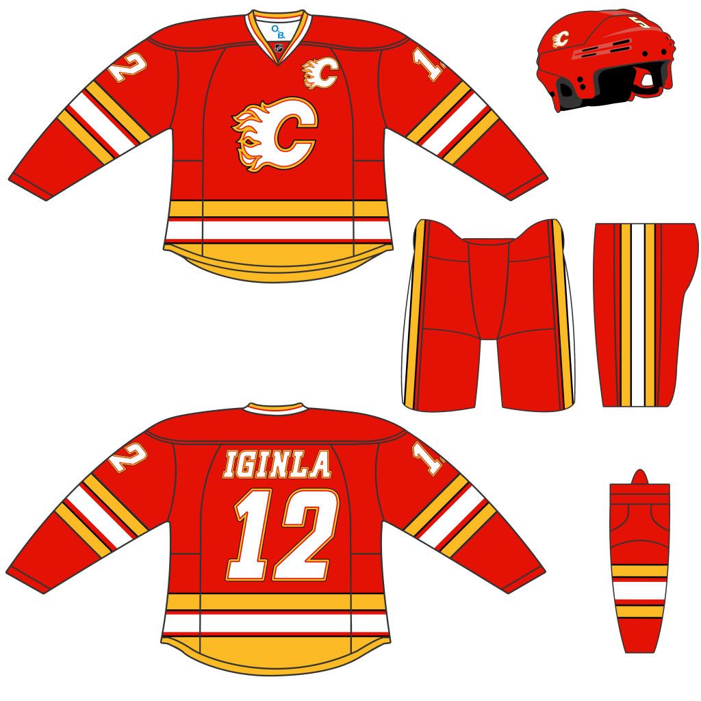
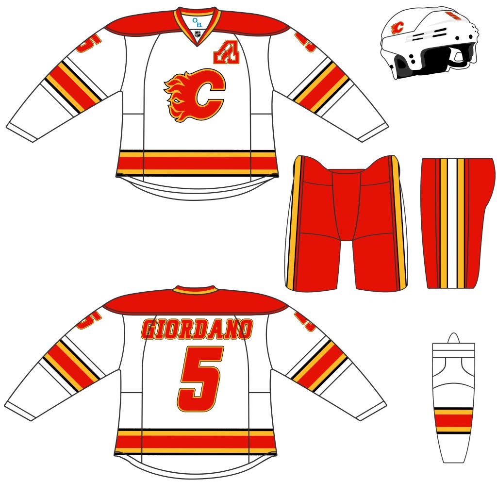
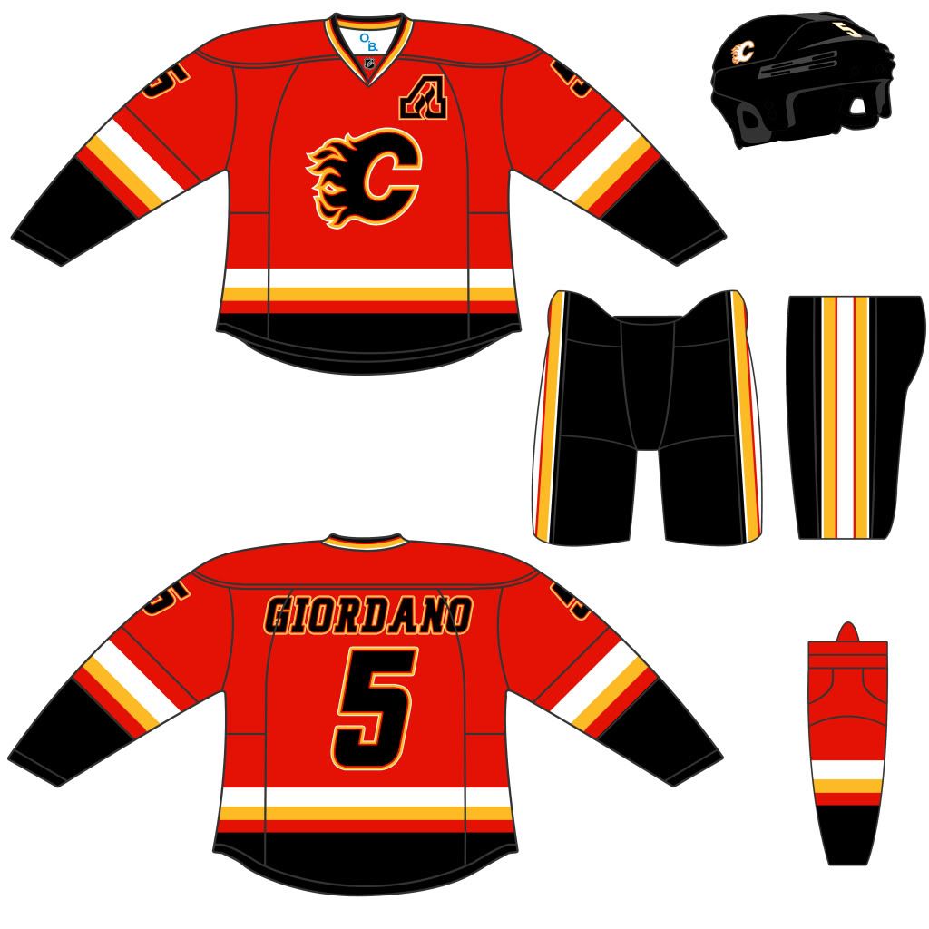
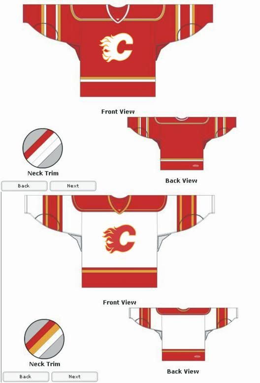
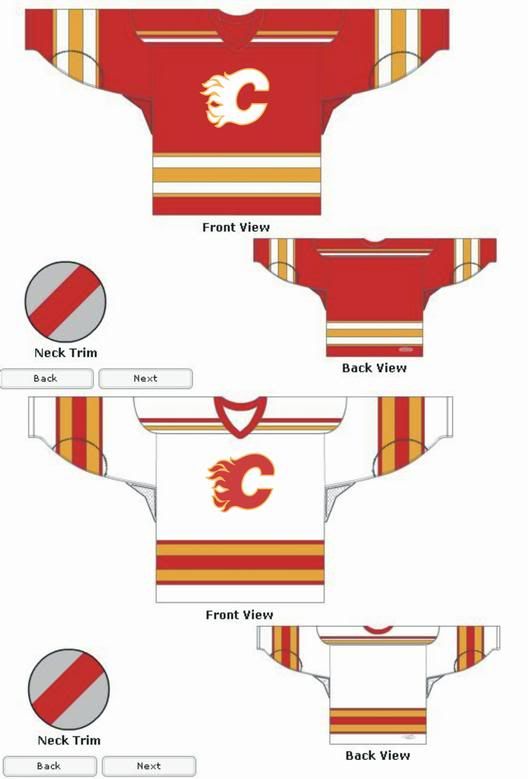
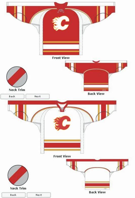
There were a couple posted on uniwatch -- not a fan of either but here they are:
Home:
Away:
Alternate:
|
|
|
|
|
The Following 2 Users Say Thank You to tvp2003 For This Useful Post:
|
|
|
The Following 6 Users Say Thank You to tvp2003 For This Useful Post:
|
|
|
04-20-2012, 10:06 PM
|
#29
|
|
#1 Goaltender
Join Date: Jan 2009
Location: Calgary
|
Retro home & retro away. Nothing else this team has released since then has even been remotely good enough for an NHL team (and yes I am including the crappy '04 jersey).
|
|
|
|
|
The Following User Says Thank You to _Q_ For This Useful Post:
|
|
|
04-20-2012, 10:19 PM
|
#30
|
|
Franchise Player
Join Date: Feb 2009
Location: Abbotsford, BC
|
I like that horse head alternate logo tvp2003. Pretty neat looking.
|
|
|
|
|
The Following User Says Thank You to Pierre "Monster" McGuire For This Useful Post:
|
|
|
04-20-2012, 10:21 PM
|
#31
|
|
Franchise Player
|
There's absolutely nothing wrong with the current Flaming C logo. It's perfect.
Don't know why people would even think about changing it. Re-design the jerseys all you want, but if there's one thing that remains constant, it's the logo.
|
|
|
|
|
The Following 21 Users Say Thank You to Ashasx For This Useful Post:
|
bc-chris,
BloodFetish,
CaptainCraig,
chalms04,
Coach,
Domoic,
Flamesoholic,
Jimmy Stang,
Mango,
Mav,
Mazrim,
mikephoen,
MissTeeks,
Neeper,
OffsideSpecialist,
PlayfulGenius,
redforever,
Redliner,
Reign of Fire,
RoadGame,
You Need a Thneed
|
|
04-20-2012, 10:30 PM
|
#32
|
|
Franchise Player
Join Date: Nov 2009
Location: Kelowna, BC
|
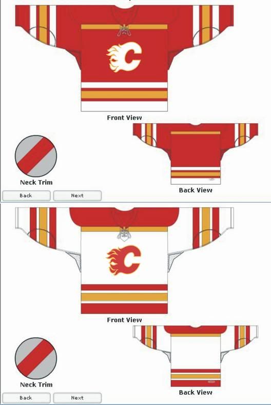
just playing around with the jerseys
i don't think i'd change the flaming c.... i love that logo
================================================== ========
================================================== =========
================================================== =========
================================================== =========
__________________
"...and there goes Finger up the middle on Luongo!" - Jim Hughson, Av's vs. 'Nucks
|
|
|
|
|
The Following 3 Users Say Thank You to bc-chris For This Useful Post:
|
|
|
04-20-2012, 10:44 PM
|
#33
|
|
#1 Goaltender
|
Logo should never change IMO but the current jerseys, to me, look pretty bad. Way too busy, the angled piping looks 90s style and I could take or leave the black color entirely, I don`t consider it one of our primary colors.
The Flames could take a page out of the Blue Jays book and go back to their primary colors and just refresh the 80s-90s jersey a little. Make it new so people buy it but give us the old colors back.
|
|
|
|
|
The Following 14 Users Say Thank You to DionTheDman For This Useful Post:
|
chalms04,
Codes,
cral12,
DaQwiz,
davidus_49,
Deelow,
Iggyinla,
Jimmy Stang,
klikitiklik,
Neeper,
pylon,
Redliner,
Rod Hockey,
slybomb
|
|
04-20-2012, 11:44 PM
|
#35
|
|
Crash and Bang Winger
Join Date: Mar 2010
Location: Calgary
|
^ Love this jersey.
|
|
|
|
|
04-20-2012, 11:55 PM
|
#36
|
|
#1 Goaltender
Join Date: Aug 2011
Location: Not cheering for losses
|
Quote:
Originally Posted by davidus_49
^ Love this jersey.
|

???
|
|
|
|
|
The Following 2 Users Say Thank You to sun For This Useful Post:
|
|
|
04-20-2012, 11:55 PM
|
#37
|
|
Franchise Player
Join Date: Feb 2009
Location: Abbotsford, BC
|
Too plain. It's only slightly more detailed than a practice jersey.
|
|
|
|
|
04-20-2012, 11:57 PM
|
#38
|
|
Celebrated Square Root Day
|
Quote:
Originally Posted by Pierre "Monster" McGuire
Too plain. It's only slightly more detailed than a practice jersey.
|
Yeah, I think all the people that say they love that jersey would quickly change their tune if they saw it in action.
|
|
|
|
|
04-21-2012, 01:25 AM
|
#40
|
|
Powerplay Quarterback
|
keep the retros
add a white retro
add #'s to the front
__________________
Quote:
Originally Posted by HotHotHeat
THIS is why people make fun of Edmonton. When will this stupid city figure it out? They continue to kick their own ass every day, it's impossible not to make fun of them.
|
|
|
|
|
|
The Following User Says Thank You to Sutter_in_law For This Useful Post:
|
|
 Posting Rules
|
You may not post new threads
You may not post replies
You may not post attachments
You may not edit your posts
HTML code is Off
|
|
|
All times are GMT -6. The time now is 09:23 PM.
|
|


