06-21-2017, 12:56 PM
|
#321
|
|
First Line Centre
Join Date: Feb 2010
Location: Calgary
|
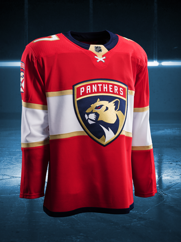
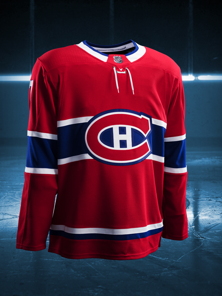
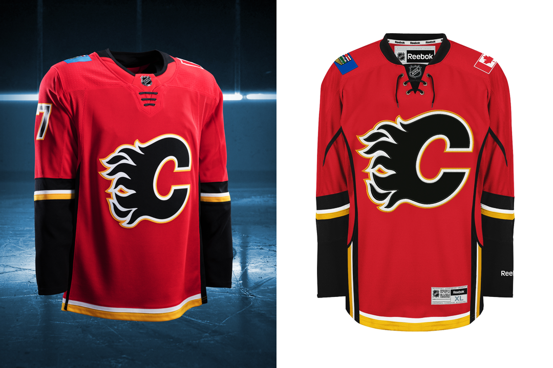
One thing that caught my attention is just how many variations of neck laces Adidas included in these. I counted no less than 5 lace styles among the home jerseys, some of which are only being used by a single team.
Three straight laces, no loose strings
- Anaheim
- Arizona
- Buffalo
- Calgary
- Minnesota
1 straight lace & 2 crossed laces, loose strings
- Boston
- Carolina
- Dallas
- New York Islanders
- New York Rangers
- San Jose
- Toronto
2 crossed laces, no loose strings
- Florida
1 straight lace, loose strings
- Montreal
1 straight lace, 4 crossed laces, no loose strings
- Winnipeg
I actually find the styles without the loose laces look a lot better this time around. The loose laces just look too short to my eyes, looks like someone broke the original lace and tossed a random spare they had laying around onto the jersey.
The styles without the loose laces just look more "finished" to my eyes.
Last edited by Regular_John; 06-21-2017 at 01:01 PM.
|

|

|
|
The Following 5 Users Say Thank You to Regular_John For This Useful Post:
|
|
|
06-21-2017, 01:15 PM
|
#322
|
|
#1 Goaltender
Join Date: Aug 2011
Location: Not cheering for losses
|
Quote:
Originally Posted by Textcritic

See, here is another reaction that I don't get. At first reveal I thought Nashville's were among the better new ones. I think the general response around the League has more to do with the volatile mix of fan enthusiasm, summer boredom and faceless internet aggression than anything else.
|
Could also be that you have a below average sense of style.
|
|
|
|
|
The Following 3 Users Say Thank You to sun For This Useful Post:
|
|
|
06-21-2017, 01:34 PM
|
#323
|
|
Acerbic Cyberbully
Join Date: Aug 2003
Location: back in Chilliwack
|
Quote:
Originally Posted by sun
Could also be that you have a below average sense of style.
|
It could be that. But given that the Flames and every other NHL team will sell thousands upon thousands of the new jerseys suggests to me that more likely this is all about as subjective as it gets.
|
|
|
|
|
06-21-2017, 01:36 PM
|
#324
|
|
Powerplay Quarterback
Join Date: Apr 2015
Location: ...the bench
|
Quote:
Originally Posted by jaydorn
One thing that caught my attention is just how many variations of neck laces Adidas included in these. I counted no less than 5 lace styles among the home jerseys, some of which are only being used by a single team.
Three straight laces, no loose strings
- Anaheim
- Arizona
- Buffalo
- Calgary
- Minnesota
1 straight lace & 2 crossed laces, loose strings
- Boston
- Carolina
- Dallas
- New York Islanders
- New York Rangers
- San Jose
- Toronto
2 crossed laces, no loose strings
- Florida
1 straight lace, loose strings
- Montreal
1 straight lace, 4 crossed laces, no loose strings
- Winnipeg
I actually find the styles without the loose laces look a lot better this time around. The loose laces just look too short to my eyes, looks like someone broke the original lace and tossed a random spare they had laying around onto the jersey.
The styles without the loose laces just look more "finished" to my eyes. |
I actually like Floridas' two lace the best.
|
|
|
|
|
The Following 2 Users Say Thank You to Benched For This Useful Post:
|
|
|
06-21-2017, 01:55 PM
|
#325
|
|
#1 Goaltender
Join Date: Aug 2011
Location: Not cheering for losses
|
Quote:
Originally Posted by Textcritic
It could be that. But given that the Flames and every other NHL team will sell thousands upon thousands of the new jerseys suggests to me that more likely this is all about as subjective as it gets.
|
How many jerseys would CHI sell if they had piping, random tee arm stripes, vertical stripes, and state flags on them? DET if the logo was a black winged wheel instead? TOR with a polar bear blowing smoke out of its ears?
Hundreds of thousands. Nary a sales blip, I would reckon. They would still be abominations, terribly designed, and an affront to their clubs' history of absolutely beautiful jerseys.
The Nickleback defence is weak af.
|
|
|
|
|
The Following User Says Thank You to sun For This Useful Post:
|
|
|
06-21-2017, 02:23 PM
|
#326
|
|
First Line Centre
Join Date: Feb 2010
Location: Calgary
|
Quote:
Originally Posted by Benched
I actually like Floridas' two lace the best.
|
I'm surprised more teams didn't go with Winnipeg's set up to be honest. Seems like the most natural transition from what was the "default" lace style last season.
Although I'm also quite fond of the 3 straight laces the Flames opted for.
|
|
|
|
|
The Following 3 Users Say Thank You to Playfair For This Useful Post:
|
|
|
06-22-2017, 08:52 AM
|
#328
|
|
Taking a while to get to 5000
|
Thats a very neat page. Fun looking at the subtle and not so subtle changes on all the jerseys compared to last season.
|
|
|
|
|
The Following User Says Thank You to Toonage For This Useful Post:
|
|
|
06-22-2017, 10:22 AM
|
#329
|
|
Franchise Player
Join Date: Mar 2006
Location: Shanghai
|
Going through all of them, I think every team except possibly Buffalo benefits from the new collar and laces style. For overall look, only Minnesota and Nashville look like significant improvements, while the Flames and a couple of others have moderate improvements. Ottawa, Edmonton and maybe Carolina are the only ones that look worse to me in the new versions.
__________________
"If stupidity got us into this mess, then why can't it get us out?"
|
|
|
|
|
06-22-2017, 10:26 AM
|
#330
|
|
#1 Goaltender
|
Quote:
Originally Posted by Benched
I actually like Floridas' two lace the best.
|
The two crossed laces is actually supposed to be a representation of the Florida Flag. Fun fact
|
|
|
|
|
The Following 2 Users Say Thank You to bax For This Useful Post:
|
|
|
06-22-2017, 10:26 AM
|
#331
|
|
Franchise Player
|
Quote:
Originally Posted by Playfair
Side by side of all teams, all jerseys from last year and the new ones just released....
|
It's a clear improvement, just not what many had hoped for.
I'm thinking a #19 is in my future.
|
|
|
|
|
The Following User Says Thank You to ComixZone For This Useful Post:
|
|
|
06-22-2017, 10:47 AM
|
#332
|
|
GOAT!
|
I think Minnesota and Colorado are the best in terms of this year vs last year.
Also... Haha, stupid Oilers.
|
|
|
|
|
06-22-2017, 01:05 PM
|
#333
|
|
Scoring Winger
|
I think Nashville actually looked better with the blue on the shoulders and the piping.
|
|
|
|
|
06-30-2017, 11:38 PM
|
#334
|
|
Resident Videologist
Join Date: Mar 2002
Location: Calgary
|
The Vegas uniforms don't look too terrible with the full equipment:

The white gloves look less hideous.
|
|
|
|
|
The Following 2 Users Say Thank You to AC For This Useful Post:
|
|
|
07-01-2017, 07:01 AM
|
#335
|
|
tromboner
Join Date: Mar 2006
Location: where the lattes are
|
One thing I noticed going through them all is that the way the NHL logo is handled is worse... either breaking the line of the collar or creating an excessive visual weight close to the neck that competes with the primary logo. Also having it prutrude into the neckhole just makes it look like the sort of thing that would impale your windpipe. The old collars were much better done. Triangle > pentagon.
|
|
|
|
| Thread Tools |
Search this Thread |
|
|
|
 Posting Rules
|
You may not post new threads
You may not post replies
You may not post attachments
You may not edit your posts
HTML code is Off
|
|
|
All times are GMT -6. The time now is 10:34 PM.
|
|