|
View Poll Results: Are you happy Blasty is back?
|
|
Yes
|
   
|
275 |
72.56% |
|
No
|
  
|
104 |
27.44% |
 11-16-2020, 10:51 PM
|
#1041
|
|
First round-bust
Join Date: Feb 2015
Location: speculating about AHL players
|
Chicago is clearly ashamed of the cultural appropriation overflowing from their current branding. It's not as bad as the Washington NFL team but it's close.
The release video for their jersey today was comically edited to show the logo as little as possible. I think it appears for less than a second. In another shot, the model wearing the jersey has his arm over the face on the logo. And when the NHL tweeted out pictures of all the jerseys, they showed a picture of the back of Chicago's jersey... the only one to be displayed in that fashion.
__________________
"This has been TheScorpion's shtick for years. All these hot takes, clickbait nonsense just to feed his social media algorithms." Tuco
|

|

|
|
11-16-2020, 10:52 PM
|
#1042
|
|
Franchise Player
Join Date: Mar 2006
Location: Shanghai
|
Quote:
Originally Posted by Jetfire

Excuse me if it was posted already:
 |
White flaming C as the main crest and blasty on the shoulders, that would be a nice jersey.
__________________
"If stupidity got us into this mess, then why can't it get us out?"
|

|
|
|
The Following 2 Users Say Thank You to JohnnyB For This Useful Post:
|
|
|
11-16-2020, 10:54 PM
|
#1043
|
|
First Line Centre
Join Date: Oct 2009
Location: Calgary
|
Quote:
Originally Posted by Fuzz
Yes, well, it's got an over-abundance of mismatched parts.
|
A uniform with too many accolades. A Canadian who moved to Alberta to play many years for the Flames to become Captain of the team and make the all-star team.
|
|
|
|
|
11-17-2020, 03:14 AM
|
#1045
|
|
Scoring Winger
Join Date: Jul 2011
Location: at home
|
|
|
|
|
|
11-17-2020, 03:29 AM
|
#1046
|
|
Scoring Winger
|
My first thought was also Vancouver V piping .... why cant our team get our jerseys right .... if you are old enough to remember its very obvious ... I wonder if the person who came up with flags for shoulder patches is the same person responsible for the Vancouver retro pipping on this jersey ... Jeebez .... another lost opportunity ....
|
|
|
|
|
The Following 2 Users Say Thank You to stamps For This Useful Post:
|
|
|
11-17-2020, 07:05 AM
|
#1047
|
|
Franchise Player
Join Date: Oct 2006
Location: San Fernando Valley
|
Quote:
Originally Posted by Jetfire
Excuse me if it was posted already:
|
The more I see this the better it looks. I'm actually very happy with how this turned out given how bad Flames jerseys have been since 2007.
|
|
|
|
|
11-17-2020, 07:20 AM
|
#1048
|
|
Franchise Player
Join Date: Oct 2006
Location: San Fernando Valley
|
Quote:
Originally Posted by Hemi-Cuda
Gallery with all of the jerseys for easy viewing
https://www.flickr.com/photos/655167...57716910961806
St. Louis, New Jersey, NYR, and San Jose are my favorites. What's with none of the pictures clearly showing the Blackhawks logo? Really seems like we're not far from Chicago renaming the team completely with how little they're embracing the logo |
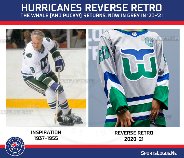
Lots of these are really, really nice. Even some of the lesser ones are more safe than bad. The Whalers and Wild are the two that stand out as ones I would buy just because they look nice. What is the Oilers fascination with Orange? It's always been a secondary color much like yellow on Flames jerseys but now it's become the dominant color.
|
|
|
|
|
11-17-2020, 08:52 AM
|
#1049
|
|
Powerplay Quarterback
Join Date: Jul 2004
Location: In the whites
|
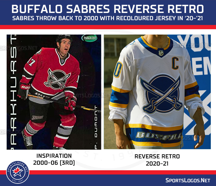
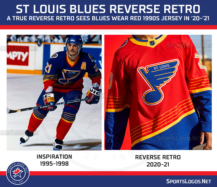
I like most of them, even some like the Blues and Sabres which are rather ugly are at least in the spirit of the exercise. I was never a fan of the Blasty jersey in the first place so I'm rather meh on it.
1. Wild
2. Nordiques
3. Whalers
4. Kings
...
29. Toronto
30. Tampa
31. Vegas
__________________
Shot down in Flames!
Shot down in Flames!
Ain't it a shame,
To be shot down in Flames!
|
|
|
|
|
11-17-2020, 09:04 AM
|
#1050
|
|
#1 Goaltender
Join Date: Feb 2012
Location: Calgary
|
Quote:
Originally Posted by hixxes
I like most of them, even some like the Blues and Sabres which are rather ugly are at least in the spirit of the exercise. I was never a fan of the Blasty jersey in the first place so I'm rather meh on it.
1. Wild
2. Nordiques
3. Whalers
4. Kings
...
29. Toronto
30. Tampa
31. Vegas
|
I tend to agree. Wild and Kings seemed to have embraced the reverse retro the best. The Nordiques and Whaler jerseys are hard to fully accept for me. Those are cool because they always were great jerseys, but for a different city. I am not so sure they make sense for this exercise. Maybe it would have been better with the retro colours, but with a more current logo with the existing city.
__________________
From HFBoard oiler fan, in analyzing MacT's management:
O.K. there has been a lot of talk on whether or not MacTavish has actually done a good job for us, most fans on this board are very basic in their analysis and I feel would change their opinion entirely if the team was successful.
|
|
|
|
|
The Following User Says Thank You to Fighting Banana Slug For This Useful Post:
|
|
|
11-17-2020, 09:21 AM
|
#1051
|
|
Backup Goalie
Join Date: Jun 2005
Location: Lakebay, WA
Exp: 
|
I think more than anything this shows how polarized the jersey market is. You see jerseys that I think are incredible that people hate more than anything, and vice-versa. You clearly can't make everyone happy, so why not generate more revenue streams?
I LOVE Blasty but I wish that they had changed up the color scheme a bit; this looks more like a sweatshirt I would buy as opposed to a jersey. But whatever.
Pretend it's two years ago and the Flames said "We are going to go back to our classic "retro" jerseys as the full-time jersey, and a few times a year we'll use wacky Blasty to change things up." How many of you would be angry? Let's be grateful we now have some of the most beautiful everyday jerseys, and take Blasty for what he is.
A godlike beast of passion.
|
|
|
|
|
11-17-2020, 09:28 AM
|
#1052
|
|
First Line Centre
Join Date: Sep 2007
Location: Regina
|
I love it. It’s cleaned up nicely. I would liked to see white on the bottom rather than black but it’s still looking very sharp.
|
|
|
|
|
11-17-2020, 09:50 AM
|
#1053
|
|
Not the 1 millionth post winnar
Join Date: Aug 2004
Location: Los Angeles
|
Super ugly, perhaps second only to the Ronald McDonald jerseys in terms of eyesore. Reminiscent of a very bad time for the franchise, and then made worse by going “vintage Canucks”. We signed like half the Vancouver team, so I guess there’s that.
On the plus side, it looks demonic, so at least will piss off the Bible thumpers and Jesus freaks(again).
__________________
"Isles give up 3 picks for 5.5 mil of cap space.
Oilers give up a pick and a player to take on 5.5 mil."
-Bax
|
|
|
|
|
The Following 2 Users Say Thank You to Flashpoint For This Useful Post:
|
|
|
11-17-2020, 09:50 AM
|
#1054
|
|
Franchise Player
Join Date: Dec 2011
Location: Calgary
|
I think the full uniform is going to look really slick. I can’t wait.
|
|
|
|
|
The Following User Says Thank You to N-E-B For This Useful Post:
|
|
|
11-17-2020, 09:52 AM
|
#1055
|
|
First Line Centre
Join Date: Oct 2009
Location: Reppin' the C in BC
|
Anyone ever come up with a logo where the horse's mane (side view of the horse head) is in the form of the flames of the C? Curious as to how that would look.
__________________
"There are no asterisks in this life, only scoreboards." - Ari Gold
12 13 14 2 34
|
|
|
|
|
11-17-2020, 09:53 AM
|
#1056
|
|
Franchise Player
|
After digesting for 24 hours, I like the Flames jersey more. I think it's great and I even convinced the wife to let me buy one 
The clear cut #1 is Minnesota. Caps, Habs and Panthers with the next best.
Flames, Nordiques, Hawks, NJD and Kings a tier above everyone else. Buffalo really close to having one of the best, but the wordmark ruins it.
|
|
|
|
|
11-17-2020, 09:54 AM
|
#1057
|
|
Franchise Player
|
Quote:
Originally Posted by Flashpoint
Super ugly, perhaps second only to the Ronald McDonald jerseys in terms of eyesore. Reminiscent of a very bad time for the franchise, and then made worse by going vintage Canucks. We signed like half the Vancouver team, so I guess theres that.
On the plus side, it looks demonic, so at least will piss off the Bible thumpers and Jesus freaks(again).
|
Dude, did you forget your coffee this morning? Yikes.
|
|
|
|
|
11-17-2020, 09:56 AM
|
#1058
|
|
Not the 1 millionth post winnar
Join Date: Aug 2004
Location: Los Angeles
|
__________________
"Isles give up 3 picks for 5.5 mil of cap space.
Oilers give up a pick and a player to take on 5.5 mil."
-Bax
|
|
|
|
|
The Following 7 Users Say Thank You to Flashpoint For This Useful Post:
|
|
|
11-17-2020, 09:59 AM
|
#1059
|
|
Not the 1 millionth post winnar
Join Date: Aug 2004
Location: Los Angeles
|
Quote:
Originally Posted by CroFlames
Dude, did you forget your coffee this morning? Yikes.
|
I feel its a bad jersey. Historically as well as the revival. I recall in the mid 2000s they were on sale on the HockeyMonkey website for $4 (along with the Dallas Stars Mooterus). The shipping was more than the jersey.
They took that and made it worse.
Blasty is a good shoulder patch. This thing is awful.
__________________
"Isles give up 3 picks for 5.5 mil of cap space.
Oilers give up a pick and a player to take on 5.5 mil."
-Bax
|
|
|
|
|
The Following 2 Users Say Thank You to Flashpoint For This Useful Post:
|
|
|
11-17-2020, 10:22 AM
|
#1060
|
|
Scoring Winger
Join Date: Jul 2018
Location: 403
|
Re: Islanders
I think the lack of effort on the reverse retro has to do with the organization having to embrace Lou Lamoriello's 'old-school' principles. If he wasn't around, I bet we're talking about how fancy the teal Fisherman sticks are or how classy the orange jerseys (in classic template of course!) are.
|
|
|
|
|
The Following 2 Users Say Thank You to TheRealPepman For This Useful Post:
|
|
 Posting Rules
|
You may not post new threads
You may not post replies
You may not post attachments
You may not edit your posts
HTML code is Off
|
|
|
All times are GMT -6. The time now is 11:55 PM.
|
|