 04-27-2019, 08:01 PM
|
#1
|
|
Scoring Winger
Join Date: Jul 2018
Location: 403
|
 Origin of Flames' Horsehead Logo Story?
Can anyone here share the story behind the Flames' horsehead logo/Ol' Blasty? Is it true that a child designed the logo?
|

|

|
|
04-27-2019, 08:10 PM
|
#2
|
|
Scoring Winger
|
Quote:
Originally Posted by TheRealPepman

Can anyone here share the story behind the Flames' horsehead logo/Ol' Blasty? Is it true that a child designed the logo?
|
That's true. It was a design contest for the 3rd jersey, and I think the winning submission was a 13 year old kid.... Can't remember if that was the exact age. It was during the dark years of the flames young guns I believe, and the flames were trying to attract fan involvement.
|
|
|
|
|
04-27-2019, 08:11 PM
|
#3
|
|
First round-bust
Join Date: Feb 2015
Location: speculating about AHL players
|
It was forged out of the dying star at Nidavellir. No other backstory could explain its eternal glory.
__________________
"This has been TheScorpion's shtick for years. All these hot takes, clickbait nonsense just to feed his social media algorithms." Tuco
|

|
|
|
The Following 5 Users Say Thank You to TheScorpion For This Useful Post:
|
|
|
04-27-2019, 08:28 PM
|
#4
|
|
Powerplay Quarterback
Join Date: Mar 2016
Location: Calgary
|
I belive it was a 11-13 year old Girl that drew the winning picture
|
|
|
|
|
04-27-2019, 08:28 PM
|
#5
|
|
Celebrated Square Root Day
|
Quote:
Originally Posted by TheScorpion
It was forged out of the dying star at Nidavellir. No other backstory could explain its eternal glory.
|
Except the actual one?
|
|
|
|
|
04-27-2019, 08:31 PM
|
#6
|
|
Lifetime Suspension
Join Date: Jul 2012
Location: North America
|
Taken off Reddit
“The Horsehead was designed drawn in pencil crayon by a 14 year old kid for a contest in the Sun. He won a Ken Wregget mask and a jersey for his troubles. It's a fitting representation of the young guns (TM) era. Completely inappropriate for a Big League team.
Bonus hatred: Calgarian Todd fing Mcfarlane offered to design a proper 3rd FOR FREE but was turned down.”
|
|
|
|
|
The Following 5 Users Say Thank You to Yoho For This Useful Post:
|
|
|
04-27-2019, 08:31 PM
|
#7
|
|
Powerplay Quarterback
Join Date: Apr 2004
Location: Behind the microphone
|
All I remember was that it was debuted in 1998 to celebrate "The Year Of The Cowboy".
__________________
Fireside Chat - Official Podcast for the C of Red
New Episode Weekly! Listen Now: FiresideChat.ca
|
|
|
|
|
04-27-2019, 08:39 PM
|
#8
|
|
Franchise Player
Join Date: Mar 2004
Location: Chilliwack, B.C
|
Worst team logo that snot horse is horrible! One thing I appreciate that Ken King did was recognizing the importance of a red jersey and the flaming C logo. The new home red jersey was right on time for a run for the cup in 2003-2004.
Sent from my SM-G930W8 using Tapatalk
|
|
|
|
|
04-27-2019, 09:05 PM
|
#9
|
|
Franchise Player
Join Date: Oct 2001
Location: NYYC
|
Quote:
Originally Posted by Yoho
Bonus hatred: Calgarian Todd fing Mcfarlane offered to design a proper 3rd FOR FREE but was turned down.
|
Considering what he designed for the Oilers, not sure that wouldve been any better.
|
|
|
|
|
The Following 36 Users Say Thank You to Table 5 For This Useful Post:
|
---Hatrick---,
Aarongavey,
Azhouse,
Bill Bumface,
Cheese,
CofR,
Cowboy89,
deejay829,
dino7c,
Flamezzz,
getbak,
GreatWhiteEbola,
habernac,
I-Hate-Hulse,
Iceman57,
ignite09,
iLoveLamp,
Ironhorse,
JD,
Jimmy Stang,
KevanGuy,
Kipper is King,
KTrain,
lambeburger,
Loudog,
OldDutch,
Rando,
redflamesfan08,
Sainters7,
SmoggyFlamesFan,
speede5,
Split98,
Stay Golden,
tripin_billie,
underGRADFlame,
Yamer
|
|
04-27-2019, 09:10 PM
|
#10
|
|
Franchise Player
Join Date: Sep 2013
Location: Brisbane
|
I’ve ranted about this logo before but since we have this thread I’ll go for it again.
I hate it so much. Portrait logos of animals look silly, the nostril flames look like tissues blowing a nose, the mouth makes the horse look happy while the eyes show anger, and the only neat aspect, the symmetry, is ruined by that flame on the forehead. Then add it is promoting a dated western stereotype of Calgary and the team that wore those was horrible and I can’t understand why anyone wants to see these back.
I guess it was good work for a teenager paid in Ken Wregget gear but totally wrong for an NHL team.
__________________
The masses of humanity have always had to surf.
|
|
|
|
|
04-27-2019, 09:17 PM
|
#11
|
|
Franchise Player
Join Date: Jul 2005
Location: SW Ontario
|
I like it.
|
|
|
|
|
The Following 14 Users Say Thank You to dissentowner For This Useful Post:
|
---Hatrick---,
craigwd,
DaQwiz,
dino7c,
Flamezzz,
Iceman57,
Ironhorse,
Jordan!,
Loudog,
Mccree,
Shin Pad,
Split98,
t0rrent98,
Titan
|
|
04-27-2019, 09:20 PM
|
#12
|
|
Franchise Player
|
Quote:
Originally Posted by Yoho
Taken off Reddit
“The Horsehead was designed drawn in pencil crayon by a 14 year old kid for a contest in the Sun. He won a Ken Wregget mask and a jersey for his troubles. It's a fitting representation of the young guns (TM) era. Completely inappropriate for a Big League team.
|
I don't recall who originally designed the horsehead logo/jersey but I don't think this is correct. How do I know? Because I entered that very contest back in 1998.
The contest was to design Ken Wregget's mask for the upcoming season and this was the winner:
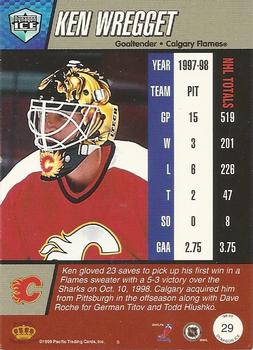
I recall the second place entry was simply the new horsehead logo (that was introduced earlier that summer?) covering the entire mask. I remember being pissed that it got second place because it showed virtually no creativity. In any event, I am 100% certain that the logo did not get designed through that contest...
Last edited by tvp2003; 04-27-2019 at 09:23 PM.
|
|
|
|
|
The Following 4 Users Say Thank You to tvp2003 For This Useful Post:
|
|
|
04-27-2019, 09:45 PM
|
#13
|
|
First Line Centre
Join Date: Jul 2013
Location: Calgary
|
I remember when they announced it because at the time we were in danger of losing the team due to poor ticket sales. It was a big deal because initially the news was that the team is moving to "new jersey" but really, it was just a new jersey lol
|
|
|
|
|
The Following User Says Thank You to shogged For This Useful Post:
|
|
|
04-27-2019, 09:46 PM
|
#14
|
|
All I can get
|
Quote:
Originally Posted by Table 5
Considering what he designed for the Oilers, not sure that wouldve been any better.
|
This abomination?

|
|
|
|
|
The Following User Says Thank You to Reggie Dunlop For This Useful Post:
|
|
|
04-27-2019, 09:49 PM
|
#15
|
|
All I can get
|
Quote:
Originally Posted by tvp2003
In any event, I am 100% certain that the logo did not get designed through that contest...
|
It was designed by an ad agency after intensive focus group consultation. Many prototypes were presented. Black jerseys were popular at the time and the Flames decided to follow that trend. It had tested well amongst young fans.
|
|
|
|
|
04-28-2019, 12:13 AM
|
#16
|
|
Franchise Player
Join Date: Oct 2006
Location: San Fernando Valley
|
Quote:
Originally Posted by Reggie Dunlop
This abomination?
|
I almost forgot about those ones. The horsehead jerseys are way better than that alien spaceship jersey.
|
|
|
|
|
04-28-2019, 09:15 AM
|
#17
|
|
Scoring Winger
Join Date: Apr 2014
Location: Red Deer
|
I would love for Ol’ Blasty to be our thirds. I’m a fan
__________________
It was in.
|
|
|
|
|
The Following User Says Thank You to ---Hatrick--- For This Useful Post:
|
|
|
04-28-2019, 10:16 AM
|
#18
|
|
|
Quote:
Originally Posted by calgaryred
Worst team logo that snot horse is horrible! One thing I appreciate that Ken King did was recognizing the importance of a red jersey and the flaming C logo. The new home red jersey was right on time for a run for the cup in 2003-2004.
Sent from my SM-G930W8 using Tapatalk
|
The 2003-04 jersey did have 2 of the horse head logo on its shoulders
|
|
|
|
|
04-28-2019, 10:54 AM
|
#19
|
|
First Line Centre
|
The Horsehead makes a cool shoulder patch, way better than the flags for sure.
|
|
|
|
|
The Following 16 Users Say Thank You to David Struch For This Useful Post:
|
Azhouse,
Buff,
calgaryred,
corporatejay,
Cowboy89,
DaQwiz,
deejay829,
Iceman57,
Ironhorse,
lambeburger,
Matata,
Pellanor,
Scroopy Noopers,
Split98,
TheScorpion,
underGRADFlame
|
|
04-28-2019, 12:42 PM
|
#20
|
|
Franchise Player
Join Date: Mar 2002
Location: Calgary
|
Quote:
Originally Posted by Table 5
Considering what he designed for the Oilers, not sure that would’ve been any better.
|
And he was also part of the 30 or so Oilers owners before Katz stepped up. The mechancial sperm was putrid and the 9 part explanation for each minute peice of they logo was equally as pathetic.
The Horsehead in itself should've always been a secondary logo, it was the fascination of former "beer cold and hot dogs warm and fans will come" President Ron Bremner to jump on the black jersey fad that stripped away the teams tradition for some extra merchandise.
Flames first wore it when they played in Japan. And should've left it there. The fact that it ended being the primary away jersey for 3 years was a joke.
Last edited by browna; 04-28-2019 at 12:46 PM.
|
|
|
|
|
The Following 2 Users Say Thank You to browna For This Useful Post:
|
|
 Posting Rules
|
You may not post new threads
You may not post replies
You may not post attachments
You may not edit your posts
HTML code is Off
|
|
|
All times are GMT -6. The time now is 10:45 PM.
|
|


