 11-27-2013, 02:35 AM
|
#1
|
|
Franchise Player
Join Date: Dec 2011
Location: Calgary
|
 Islanders Stadium Series Jersey
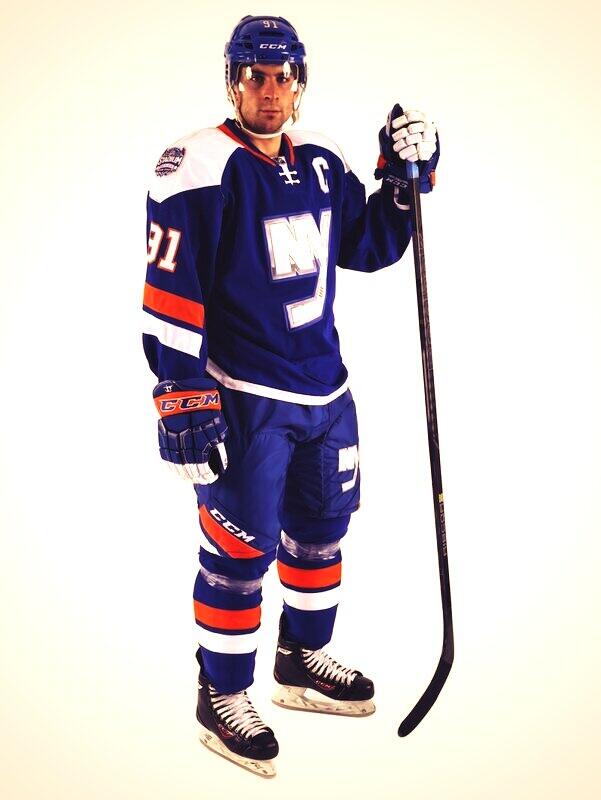
Thoughts?
|

|

|
|
11-27-2013, 02:38 AM
|
#2
|
|
Franchise Player
Join Date: Feb 2013
Location: Calgary
|
better than our 3rd jersey
|
|
|
|
|
The Following 19 Users Say Thank You to jg13 For This Useful Post:
|
カナダ人です,
btimbit,
DaQwiz,
Domoic,
Don Benji,
Erick Estrada,
Flamezzz,
ignite,
lambeburger,
mac_82,
Mustache,
OffsideSpecialist,
Reaper,
RedMileDJ,
Regulator75,
roberts10,
the_only_turek_fan,
troutman,
You Need a Thneed
|
|
11-27-2013, 02:38 AM
|
#3
|
|
Don't click that link!
Join Date: Apr 2006
Location: Rural Alberta
|
It is acceptable. Clean but nothing special. Just glad theres no signs of a fisherman or any resemblence to their nasty 3rd jersey.
|

|
|
|
11-27-2013, 03:10 AM
|
#4
|
|
Powerplay Quarterback
Join Date: Jul 2006
Location: Calgary
|
I like it a lot. The silver is super slick IMO.
|
|
|
|
|
11-27-2013, 03:25 AM
|
#5
|
|
First Line Centre
Join Date: Jan 2011
Location: Fort St. John, BC
|
It's ok, would of like to seen a little more orange. It sure beats the hell out of their third jerseys and I hope these replace them
|
|
|
|
|
11-27-2013, 03:48 AM
|
#6
|
|
Franchise Player
Join Date: Feb 2006
Location: Calgary, AB
|
They stole our cowboy shoulders.
__________________
Turn up the good, turn down the suck!
|
|
|
|
|
The Following 2 Users Say Thank You to getbak For This Useful Post:
|
|
|
11-27-2013, 04:07 AM
|
#7
|
|
Scoring Winger
|
I like it, but the logo looks unfinished. Would look great with an orange outline.
|
|
|
|
|
The Following 2 Users Say Thank You to Haplo For This Useful Post:
|
|
|
11-27-2013, 04:37 AM
|
#8
|
|
Scoring Winger
Join Date: Sep 2013
Location: 17th Ave :D
|
Absolutely love it!
|
|
|
|
|
11-27-2013, 05:16 AM
|
#9
|
|
First Line Centre
Join Date: Aug 2003
Location: Toronto, ON
|
Here is an article on it, and a notable quote on how to go about designing a jersey:
"General manager as well as coaches and players from the organization had input on the design."
http://www.newsday.com/sports/hockey...ries-1.6503895
|
|
|
|
|
11-27-2013, 05:17 AM
|
#10
|
|
Franchise Player
Join Date: Oct 2001
Location: Behind Nikkor Glass
|
Not too bad at all, maybe a stripe of orange above the white stripe on the bottom.
|
|
|
|
|
11-27-2013, 06:53 AM
|
#11
|
|
Franchise Player
Join Date: Oct 2001
Location: NYYC
|
Overall looks decent...not crazy about the logo treatment (looks a little like something you would see in a movie set in the future), but I know that's the look they are going for. But yeah, better than ours.
|
|
|
|
|
11-27-2013, 06:55 AM
|
#12
|
|
Franchise Player
Join Date: Jun 2009
Location: Thunder Bay Ontario
|
I do like these but it just feels like it's missing something. I do like them but it just looks like whoever is wearing them is sad... Maybe it's the blue or maybe it's just the lack of any vibrance but it's missing something. Typical islanders; so much potential and so little result
__________________
Fan of the Flames, where being OK has become OK.
|
|
|
|
|
11-27-2013, 06:58 AM
|
#13
|
|
Franchise Player
Join Date: Oct 2001
Location: Kalispell, Montana
|
Can't wait to see the Devils one. Will be sharp I think!
__________________
I am in love with Montana. For other states I have admiration, respect, recognition, even some affection, but with Montana it is love." - John Steinbeck
|
|
|
|
|
The Following User Says Thank You to Displaced Flames fan For This Useful Post:
|
|
|
11-27-2013, 07:34 AM
|
#14
|
|
Backup Goalie
Join Date: Feb 2011
Location: Houston TX, formerly NYC
Exp: 
|
Better than their weird black thirds for sure. Interesting to see how the rest of the series jerseys will come out, with the whole chrome scheme.
|
|
|
|
|
11-27-2013, 07:45 AM
|
#15
|
|
Crash and Bang Winger
Join Date: Mar 2009
Location: Dome Rafters
|
I like it. Looks sharp
__________________
GO FLAMES GO!!
|
|
|
|
|
11-27-2013, 07:50 AM
|
#16
|
|
Franchise Player
Join Date: Oct 2001
Location: Vancouver
|
I like the style of the logo, but not the colour. It doesn't really go with the rest of the uniform colour scheme.
__________________
"A pessimist thinks things can't get any worse. An optimist knows they can."
|
|
|
|
|
11-27-2013, 08:18 AM
|
#17
|
|
Crash and Bang Winger
Join Date: Aug 2011
Location: East of the Rockies, West of the rest
|
I actually really like that logo, but I'm not crazy about the tilted stripes on the arms and pants. Overall, pretty good I'd say.
|
|
|
|
|
11-27-2013, 09:14 AM
|
#18
|
|
Franchise Player
Join Date: Nov 2002
Location: Hamilton, Ontario
|
I like the socks best
__________________
2018 OHL CHAMPIONS
2022 OHL CHAMPIONS
|
|
|
|
|
11-27-2013, 09:26 AM
|
#19
|
|
Powerplay Quarterback
|
Just another Jersey scam.
|
|
|
|
|
11-27-2013, 09:28 AM
|
#20
|
|
Franchise Player
Join Date: Nov 2003
Location: Calgary, AB
|
Quote:
Originally Posted by hummdeedoo

Just another Jersey scam.
|
I know eh!? It's like they're trying to make money in a sports entertainment business. What a ridiculous concept. I thought owners just bought teams for fun and to lose money.
|
|
|
|
 Posting Rules
|
You may not post new threads
You may not post replies
You may not post attachments
You may not edit your posts
HTML code is Off
|
|
|
All times are GMT -6. The time now is 10:40 AM.
|
|


