11-23-2021, 08:53 PM
|
#61
|
|
Voted for Kodos
|
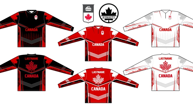
Our flag is red and white. The jerseys should be majority those two colours. I can live with a black third, but that red jersey is a huge fail. The white jersey needs to lose the black pants.
|

|

|
|
The Following 11 Users Say Thank You to You Need a Thneed For This Useful Post:
|
btimbit,
Cheese,
Domoic,
dustygoon,
GreenLantern2814,
greyshep,
megatron,
Number 39,
Redliner,
Scroopy Noopers,
Zarley
|
|
11-23-2021, 09:38 PM
|
#62
|
|
#1 Goaltender
Join Date: Jan 2009
Location: Calgary
|
These are incredible.
I especially like the white jersey. They're like a modern take on the 2010 jerseys.
|

|
|
|
The Following 2 Users Say Thank You to _Q_ For This Useful Post:
|
|
|
11-23-2021, 09:40 PM
|
#63
|
|
Franchise Player
|
Quote:
Originally Posted by Mr.Coffee

I think its the leaf that ruins it. The leaf is hideous but the designs are okay.
I dunno. Dont they use focus groups?
|
Focus groups are how you get these.
__________________
Mom and Dad love you, Rowan - February 15, 2024
|
|
|
|
|
The Following User Says Thank You to GreenLantern2814 For This Useful Post:
|
|
|
11-23-2021, 09:43 PM
|
#64
|
|
#1 Goaltender
|
These are fn gross.
__________________
No, no
Im not sloppy, or lazy. This is a sign of the boredom.
|
|
|
|
|
11-23-2021, 09:46 PM
|
#65
|
|
Franchise Player
|
Looks like a basketball logo
__________________
GFG
|
|
|
|
|
11-23-2021, 09:47 PM
|
#66
|
|
Franchise Player
|
2002 had the best jerseys IMO, but I really like these! This is how it always goes.....
design gets released people hate on it then later people realize they like it and they become crazy expensive on the 2ndary market.
|
|
|
|
|
The Following User Says Thank You to Nadal Fan For This Useful Post:
|
|
|
11-23-2021, 09:52 PM
|
#67
|
|
#1 Goaltender
|
The black jersey will pair nicely with the Gold medal.
|
|
|
|
|
11-23-2021, 10:15 PM
|
#68
|
|
Franchise Player
Join Date: Dec 2008
Location: Calgary, Alberta
|
I think they are awesome, would definitely want to get either the white or the black jersey.
|
|
|
|
|
11-23-2021, 10:21 PM
|
#69
|
|
Franchise Player
Join Date: Dec 2003
Location: Sector 7-G
|
I get NBC Logo from our Maple Leaf.
I hate these ones - way too much black used for Canada.
|
|
|
|
|
The Following User Says Thank You to DeluxeMoustache For This Useful Post:
|
|
|
11-23-2021, 11:03 PM
|
#71
|
|
Franchise Player
Join Date: Jul 2010
Location: Barthelona
|
The red kit looks like it took inspiration from a can of Coke Zero.
Don't mind them in general though.
__________________
Quote:
Originally Posted by snipetype
k im just not going to respond to your #### anymore because i have better things to do like #### my model girlfriend rather then try to convince people like you of commonly held hockey knowledge.
|
|
|
|
|
|
11-23-2021, 11:03 PM
|
#72
|
|
Powerplay Quarterback
Join Date: Jan 2017
Location: The real "Cowtown"
|
I think our flag jerseys were much better...and it hurts me to type that.
|
|
|
|
|
11-23-2021, 11:03 PM
|
#73
|
|
NOT breaking news
Join Date: Jan 2007
Location: Calgary
|
The curling ones are better!
__________________
Watching the Oilers defend is like watching fire engines frantically rushing to the wrong fire

|
|
|
|
|
The Following 6 Users Say Thank You to GirlySports For This Useful Post:
|
|
|
11-23-2021, 11:07 PM
|
#74
|
|
damn onions
|
Can’t they just permanently use the summit series ones and call it a day? No need to change the sweetness of perfection.
|
|
|
|
|
The Following 2 Users Say Thank You to Mr.Coffee For This Useful Post:
|
|
|
11-23-2021, 11:08 PM
|
#75
|
|
Franchise Player
|
The curling ones got the leaf right, and that makes all the difference
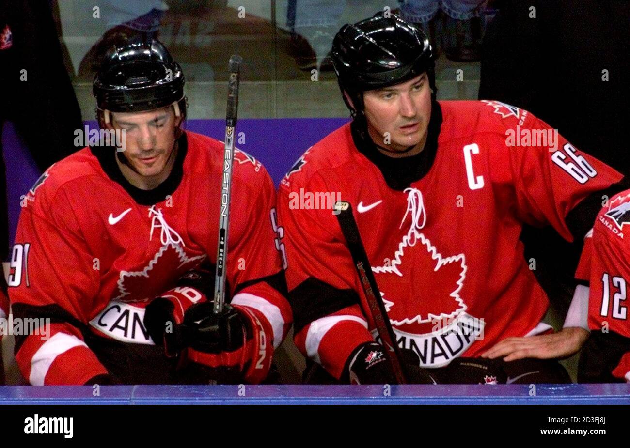
And yes, the Summit Series unis are all we need
|
|
|
|
|
The Following User Says Thank You to Enoch Root For This Useful Post:
|
|
|
11-23-2021, 11:13 PM
|
#76
|
|
Franchise Player
Join Date: Mar 2005
Location: Van City - Main St.
|
Horrendous.
Trying to be modern for the sake of being modern, but failing miserably to pull it off.
The leaf is just wrong.
The white jersey is ok. The red & black jerseys lack white elements to balance out the roller hockey vibes.
|
|
|
|
|
The Following 2 Users Say Thank You to Winsor_Pilates For This Useful Post:
|
|
|
11-23-2021, 11:15 PM
|
#77
|
Join Date: Mar 2006
Location: Now world wide!
|
Yeah, I'd like to see a shop of the curling leaf on the white jersey.
The red leaf on the black jersey might look okay too. More of a laser tag vibe.
|
|
|
|
|
11-23-2021, 11:30 PM
|
#78
|
|
Franchise Player
Join Date: Mar 2007
Location: Income Tax Central
|
The rest of the jersey is pretty 'meh.'
Its not horri-awful or anything, its uninspired, but its okay.
But the centerpiece of the entire thing is the maple leaf and its a goddamned tragedy.
__________________
The Beatings Shall Continue Until Morale Improves!
This Post Has Been Distilled for the Eradication of Seemingly Incurable Sadness.
If you are flammable and have legs, you are never blocking a Fire Exit. - Mitch Hedberg
|
|
|
|
|
The Following 3 Users Say Thank You to Locke For This Useful Post:
|
|
|
11-23-2021, 11:30 PM
|
#79
|
|
Franchise Player
|
the leaf reminds me of spider man
|
|
|
|
|
The Following 2 Users Say Thank You to Ashasx For This Useful Post:
|
|
|
11-24-2021, 12:07 AM
|
#80
|
|
First Line Centre
|
First impression I just about gagged... But the first two jerseys are already growing on me a few hours later.
Last edited by Jetfire; 11-24-2021 at 03:00 AM.
|
|
|
|
 Posting Rules
|
You may not post new threads
You may not post replies
You may not post attachments
You may not edit your posts
HTML code is Off
|
|
|
All times are GMT -6. The time now is 02:50 PM.
|
|