 04-29-2012, 10:27 AM
|
#101
|
|
Franchise Player
|
I never want any words on my jersey. So tacky.
|

|

|
|
The Following 10 Users Say Thank You to Ashasx For This Useful Post:
|
|
|
04-29-2012, 01:43 PM
|
#102
|
|
First Line Centre
|
Quote:
Originally Posted by Ashasx

I never want any words on my jersey. So tacky.
|
I guess you absolutely hate the Rangers jersey then...
Anyways, I am with you. You shouldn't use wordmarks as a jersey "logo" unless it is stemmed from tradition (e.g. baseball). I don't think finding some artists to come up with a tasteful 2nd Flames logo will be "that" difficult...
|
|
|
|
|
04-29-2012, 01:48 PM
|
#103
|
|
damn onions
|
Quote:
Originally Posted by Ashasx
I never want any words on my jersey. So tacky.
|
also, black sucks.
|
|
|
|
|
The Following 2 Users Say Thank You to Mr.Coffee For This Useful Post:
|
|
|
04-29-2012, 02:45 PM
|
#104
|
|
Franchise Player
|
Quote:
Originally Posted by lazypucker
I guess you absolutely hate the Rangers jersey then...
Anyways, I am with you. You shouldn't use wordmarks as a jersey "logo" unless it is stemmed from tradition (e.g. baseball). I don't think finding some artists to come up with a tasteful 2nd Flames logo will be "that" difficult...
|
Rangers are an original 6 team. That's their logo, it's a little different when we already have one.
I also don't even know what a Ranger is.
|
|
|
|
|
04-29-2012, 02:53 PM
|
#105
|
|
#1 Goaltender
Join Date: Aug 2011
Location: Not cheering for losses
|
Quote:
Originally Posted by Ashasx
I also don't even know what a Ranger is.
|

|
|
|
|
|
The Following 3 Users Say Thank You to sun For This Useful Post:
|
|
|
04-29-2012, 02:54 PM
|
#106
|
|
damn onions
|
Quote:
Originally Posted by Ashasx
Rangers are an original 6 team. That's their logo, it's a little different when we already have one.
I also don't even know what a Ranger is.
|
old president of Madison Square Garden was awarded an NHL team, his nickname was Tex, and the team was nicknamed Tex's Rangers.
|
|
|
|
|
04-29-2012, 03:01 PM
|
#107
|
|
Franchise Player
|
I've always thought of it like park rangers or something. Like the guy in the tower on Red Green.
|
|
|
|
|
04-29-2012, 03:07 PM
|
#108
|
|
Franchise Player
Join Date: Mar 2004
Location: Chilliwack, B.C
|
Quote:
Originally Posted by Ashasx
I've always thought of it like park rangers or something. Like the guy in the tower on Red Green.
|
or in the movie ELF
|
|
|
|
|
04-29-2012, 05:49 PM
|
#109
|
|
Norm!
|
Quote:
Originally Posted by Dr. Pepper
If you would have described this concept - I would have laughed. Seeing is believing - quite like it! Thanks for sharing.
|
One of the things that you have to consider is how the Jersey's would come across on T.V. and in the upper rows and the players would look like a big blob of black with a indistinguishable logo hard to read numbers and names.
Plus there is such a thing as too dark and too much black.
__________________
My name is Ozymandias, King of Kings;
Look on my Works, ye Mighty, and despair!
|
|
|
|
|
04-30-2012, 10:51 AM
|
#110
|
|
Backup Goalie
Join Date: Mar 2010
Location: Seattle
Exp: 
|
Quote:
Originally Posted by CaptainCrunch
One of the things that you have to consider is how the Jersey's would come across on T.V. and in the upper rows and the players would look like a big blob of black with a indistinguishable logo hard to read numbers and names.
Plus there is such a thing as too dark and too much black.
|
Agreed, I am going to post an edit of it and make it more "tv viewable".
It was a first pass and I was trying to juxtapose our current jersey design with the black Team Germany uniforms and the richness of the charcoal New Jersey Nets Uniforms.
By no way do I want this to be a replacement for the red, white or retro jerseys. But I would love it as another third jersey, we have been in need of another dark jersey that is more tasteful than the black jersey with the flaming horse.
|
|
|
|
|
04-30-2012, 11:27 AM
|
#111
|
|
Powerplay Quarterback
|
Quote:
Originally Posted by tomo
My third jersey concept.
Charcoal body with Black pants charcoal socks.
Crests (flaming C, numbers, & both flags) in graphite & silver
hope you like.
 |
Very similar to the Black Ice Jerseys.
http://shop.nhl.com/family/index.jsp...oryId=12175252

__________________
"Somebody may beat me, but they are going to have to bleed to do it."
-Steve Prefontaine
Last edited by sevenarms; 04-30-2012 at 11:31 AM.
|
|
|
|
|
04-30-2012, 12:25 PM
|
#112
|
|
Backup Goalie
Join Date: Mar 2010
Location: Seattle
Exp:
|
Quote:
Originally Posted by sevenarms
Very similar to the Black Ice Jerseys.
|
oh wow! I've never seen those before.
|
|
|
|
|
05-01-2012, 10:01 AM
|
#113
|
|
Backup Goalie
Join Date: Mar 2010
Location: Seattle
Exp:
|
Here is my updated design with changes from feedback.
Thanks for the feedback guys.
- made numbers and "C" white for improved readability.
- Added silver outline around numbers and logos.
- made charcoal cloth of jersey and socks a bit lighter (to avoid one big black blob).

|
|
|
|
|
The Following 16 Users Say Thank You to tomo For This Useful Post:
|
BurningYears,
carom,
chalms04,
DatSOOKin,
Dr. Pepper,
Erick Estrada,
Flames_F.T.W,
Mustache,
PlayfulGenius,
Redliner,
Roof-Daddy,
Stampede2TheCup,
the-rasta-masta,
Traditional_Ale,
valo403,
wpgflamesfan
|
|
05-01-2012, 10:37 AM
|
#114
|
|
First Line Centre
|
Tomo, I am just curious what the jersey will look like if the main color is yellow instead of silver/grey. Can you make a mock up of that? Thanks
|
|
|
|
|
05-01-2012, 11:07 AM
|
#115
|
|
Franchise Player
|
Quote:
Originally Posted by lazypucker
Tomo, I am just curious what the jersey will look like if the main color is yellow instead of silver/grey. Can you make a mock up of that? Thanks
|
I'll save him the trouble, it will look terrible.
|
|
|
|
|
The Following 2 Users Say Thank You to valo403 For This Useful Post:
|
|
|
05-01-2012, 11:18 AM
|
#116
|
|
Franchise Player
Join Date: Jul 2009
Location: Calgary
|
|
|
|
|
|
The Following 6 Users Say Thank You to Icon For This Useful Post:
|
|
|
05-01-2012, 12:25 PM
|
#117
|
|
Backup Goalie
Join Date: Mar 2010
Location: Seattle
Exp:
|
Quote:
Originally Posted by Icon
|
Who was the team that had those Tuxedo uniforms?
|
|
|
|
|
05-01-2012, 01:07 PM
|
#118
|
|
Franchise Player
Join Date: Nov 2003
Location: Calgary, AB
|
Quote:
Originally Posted by tomo
Here is my updated design with changes from feedback.
Thanks for the feedback guys.
- made numbers and "C" white for improved readability.
- Added silver outline around numbers and logos.
- made charcoal cloth of jersey and socks a bit lighter (to avoid one big black blob).
|
I actually don't mind that. Get rid of the flags on the shoulders and I think it would look pretty sharp.
|
|
|
|
|
05-01-2012, 01:11 PM
|
#119
|
|
Franchise Player
Join Date: Jun 2006
Location: Calgary, Alberta
|
Ya it's not too bad as a black jersey.
|
|
|
|
|
05-01-2012, 01:33 PM
|
#120
|
|
Franchise Player
Join Date: Sep 2008
Location: Calgary
|
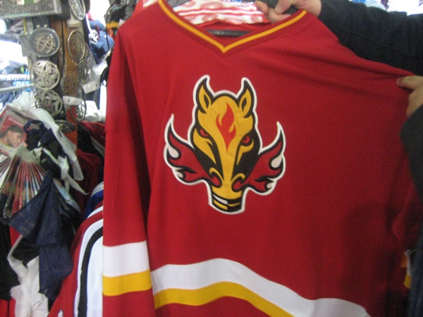
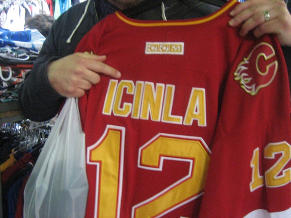
It has been a while since I busted out the mis-spelled fake jersey I saw in a market in Sydney in 2010. I feel compelled to share every so often.
These are for laughs only, given the thread. The yellow name/number on red looks pretty sharp, however. And I don't mind the "C" on the shoulders for an alternate (not unlike the "real" horse head jersey). But they look a bit too cheap for my liking.
Actually, I saw a guy on the concourse this season with one of these (no name or number though), and I couldn't help but ask him where he got it. I can't remember exactly, but something about a friend finding it in Asia somewhere at a market and bringing it back for him. Although obviously really bad fakes, they're so bad that I have to wonder why this design even exists. An old prototype? A hybrid of spare parts at the fake factory?
|
|
|
|
|
The Following User Says Thank You to Jimmy Stang For This Useful Post:
|
|
 Posting Rules
|
You may not post new threads
You may not post replies
You may not post attachments
You may not edit your posts
HTML code is Off
|
|
|
All times are GMT -6. The time now is 08:51 AM.
|
|


