I think the OP coined the name.
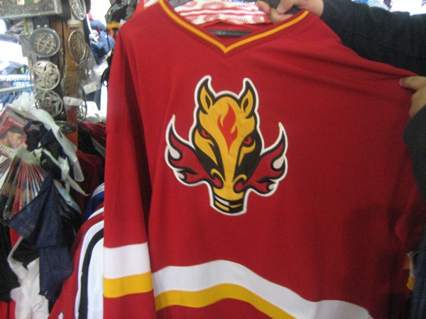
Everyone's always called that trash the flaming snot horse around here. I always hated it. Loved the team bit hated that Crest.
I had also thought it was almost universally disliked, so it's a little surprising to see so many admirers here.
I didn't, I took it from Popowich.
__________________
"This has been TheScorpion's shtick for years. All these hot takes, clickbait nonsense just to feed his social media algorithms." Tuco
The Following User Says Thank You to TheScorpion For This Useful Post:
A quick CP search shows this is the oldest post using the term “blasty”. So maybe blame Pinder.
Quote:
Originally Posted by mkd_087
Was listening to the Fan earlier with Pinder, Steinberg and Nault. They were chatting about the 3rds. Pinder had asked if it may be “Ol Blasty” as the pictures hinted it could be black. Nault piped up and said that he knew someone who had seen them and that the jerseys are red and not black. He wouldn’t give any other details, but he very confidently stated they were not black. Either way I’m buying one
Popovich has called it ol Blasty in several tweets. Maybe Pinder got it from him.
Last edited by Cecil Terwilliger; 09-02-2019 at 08:29 AM.
I wonder what kind of trauma that kid endured creating a logo that was almost universally hated for so long. He’s gotta be in his 30s by now right?
Quote:
Originally Posted by Yoho
Taken off Reddit
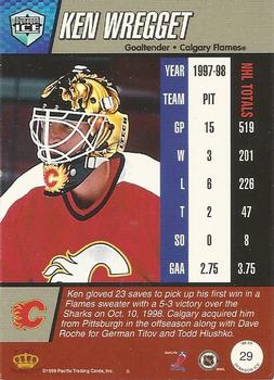
“The Horsehead was designed drawn in pencil crayon by a 14 year old kid for a contest in the Sun. He won a Ken Wregget mask and a jersey for his troubles. It's a fitting representation of the young guns (TM) era. Completely inappropriate for a Big League team.
Bonus hatred: Calgarian Todd fing Mcfarlane offered to design a proper 3rd FOR FREE but was turned down.”
I wonder what kind of trauma that kid endured creating a logo that was almost universally hated for so long. Hes gotta be in his 30s by now right?
You needed to keep reading in that thread. That kid only drew a design for Wregget's mask, not the new (at the time) logo...
Quote:
Originally Posted by tvp2003
I don't recall who originally designed the horsehead logo/jersey but I don't think this is correct. How do I know? Because I entered that very contest back in 1998.
The contest was to design Ken Wregget's mask for the upcoming season and this was the winner:
I recall the second place entry was simply the new horsehead logo (that was introduced earlier that summer?) covering the entire mask. I remember being pissed that it got second place because it showed virtually no creativity. In any event, I am 100% certain that the logo did not get designed through that contest...
Also, as Table 5 pointed out in that thread, considering what McFarlane came up with as a third jersey for the Oilers, I'd say we dodged a bullet on not getting his "free" design.
__________________
Turn up the good, turn down the suck!
Also, as Table 5 pointed out in that thread, considering what McFarlane came up with as a third jersey for the Oilers, I'd say we dodged a bullet on not getting his "free" design.
I dunno. I'd love to see what McFarlane would have done. And as far as I'm concerned he showed true Flames fandom by giving us the Mechasperm. Hopefully he charged them for it too.
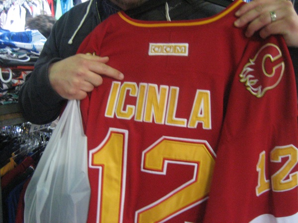
Logo itself was fine as a secondary one, but to be a primary, and, with the Flames clumsily going down the "black for the sake of black" route, as two strikes against that jersey and thet look. A lazy marketing stunt by former President Ron Bremner.
Strike 3 for that jersey came in about 2000 or 2001 when they dropped the pedestals, redid the white jersey, but left the Horsehead as the primary away jersey, with no red jersey at all until 2003.
That shirt is hilarious. Thats what he said at the end of his Norris speech.
Gio:
Quote:
I still get the text messages and the hashtag #youngandfresh sent to me pretty much weekly, said the Flames captain on Monday, with a grin as he met with the local media for the first time since returning to Calgary after spending his off-season in Toronto. A couple of the boys reached out right away (after the awards) and a couple friends back home made t-shirts with the hashtag. So I wouldnt say Ive lived it down yet.
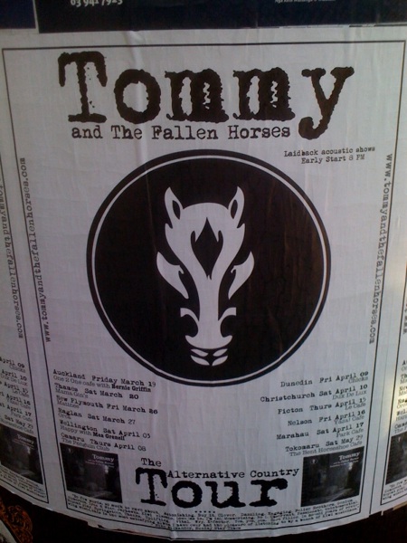
In 2010 I went on a holiday and found counterfeit/plagiarized Blasty in two unlikely locations:
Christchurch, New Zealand
Sydney, Australia
I have little else to offer this thread other than: give us full-time home AND away uniforms in the original colour palette with no tacky flags and the team can do whatever they want with the thirds. Blasty, Scorch, Scorch emerging from Blasty's nostril, 90's black everywhere, I don't even care.
In 2010 I went on a holiday and found counterfeit/plagiarized Blasty in two unlikely locations:
Spoiler!
Christchurch, New Zealand
Sydney, Australia
I have little else to offer this thread other than: give us full-time home AND away uniforms in the original colour palette with no tacky flags and the team can do whatever they want with the thirds. Blasty, Scorch, Scorch emerging from Blasty's nostril, 90's black everywhere, I don't even care.
a slightly modified blasty may or may not be used by a certain men's hockey team in kelowna. a pic of one of the guys from my team and someone i WISH was on my team... and geli LOVES these jerseys!
He looks like a mannequin mixed with somebody out of Zoolander.
__________________
"This has been TheScorpion's shtick for years. All these hot takes, clickbait nonsense just to feed his social media algorithms." Tuco