|
View Poll Results: Where would you like the Flames to go with their jerseys?
|
|
Keep with the existing set
|
   
|
9 |
2.34% |
|
go back to vintage home and away
|
  
|
229 |
59.48% |
|
go back to 2004 home and away
|
  
|
26 |
6.75% |
|
minor tweak to the existing set (piping, flags)
|
  
|
40 |
10.39% |
|
new design that adds black to the retro look
|
  
|
36 |
9.35% |
|
completely new design
|
  
|
39 |
10.13% |
|
other (elaborate)
|
|
6 |
1.56% |
 06-10-2017, 02:21 PM
|
#81
|
|
First Line Centre
|
I agree with the shoulder patches. That blue on red was so goddamn tacky it always bugged the hell outta me.
|

|
|
|
06-10-2017, 02:55 PM
|
#82
|
|
That Crazy Guy at the Bus Stop
Join Date: Jun 2010
Location: Springfield Penitentiary
|
I've never understood the mcdonalds comparison.
Our regular retros look way more like mcdonalds than the heritage jerseys did. It makes no sense.
|
|
|
|
|
The Following 3 Users Say Thank You to Cecil Terwilliger For This Useful Post:
|
|
|
06-10-2017, 03:07 PM
|
#83
|
|
Scoring Winger
Join Date: Sep 2010
Location: Calgary
|
Quote:
Originally Posted by Cecil Terwilliger

I've never understood the mcdonalds comparison.
Our regular retros look way more like mcdonalds than the heritage jerseys did. It makes no sense.
|
Google Ronald McDonald...you'll see it.
|
|
|
|
|
06-10-2017, 03:09 PM
|
#84
|
|
Powerplay Quarterback
|
Quote:
Originally Posted by Cecil Terwilliger
I've never understood the mcdonalds comparison.
Our regular retros look way more like mcdonalds than the heritage jerseys did. It makes no sense.
|
For me it was the clearly knock-off Heritage jerseys that reminded me of Ronald Mcdonald
__________________
Quote:
Originally Posted by HotHotHeat
THIS is why people make fun of Edmonton. When will this stupid city figure it out? They continue to kick their own ass every day, it's impossible not to make fun of them.
|
|
|
|
|
|
The Following 4 Users Say Thank You to Sutter_in_law For This Useful Post:
|
|
|
06-10-2017, 04:25 PM
|
#85
|
|
Franchise Player
Join Date: Sep 2013
Location: Brisbane
|
Quote:
Originally Posted by Cecil Terwilliger
I've never understood the mcdonalds comparison.
Our regular retros look way more like mcdonalds than the heritage jerseys did. It makes no sense.
|
I don't understand it either. Ronald McDonald wears red and white stripes with yellow overalls, it's nothing like the heritage jersey. Besides pretty much every team in the league shares their colours with a major brand, it's not a big deal. That said the current Flames jerseys make me think of Lego.
I'm not a big fan of the heritage jerseys though, there is something not quite right about them. I think it is a combination of:
1. Another "jersey by committee" trying to combine the Flames and Tigers looks.
2. The Flames already had a great retro jersey which was worn against Montreal in 2 Stanley Cups.
3. Other outdoor games had great jerseys, these are just meh in comparison.
__________________
The masses of humanity have always had to surf.
|
|
|
|
|
06-10-2017, 04:40 PM
|
#86
|
|
Lifetime Suspension
|
probaly not a popular thought, but i would love if the flames went tan instead of white for their away jerseys.. the tan on the heritage jerseys were gorgeous in my opinion
|
|
|
|
|
06-10-2017, 07:05 PM
|
#87
|
|
All I can get
|
I think the new design will be cleaner and less busy. I do think there'll be some vertical Adidas three stripes incorporated somewhere.
|
|
|
|
|
The Following User Says Thank You to Reggie Dunlop For This Useful Post:
|
|
|
06-10-2017, 07:18 PM
|
#88
|
|
Franchise Player
|

Quote:
Originally Posted by Cecil Terwilliger
I've never understood the mcdonalds comparison.
Our regular retros look way more like mcdonalds than the heritage jerseys did. It makes no sense.
|
The fake knock off heritage classic jerseys using the retro red/yellow that came out before the real ones did is where the McDonalds look came from. They botched the roll out by revealing the design before they had jerseys to sell
So the knock off companies screwed them all up.
The actual Jeresies looked fantastic.
We really have had 2 good Jerseys which worked well for their time. The retros and the 03-07. Black is getting tires so time to move away from it so something retroish is the way to go.
For a third jersey I liked the Horsehead. That is what a third jersey should be. Try out different stuff and see what it looks like. I think a Black on Black jersey with a black C with just red and yellow piping around the C would be pretty slick for a third. Or do something else that is out there like Yellow as the main colour. Keep the the regular uniforms modifications around a classic theme then each year push an ultra modern third of which some will be terrible and some will be cools
|
|
|
|
|
The Following User Says Thank You to GGG For This Useful Post:
|
|
|
06-10-2017, 08:12 PM
|
#89
|
|
#1 Goaltender
|
I don't think most people under 30 know who ronald mcdonald is... Maybe older. I haven't seen him on tv since the 80s. If the flames are taking heat for looking like him its a pretty dated reference. Not that I think those jerseys should come back anyway.
|
|
|
|
|
06-10-2017, 08:18 PM
|
#90
|
|
Franchise Player
|
Quote:
Originally Posted by Matty81
I don't think most people under 30 know who ronald mcdonald is... Maybe older.
|
Lol?
|
|
|
|
|
The Following 8 Users Say Thank You to Oling_Roachinen For This Useful Post:
|
|
|
06-10-2017, 08:36 PM
|
#91
|
|
Franchise Player
Join Date: Sep 2013
Location: Brisbane
|
The 2003-2007 jerseys are nice and easily the 2nd best ever. Unfortunately they have one glaring ugly flaw that prevented me from ever buying one:
__________________
The masses of humanity have always had to surf.
|
|
|
|
|
The Following User Says Thank You to FireGilbert For This Useful Post:
|
|
|
06-10-2017, 09:06 PM
|
#92
|
|
Powerplay Quarterback
|
Quote:
Originally Posted by FireGilbert
The 2003-2007 jerseys are nice and easily the 2nd best ever. Unfortunately they have one glaring ugly flaw that prevented me from ever buying one:
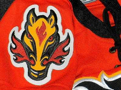 |
The Flaming Snot Horsehead logo was perfectly fine as a shoulder patch. For me, the only flaw of the 2003-2007 jerseys was the font used for name and numbers.
|
|
|
|
|
The Following 11 Users Say Thank You to Howie_16 For This Useful Post:
|
apiquard,
BigT112,
BurningYears,
Flamezzz,
jayswin,
Kipper_3434,
MisterJoji,
Mony,
Otto-matic,
PepsiFree,
PugnaciousIntern
|
|
06-10-2017, 09:25 PM
|
#93
|
|
Franchise Player
Join Date: Sep 2013
Location: Brisbane
|
Quote:
Originally Posted by Howie_16
The Flaming Snot Horsehead logo was perfectly fine as a shoulder patch. For me, the only flaw of the 2003-2007 jerseys was the font used for name and numbers.
|
It is a stupid, ugly logo no matter what part of the jersey it is on. The fact it is described as flaming snot should be enough evidence of that. The creation of that gross monstrosity is a very dark part of Flames history.
__________________
The masses of humanity have always had to surf.
|
|
|
|
|
06-10-2017, 11:42 PM
|
#94
|
|
First Line Centre
|
Quote:
Originally Posted by FireGilbert
It is a stupid, ugly logo no matter what part of the jersey it is on. The fact it is described as flaming snot should be enough evidence of that. The creation of that gross monstrosity is a very dark part of Flames history.
|
I completely disagree, I love the horse head logo. I know many don't but it is definitely not a "dark part of Flames history". I still have my sweet black horse head third Jersey and rock it at least once a year.
|
|
|
|
|
The Following 4 Users Say Thank You to Since1984 For This Useful Post:
|
|
|
06-11-2017, 12:15 AM
|
#95
|
|
Powerplay Quarterback
|
Quote:
Originally Posted by FireGilbert
It is a stupid, ugly logo no matter what part of the jersey it is on. The fact it is described as flaming snot should be enough evidence of that. The creation of that gross monstrosity is a very dark part of Flames history.
|
"My opinion is better than your opinion."
|
|
|
|
|
06-11-2017, 12:53 AM
|
#96
|
|
Lifetime Suspension
|
Lol at the NHL thinking this will get me to watch the awards show.
|
|
|
|
|
The Following User Says Thank You to Love For This Useful Post:
|
|
|
06-11-2017, 01:10 AM
|
#97
|
|
Franchise Player
Join Date: Sep 2013
Location: Brisbane
|
I'm surprised at the love for the horse head. I thought it was almost universally hated but clearly I was wrong. I'm willing to admit it was at least the best third jersey in Flames history though.
__________________
The masses of humanity have always had to surf.
|
|
|
|
|
06-11-2017, 01:20 AM
|
#98
|
|
Acerbic Cyberbully
Join Date: Aug 2003
Location: back in Chilliwack
|
Quote:
Originally Posted by dissentowner
Maybe if the team moves to Hogwarts. Team Gryffindor!
 |
Come on! How awesome is it that the Flames are Gryffindor's team?
|
|
|
|
|
06-11-2017, 11:34 AM
|
#99
|
|
First Line Centre
Join Date: Oct 2014
Location: Vancouver, B.C.
|
The only Flames Jerseys that I really liked when they came out besides our originals were the 94/95 Jerseys as well as the 03/04 Jerseys. Everything else has been a dissapointment.
|
|
|
|
|
06-11-2017, 12:09 PM
|
#100
|
|
Celebrated Square Root Day
|
Quote:
Originally Posted by locsofblu
The only Flames Jerseys that I really liked when they came out besides our originals were the 94/95 Jerseys as well as the 03/04 Jerseys. Everything else has been a dissapointment.
|
They've only had three jersey designs, you said you liked two of them and hated the rest. 
|
|
|
|
|
The Following User Says Thank You to jayswin For This Useful Post:
|
|
 Posting Rules
|
You may not post new threads
You may not post replies
You may not post attachments
You may not edit your posts
HTML code is Off
|
|
|
All times are GMT -6. The time now is 11:24 PM.
|
|