 01-20-2022, 01:49 PM
|
#2921
|
|
Powerplay Quarterback
Join Date: Mar 2014
Location: MTL
|
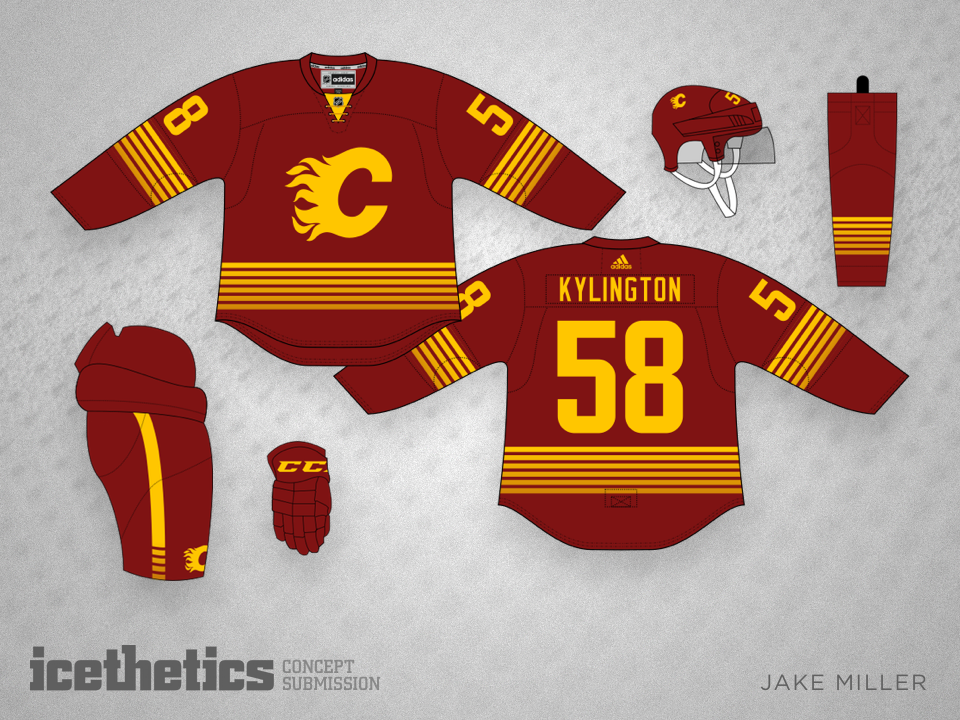
I liked this dark concept as a third personally. Something fun, clean, design oriented.
|

|

|
|
The Following 10 Users Say Thank You to Funkhouser For This Useful Post:
|
|
|
01-20-2022, 01:53 PM
|
#2922
|
|
#1 Goaltender
Join Date: Jan 2009
Location: Calgary
|
Quote:
Originally Posted by Funkhouser

I liked this dark concept as a third personally. Something fun, clean, design oriented.
|
Everything about this concept says that I shouldn't like it, but I like it for some reason.
|
|
|
|
|
The Following User Says Thank You to _Q_ For This Useful Post:
|
|
|
01-20-2022, 01:55 PM
|
#2923
|
|
Franchise Player
|
Quote:
Originally Posted by Funkhouser
I liked this dark concept as a third personally. Something fun, clean, design oriented.
|
Yeah, I really hope we get some 3rd/4th/5th jerseys like this. It's rad.
|
|
|
|
|
The Following User Says Thank You to ComixZone For This Useful Post:
|
|
|
01-20-2022, 01:56 PM
|
#2924
|
|
Franchise Player
|
I think Vancouver really ruined a lot of these black colour combos for us when they had black as their colour. They just all come out looking like this:
|
|
|
|
|
The Following User Says Thank You to Fuzz For This Useful Post:
|
|
|
01-20-2022, 01:57 PM
|
#2925
|
|
First round-bust
Join Date: Feb 2015
Location: speculating about AHL players
|
I would love to see the matching socks with that concept!
__________________
"This has been TheScorpion's shtick for years. All these hot takes, clickbait nonsense just to feed his social media algorithms." Tuco
|

|
|
|
01-20-2022, 02:21 PM
|
#2926
|
|
First Line Centre
Join Date: Oct 2002
Location: Calgary
|
Quote:
Originally Posted by SuperMatt18
I hated the flags on the shoulders
But if the end up living on the neck (preferably inside the neck) or somewhere else on the jersey I'm okay with that.
The flags were very much something Ken King was very proud of, and if they remain as a way to honor him but in a smaller, less ugly way then I'm fine with that.

The different striping pattern on the sleeves and hem would have driven me crazy.
Makes it look like the wal-mark knock offs |
What a bizarre thing to have the patterns not matching... Wal-Mart knock off is right. How would that get approved by the Flames if this was indeed to be a third jersey this year?
|
|
|
|
|
01-20-2022, 03:31 PM
|
#2927
|
|
First Line Centre
Join Date: Oct 2009
Location: Calgary
|
Quote:
Originally Posted by Funkhouser
I liked this dark concept as a third personally. Something fun, clean, design oriented.
|
Looks a bit like the newer Utah Jazz branding.
|
|
|
|
|
01-20-2022, 04:00 PM
|
#2928
|
|
First Line Centre
|
Quote:
Originally Posted by Funkhouser
I liked this dark concept as a third personally. Something fun, clean, design oriented.
|
Tequila sunrise jersey! I'd take it
|
|
|
|
|
01-20-2022, 05:26 PM
|
#2929
|
|
Powerplay Quarterback
|
Quote:
Originally Posted by Funkhouser
I liked this dark concept as a third personally. Something fun, clean, design oriented.
|
My first reaction was "that's not too bad, reminds me of the Houston Astros." Then "Houston" triggered the thought that Murray Edwards backed out of the Event Centre and may threaten to move the Flames there, so now I am unnecessarily angry. 
|
|
|
|
|
The Following User Says Thank You to Howie_16 For This Useful Post:
|
|
|
01-20-2022, 06:16 PM
|
#2930
|
|
Franchise Player
Join Date: Dec 2005
Location: back in the 403
|
Quote:
Originally Posted by TheScorpion
But then they ditched it in favour of something that's coming next season. Let me just say, it was the right call.
|
Not expecting you to answer as I'm sure you can't...but it's the return of the 2004 version black C jerseys isn't it. Just a feeling.
|
|
|
|
|
The Following User Says Thank You to Sainters7 For This Useful Post:
|
|
|
01-20-2022, 07:58 PM
|
#2931
|
|
Franchise Player
Join Date: Mar 2002
Location: Calgary
|

Quote:
Originally Posted by Sainters7
Not expecting you to answer as I'm sure you can't...but it's the return of the 2004 version black C jerseys isn't it. Just a feeling.
|
Well I remember KK saying he had a ton of prototypes that never saw the light of day both in 2003 and then again in 2009 and then when the script jersey came out in 2013.
The old red jersey with the black C was still in rotation last year probably because of NHL licensing rules around jerseys that the Flames had to fulfill. Bit also as Ken King and Hotchkiss and some other owners at the time were the ones that liked the flags. Again, the original plan (I heard straight from the mouths ( was to just have a maple leaf and the AB coat of Arms from the flag, not the full flags, but they weren't allowed to so this is what they settled on.
This prototype was probably created as a mash together to in part honor KK with the bits of the jerseys he was a part of while in charge, but I would say it was unlikely to ever see the light of day.
Again, I think bringing back the 2004 jersey as a third is a big mistake. Even if they bring them back for some sort of NHL program, and the main reason is that they aren't going to sell many. Sales are a driving force and tens of thousands of them were sold in this city. They ran out after the first round in 2004, and people I know that have gone to 2 hockey games since, bought a jersey back then.
There's so much potential for doing something different design wise. Some of those reverse retros were absolutely great, Kings, Wild, even the Oilers, and the Flames trotted out something they dusted off from 1997...they shouldn't do the same from 2003 for a 3rd jersey which should be a bit off the wall.
Last edited by browna; 01-20-2022 at 08:00 PM.
|
|
|
|
|
The Following User Says Thank You to browna For This Useful Post:
|
|
|
01-20-2022, 08:30 PM
|
#2932
|
|
Franchise Player
Join Date: Dec 2005
Location: back in the 403
|
Yep, those are all good points. I guess my reasoning for saying that is, after years of Flames brass responsible for such things seemingly ignoring fan outcries for what they wanted and instead putting their own twist on it, this new regime seems to be giving the fans what they want:
A large portion of the fans were vocal for years about wanting a true return to the retro look, and they gave it to us. Then in the last 2-3 years people were clamouring for a Blasty return, and the Flames gave it to us. I have no doubt those in charge have also heard the ongoing desire for a return of the 2003-06 original black C, and I just have a feeling they'll give us that too.
It seems to be the trend under this new marketing team, and Flames current Director of Marketing & Promotions Ryan Popowich who is active on Twitter and seems to really understand what the fanbase wants in terms of uniforms, to give us what we want. Of course this is all pure speculation, but that's just what I feel will happen. But we will see...
|
|
|
|
|
The Following User Says Thank You to Sainters7 For This Useful Post:
|
|
|
01-20-2022, 08:49 PM
|
#2934
|
|
Franchise Player
|
what is with Vancouver's fascination with Flames' colours?
|
|
|
|
|
01-20-2022, 09:01 PM
|
#2935
|
|
Franchise Player
Join Date: Mar 2002
Location: Calgary
|
Quote:
Originally Posted by Reggie Dunlop
I predict a minimalist design, perhaps two colours total (black and red) with simple striping. Similar to what the Stars and the Oilers have done. A Blasty or Flaming C outline as primary cresting.
|
From post 1621 in this thread has something along those lines.
On page one, user Tomo had some very sharp graphite jerseys, but pics are now gone.
|
|
|
|
|
The Following 4 Users Say Thank You to browna For This Useful Post:
|
|
|
01-20-2022, 09:34 PM
|
#2936
|
|
Powerplay Quarterback
Join Date: Dec 2009
Location: Tokyo, Japan
|
Quote:
Originally Posted by Howie_16
My first reaction was "that's not too bad, reminds me of the Houston Astros." Then "Houston" triggered the thought that Murray Edwards backed out of the Event Centre and may threaten to move the Flames there, so now I am unnecessarily angry. |
"Mesquite grilled onions, jalapeno relish...wait a minute, those are southwestern ingredients! Mango-lime salsa? That's the kind of bold flavor they enjoy in...ALBUQUERQUE!!!"
|
|
|
|
|
The Following 4 Users Say Thank You to P-DAZZLE For This Useful Post:
|
|
|
01-20-2022, 09:54 PM
|
#2937
|
|
#1 Goaltender
|
That sunrise jersey is really cool. I do hope the nhl starts playing with unique thirds like that every year or two.
|
|
|
|
|
01-20-2022, 10:49 PM
|
#2938
|
|
First Line Centre
|
Quote:
Originally Posted by Matty81
That sunrise jersey is really cool. I do hope the nhl starts playing with unique thirds like that every year or two.
|
Agreed. Make a new third every 1-2 years. Have fun with them like nba or EPL. You dont like them one year, dont buy one they will be gone soon
|
|
|
|
|
01-21-2022, 01:32 AM
|
#2939
|
|
Celebrated Square Root Day
|
Quote:
Originally Posted by mile
|
Those are beer league level shoulder patches, they look so wildly and yet boring at the same time. They look way too much like a logo to be a shoulder patch, all they do is detract from the flaming C logo. I've never understood the CP fascination with them, at all.
Too much for a shoulder patch, too boring for a main logo. Shoulder patches aren't meant to attract attention away from the main logo in that manner. It's like putting two patches of a runner up main jersey logo on the shoulders.
Last edited by jayswin; 01-21-2022 at 01:59 AM.
|
|
|
|
|
The Following 2 Users Say Thank You to jayswin For This Useful Post:
|
|
|
01-21-2022, 05:54 AM
|
#2940
|
|
Powerplay Quarterback
Join Date: Jan 2003
Location: Toronto, ON
|
Quote:
Originally Posted by TheScorpion
But then they ditched it in favour of something that's coming next season. Let me just say, it was the right call.
|
as long as it's not the pedestal then everything should be fine.
__________________
*Disclaimer: I am a "glass half full" Flames fan. 
|
|
|
|
|
The Following 2 Users Say Thank You to robertsfanatic For This Useful Post:
|
|
 Posting Rules
|
You may not post new threads
You may not post replies
You may not post attachments
You may not edit your posts
HTML code is Off
|
|
|
All times are GMT -6. The time now is 11:46 PM.
|
|


