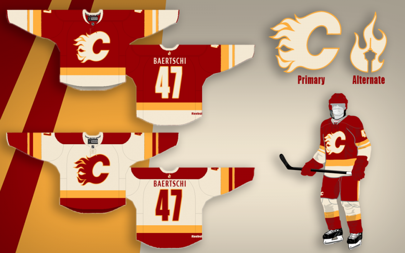
I first saw these on CP close to two years ago. I have been an avid flames fan since 1990. Yet I have never loved a flames jersey enough to want to purchase one. These jerseys are still the sharpest I've seen and I would gladly purchase a home and away if they came into production. They have a retro-ish look to them but are truly original. The debate is over IMO.
The suggestion to move the tower to the shoulders is the icing on the cake. Applause to the designer and this suggestion.
Sorry I missed his, but thanks!
I don't think Reebok would ever let their logo be shifted, so the shoulder would be the home for the tower as well. I'd also be a bug fan of keeping the shoulders blank and keeping things clean.
One of the earlier ideas was go put it on the cuff as the Blue Jackets have. Cool little hidden effect.
The Following 2 Users Say Thank You to Split98 For This Useful Post:
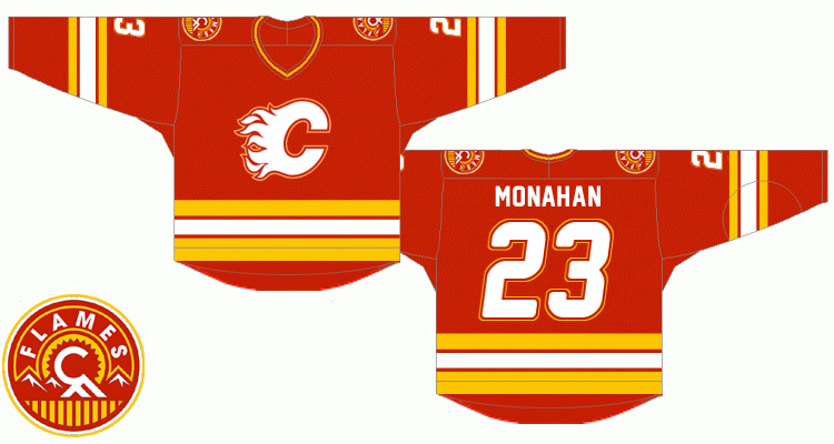
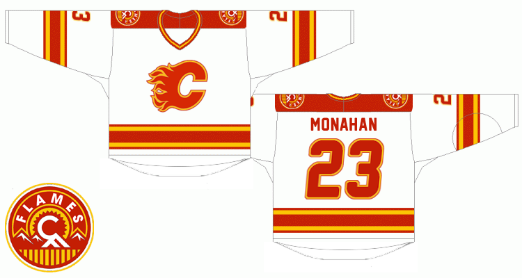
So I think I'm finally pretty happy with the concept. After playing around with the nameplate font, I found that I really did just love the clean (though Coyote's-esque) simple sans font. I also still never dug adding the extra band to the waist and included here is the neck-placement alternate logo that would be a great place if Reebok does end up allowing their branding relocation. I also retained the tie-ups, but decided on a jersey coloured thread to blend while keeping the (IMO) great look of a tie-up. Blends, avoids the clutter that bothered some people and adds that classic tie-up touch.
Thanks a lot for the positive response guys, this was definitely something I've had a ton of fun working on.
With people talking jerseys again, this needed to be bumped. Plus, maybe we can convince split98 to fix the small problem with them.
The Following 6 Users Say Thank You to morgin For This Useful Post:
I really love Split's design. Fantastic looking jersey and the secondary logo is great. The only thing is, I don't ever see the Flames changing from the shade of red that they've always worn.
I really love Split's design. Fantastic looking jersey and the secondary logo is great. The only thing is, I don't ever see the Flames changing from the shade of red that they've always worn.
Funny enough, I designed it to be the same red! That colour looks different on every gen of jersey, it's hilarious.
Well... that... and jpeg compression altering the RGB... but...
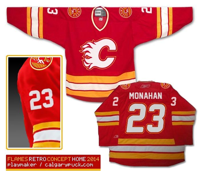
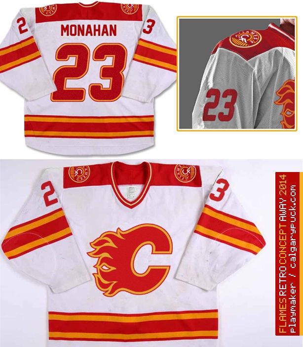
I tried to photoshop my previously posted retro concept (the one enclosed in spoiler tags below) into images of real jerseys, hope you like it.
Spoiler!
Although I did my best to find and combine various jersey images, the fact is that I'm not a professional graphic designer so please note that color shades and some details such as stitching may not necessarily correspond to an actual Reebok jersey.
Anyways, I'm hoping that these two will give a better impression of what the real thing would look like. In comparison to the previous iteration there are two minor changes - sleeve numbers are not outlined (in order to achieve a sharper look) and the flaming C is larger than before.
here we go ...
Last but not least, as the third jersey I'd choose our home uniforms from 2004:
Fantastic!
The Following 4 Users Say Thank You to MJK For This Useful Post: