 06-01-2012, 09:17 AM
|
#241
|
|
Powerplay Quarterback
|
Quote:
Originally Posted by FlamingInfinity

Saw the Columbus idea, and did a quick PS job... Thoughts?
 |
I somewhat like those. They just look good. Vast improvement over some of the monstrosities in this thread.
__________________
"Somebody may beat me, but they are going to have to bleed to do it."
-Steve Prefontaine
|

|

|
|
06-01-2012, 12:03 PM
|
#242
|
|
Scoring Winger
Join Date: Mar 2012
Location: Halifax, NS
|
While I don't want to see us go all black, I think having some black works to ground the uniforms, especially on the bottom of the jersey.
I think removing too much black could be detrimental.
__________________
"Im on a mission to civilize." - Will McAvoy
|
|
|
|
|
06-01-2012, 06:57 PM
|
#243
|
|
Backup Goalie
Join Date: Nov 2009
Location: Toronto
Exp: 
|
I have this hoodie at home and think a jersey based on this would look good. 
|
|
|
|
|
The Following 3 Users Say Thank You to Iveman For This Useful Post:
|
|
|
06-01-2012, 07:45 PM
|
#244
|
|
Lifetime Suspension
|
IMO we need a update of the logo as well.
|
|
|
|
|
06-01-2012, 08:20 PM
|
#245
|
|
#1 Goaltender
Join Date: Aug 2011
Location: Not cheering for losses
|
Quote:
Originally Posted by Kipperking
IMO we need a update of the logo as well.
|

|
|
|
|
|
The Following 30 Users Say Thank You to sun For This Useful Post:
|
Ashasx,
badradio,
bc-chris,
calculoso,
cgy2london,
chalms04,
Cheerio,
DaQwiz,
Dx54,
HPLovecraft,
Itse,
Jimmy Stang,
Lt.Spears,
mac_82,
Mccree,
Milt Schmidt,
MissTeeks,
MrMastodonFarm,
Mustache,
OBCT,
OffsideSpecialist,
Otto-matic,
Pierre "Monster" McGuire,
rayne008,
redflamesfan08,
redforever,
sec304,
SuperMatt18,
Yeah_Baby,
You Need a Thneed
|
|
06-01-2012, 08:21 PM
|
#246
|
|
#1 Goaltender
|
Quote:
Originally Posted by Kipperking
IMO we need a update of the logo as well.
|
If there is one thing we do not need is a new logo. They can change anything they want except the logo and the primary color.
|
|
|
|
|
The Following User Says Thank You to Flames in 07 For This Useful Post:
|
|
|
06-02-2012, 01:12 PM
|
#247
|
|
Franchise Player
Join Date: Aug 2007
Location: Ontario
|
Quote:
Originally Posted by Kipperking
IMO we need a update of the logo as well.
|
The logo should never, and will never be changed
IMO, the logo will live on in the NHL future as one of the most iconic and timeless of the logos. Chicago, Montreal, Philadelphia, Boston, St. Louis, Colorado, Detroit, NJ and Calgary are all teams that will only ever slightly tweak their logo.
Last edited by Split98; 06-02-2012 at 01:15 PM.
|
|
|
|
|
The Following 2 Users Say Thank You to Split98 For This Useful Post:
|
|
|
06-02-2012, 01:54 PM
|
#248
|
|
First Line Centre
Join Date: Dec 2009
Location: DeWinton
|
Quote:
Originally Posted by Split98
The logo should never, and will never be changed
IMO, the logo will live on in the NHL future as one of the most iconic and timeless of the logos. Chicago, Montreal, Philadelphia, Boston, St. Louis, Colorado, Detroit, NJ and Calgary are all teams that will only ever slightly tweak their logo.
|
I agree..Look how well it turned out for the Islanders..All that tradition and they change their logo to that stupid captain highliner logo..It was brutal, lasted only a year or two then they switched back.l
|
|
|
|
|
06-02-2012, 02:28 PM
|
#249
|
|
Lifetime Suspension
Join Date: Jan 2010
Location: 89' First Round Game Seven Overtime
|
13 pages of ideas and not one decent design. I don't want to be too harsh but man, they all suck IMO, sorry.
Our current jersey is awesome, the retro 3rd is awesome. My only request would be to have a white retro Jersey, Im sure we will see it someday.
Im sure glad none of you guys are doing design work for the Flames....
Edit: Ken King Please DO NOT read this thread. Sheesh
Last edited by Mike Vernon; 06-02-2012 at 02:30 PM.
|
|
|
|
|
The Following User Says Thank You to Mike Vernon For This Useful Post:
|
|
|
06-02-2012, 03:02 PM
|
#250
|
|
Franchise Player
|
Quote:
Originally Posted by Mike Vernon
13 pages of ideas and not one decent design. I don't want to be too harsh but man, they all suck IMO, sorry.
Our current jersey is awesome, the retro 3rd is awesome. My only request would be to have a white retro Jersey, Im sure we will see it someday.
Im sure glad none of you guys are doing design work for the Flames....
Edit: Ken King Please DO NOT read this thread. Sheesh
|
No one ever read any of Mike Vernon's posts. I'm sorry, not to be harsh - but they all suck IMO, sorry (except not really, because they suck).
Edit: Ken King, I like Giraffes and pickle pot pies. Sheesh.
|
|
|
|
|
The Following 3 Users Say Thank You to ComixZone For This Useful Post:
|
|
|
06-02-2012, 03:29 PM
|
#251
|
|
Crash and Bang Winger
Join Date: Dec 2011
Location: Calgary
|
Quote:
Originally Posted by Split98
The logo should never, and will never be changed
IMO, the logo will live on in the NHL future as one of the most iconic and timeless of the logos. Chicago, Montreal, Philadelphia, Boston, St. Louis, Colorado, Detroit, NJ and Calgary are all teams that will only ever slightly tweak their logo.
|
I agree, the Flames have a great logo, changing it would be a huge mistake.
Milt
|
|
|
|
|
06-02-2012, 04:39 PM
|
#252
|
|
Celebrated Square Root Day
|
Quote:
Originally Posted by Mike Vernon
13 pages of ideas and not one decent design. I don't want to be too harsh but man, they all suck IMO, sorry.
Our current jersey is awesome, the retro 3rd is awesome. My only request would be to have a white retro Jersey, Im sure we will see it someday.
Im sure glad none of you guys are doing design work for the Flames....
Edit: Ken King Please DO NOT read this thread. Sheesh
|
nm
|
|
|
|
|
06-02-2012, 04:42 PM
|
#253
|
|
Took an arrow to the knee
Join Date: Mar 2006
Location: Toronto
|
I don't think they all suck, but I don't think any of them are all that good, either. Goes to show just how difficult it is to design a jersey that can stand the test of time.
__________________
"An adherent of homeopathy has no brain. They have skull water with the memory of a brain."
|
|
|
|
|
06-02-2012, 04:48 PM
|
#254
|
|
Franchise Player
Join Date: Oct 2006
Location: Calgary
|
Quote:
Originally Posted by HPLovecraft
I don't think they all suck, but I don't think any of them are all that good, either. Goes to show just how difficult it is to design a jersey that can stand the test of time.
|
It's also pretty difficult when your muse on this is Flames. It is extremely difficult to not get something that is fugly just on the nature of the subject.
|
|
|
|
|
The Following User Says Thank You to Caged Great For This Useful Post:
|
|
|
06-02-2012, 05:47 PM
|
#255
|
|
Scoring Winger
Join Date: Mar 2012
Location: Halifax, NS
|
I don't want to see the Flames change the logo drastically like the Coyotes did back in 03-04. But I wouldn't be opposed to a slight modification.
__________________
"Im on a mission to civilize." - Will McAvoy
|
|
|
|
|
06-02-2012, 09:47 PM
|
#256
|
|
Celebrated Square Root Day
|
Quote:
Originally Posted by JerryUnderscore
I don't want to see the Flames change the logo drastically like the Coyotes did back in 03-04. But I wouldn't be opposed to a slight modification.
|
Noooooooooooo!!!! 
|
|
|
|
|
06-02-2012, 09:59 PM
|
#257
|
|
Franchise Player
Join Date: Feb 2009
Location: Abbotsford, BC
|
If any team needs a new logo it's the Carolina Hurricanes.
|
|
|
|
|
06-02-2012, 09:59 PM
|
#258
|
|
Lifetime Suspension
Join Date: Sep 2006
Location: home, calgary
|
Quote:
Originally Posted by Dr. Pepper
Just for kicks and giggles - and since I'd never seen this before:
 |
i love the historical aspect, i would buy one of these in a second
|
|
|
|
|
06-03-2012, 12:40 AM
|
#259
|
|
Franchise Player
Join Date: Aug 2007
Location: Ontario
|
Quote:
Originally Posted by CedarMeter
I agree..Look how well it turned out for the Islanders..All that tradition and they change their logo to that stupid captain highliner logo..It was brutal, lasted only a year or two then they switched back.l
|
Them, and the Sabres. They left a clean, impactful and significant logo for something they considered more modern... and they ultimately returned to their original style after enduring years of fan hate.
I can totally get behind, and get excited about tweaks and 3rd jerseys... but these teams have nailed their logos and trying to improve will only end in disaster.
The only 'iconic' teams I can see benefiting from a redesign are the Rangers (just permanently switch to the Liberty head already) and Toronto. Toronto being tougher, but a sans-serif font sitting on a Maple Leaf is hardly a perfect design.
Anywho... I digress...
Last edited by Split98; 06-03-2012 at 12:44 AM.
|
|
|
|
|
06-03-2012, 01:29 AM
|
#260
|
|
Franchise Player
Join Date: Aug 2007
Location: Ontario
|
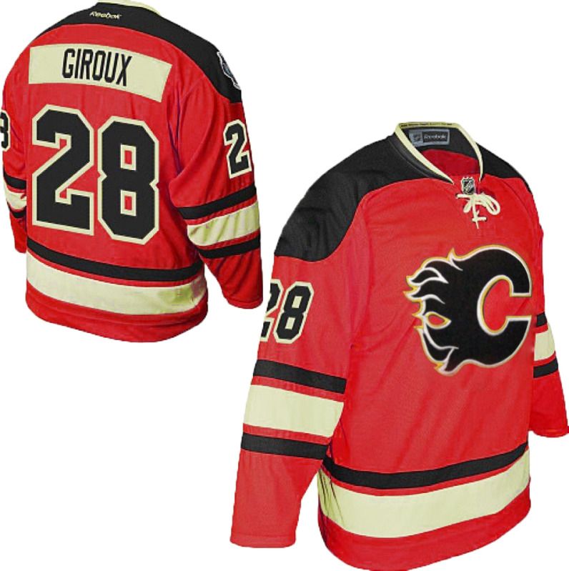
Idea that was posted earlier... but I am really liking the Flyers Classic as Flames silks. Just a super quick colour and logo adjustment:
|
|
|
|
 Posting Rules
|
You may not post new threads
You may not post replies
You may not post attachments
You may not edit your posts
HTML code is Off
|
|
|
All times are GMT -6. The time now is 05:58 PM.
|
|


