 09-06-2019, 02:26 PM
|
#81
|
|
Ate 100 Treadmills
|
Quote:
Originally Posted by Tyler

Would someone please just kill these stupid flag jerseys once and for all?! OH THE HUMANITY
|
Every year they look more and more dated. The excessive use of black. The weird off red tone.
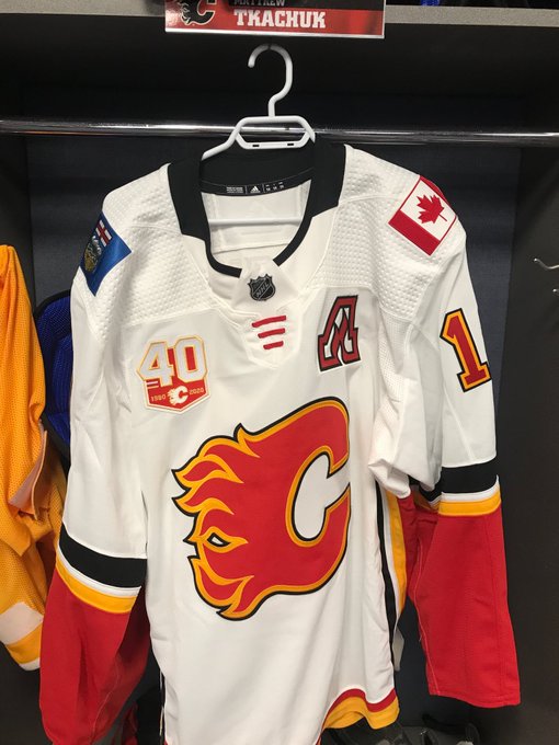
Also, the number of patches is getting excessive. A captain/assistant now hands 2 patches on the chest plus the NHL symbol/fake strings, 2 shoulder patches, and 2 jersey number patches.
|

|

|
|
09-06-2019, 02:37 PM
|
#82
|
|
First Line Centre
Join Date: Oct 2002
Location: Calgary
|
Do teams wear anniversary patches in the post season? I honestly cant recall.
|
|
|
|
|
09-06-2019, 02:43 PM
|
#83
|
|
Backup Goalie
Join Date: Oct 2009
Exp: 
|
Quote:
Originally Posted by the-rasta-masta
Do teams wear anniversary patches in the post season? I honestly cant recall.
|
Usually, and through the finals as well

|
|
|
|
|
09-07-2019, 07:27 AM
|
#84
|
|
Powerplay Quarterback
Join Date: Nov 2014
Location: Calgary, AB
|
Quote:
Originally Posted by brew
Usually, and through the finals as well
|
I would imagine, that if we made the finals (knock on wood) this year, we would do the same idea with our retro jerseys, and wear the patch on the shoulder. The finals patch would gloriously be nestles om the chest.
|
|
|
|
|
09-07-2019, 12:07 PM
|
#85
|
|
Scoring Winger
Join Date: Jul 2018
Location: 403
|
Quote:
Originally Posted by rohara66
That retro patch on that non-retro jersey is bush league.
30 seconds in photoshop:

How the patch Flames logo doesn't match the main Flames log 4" away is just plain lazy work on the Flames end. |


Last edited by TheRealPepman; 09-07-2019 at 12:10 PM.
|
|
|
|
|
The Following 4 Users Say Thank You to TheRealPepman For This Useful Post:
|
|
|
09-09-2019, 02:37 AM
|
#86
|
|
Backup Goalie
Join Date: Dec 2017
Location: Enemy territory
Exp:
|
Unpopular opinion. Patch looks dumb on the home jersey and in general. 30th patch was better.
|
|
|
|
|
09-11-2019, 09:36 PM
|
#87
|
|
Scoring Winger
Join Date: Jul 2018
Location: 403
|

Thoughts on how it looks on TV thus far?
|
|
|
|
|
The Following User Says Thank You to tvp2003 For This Useful Post:
|
|
|
10-03-2019, 12:21 PM
|
#89
|
|
#1 Goaltender
|
Feels cheap to not have multiple versions of the logo in different colors. Vancouver has different colors for theirs depending on which jersey they are wearing.
|
|
|
|
|
10-03-2019, 12:50 PM
|
#90
|
|
Franchise Player
Join Date: Feb 2007
Location: Calgary, AB
|
I actually don't mind it on the home and retro but yeah on the road it's too washed out. Probably should have had a different version for that jersey.
|
|
|
|
|
10-03-2019, 12:51 PM
|
#91
|
|
Franchise Player
Join Date: Aug 2007
Location: Ontario
|
Quote:
Originally Posted by bax
Feels cheap to not have multiple versions of the logo in different colors. Vancouver has different colors for theirs depending on which jersey they are wearing.
|
Yeah, I think this was a rush job
|
|
|
|
|
10-03-2019, 01:01 PM
|
#92
|
|
Scoring Winger
Join Date: Nov 2006
Location: Calgary, AB
|
Quote:
Originally Posted by tvp2003
So... um... yeah...
 |
Ken King please read?
|
|
|
|
|
10-03-2019, 01:11 PM
|
#93
|
|
First Line Centre
Join Date: Oct 2002
Location: Calgary
|
Im surprised they are making such a big deal about Tanguay.
|
|
|
|
|
The Following 8 Users Say Thank You to the-rasta-masta For This Useful Post:
|
|
|
10-03-2019, 01:12 PM
|
#94
|
|
Franchise Player
Join Date: Nov 2003
Location: Calgary, AB
|
These are laughably horrible on our away jersey. Ouch.
|
|
|
|
|
10-03-2019, 01:27 PM
|
#95
|
|
Franchise Player
|
It looks especially bad compared to the "A" on the other shoulder, which is red and black.
A simple black outline makes it look 100x better IMO:

|
|
|
|
|
The Following 2 Users Say Thank You to tvp2003 For This Useful Post:
|
|
|
10-03-2019, 02:05 PM
|
#96
|
|
Threadkiller
Join Date: Oct 2003
Location: 51.0544° N, 114.0669° W
|
Well, they did correct the namebar font lettering color in 2002-03, so maybe they'll see this and wise up again.
Last edited by ricosuave; 10-03-2019 at 02:18 PM.
|
|
|
|
|
10-03-2019, 02:30 PM
|
#97
|
|
Franchise Player
|
Maybe they have white gloves and pants to match.
|
|
|
|
|
10-03-2019, 04:10 PM
|
#98
|
|
First Line Centre
|
Like I posted on the last page how they create a patch with only white/red/yellow on a jersey that has BLACK/white/red/yellow is terrible. Looks stupid on regular home and aways.
|
|
|
|
|
10-03-2019, 04:48 PM
|
#99
|
|
Franchise Player
|
Sheesh, what a clash of colours and style. You've got the 40th in one style, the A in another, the regular Jersey stuff in another, and UGH...a blue Alberta flag. That jersey is firmly in the disaster zone. Kill it with fire.
|

|
|
|
10-03-2019, 04:56 PM
|
#100
|
|
First Line Centre
Join Date: Oct 2002
Location: Calgary
|
Even a red outline around the "40" on the white jersey would help it not blend in so much, if they were intent on going retro on all iterations of jersey for the patch.
|
|
|
|
| Thread Tools |
Search this Thread |
|
|
|
 Posting Rules
|
You may not post new threads
You may not post replies
You may not post attachments
You may not edit your posts
HTML code is Off
|
|
|
All times are GMT -6. The time now is 12:01 PM.
|
|


