08-19-2019, 11:53 AM
|
#21
|
|
In the Sin Bin
|
Honestly that's not a very good logo. The 40 sticking outside the shield makes the whole thing look lopsided. Also, it's kinda silly to completely de-emphasize the team logo at centre ice.
|

|

|
|
The Following User Says Thank You to Resolute 14 For This Useful Post:
|
|
|
08-19-2019, 12:52 PM
|
#22
|
|
First round-bust
Join Date: Feb 2015
Location: speculating about AHL players
|
I agree with Resolute.
Also, I always think of Olli Jokinen when I see those awful 30th patches.
__________________
"This has been TheScorpion's shtick for years. All these hot takes, clickbait nonsense just to feed his social media algorithms." Tuco
|
|
|
|
|
08-19-2019, 12:53 PM
|
#23
|
|
Franchise Player
|
Quote:
Originally Posted by TheScorpion

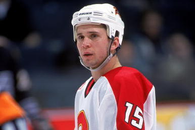
Also, I always think of Olli Jokinen when I see those awful 30th patches.
|
It will always remind me of this:

|
|
|
|
|
The Following 5 Users Say Thank You to ComixZone For This Useful Post:
|
|
|
08-19-2019, 02:30 PM
|
#24
|
|
Franchise Player
|
Quote:
Originally Posted by Toonage
Hate to be that guy, but...
Those two lines seem out of place. Just center the 40 and be done with it.
I am encouraged by the colors. Retro.
|
The 40 is centered. The far edge of the 4 and the far edge of the 0 bleed outside of the lines the exact same amount.
The lines under the 4 just fill in space where the 0 doesn't need filling in because the shape of the number. It's ok not to like the stripes, the 40 is centered.
|
|
|
|
|
The Following 2 Users Say Thank You to Cleveland Steam Whistle For This Useful Post:
|
|
|
The Following 8 Users Say Thank You to Madman For This Useful Post:
|
|
|
08-19-2019, 02:45 PM
|
#26
|
Participant  |
Quote:
Originally Posted by Cleveland Steam Whistle
The 40 is centered. The far edge of the 4 and the far edge of the 0 bleed outside of the lines the exact same amount.
The lines under the 4 just fill in space where the 0 doesn't need filling in because the shape of the number. It's ok not to like the stripes, the 40 is centered.
|
That's not true, the far edge of the 4 extends further than the far edge of the zero. The 40 is "centred" along the inside edge of the 4 (not the space between the 4 and 0), so it's not "technically" centre, but it seems like a fine balance.
Centre it directly between the two letters and the 4 sticks out even more. Centre it based on the overall combined width of the 40, and it'll look too far to the right.
I think it looks good. It looks balanced, which is more important than centred.
|
|
|
|
|
The Following User Says Thank You to PepsiFree For This Useful Post:
|
|
|
08-19-2019, 05:20 PM
|
#27
|
|
Franchise Player
Join Date: Feb 2006
Location: Calgary, AB
|
Ice already...
https://twitter.com/user/status/1163586381886570496
I guess Hitmen training camp will be starting soon.
__________________
Turn up the good, turn down the suck!
|

|
|
|
The Following 5 Users Say Thank You to getbak For This Useful Post:
|
|
|
08-19-2019, 05:57 PM
|
#28
|
|
All I can get
|
I think it's fine. Not particularly clever (the Canucks' 50th has rather clever use of the stick in rink motif), but not atrociously "creative" either.
|
|
|
|
|
08-19-2019, 06:30 PM
|
#29
|
|
Owner
Join Date: Dec 2001
Location: Calgary
|
Funny but also predictable.
If you google "NHL 40th Anniversary logo" you see quite a few, the Flyers and Islanders included.
The only one with cartoon versions of their Stanley Cups ... yep Edmonton.
|
|
|
|
|
The Following User Says Thank You to Bingo For This Useful Post:
|
|
|
08-19-2019, 06:51 PM
|
#30
|
|
First Line Centre
Join Date: Jul 2010
Location: Calgary
|
Misleading thread title
__________________
|
|
|
|
|
08-19-2019, 07:13 PM
|
#31
|
|
Pent-up
Join Date: Mar 2018
Location: Plutanamo Bay.
|
Quote:
Originally Posted by Bingo
Funny but also predictable.
If you google "NHL 40th Anniversary logo" you see quite a few, the Flyers and Islanders included.
The only one with cartoon versions of their Stanley Cups ... yep Edmonton.
|
With the cups on it. What a bunch of knobs.
|
|
|
|
|
08-19-2019, 07:32 PM
|
#32
|
|
Franchise Player
Join Date: Mar 2005
Location: Van City - Main St.
|
Looks better on the ice than just as a logo, but both the lack of symmetry with the outer edges and the extra 2 lines jumped out at me as poor design.
Nice colours and ok overall, 5/10.
|
|
|
|
|
08-19-2019, 07:43 PM
|
#33
|
|
Powerplay Quarterback
|
This just means 40 years of terrible graphics department. Original Flaming C is still the best of the bunch. At least the 40 was an improvement over previous anniversaries.
|
|
|
|
|
08-19-2019, 08:11 PM
|
#34
|
|
Scoring Winger
Join Date: Jul 2018
Location: 403
|
Quote:
Originally Posted by tvp2003
I don't recall them using the 20th; they definitely used the 25th and 30th patches. The 10th Anniversary patch was a smaller one on the shoulder.
|
20th anniversary logo appeared on the helmets
|
|
|
|
|
The Following 5 Users Say Thank You to TheRealPepman For This Useful Post:
|
|
|
08-19-2019, 09:11 PM
|
#35
|
|
#1 Goaltender
Join Date: Sep 2005
Location: Calgary, AB
|
Dropped?
Jesus Christ, I read this thread totally confused. I thought it was released then dropped from future plans.
|
|
|
|
|
08-19-2019, 09:50 PM
|
#36
|
|
Lifetime Suspension
|
Quote:
Originally Posted by Rhettzky
Definitely better than the 30th season patches, those were so bad and looked out of place on the jerseys.

For reference, here are the other patches:
10th
15th (Credit to RM14)
20th
25th (Credit to smoggyflamesfan)
30th
40th
|
The 30ths were so bad that they should have just gone all out and made it in comic sans.
|
|
|
|
|
The Following 3 Users Say Thank You to djsFlames For This Useful Post:
|
|
|
08-20-2019, 12:26 AM
|
#37
|
|
Franchise Player
Join Date: Aug 2012
Location: Seattle, WA
|
Those are some pretty bad anniversary logos. The ability to make each one uniquely awful in its own way is impressive.
__________________
It's only game. Why you heff to be mad?
|
|
|
|
|
08-20-2019, 02:33 AM
|
#38
|
|
First Line Centre
Join Date: Jun 2012
Location: Sweden
|
I honestly think it's impossible to get any more 90's than that incredible 15 year logo.
|
|
|
|
|
The Following User Says Thank You to crapshoot For This Useful Post:
|
|
|
08-20-2019, 06:12 AM
|
#39
|
|
Pent-up
Join Date: Mar 2018
Location: Plutanamo Bay.
|
Quote:
Originally Posted by crapshoot
I honestly think it's impossible to get any more 90's than that incredible 15 year logo.
|
Why does the A look like a completely different font?
|
|
|
|
|
08-20-2019, 06:28 AM
|
#40
|
|
Backup Goalie
Join Date: Jan 2013
Location: Calgary
Exp: 
|
Bit basic, I am in minority I think but I love the ones that say CALGARY across the front! ALso love the old flaming horse head haha
__________________
This tendy can bendy any angle of the dangle,
#33 Madgiec
|
|
|
|
 Posting Rules
|
You may not post new threads
You may not post replies
You may not post attachments
You may not edit your posts
HTML code is Off
|
|
|
All times are GMT -6. The time now is 10:34 AM.
|
|