Calgarypuck Forums - The Unofficial Calgary Flames Fan Community

Go Back   Calgarypuck Forums - The Unofficial Calgary Flames Fan Community > Main Forums > Fire on Ice: The Calgary Flames Forum
Register Forum Rules FAQ Community Calendar Today's Posts Search

View Poll Results: Where would you like the Flames to go with their jerseys?
Keep with the existing set 9 2.34%
go back to vintage home and away 229 59.48%
go back to 2004 home and away 26 6.75%
minor tweak to the existing set (piping, flags) 40 10.39%
new design that adds black to the retro look 36 9.35%
completely new design 39 10.13%
other (elaborate) 6 1.56%
Voters: 385. You may not vote on this poll

Closed Thread
 
Thread Tools Search this Thread
Old 06-13-2017, 08:57 AM   #261
Kolbe31
Crash and Bang Winger
 
Kolbe31's Avatar
 
Join Date: Jun 2007
Exp:
Default

Quote:
Originally Posted by ComixZone View Post
I believe I read that Authenticator will run $200 USD and Fanatics will go for $150 USD.

At those prices, I think I'll be opting for the authentic - but we'll see.
Further to this, it's been rumored for a while now that on-ice authentics (made in Canada) will not be made available for retail purchase. There will be a similar, yet somewhat altered version (made overseas) that will be the retail authentic. So the only opportunity to get an actual on-ice game jersey will be the game worn or team issued route.

With the Reebok Edge, they had a replica, retail authentic (made in Indonesia aka Indo-Edge), and on-ice authentic, all available for purchase.
Kolbe31 is offline  
Old 06-13-2017, 08:58 AM   #262
red sky
#1 Goaltender
 
red sky's Avatar
 
Join Date: Apr 2006
Exp:
Default

I've seen them and they will blow your socks off.

I am kidding. I haven't seen them.
red sky is offline  
The Following 5 Users Say Thank You to red sky For This Useful Post:
Old 06-13-2017, 09:56 AM   #263
GioforPM
Franchise Player
 
Join Date: Oct 2014
Location: Springbank
Exp:
Default

Quote:
Originally Posted by Mr.Coffee View Post
I like the retro, but the black can be incorporated in a nice way. Like others have said if you ditch the crap striping, flags and piping... and go to more / less what we had in '04... that's a slick uniform really. Maybe trade horsehead side patch for the new C circle mountain thing, it'd be nice.
The 04s were fine. If they didn't angle the bottom wide strip, better, IMO:

GioforPM is offline  
Old 06-13-2017, 10:01 AM   #264
Icon
Franchise Player
 
Icon's Avatar
 
Join Date: Jul 2009
Location: Calgary
Exp:
Default

Quote:
Originally Posted by Mr.Coffee View Post
... icethetics.co website...
Browsing that site again this morning, and after seeing the teaser, I expect to see something like this mockup next week:

Icon is offline  
The Following 6 Users Say Thank You to Icon For This Useful Post:
Old 06-13-2017, 10:05 AM   #265
Howie_16
Powerplay Quarterback
 
Howie_16's Avatar
 
Join Date: Apr 2006
Exp:
Default

Quote:
Originally Posted by Icon View Post
Browsing that site again this morning, and after seeing the teaser, I expect to see something like this mockup next week:

Add a red stripe to the pants, and that is a perfect look in my eyes.
Howie_16 is offline  
Old 06-13-2017, 10:09 AM   #266
_Q_
#1 Goaltender
 
_Q_'s Avatar
 
Join Date: Jan 2009
Location: Calgary
Exp:
Default

Quote:
Originally Posted by Icon View Post
Browsing that site again this morning, and after seeing the teaser, I expect to see something like this mockup next week:

If we're keeping black, this looks good.

Obviously, that means we're not getting this.
_Q_ is offline  
The Following 13 Users Say Thank You to _Q_ For This Useful Post:
Old 06-13-2017, 10:11 AM   #267
ComixZone
Franchise Player
 
ComixZone's Avatar
 
Join Date: Feb 2008
Exp:
Default

Quote:
Originally Posted by Icon View Post
Browsing that site again this morning, and after seeing the teaser, I expect to see something like this mockup next week:

Walmart. Way too Walmart.
ComixZone is offline  
The Following User Says Thank You to ComixZone For This Useful Post:
Old 06-13-2017, 10:12 AM   #268
Erick Estrada
Franchise Player
 
Erick Estrada's Avatar
 
Join Date: Oct 2006
Location: San Fernando Valley
Exp:
Default

Why does there need to be piping on new jerseys? Part of what makes the retros look so great is that there's no piping.
Erick Estrada is offline  
Old 06-13-2017, 10:20 AM   #269
GioforPM
Franchise Player
 
Join Date: Oct 2014
Location: Springbank
Exp:
Default

Quote:
Originally Posted by Erick Estrada View Post
Why does there need to be piping on new jerseys? Part of what makes the retros look so great is that there's no piping.
I'm not sure that's piping, or just a seam, if you're talking about the lines on the shoulders, sides and underarms. If it's piping, I agree.
GioforPM is offline  
Old 06-13-2017, 10:21 AM   #270
Reaper
Franchise Player
 
Reaper's Avatar
 
Join Date: Sep 2002
Location: I'm right behind you
Exp:
Default

Quote:
Originally Posted by ComixZone View Post
Walmart. Way too Walmart.
You seem to equate simple designs with Walmart. Are the Detroit Red Wings' and New Jersey Devils' jerseys also "way too Walmart" for you too or is it just a term you've reserved for any Flames jersey that isn't based on the 1980-1994 set?
__________________
Don't fear me. Trust me.
Reaper is offline  
Old 06-13-2017, 10:22 AM   #271
Otto-matic
Franchise Player
 
Otto-matic's Avatar
 
Join Date: Dec 2003
Location: Sector 7-G
Exp:
Default

Quote:
Originally Posted by GioforPM View Post
I'm not sure that's piping, or just a seam, if you're talking about the lines on the shoulders, sides and underarms. If it's piping, I agree.
IMO that is just the "seams" and not actual piping.
Otto-matic is offline  
The Following User Says Thank You to Otto-matic For This Useful Post:
Old 06-13-2017, 10:27 AM   #272
Icon
Franchise Player
 
Icon's Avatar
 
Join Date: Jul 2009
Location: Calgary
Exp:
Default

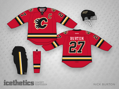
Yeah based on the other designs on the website, I think it's just seams / templates for piping/striping/color boundaries he's used for all of his jerseys he's made.

I don't love everything about that one, but it's the closest mockup I've seen to what I expect we'll have for next year (and I don't have the artistic ability to draw it myself)
Icon is offline  
Old 06-13-2017, 10:29 AM   #273
darockwilder
Powerplay Quarterback
 
darockwilder's Avatar
 
Join Date: Apr 2004
Exp:
Default

Quote:
Originally Posted by Icon View Post
Browsing that site again this morning, and after seeing the teaser, I expect to see something like this mockup next week:

So, does that mean we're getting Burton on the team now?! I never thought we'd get the opportunity, he's basically a 2017 version of Albert....


__________________
Sent from an adult man under a dumpster
darockwilder is offline  
The Following User Says Thank You to darockwilder For This Useful Post:
Old 06-13-2017, 11:24 AM   #274
ComixZone
Franchise Player
 
ComixZone's Avatar
 
Join Date: Feb 2008
Exp:
Default New Flames Uniforms for 2017-2018 due to be revealed June 20th

Quote:
Originally Posted by Reaper View Post
You seem to equate simple designs with Walmart. Are the Detroit Red Wings' and New Jersey Devils' jerseys also "way too Walmart" for you too or is it just a term you've reserved for any Flames jersey that isn't based on the 1980-1994 set?


First off, I'm not huge on the retros - so back off that.

Secondly, New Jersey and Detroit don't use such offensively disruptive horizontal piping. Having the double thick black lines in each set of piping is over-kill and makes the jersey look like a pile of crap. Jersey uses a thick horizontal pipe of black, which shows a level of simplicity that Flames jerseys always lack. Seriously - why is there yellow, black and white slammed into one piping area? It's horrific.

The black collar is also unneeded.

Last edited by ComixZone; 06-13-2017 at 11:28 AM.
ComixZone is offline  
Old 06-13-2017, 11:28 AM   #275
GioforPM
Franchise Player
 
Join Date: Oct 2014
Location: Springbank
Exp:
Default

Quote:
Originally Posted by ComixZone View Post
First off, I'm not huge on the retros - so back off that.

Secondly, New Jersey and Detroit don't use such offensively disruptive horizontal piping. Having the double thick black lines in each set of piping is over-kill and makes the jersey look like a pile of crap.
You may not like the lines but FYI, those stripes aren't "piping". Piping is a thicker seam of cloth used as a highlight.
GioforPM is offline  
Old 06-13-2017, 11:36 AM   #276
Reaper
Franchise Player
 
Reaper's Avatar
 
Join Date: Sep 2002
Location: I'm right behind you
Exp:
Default

Quote:
Originally Posted by ComixZone View Post
First off, I'm not huge on the retros - so back off that.

Secondly, New Jersey and Detroit don't use such offensively disruptive horizontal piping. Having the double thick black lines in each set of piping is over-kill and makes the jersey look like a pile of crap. The black collar is also unneeded.
There's no piping on that jersey. Those are seams. If you mean you think the black stripes are too thick then say that rather than implying the design is cheap. "Offensively disruptive horizontal piping" is so dramatic and unneeded.
__________________
Don't fear me. Trust me.
Reaper is offline  
Old 06-13-2017, 11:40 AM   #277
Young_Guns
Scoring Winger
 
Young_Guns's Avatar
 
Join Date: Jan 2015
Exp:
Default

So all the Adidas teaser pictures appear to be the current uniforms for every team. For example, I thought Ottawa was confirmed to be going to the 'O' jersey for both home and away, yet the Adidas teaser still shows half of the 3D senator...

Young_Guns is offline  
Old 06-13-2017, 11:42 AM   #278
TheScorpion
First round-bust
 
TheScorpion's Avatar
 
Join Date: Feb 2015
Location: speculating about AHL players
Exp:
Default

^ the Minnesota one is clearly different
__________________
"This has been TheScorpion's shtick for years. All these hot takes, clickbait nonsense just to feed his social media algorithms." –Tuco

TheScorpion is offline  
Old 06-13-2017, 11:44 AM   #279
Itse
Franchise Player
 
Itse's Avatar
 
Join Date: May 2004
Location: Helsinki, Finland
Exp:
Default

Quote:
Originally Posted by Young_Guns View Post
So all the Adidas teaser pictures appear to be the current uniforms for every team. For example, I thought Ottawa was confirmed to be going to the 'O' jersey for both home and away, yet the Adidas teaser still shows half of the 3D senator...

Don't give me hope.
Itse is offline  
The Following 5 Users Say Thank You to Itse For This Useful Post:
Old 06-13-2017, 11:53 AM   #280
ComixZone
Franchise Player
 
ComixZone's Avatar
 
Join Date: Feb 2008
Exp:
Default

Quote:
Originally Posted by Reaper View Post
There's no piping on that jersey. Those are seams. If you mean you think the black stripes are too thick then say that rather than implying the design is cheap. "Offensively disruptive horizontal piping" is so dramatic and unneeded.
I've always heard of the stripes referred to as "horizontal piping", so my bad if I'm wrong on that front although I was entirely unaware of specific definitions for such things.

Fact remains, the iconic hockey jerseys that have stood the test of time go for elegance and simplicity above all else. I can't understand why we would include a hard Black/White/Yellow/Black set of stripes. It cuts the red out of those parts of the jersey entirely - and no other jerseys seem to do the same (except of course our poorly received 3rd jerseys that featured the Calgary font).

If you're going for horizontal striping/piping/whatever, this is what should be targeted:

Spoiler!
ComixZone is offline  
Closed Thread


Posting Rules
You may not post new threads
You may not post replies
You may not post attachments
You may not edit your posts

BB code is On
Smilies are On
[IMG] code is On
HTML code is Off

Forum Jump


All times are GMT -6. The time now is 05:40 PM.

Calgary Flames
2023-24


Powered by vBulletin® Version 3.8.4
Copyright ©2000 - 2024, Jelsoft Enterprises Ltd.
Copyright Calgarypuck 2021