06-20-2017, 08:50 PM
|
#281
|
|
First Line Centre
Join Date: Feb 2010
Location: Calgary
|
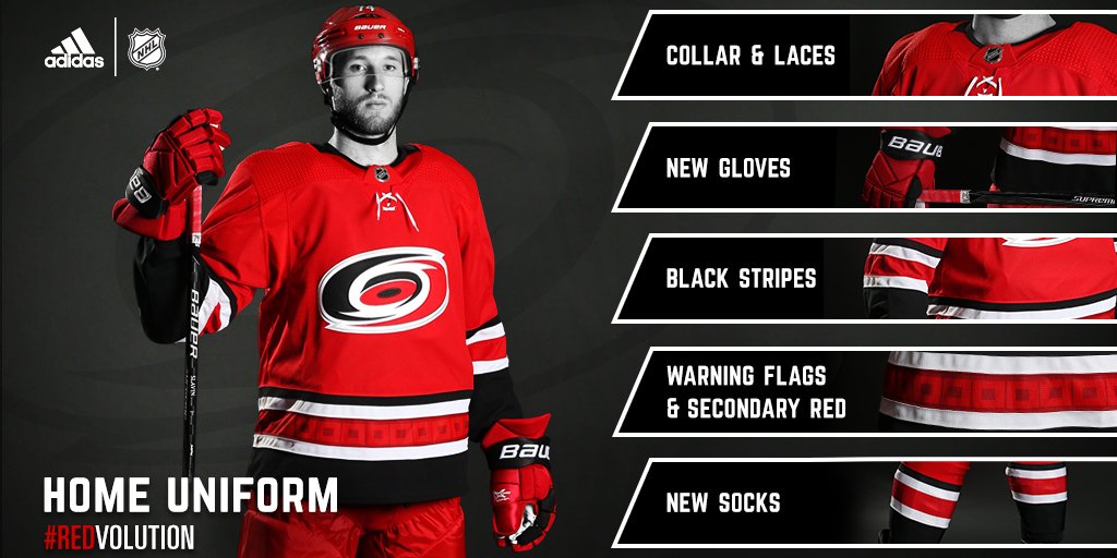
Interesting that the Hurricanes have added the black stripes and storm flag pattern back into their jerseys.
They dropped a lot of those extra detail when they redesigned in 2013, went with a basic red/white combo that matched the trend in the NHL at time of simpler lines/color pallets. Tampa Bay also went pretty "retro" around the same time, but seems Tampa is sticking with it.
|

|

|
|
The Following 2 Users Say Thank You to Regular_John For This Useful Post:
|
|
|
06-20-2017, 08:51 PM
|
#282
|
|
Franchise Player
|
Quote:
Originally Posted by Swayze11

What am I not seeing? They are the same as last year.
 |
My friend.
Let me explain to you with one photo.

The grey 'pit stains' (and horrible piping). Gone forever.
|
|
|
|
|
The Following User Says Thank You to OutOfTheCube For This Useful Post:
|
|
|
06-20-2017, 08:52 PM
|
#283
|
|
Franchise Player
Join Date: Sep 2013
Location: Brisbane
|
Where do the Flames now rank on worst jerseys in the league? The ones I can think of that are worse:
-I have never liked Anaheim's black, gold, and orange colour scheme.
-Nothing wrong with the Vancouver jersey however having the city name is stupid and their logo is nothing special.
-I hate the Oilers and everything about them. That said if you are a fan of orange there is nothing wrong with them.
-I am currently not a huge fan of the Vegas jerseys or the New Jersey changes. These may grow on my however.
So from that 6th worst in the league. Great job Flames!
__________________
The masses of humanity have always had to surf.
|
|
|
|
|
06-20-2017, 08:54 PM
|
#284
|
|
That Crazy Guy at the Bus Stop
Join Date: Jun 2010
Location: Springfield Penitentiary
|
Quote:
Originally Posted by JurassicTunga12
The red stripes on the Vegas jersey is killing it for me. Other than that, it's pretty good.
|
Especially since they did it only around the arms and not the waist.
|
|
|
|
|
06-20-2017, 08:56 PM
|
#285
|
|
Franchise Player
Join Date: Feb 2006
Location: Calgary, AB
|
Quote:
Originally Posted by OutOfTheCube
The grey 'pit stains' (and horrible piping). Gone forever.
|
The pit stains have always made me laugh. Seriously, how did no one take one look at those and send Reebok back to the drawing board?
__________________
Turn up the good, turn down the suck!
|

|
|
|
06-20-2017, 08:56 PM
|
#286
|
|
First Line Centre
Join Date: Sep 2002
Location: Fort Collins, CO
|
Those Vegas jerseys look like they belong in a Will Ferrell movie...really awful as is the name.
Should have gone with Hookers and Blow.
|
|
|
|
|
06-20-2017, 08:56 PM
|
#287
|
|
Franchise Player
Join Date: Jun 2011
Location: Calgary
|
I really dig the New Jersey.....Jersey. it's what I had hoped the Flames' would be.
|
|
|
|
|
The Following User Says Thank You to dammage79 For This Useful Post:
|
|
|
06-20-2017, 08:57 PM
|
#288
|
|
First Line Centre
Join Date: Feb 2010
Location: Calgary
|
Quote:
Originally Posted by FireGilbert
Where do the Flames now rank on worst jerseys in the league? The ones I can think of that are worse:
-I have never liked Anaheim's black, gold, and orange colour scheme.
-Nothing wrong with the Vancouver jersey however having the city name is stupid and their logo is nothing special.
-I hate the Oilers and everything about them. That said if you are a fan of orange there is nothing wrong with them.
-I am currently not a huge fan of the Vegas jerseys or the New Jersey changes. These may grow on my however.
So from that 6th worst in the league. Great job Flames!
|
I've always felt Ottawa's standard jerseys were the bottom of the rung from a design perspective. With the Penguins pre-2016 threads being just about as bad.
|
|
|
|
|
06-20-2017, 08:57 PM
|
#289
|
|
Franchise Player
|
Vegas jerseys look like the incarnation of the inside of the Excalibur Casino
- Patterned gold sparkly fabric? Check
- Terrible crushed velvet red? Check
- Knight's heads? Check
- Odd patches of random colors for no reason (purple in this case)? Check
I imagine it comes smelling like an ashtray as well
|
|
|
|
|
The Following User Says Thank You to Ducay For This Useful Post:
|
|
|
06-20-2017, 08:59 PM
|
#290
|
|
Franchise Player
Join Date: Sep 2013
Location: Brisbane
|
Quote:
Originally Posted by jaydorn
I've always felt Ottawa's standard jerseys were the bottom of the rung from a design perspective. With the Penguins pre-2016 threads being just about as bad.
|
How did I forget about Ottawa! Yep a bad design and bad logo. Definitely worse than the Flames.
__________________
The masses of humanity have always had to surf.
|
|
|
|
|
06-20-2017, 09:00 PM
|
#291
|
|
Acerbic Cyberbully
Join Date: Aug 2003
Location: back in Chilliwack
|
Quote:
Originally Posted by Playfair
|
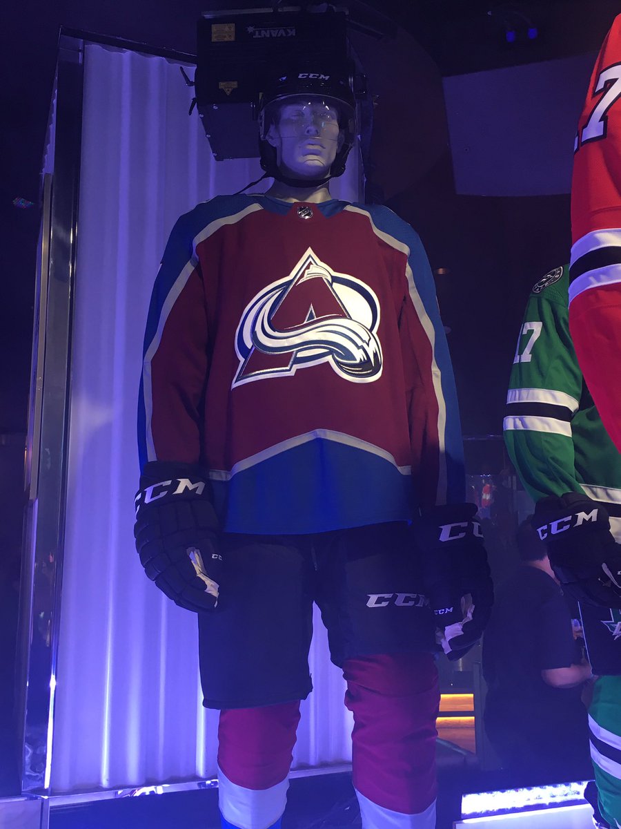
As much as I do not understand the vitriol for the new Flames jersey I am equally confused by the gushing appraisals of the new Avalanche sweater.
Hmmm.
|
|
|
|
|
The Following 14 Users Say Thank You to Textcritic For This Useful Post:
|
AC,
davidus_49,
dino7c,
driveway,
Enoch Root,
Fire,
mdubz,
midniteowl,
Mony,
N-E-B,
Plaedo,
Playfair,
Rhettzky,
socalwingfan
|
|
06-20-2017, 09:01 PM
|
#292
|
|
First Line Centre
|
Nashville's are bad and seems like all their fans on Reddit agree
I hope Vegas wears shiny gold helmets
|
|
|
|
|
06-20-2017, 09:07 PM
|
#293
|
|
Crash and Bang Winger
|
I think the changes to most of the jerseys are pretty underwhelming/minimal. Though, I think Carolina and Minnesota ended up looking pretty slick.
__________________

|
|
|
|
|
06-20-2017, 09:11 PM
|
#294
|
|
damn onions
|
I really like what Carolina did. A good move to distance themselves from looking like they literally just stole Team Canada's uniform.
Colorado going back to close to their original is better, but the silver striping I think was black and white on the original, and looks worse this way.
Minnesota might have the best uniform in the NHL now.
Buffalo needs to ditch the silver otherwise pretty sweet.
Ottawa needs to go back to their original black sweater they broke out in the league with and that same original logo. Not sure why they love front facing sen guy so much, but it's hideous.
New Jersey had a classic feel for years so not sure why they decided to promptly throw 25 years of history in the garbage.
Last edited by Mr.Coffee; 06-20-2017 at 09:14 PM.
|
|
|
|
|
The Following User Says Thank You to Mr.Coffee For This Useful Post:
|
|
|
06-20-2017, 09:12 PM
|
#295
|
|
Acerbic Cyberbully
Join Date: Aug 2003
Location: back in Chilliwack
|
 New 2017-2018 Uniforms: All other teams
Quote:
Originally Posted by Wood
Nashville's are bad and seems like all their fans on Reddit agree...
|
See, here is another reaction that I don't get. At first reveal I thought Nashville's were among the better new ones. I think the general response around the League has more to do with the volatile mix of fan enthusiasm, summer boredom and faceless internet aggression than anything else.
|
|
|
|
|
The Following 2 Users Say Thank You to Textcritic For This Useful Post:
|
|
|
06-20-2017, 09:14 PM
|
#296
|
|
First Line Centre
Join Date: Feb 2010
Location: Calgary
|
Quote:
Originally Posted by Isikiz
I think the changes to most of the jerseys are pretty underwhelming/minimal. Though, I think Carolina and Minnesota ended up looking pretty slick.
|
I've said it before and I'll say it again... the Wild simply have the best design sense in the league when it comes to their uniforms.
They've got a color combination that could easily end up looking like a Christmas tree... yet they've consistently put out some of the best uniforms for a non-original six club.
|
|
|
|
|
The Following 3 Users Say Thank You to Regular_John For This Useful Post:
|
|
|
06-20-2017, 09:17 PM
|
#297
|
|
NOT breaking news
Join Date: Jan 2007
Location: Calgary
|
glad the Wild put some red one those jerseys
__________________
Watching the Oilers defend is like watching fire engines frantically rushing to the wrong fire

|
|
|
|
|
06-20-2017, 09:47 PM
|
#298
|
|
Franchise Player
Join Date: Dec 2005
Location: back in the 403
|
I'm surprised how many people are ok with the Oilers' eyesores. I'll admit I've liked some of their past unis (I'm just a fan of orange/blue in general), but those are gross.
It's not even me hating a predominantly orange jersey either, I LOVE the Tennessee Volunteers football unis, it's a nice lighter orange. But the Oilers orange is just so invasive to the retina, it's a nice secondary shade but should not be a primary. Not a fan at all, they're gaudy
Last edited by Sainters7; 06-20-2017 at 10:07 PM.
|
|
|
|
|
The Following 3 Users Say Thank You to Sainters7 For This Useful Post:
|
|
|
06-20-2017, 10:42 PM
|
#299
|
|
Franchise Player
Join Date: Dec 2011
Location: Calgary
|
Those Vegas jerseys look like something a 14 year old would create for his EA Sports Hockey League team in NHL17.
|
|
|
|
|
06-20-2017, 10:56 PM
|
#300
|
|
Powerplay Quarterback
Join Date: Oct 2014
Location: Calgary
|
Was hesitant about the Wild's big beige bar when I first heard about it but it actually works beautifully. Did not expect that. Top 5 set in the league now for the wrist hackers.
Vegas has a nice color scheme but the execution isn't quite right.
Do not understand the love for Colorado.
And I actually love the Devils. It looks awful not being modeled by a player (pajamas-esque) but that pic with Hall modeling it, it actually quite works IMO.
__________________
NHL Flames | Golden Knights | Cal Stampeders | Panthers | Chelsea FC | AVFC | Raptors | Orlando Magic | Blue Jays | Athletics | Inferno CWHL
|
|
|
|
 Posting Rules
|
You may not post new threads
You may not post replies
You may not post attachments
You may not edit your posts
HTML code is Off
|
|
|
All times are GMT -6. The time now is 08:46 AM.
|
|