 04-21-2012, 03:33 AM
|
#41
|
|
First Line Centre
Join Date: Jan 2011
Location: Fort St. John, BC
|
Quote:
Originally Posted by Dr. Pepper

|
I really dig that one.
Also, I love the Calgary Flames script with the flaming "F", real sharp
|

|

|
|
The Following User Says Thank You to normtwofinger For This Useful Post:
|
|
|
04-21-2012, 09:43 AM
|
#43
|
|
Scoring Winger
Join Date: Mar 2004
Location: Movin' Dirt
|
Just say no to black...I like black generally and my truck is black, but it does not belong on the Flames uni's I would like to see a consistent color theme like the Leafs or the Wings. I believe there is a lot to be said for tradition in sports and the superstitious me believes that all started to go bad, here in Calgary, when black was introduced in the uniform design.
__________________
"25 strong"+Thousands in the stands at the 'Dome & millions elswhere
-be counted.
I Believe in the Red!!!
|
|
|
|
|
04-21-2012, 07:00 PM
|
#44
|
|
First Line Centre
Join Date: Aug 2009
Location: Coquitlam, BC
|
I've always wanted to see a red flaming C, complete with the white and yellow outline, on a red jersey. Anyone feel like doing up a concept?
|
|
|
|
|
04-21-2012, 07:29 PM
|
#45
|
|
#1 Goaltender
|
Quote:
Originally Posted by tvp2003
There were a couple posted on uniwatch -- not a fan of either but here they are:
Home:
Away:
Alternate:
 |
The home and away look amazing, the alternate not so much. Also I dislike having the exact same logo for the captain as the main one on the jersey, but that's just me.
|
|
|
|
|
04-21-2012, 08:12 PM
|
#46
|
|
Franchise Player
Join Date: Feb 2006
Location: Calgary, AB
|

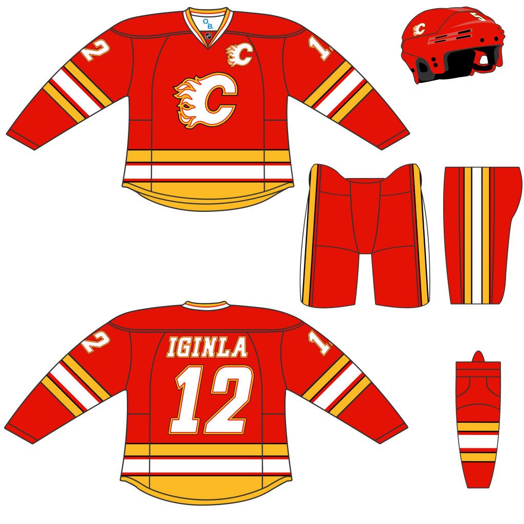
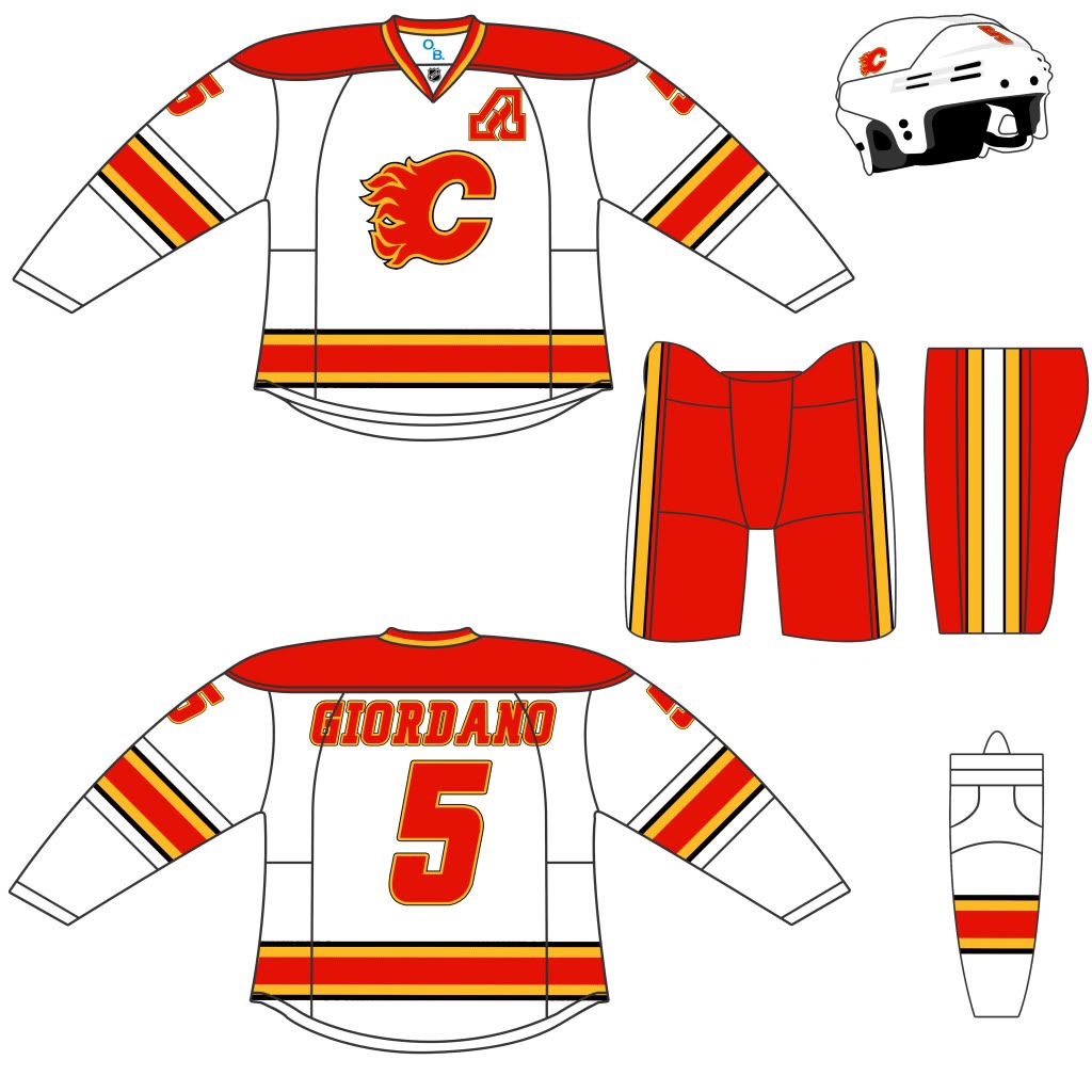
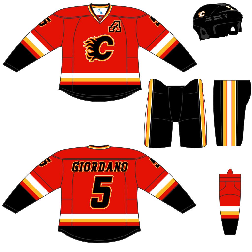
I really liked how the logo they used on the Heritage Classic jersey looked when it was put onto the helmets and practice jerseys when it was on a solid dark red base rather than the thick yellow stripes. I also think that having the dark line separating the white and yellow in the logo makes it stand out a lot better, so even if they did go full retro, I'd hope they keep that on the logo.
After thinking about how nice I thought the dark red looked, I wondered what it would like if instead of red, white, yellow, and black, they went with red, white, yellow, and dark red (similar to St Louis' colour scheme, but red instead of blue). Based on that, I came up with these mock-ups:
First, is basically the retro style, but adding the dark red highlight colour to the logo and letters, as well as swapping out the red for dark red on the thin stripes, and making the shoulders the dark red on the red jersey. For all of these mock-ups, the pants, helmets, and gloves would use the dark red colour.
I also took a photo of the retro jersey and tweaked it to darken the parts of the uniform in question (look at how much more the logo on Iginla's jersey stands out compared to the one on Glencross -- cropped out beside Iggy).
 
Then, I tried a variation where the stripes are similar (but not identical) to the 2003 version of the jersey. Since the Edge style doesn't seem to play well with angles, I kept the lines straight.

Here's the same thing without the contrasting shoulder colours.

Finally, here's an alternate with the dark red as the base, and no white on it whatsoever. I doubt this would pass the NHL's "TV" colour contrast test.

__________________
Turn up the good, turn down the suck!
|
|
|
|
|
04-21-2012, 09:00 PM
|
#47
|
|
Crash and Bang Winger
Join Date: May 2009
Location: Calgary
|
Thanks for all the replies and ideas guys! A few of these are pretty sweet. I favor the more classic looks - and the ones posted here with some of the multiple-stripe pattens look fantastic. That alternate flaming horse head looks great too.
The more I think about it - let's go back to a design in the spirit of the 89's, but updated with some modern numbers, slightly altered and updated multi-stripes, like some of the versions posted here. Classic feel, but updated.
Did anyone answer the question of what's been said about the flag-crests and when they'll be gone? Or if there has been any whisperings at all of a jersey update from the Flames?
|
|
|
|
|
04-21-2012, 09:35 PM
|
#48
|
|
Franchise Player
Join Date: Jun 2006
Location: Calgary, Alberta
|
Quote:
Originally Posted by Dr. Pepper
Did anyone answer the question of what's been said about the flag-crests and when they'll be gone? Or if there has been any whisperings at all of a jersey update from the Flames?
|
No official word or rumours from high places indicating any update at the moment.
IMO I think we're seeing a movement from the organization towards retro jerseys. I would like that move, but I also would mind a blending of new and old. Getbak mocks along with others give an idea of how that would work.
|
|
|
|
|
04-21-2012, 10:07 PM
|
#49
|
|
First Line Centre
|
Getbak, I like your 2-tone red designs, especially picture #2, and maybe the white jersey can use the darker red too.
|
|
|
|
|
04-21-2012, 11:35 PM
|
#50
|
|
Scoring Winger
|
Quote:
Originally Posted by lazypucker
Getbak, I like your 2-tone red designs, especially picture #2, and maybe the white jersey can use the darker red too.
|
Its almost identical to Florida's old jerseys.
I like our jerseys how they are. I don't know if I like the idea of full time retro jerseys either. If there is a change I want to see them redo the '04 jerseys.
|
|
|
|
|
04-23-2012, 12:08 PM
|
#52
|
|
Lifetime Suspension
|
Black should never be a part of a Flames uniform ever again.
|
|
|
|
|
The Following 2 Users Say Thank You to North East Goon For This Useful Post:
|
|
|
04-23-2012, 01:04 PM
|
#53
|
|
Crash and Bang Winger
Join Date: May 2009
Location: Calgary
|
Quote:
Originally Posted by North East Goon
Black should never be a part of a Flames uniform ever again.
|
I don't agree - I think done correctly, a black based uniform can look quite good. IIRC - the black 3rds with the horse head on the front sold pretty well too, so it's good for the fan-base.
For the regular home/aways - definitely should never be black. Also - I think black in the logo/piping/stripes can look great. Again - if done correctly.
|
|
|
|
|
04-23-2012, 01:33 PM
|
#54
|
|
Lifetime Suspension
|
We are not the Calgary charred remains, we are the Calgary Flames - no more black!!!
|
|
|
|
|
04-23-2012, 01:36 PM
|
#55
|
|
Jordan!
Join Date: Jul 2009
Location: Chandler, AZ
|
Some brutal designs ITT
|
|
|
|
|
04-23-2012, 01:37 PM
|
#56
|
|
First Line Centre
Join Date: Oct 2011
Location: The Armpit of BC: Trail
|
I think the jersey needs a shot of rejuvination. The yellow and red is getting kinda old. I absolutely love the heritage jersey. Some sexy combination of black, gold and maroon/burgandy/whatever other red like colour would, in my opinion, look awesome.
I also love the idea of the restylized logo, but the block-y, flame-y C doesn't look quite right. I dunno this is just my worthless two pennies.
__________________
Disregard any and all THANKS I give. I'm a dirty, dirty thanks-whore.
|
|
|
|
|
04-23-2012, 02:50 PM
|
#57
|
|
Franchise Player
Join Date: Jun 2006
Location: Calgary, Alberta
|
2014. New arena, new logo, new jerseys, new everything!
|
|
|
|
|
04-23-2012, 06:43 PM
|
#58
|
|
Scoring Winger
Join Date: Dec 2010
Location: Cowtown
|
Quote:
Originally Posted by sevenarms
It looks like the horse is chewing gum and about to blow a bubble.
|
Hahaha. He is actually Gagging at the logo. 
__________________

|
|
|
|
|
04-24-2012, 12:00 PM
|
#59
|
|
Scoring Winger
Join Date: Mar 2011
Location: Rural AB
|
my quick concepts. I'd like to see a change to a more fluid design.

|
|
|
|
|
04-24-2012, 12:03 PM
|
#60
|
|
Powerplay Quarterback
|
Appreciate the effort, but that looks REALLY bush league. I don't want some weird vanity design with funky shapes and designs like the Blues' musical note jersey. I'd prefer something sleek, clean, and classic.
As for including black, I'm fine with it, because red and yellow don't necessarily contrast very well. Having a bit of a black accent is nice and makes the jerseys look sharper. However, I would be against using it as the primary colour.
|
|
|
|
 Posting Rules
|
You may not post new threads
You may not post replies
You may not post attachments
You may not edit your posts
HTML code is Off
|
|
|
All times are GMT -6. The time now is 12:30 AM.
|
|


