09-18-2020, 11:51 AM
|
#21
|
|
Lifetime Suspension
|
Quote:
Originally Posted by Puppet Guy

If that look didn't already "belong" to the 67s they'd be wise to use it.
|
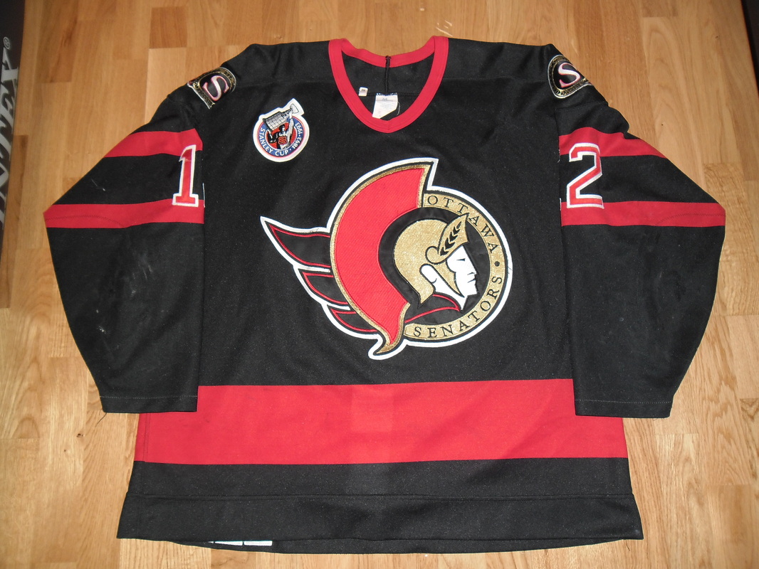
They've used this look a few times with wider stripes. The mostly black version they wore for a few years were probably the best unies they've ever had.

|

|

|
|
The Following 2 Users Say Thank You to Magnum PEI For This Useful Post:
|
|
|
09-18-2020, 11:55 AM
|
#22
|
|
Franchise Player
Join Date: Nov 2008
Location: the dark side of Sesame Street
|
Quote:
Originally Posted by troutman
I think that concept is ancient, and pre-dates the 67s.
 |
It's probably more of an "Ottawa" thing than a Sens or 67s thing, really. Just sayin' that the 67s made it their own in between Senators' franchises. It's a sharp look.
__________________
"If Javex is your muse
then dive in buddy"
- Surferguy
|
|
|
|
|
The Following User Says Thank You to Puppet Guy For This Useful Post:
|
|
|
09-18-2020, 11:58 AM
|
#23
|
|
Franchise Player
Join Date: Nov 2008
Location: the dark side of Sesame Street
|
Quote:
Originally Posted by Magnum PEI
They've used this look a few times with wider stripes. The mostly black version they wore for a few years were probably the best unies they've ever had.
|
If they'd kept those sweaters and gone with the Heritage Classic version as the road ones, they'd easily be top five in the league:
__________________
"If Javex is your muse
then dive in buddy"
- Surferguy
|
|
|
|
|
The Following 5 Users Say Thank You to Puppet Guy For This Useful Post:
|
|
|
09-18-2020, 12:06 PM
|
#24
|
|
Lifetime Suspension
|
Quote:
Originally Posted by topfiverecords
Why does the news release not actually show the logo?
|
Would have cost Melnyk an additional tenth of a cent
|
|
|
|
|
09-18-2020, 12:15 PM
|
#25
|
|
Lifetime Suspension
|
Quote:
Originally Posted by Magnum PEI
They've used this look a few times with wider stripes. The mostly black version they wore for a few years were probably the best unies they've ever had.
|
Those along with their Heritage Classic jersey would be the perfect jerseys for them IMO
edit: missed Puppet's reply, he said the same and also included a pic, so I have removed my large photo
|
|
|
|
|
09-18-2020, 02:50 PM
|
#26
|
|
#1 Goaltender
Join Date: Jan 2009
Location: Calgary
|
Those new sweaters are about as exciting as the city they call home.
|
|
|
|
|
The Following User Says Thank You to _Q_ For This Useful Post:
|
|
|
09-18-2020, 02:56 PM
|
#27
|
|
Franchise Player
Join Date: Jul 2010
Location: Van Island
|
Quote:
Originally Posted by Elkyiv
this made me wonder, would it be at all possible to make the Flaming C 3 dimensional?
|
Please dont give anyone this idea.
|
|
|
|
|
The Following 5 Users Say Thank You to MrMike For This Useful Post:
|
|
|
09-18-2020, 04:49 PM
|
#28
|
|
Not a casual user
Join Date: Mar 2006
Location: A simple man leading a complicated life....
|
Quote:
Originally Posted by TheScorpion
|

__________________

|
|
|
|
|
09-18-2020, 08:31 PM
|
#29
|
|
First Line Centre
Join Date: Sep 2002
Location: Fort Collins, CO
|
To sum up: 2D snooze fest
|
|
|
|
|
09-18-2020, 09:08 PM
|
#30
|
|
Scoring Winger
Join Date: Jul 2011
Location: at home
|
This alternate sens logo is IMHO much better, strange they haven't figured it out. Is it actually being used anywhere?

|
|
|
|
|
The Following 6 Users Say Thank You to playmaker For This Useful Post:
|
|
|
09-18-2020, 09:12 PM
|
#31
|
|
Franchise Player
Join Date: Feb 2010
Location: Hyperbole Chamber
|
That is waaaaaay better.
|

|
|
|
09-18-2020, 09:13 PM
|
#32
|
|
First round-bust
Join Date: Feb 2015
Location: speculating about AHL players
|
Every Sens fan I have ever known (and I know more than a few from my time in Ottawa) hates that logo. The Sens abandoned it basically right after they revealed it.
__________________
"This has been TheScorpion's shtick for years. All these hot takes, clickbait nonsense just to feed his social media algorithms." Tuco
|
|
|
|
|
09-18-2020, 09:53 PM
|
#33
|
|
Franchise Player
Join Date: Sep 2013
Location: Brisbane
|
Meet the new logo, same as the old logo.
Human face logos are tough to pull off, hence why most teams avoid them. I prefer the Sens stripes with the O.
__________________
The masses of humanity have always had to surf.
|
|
|
|
|
09-19-2020, 12:31 AM
|
#34
|
|
Franchise Player
Join Date: Mar 2002
Location: Calgary
|
Jerseys look like they are in a Walmart, so thats where they should stay. No matter if its a womens cut or whatever, the design is the design. A glorified bland practice jersey template and a logo size that looks like an afterthought. The early years of the Sens has the white stripe in them which is so much better. Or how about a gold stripe in there?
Not everything retro is automatically better.
|
|
|
|
|
09-19-2020, 01:23 AM
|
#35
|
|
Lifetime Suspension
|
Quote:
Originally Posted by browna
Jerseys look like they are in a Walmart, so thats where they should stay. No matter if its a womens cut or whatever, the design is the design. A glorified bland practice jersey template and a logo size that looks like an afterthought. The early years of the Sens has the white stripe in them which is so much better. Or how about a gold stripe in there?
Not everything retro is automatically better.
|
The location of the photo really makes me question the legitimacy of it being a leaked jersey. Looks more like one of those cheap licensed Canadian Tire Jerseys that aren't real jerseys.
|
|
|
|
|
09-19-2020, 02:13 AM
|
#36
|
|
Franchise Player
Join Date: Feb 2006
Location: Calgary, AB
|
Quote:
Originally Posted by Crown Royal
The location of the photo really makes me question the legitimacy of it being a leaked jersey. Looks more like one of those cheap licensed Canadian Tire Jerseys that aren't real jerseys.
|
The photo was taken at a Canadian Tire, but it appears to be the same style as the women's jerseys that Canadian Tire sells, like this: https://www.canadiantire.ca/en/pdp/e...-1831741p.html
Other than having a slimmer cut through the body, they appear to have the same design as the regular team jerseys.
__________________
Turn up the good, turn down the suck!
|
|
|
|
|
09-19-2020, 02:42 AM
|
#37
|
|
Lifetime Suspension
|
Quote:
Originally Posted by getbak
The photo was taken at a Canadian Tire, but it appears to be the same style as the women's jerseys that Canadian Tire sells, like this: https://www.canadiantire.ca/en/pdp/e...-1831741p.html
Other than having a slimmer cut through the body, they appear to have the same design as the regular team jerseys. |
I didn't even realize they sold real jerseys haha
|
|
|
|
|
09-19-2020, 03:19 AM
|
#38
|
|
Franchise Player
Join Date: Sep 2012
Location: SW Calgary
|
Quote:
Originally Posted by Crown Royal
I didn't even realize they sold real jerseys haha
|
I believe they started too when the bought Sportchek
|
|
|
|
|
09-19-2020, 03:28 AM
|
#39
|
|
Lifetime Suspension
|
Quote:
Originally Posted by btimbit
I believe they started too when the bought Sportchek
|
That does make sense.
|
|
|
|
|
09-19-2020, 09:21 PM
|
#40
|
|
Franchise Player
|
Quote:
Originally Posted by Puppet Guy
Moving the red stripe a bit higher up the hem would make it a bit more colourful, like in the original sweater:
The change they made in '95 made them a little brighter:
I do like that they're reviving the original logo. |
I always liked the black one they had with the white striping. I'm surprised they're not going to that era instead. They wore those ones for a longer period, had more success in them and they looked better.
|
|
|
|
| Thread Tools |
Search this Thread |
|
|
|
 Posting Rules
|
You may not post new threads
You may not post replies
You may not post attachments
You may not edit your posts
HTML code is Off
|
|
|
All times are GMT -6. The time now is 06:16 PM.
|
|


/cdn.vox-cdn.com/uploads/chorus_asset/file/9679981/476865339.jpg.jpg)