05-14-2017, 09:41 AM
|
#1681
|
|
Powerplay Quarterback
|
Quote:
Originally Posted by Kolbe31

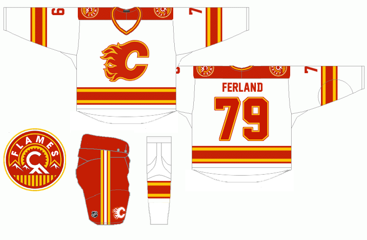
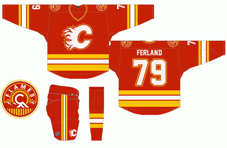
This was one I did a while back!
 |
I think these are fantastic. Exactly what I would want.
__________________
Is your cat doing singing?
|

|

|
|
05-14-2017, 09:55 AM
|
#1682
|
|
First Line Centre
|
Gross & Walmartesque. Get rid of the black. They look like the 90's slanted bottom minus the slant.
|
|
|
|
|
The Following 4 Users Say Thank You to Boreal For This Useful Post:
|
|
|
05-14-2017, 11:02 AM
|
#1683
|
|
Franchise Player
Join Date: Sep 2002
Location: I'm right behind you
|
Quote:
Originally Posted by nobles_point
Gross & Walmartesque. Get rid of the black. They look like the 90's slanted bottom minus the slant.
|
Dude, crack first thing in the morning on Mother's Day? Those look nothing like the pedestal jerseys. 
__________________
Don't fear me. Trust me.
|

|
|
|
05-14-2017, 11:11 AM
|
#1684
|
|
Franchise Player
|
Quote:
Originally Posted by Reaper
Dude, crack first thing in the morning on Mother's Day? Those look nothing like the pedestal jerseys. |
What are you talking about? The striping on the white is exactly the same as the pedestal jerseys and the red is very similar. The only major difference other than the pedestal itself on the white is the shoulder yolk doesn't extend down the sleeve.
|
|
|
|
|
05-14-2017, 11:44 AM
|
#1685
|
|
Franchise Player
Join Date: Sep 2002
Location: I'm right behind you
|
Quote:
Originally Posted by Alberta_Beef
What are you talking about? The striping on the white is exactly the same as the pedestal jerseys and the red is very similar. The only major difference other than the pedestal itself on the white is the shoulder yolk doesn't extend down the sleeve.
|
Okay, let me break it down for you. The striping pattern isn't angled on either of the sleeves and the shoulder yoke (it's not an egg) has the old St. Louis Blues striping pattern. The Flames have used the same sleeve and sock stripes across a few different jerseys and I don't think I've ever heard of anyone saying they look like the pedestal jerseys. Also, the Calgary Flames have used the same shade of red for their entire existence (186). It has never changed.
__________________
Don't fear me. Trust me.
|
|
|
|
|
The Following User Says Thank You to Reaper For This Useful Post:
|
|
|
05-14-2017, 11:57 AM
|
#1686
|
|
Franchise Player
|
Quote:
Originally Posted by Reaper
Okay, let me break it down for you. The striping pattern isn't angled on either of the sleeves and the shoulder yoke (it's not an egg) has the old St. Louis Blues striping pattern. The Flames have used the same sleeve and sock stripes across a few different jerseys and I don't think I've ever heard of anyone saying they look like the pedestal jerseys. Also, the Calgary Flames have used the same shade of red for their entire existence (186). It has never changed.
|
You stated they look "nothing like" the pedestal jersey, that is simply false because as I pointed out the striping around the waist is the same. I certainly see the similarity between the two, it's really not that hard if you pull your head out of your ass. I also never said a thing about the shade of red, so I don't know what your point is in bringing it up.
|
|
|
|
|
The Following User Says Thank You to Alberta_Beef For This Useful Post:
|
|
|
05-14-2017, 11:59 AM
|
#1687
|
|
Franchise Player
Join Date: Sep 2002
Location: I'm right behind you
|
Quote:
Originally Posted by Alberta_Beef
You stated they look "nothing like" the pedestal jersey, that is simply false because as I pointed out the striping around the waist is the same. I certainly see the similarity between the two, it's really not that hard if you pull your head out of your ass. I also never said a thing about the shade of red, so I don't know what your point is in bringing it up.
|
Pull your own head out of your ass then as you certainly did bring up the shade of red. It was your second point of justification.
__________________
Don't fear me. Trust me.
|
|
|
|
|
05-14-2017, 12:00 PM
|
#1688
|
|
Franchise Player
|
Quote:
Originally Posted by Reaper
Pull your own head out of your ass then as you certainly did bring up the shade of red. It was your second point of justification.
|
I was referring to the striping on the red jersey, not the shade of red.
|
|
|
|
|
05-14-2017, 12:02 PM
|
#1689
|
|
Franchise Player
Join Date: Sep 2002
Location: I'm right behind you
|
Quote:
Originally Posted by Alberta_Beef
I was referring to the striping on the red jersey, not the shade of red.
|
The red is very similar? What else would you be referring to if not the shade? The fabric weave?
__________________
Don't fear me. Trust me.
|
|
|
|
|
05-14-2017, 12:05 PM
|
#1690
|
|
Franchise Player
|
Quote:
Originally Posted by Reaper
The red is very similar? What else would you be referring to if not the shade? The fabric weave?
|
Considering I referred to the white jersey as "the white", it shouldn't be this difficult for you.
And as I said it was referring to the red jersey, ie the home jersey.
|
|
|
|
|
The Following User Says Thank You to Alberta_Beef For This Useful Post:
|
|
|
05-14-2017, 12:08 PM
|
#1691
|
|
Franchise Player
Join Date: Dec 2003
Location: Sector 7-G
|
Quote:
Originally Posted by Alberta_Beef
What are you talking about? The striping on the white is exactly the same as the pedestal jerseys and the red is very similar. The only major difference other than the pedestal itself on the white is the shoulder yolk doesn't extend down the sleeve.
|

Totally different except for maybe the bottom striping.
|
|
|
|
|
The Following 2 Users Say Thank You to Otto-matic For This Useful Post:
|
|
|
05-14-2017, 12:11 PM
|
#1692
|
|
Franchise Player
Join Date: Sep 2002
Location: I'm right behind you
|
Quote:
Originally Posted by Alberta_Beef
Considering I referred to the white jersey as "the white", it shouldn't be this difficult for you.
And as I said it was referring to the red jersey, ie the home jersey.
|
I guess it's my fault that you can't be bothered to structure a sentence and use proper nouns. Weird.
__________________
Don't fear me. Trust me.
|
|
|
|
|
05-14-2017, 12:17 PM
|
#1693
|
|
Franchise Player
|
Quote:
Originally Posted by Otto-matic
Totally different except for maybe the bottom striping.
|
Which is exactly what I was referring to. The striping being the same on the white jersey and similar on the red jersey is certainly makes saying they are "nothing like the pedestal jerseys" a false statement, that is quite a strong similarity.
Last edited by Alberta_Beef; 05-14-2017 at 12:21 PM.
|
|
|
|
|
05-14-2017, 12:19 PM
|
#1694
|
|
Franchise Player
|
Quote:
Originally Posted by Reaper
I guess it's my fault that you can't be bothered to structure a sentence and use proper nouns. Weird.
|
Sorry I can't be as perfect as you
|
|
|
|
|
05-14-2017, 12:29 PM
|
#1695
|
|
Franchise Player
Join Date: Sep 2002
Location: I'm right behind you
|
Quote:
Originally Posted by Alberta_Beef
Sorry I can't be as perfect as you
|
I'm not perfect but I do have the ability to concisely convey thoughts and ideas in written word. Maybe start with that.
__________________
Don't fear me. Trust me.
|
|
|
|
|
05-14-2017, 02:05 PM
|
#1696
|
|
First round-bust
Join Date: Feb 2015
Location: speculating about AHL players
|
Is this bickering really necessary?
__________________
2026 World Junior Pool Champion
Need a deal on a new or pre-owned car? Come see me at Platinum Mitsubishi DM me to chat!
|
|
|
|
|
05-14-2017, 02:54 PM
|
#1697
|
|
#1 Goaltender
Join Date: Aug 2011
Location: Not cheering for losses
|
Can you guys get it over with and make out already?
|
|
|
|
|
The Following 11 Users Say Thank You to sun For This Useful Post:
|
Cheese,
Clarkey,
DiracSpike,
drewtastic,
Funkhouser,
Hey Connor, It's Mess,
mile,
MrMike,
PepsiFree,
Split98,
TheScorpion
|
|
05-14-2017, 05:49 PM
|
#1698
|
|
Not a casual user
Join Date: Mar 2006
Location: A simple man leading a complicated life....
|
Quote:
Originally Posted by Reaper
I'm not perfect but I do have the ability to concisely convey thoughts and ideas in written word. Maybe start with that.
|
Get a room!
__________________
|
|
|
|
|
05-14-2017, 06:01 PM
|
#1699
|
|
Scoring Winger
|
Quote:
Originally Posted by Kolbe31
This was one I did a while back!
|
I really like these ones. I think a little bit of black is needed. I like the black C, but even as an accent it is great
|
|
|
|
|
The Following 2 Users Say Thank You to Playfair For This Useful Post:
|
|
|
05-15-2017, 12:08 PM
|
#1700
|
|
Scoring Winger
Join Date: Jul 2011
Location: at home
|
The flaming C should be white. This is, in fact, not about personal preferences. It's all about contrast.
In a small scale or seen from a distance, a white logo on red will always be recognized as SOMETHING, mostly retaining its shape and brand identity. On the other hand, a black logo on red will be, well, a splash of black color on red. That's it and you a can't really do anything about it, especially in today's digital era.
Imagine the great Red Wings home uniform with a black logo and black stripes - no more explanation is needed.
Flames retro uniforms are almost perfect. The only downside is the yellow logo outline touching the white, making the white C look too thick and the red C too thin. Yellow and white will simply blend together into a yellowish white on a small scale, thus they should be IMO always separated.
Long story short, based on my observation and knowledge, this is the the optimal variation for the fantastic flaming C design:

on jersey ...
cheers
|
|
|
|
|
The Following 28 Users Say Thank You to playmaker For This Useful Post:
|
bc-chris,
DaQwiz,
Dion,
drewtastic,
Flames89,
Funkhouser,
JohnnyB,
JT45,
Kolbe31,
Komskies,
Lil Pedro,
Max Cow Disease,
Mazrim,
MrMike,
Mustache,
normtwofinger,
OBCT,
Phaneufenstein,
Saint Troy,
sec304,
SirPsychoSexy,
Split98,
SportsJunky,
stazzy33,
TheFlamesVan,
TheScorpion,
tknez16,
tripleoradooo
|
 Posting Rules
|
You may not post new threads
You may not post replies
You may not post attachments
You may not edit your posts
HTML code is Off
|
|
|
All times are GMT -6. The time now is 08:50 AM.
|
|