 03-19-2019, 03:12 PM
|
#121
|
|
Franchise Player
Join Date: Sep 2002
Location: I'm right behind you
|
Quote:
Originally Posted by oldschoolcalgary

love the retros to be honest... the current ones are pretty good too, though the side piping isn't great...
|
This is the second season that the Calgary Flames jerseys have not had piping on them. ")
__________________
Don't fear me. Trust me.
|

|

|
|
03-19-2019, 03:14 PM
|
#122
|
|
Franchise Player
Join Date: Sep 2002
Location: I'm right behind you
|
Quote:
Originally Posted by Tyler
Someone photoshop a white Adidas retro please!
|
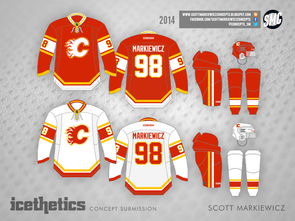
I worked a long time on this.
__________________
Don't fear me. Trust me.
|
|
|
|
|
The Following 2 Users Say Thank You to Reaper For This Useful Post:
|
|
|
03-19-2019, 03:16 PM
|
#123
|
|
Franchise Player
Join Date: Aug 2007
Location: Ontario
|

Quote:
Originally Posted by ComixZone
I'd be onboard with a full black jersey as a 3rd jersey after the retros are in place as the main jerseys.
I think the Flames need to get back to the retros and have those be their main jerseys forever. It helps establish the brand, and then from there you can have one-off jerseys, or more experimental 3rd jerseys.
Fans demanding an Ol Blasty jersey? Hell, bring it back for a few nights one year. Sell a boatload, and everyone is happy.
|
Yeah, I love this. There could even be a 'modernization' in the future, but the brand looks a lot better in red/yellow/white IMO.
On special nights, I'd love to see the team try cowboy shoulders again, I definitely want to see blasty back, the black C will be around here and there, and I'd love to see a pedestal attempt again someday just for kicks. There's so much that can be done with "The Flames", but they just need to get the identity and primaries correct.
I think they can even have a heritage jersey too if I'm not mistaken?
Throwback red
Throwback white
Blasty
Cool new idea
2023 could be a good looking year!
On the logo popping more in black, to my eyes the contrast between the red and the C is much greater on the retro whites. You can also usually spot the retros in the stands, and it's a pretty clear 'C' when a Calgary retro pops up in a road game. The black C works out as a bit bland to me, and disappears in a sea of Senators or Devils fans.
I think where they differ is clarity and the yellow outline on the logo. ComixZone's Iggy avatar is a good example of how much the C stands out on the red jerseys, but the logo always seems a touch blurry. I'm sure we'll see some offset outline variations that will look as crisp as the black C does
This one's off to a good start:
|
|
|
|
|
03-19-2019, 03:19 PM
|
#124
|
|
Franchise Player
Join Date: Dec 2003
Location: Sector 7-G
|
Quote:
Originally Posted by RM14
T shirt orders?
|
I'd love to order one too if we have a t-shirt printer.
|
|
|
|
|
03-19-2019, 03:24 PM
|
#126
|
|
Franchise Player
Join Date: Oct 2014
Location: Springbank
|
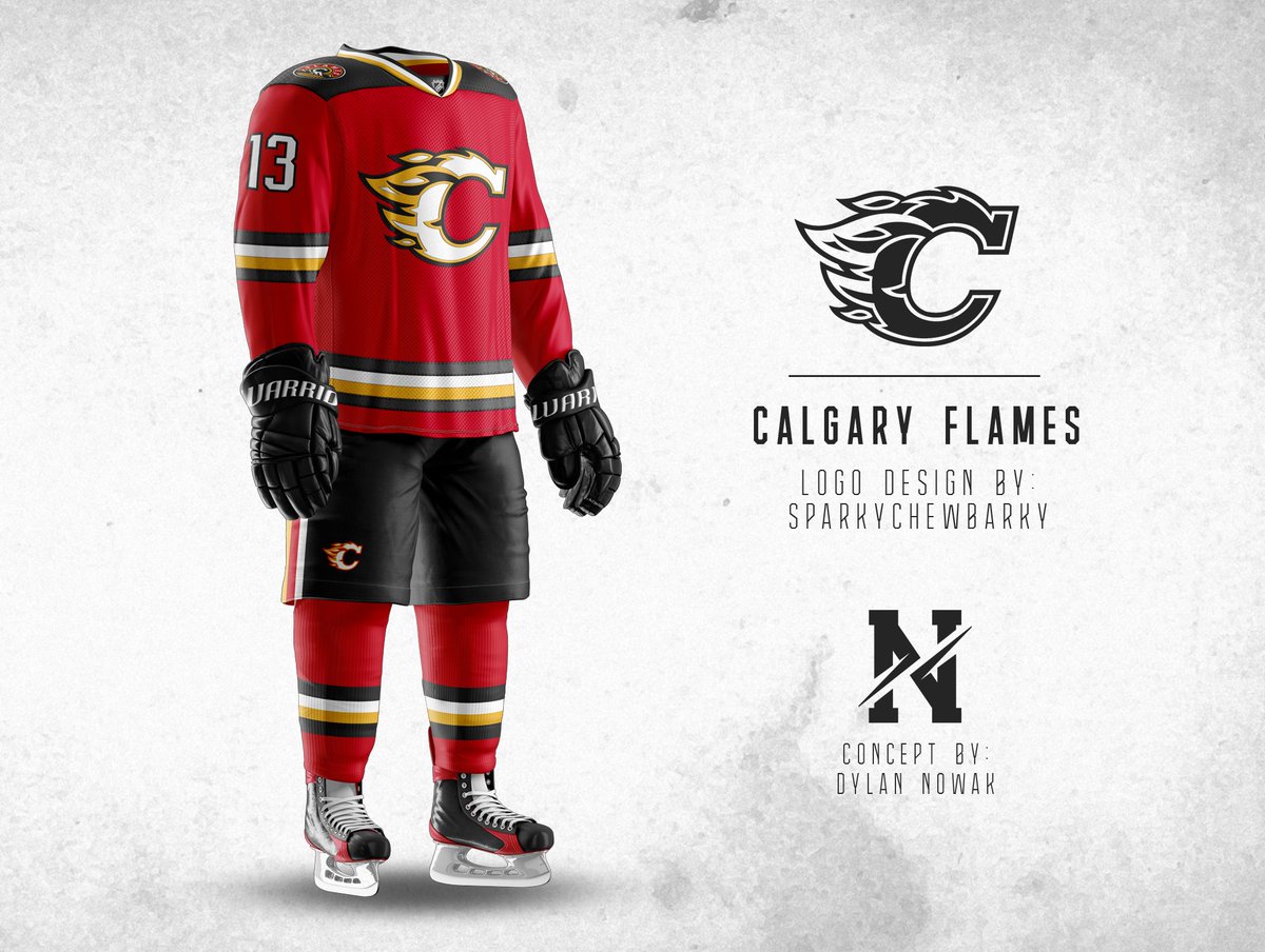
This dude did a redesign. I don't like the shape of the flaming C but I like the notion of black, yellow and white all there.
|
|
|
|
|
03-19-2019, 03:32 PM
|
#127
|
|
Franchise Player
Join Date: Dec 2003
Location: Sector 7-G
|

I took some liberties on his quotes 
Last edited by Otto-matic; 03-19-2019 at 03:41 PM.
|
|
|
|
|
The Following User Says Thank You to Otto-matic For This Useful Post:
|
|
|
03-19-2019, 03:45 PM
|
#128
|
|
Franchise Player
Join Date: Dec 2003
Location: Sector 7-G
|
I actually just prefer the font without the logo.
|
|
|
|
|
03-19-2019, 03:50 PM
|
#129
|
|
Lifetime Suspension
|
Quote:
Originally Posted by GioforPM
This dude did a redesign. I don't like the shape of the flaming C but I like the notion of black, yellow and white all there.
|
You don't tug on supermans cape and you don't touch the Flames logo.
|
|
|
|
|
The Following 28 Users Say Thank You to Rando For This Useful Post:
|
4X4,
Captaincanada80,
Cole436,
Cowboy89,
FanIn80,
Fire,
flamesgod,
Fuzz,
Gaskal,
Gaudreau is a Ninja,
GreenHardHat,
greyshep,
Hockeyguy15,
jayswin,
Locke,
redflamesfan08,
Rhettzky,
Scary Eloranta,
Scroopy Noopers,
SixtySix,
Split98,
Textcritic,
tknez16,
Tyler,
vennegoor of hesselink,
Yoho,
You Need a Thneed,
Zulu29
|
|
03-19-2019, 03:56 PM
|
#130
|
|
Franchise Player
Join Date: Nov 2003
Location: Calgary, AB
|
Quote:
Originally Posted by Toonage
|
Thanks - this is what I was looking for. All you sending me the 1989 version.. thanks
|
|
|
|
|
The Following User Says Thank You to Tyler For This Useful Post:
|
|
|
03-19-2019, 04:00 PM
|
#131
|
|
Franchise Player
|
Quote:
Originally Posted by GioforPM
This dude did a redesign. I don't like the shape of the flaming C but I like the notion of black, yellow and white all there.
|
Look at this heretical bull#### right here.
__________________
Quote:
Originally Posted by MisterJoji
Johnny eats garbage and isnt 100% committed.
|
|
|
|
|
|
03-19-2019, 04:07 PM
|
#132
|
|
Franchise Player
Join Date: Mar 2007
Location: Income Tax Central
|
Yeah, I dont think conventional designing wisdom would substantiate changing the iconic logo.
__________________
The Beatings Shall Continue Until Morale Improves!
This Post Has Been Distilled for the Eradication of Seemingly Incurable Sadness.
The World Ends when you're dead. Until then, you've got more punishment in store. - Flames Fans
If you thought this season would have a happy ending, you haven't been paying attention.
|
|
|
|
|
The Following User Says Thank You to Locke For This Useful Post:
|
|
|
03-19-2019, 04:13 PM
|
#133
|
|
Franchise Player
Join Date: Feb 2006
Location: Calgary, AB
|
I went more player specific with the Mania logo...

__________________
Turn up the good, turn down the suck!
|

|
|
|
The Following 2 Users Say Thank You to getbak For This Useful Post:
|
|
|
03-19-2019, 04:18 PM
|
#134
|
|
Scoring Winger
Join Date: Jul 2017
Location: Lethbridge
|
Quote:
Originally Posted by GioforPM
This dude did a redesign. I don't like the shape of the flaming C but I like the notion of black, yellow and white all there.
|
No thank you!!!!!
__________________
Calgary Flames #1 St. Louis Cardinals #1
|
|
|
|
|
The Following 3 Users Say Thank You to Gaudreau is a Ninja For This Useful Post:
|
|
|
03-19-2019, 05:13 PM
|
#135
|
|
First Line Centre
Join Date: Jul 2010
Location: Sagami Bay, Japan
|
I generally love checking out fan redesigns of the jerseys, but the flaming C logo is the one part that should never, under any circumstances, be tampered with.
Very happy to hear they'll be going with the retros, and I hope the rumors of a full time switch are true. The black jerseys should be saved for thirds. Oh, and no blue flags please. Can't wait for playoffs!
|
|
|
|
|
03-19-2019, 05:21 PM
|
#136
|
|
Franchise Player
Join Date: Sep 2013
Location: Brisbane
|
I've seen some love for it in here so I just wanted to counter by saying I hate the horse head logo. I hated it then and I still hate it now. There is something just off about all animal/human logos that are facing forward. Then you add in it is mostly yellow, the Flames look like tissues when blowing a nose, the mouth looks like the horse is happy when it is supposed to be angry per the eyes and nostrils, and finally the only good thing about it, the symmetry, is ruined by that flame on the forehead. I do not like this design at all.
Why do people like this? Surely it can't be the good memories of the teams that wore these jerseys? Do you all just want to watch the world burn?
It's not like I don't want change. I absolutely loved the shoulder patch logo on the recent word mark thirds. Using the sun in the west was very creative and this logo represents the Calgary Flames well. Give me this on a new third jersey or even a fresh take on the Flaming C. Just no horse head please or really anything with a horse or a "Western" theme at all.
I guess it could be worse. The horse is in a league above the all time ugliest logos like Captain Highliner, Buffaslug, Uterus Star, and the Oilers.
__________________
The masses of humanity have always had to surf.
Last edited by FireGilbert; 03-19-2019 at 05:27 PM.
|
|
|
|
|
03-19-2019, 07:55 PM
|
#137
|
|
Backup Goalie
Join Date: Dec 2017
Location: Enemy Territory
Exp: 
|
Quote:
Originally Posted by Toonage
|
The atlanta "A" needs to be on there.
Can someone help tell me how to post photo's on here instead of linking a URL.
Last edited by FlameX; 03-19-2019 at 07:59 PM.
|
|
|
|
|
03-19-2019, 08:03 PM
|
#138
|
|
Franchise Player
|
Quote:
Originally Posted by FireGilbert
I've seen some love for it in here so I just wanted to counter by saying I hate the horse head logo. I hated it then and I still hate it now. There is something just off about all animal/human logos that are facing forward. Then you add in it is mostly yellow, the Flames look like tissues when blowing a nose, the mouth looks like the horse is happy when it is supposed to be angry per the eyes and nostrils, and finally the only good thing about it, the symmetry, is ruined by that flame on the forehead. I do not like this design at all.
Why do people like this? Surely it can't be the good memories of the teams that wore these jerseys? Do you all just want to watch the world burn?
It's not like I don't want change. I absolutely loved the shoulder patch logo on the recent word mark thirds. Using the sun in the west was very creative and this logo represents the Calgary Flames well. Give me this on a new third jersey or even a fresh take on the Flaming C. Just no horse head please or really anything with a horse or a "Western" theme at all.
I guess it could be worse. The horse is in a league above the all time ugliest logos like Captain Highliner, Buffaslug, Uterus Star, and the Oilers.
|
Hated the black horsehead jerseys. It was the '04 shoulder crest version that I liked. Just a terrible mistake putting the Alberta and Canadian flags on instead.
The black jerseys though, that's right up with there with that goofy looking redesign of the Flaming C. Hate when they screw with the logo.
I find black home jerseys in general stupid looking unless it's the Kings or Bruins.
__________________
Until the Flames make the Western Finals again, this signature shall remain frozen.

|
|
|
|
|
03-19-2019, 08:10 PM
|
#139
|
|
Lifetime Suspension
|
Quote:
Originally Posted by Mr.Coffee
I find black home jerseys in general stupid looking unless it's the Kings or Bruins.
|
The Lightnings current 3rd is the dumbest thing I've ever seen.
http://www.nhluniforms.com/Lightning...ightning22.png
|
|
|
|
|
03-20-2019, 12:39 AM
|
#140
|
|
Franchise Player
Join Date: Oct 2014
Location: Springbank
|
Quote:
Originally Posted by Rando
You don't tug on supermans cape and you don't touch the Flames logo.
|
I'm not saying to change the logo shape. Just the colour scheme.
|
|
|
|
 Posting Rules
|
You may not post new threads
You may not post replies
You may not post attachments
You may not edit your posts
HTML code is Off
|
|
|
All times are GMT -6. The time now is 11:52 AM.
|
|


