|
View Poll Results: Select the logos you like below for Calgarypuck's new look? (You may choose >1)
|
|
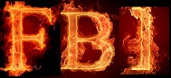
Option A - Simple black text with fire
|
   
|
74 |
12.52% |
|
Option B - Artsy CP with rink shape in the middle
|
  
|
121 |
20.47% |
|
Option C - Moving puck with text bubble
|
  
|
97 |
16.41% |
|
Option D - "Puck Calgary"
|
  
|
11 |
1.86% |
|
Option E - CP Puck text bubble
|
  
|
155 |
26.23% |
|
Option F - White text logo with puck on fire
|
  
|
21 |
3.55% |
|
Option G - Round shield (CP middle)
|
|
152 |
25.72% |
|
Option H - black text logo with Canada flag
|
|
80 |
13.54% |
|
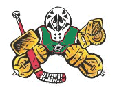
Option I - Flaming puck with city shadowed
|
|
49 |
8.29% |
|
Option J - Round shield (player outline middle)
|
|
106 |
17.94% |
|
Option K - Round shield (Calgary tower middle)
|
|
201 |
34.01% |
 09-03-2014, 06:07 PM
|
#121
|
|
#1 Goaltender
|
"I" for me....I spend a lot of time sitting around pleasant campfires....so like the flames on this one. While all are worthy, I'm not big on "stylized" logos (which is a kinda redundant description isn't it?), so I has the homiest feel to it for me.
|

|

|
|
The Following 2 Users Say Thank You to taxbuster For This Useful Post:
|
|
|
09-03-2014, 06:31 PM
|
#122
|
|
Powerplay Quarterback
Join Date: Jul 2008
Location: Republic of Panama
|
I apologize in advance if it has already been answered, but yes, the Calgary Tower became a trade mark about 20 years ago. I was involved in a small way so I am very sure.
__________________
Talk is cheap because supply exceeds demand.
|
|
|
|
|
The Following 2 Users Say Thank You to FlamingHomer For This Useful Post:
|
|
|
09-03-2014, 07:09 PM
|
#123
|
|
Lifetime Suspension
|
Quote:
Originally Posted by AC

I think my issue with K is that the flame and tower seem really crooked to me. I think if the flame was rotated a bit like so, it would work much better.
 
__________Before____________________After__________ |
Ha, I was just going to mention this.
Yes, that looks much sharper.
And besides I guess you can't use the Calgary tower logo. E it is!
|
|
|
|
|
09-03-2014, 08:54 PM
|
#124
|
|
CP's Resident DJ
Join Date: Jul 2003
Location: In the Gin Bin
|
Quote:
Originally Posted by Temporary_User
B or E
|
Then I will go the opposite.
E or B.
|
|
|
|
|
09-04-2014, 08:31 AM
|
#125
|
|
Franchise Player
Join Date: Aug 2007
Location: Ontario
|
Quote:
Originally Posted by Itse
Is there a chance we could still get G fixed?
Says "Calgary Puck" (instead of Calgarypuck) I believe because it's a variation of an earlier version of J (that had the same problem).
|
I can, yes. I thought I had put up a fixed version of that one with the others too. I'll have to look.
Edit:
I did!

Last edited by Split98; 09-04-2014 at 10:11 AM.
|
|
|
|
|
The Following User Says Thank You to Split98 For This Useful Post:
|
|
|
09-04-2014, 09:23 AM
|
#126
|
|
Franchise Player
Join Date: Feb 2012
Location: NC
|
G, J, and K look awesome, I went with G. However, I am starting to like the speech bubble the more I look at it.
|
|
|
|
|
09-04-2014, 09:41 AM
|
#127
|
|
Uncle Chester
|
I like all of them but I don't love any of them. That being said, if pressed for an answer, I'd vote for G once it is fixed.
|
|
|
|
|
09-04-2014, 11:30 AM
|
#128
|
|
Powerplay Quarterback
|
I didn't expect mine to make it to the finals... :P. It was all a spur in the moment kind of thing but I'm liking the moving puck with the text bubble.
__________________
 CPHL Dallas Stars
|
|
|
|
|
09-04-2014, 12:27 PM
|
#129
|
|
Franchise Player
Join Date: May 2004
Location: Helsinki, Finland
|
Quote:
Originally Posted by Split98
I can, yes. I thought I had put up a fixed version of that one with the others too. I'll have to look.
Edit:
I did!
|
Fantastic, thank you 
|
|
|
|
|
The Following User Says Thank You to Itse For This Useful Post:
|
|
|
09-04-2014, 12:53 PM
|
#130
|
|
Franchise Player
Join Date: Oct 2001
Location: Flames fan in Seattle
|
The calgary tower underdog dominating the voting!
__________________
|
|
|
|
|
09-04-2014, 01:01 PM
|
#131
|
|
Official CP Photographer
Join Date: Sep 2003
Location: PL15
|
I've always loved B. But I'm also feeling K. Lots of good choices here. This is tough.
|
|
|
|
|
09-04-2014, 01:18 PM
|
#132
|
|
Franchise Player
Join Date: Feb 2007
Location: City by the Bay
|
Bingo - are you planning on doing a run off between the top X (4?) contenders and have CPers narrow their vote and only be able to cast 1 vote?
|
|
|
|
|
The Following User Says Thank You to Clever_Iggy For This Useful Post:
|
|
|
09-04-2014, 01:35 PM
|
#133
|
|
The new goggles also do nothing.
Join Date: Oct 2001
Location: Calgary
|
I think having only 1 vote on the top ones would be interesting at least.
Plus the Calgary Tower one is out now so that may change people's votes.
__________________
Uncertainty is an uncomfortable position.
But certainty is an absurd one.
|
|
|
|
|
09-04-2014, 01:53 PM
|
#134
|
|
Franchise Player
Join Date: Jun 2006
Location: Calgary, Alberta
|
Should do another vote with the top 3 aside from the Calgary Tower option.
EDIT: For the round shield, can the Calgary Tower still be used in the left button of the logo?
|
|
|
|
|
09-04-2014, 02:33 PM
|
#135
|
|
Backup Goalie
Join Date: Jun 2007
Exp: 
|
I like B as the logo and K as the shoulder patch.
|
|
|
|
|
09-04-2014, 02:42 PM
|
#136
|
|
Franchise Player
Join Date: Sep 2011
Location: The toilet of Alberta : Edmonton
|
B (the coloured one), J, K.
__________________
"Illusions Michael, tricks are something a wh*re does for money ....... or cocaine"
|
|
|
|
|
09-04-2014, 03:12 PM
|
#137
|
|
Powerplay Quarterback
|
Lots of good ideas here.
I like G,J,K - although I think a black outer circle would be nice. Since a puck is (usually) black and black is also in the Flames jersey.
|
|
|
|
|
09-04-2014, 03:15 PM
|
#138
|
|
Retired
|

There is nothing wrong in trade-mark law using the Calgary Tower silhouette in the logo.
I looked up the trademarks, here are links to the two trade-marks which include design elements:
http://www.cipo.ic.gc.ca/app/opic-ci...tIndexOnPage=1
http://www.cipo.ic.gc.ca/app/opic-ci...tIndexOnPage=1
First of all, its clear the silhouette in our logo is not a copy of the silhouette in the designs that are trademarked. Second, the protected wares and services with those designs do not include anything to do with discussion boards--- so on that level, using the tower is not against the law.
There's more to it than that however, you may face a type of passing off allegation, where the owners of the Calgary Tower say having that silhouette in the logo leads others to believe we are associated with the tower, or they endorse us, etc.
So maybe its not worthwhile to go down that path anyway.
There is a bigger problem with this and some of the other logos though, and that is, calling the board "The Unofficial Calgary Flames Community" or anything with the words "Calgary Flames" in it as a logo could get some push-back from the Flames. If it hasn't been done already, someone (ie. Bingo) should ask the Flames if they take issue with a slogan which uses the word "Calgary Flames" in the title. I know it says "Unofficial" to show we're not endorsed or affiliated, so could be a type of fair-use issue, but I think it would be best to seek permission before adopting it.
|
|
|
|
|
The Following 6 Users Say Thank You to Kjesse For This Useful Post:
|
|
|
09-04-2014, 03:18 PM
|
#139
|
|
Owner
Join Date: Dec 2001
Location: Calgary
|
Quote:
Originally Posted by Delgar
There is a bigger problem with this and some of the other logos though, and that is, calling the board "The Unofficial Calgary Flames Community" or anything with the words "Calgary Flames" in it as a logo could get some push-back from the Flames. If it hasn't been done already, someone (ie. Bingo) should ask the Flames if they take issue with a slogan which uses the word "Calgary Flames" in the title. I know it says "Unofficial" to show we're not endorsed or affiliated, so could be a type of fair-use issue, but I think it would be best to seek permission before adopting it.
|
To be honest I've never liked that slogan anyway ... I prefer the 24/7 one on the main site.
unofficial sounds meek
and I don't like naming the Flames specifically
|
|
|
|
|
The Following 2 Users Say Thank You to Bingo For This Useful Post:
|
|
|
09-04-2014, 03:18 PM
|
#140
|
|
Lifetime Suspension
|
Okay, finally got a chance to do this.
The logo "banner" sans rectangle, outline and dancing flame removed as well as a subtext change:

And again with an alternate version that I meant to post earlier:

Hope this gives a better idea for people, as I previously only had time to post that first and only iteration of the logo.
Last edited by djsFlames; 09-04-2014 at 05:31 PM.
|
|
|
|
|
The Following User Says Thank You to djsFlames For This Useful Post:
|
|
 Posting Rules
|
You may not post new threads
You may not post replies
You may not post attachments
You may not edit your posts
HTML code is Off
|
|
|
All times are GMT -6. The time now is 03:31 AM.
|
|


