I guess I like the trend of simpler jerseys without piping and what not, ex: Tampa, Carolina and Dallas. But they're all just kinda boring. I wouldn't mind a few bells and whistles.
They should have kept the gold, picked a different green, and used a similar striping pattern as the 90s ones. Something like this would have been better IMO:
Last edited by AC; 06-04-2013 at 11:03 PM.
The Following 15 Users Say Thank You to AC For This Useful Post:
Uniform upgrade (not hard to beat what they had), but that's a huge downgrade on the logo. It includes all the worst trends in sports logo design over the past several years - angled serifs, obnoxious shadowing etc. I think it already looks a bit dated.
Nice to see a normal font and number (hopefully the Flames move away from the 15+ year old font on their next set).
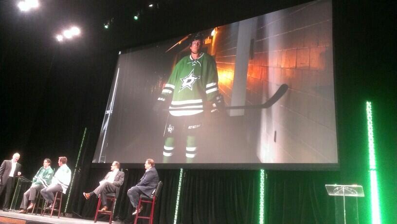
Only change I would make would be to have that pants logo with the State of Texas, as the shoulder logo, not the round logo. And a green home helmet as opposed to black.
The jerseys really highlight the design issues of that logo. If you can't put your teams logo on your jersey without adding extra padding around it, then maybe you should have rethought the logo for a second.
The white edge on the star on the green jersey just screams "amateurs at work". At least using gold there would have made it more tolerable. Like this:
(A really quick and rough Paint job on top of AC:s version, but you get the idea.)
The logo looks notably better on the white jersey, since the dark green edges effectively makes the star bigger and bolder. It makes the proportions of the star and D to work much better.
The Following User Says Thank You to Itse For This Useful Post:
They picked old school Riders green; pretty much the ugliest shade of green possible. Then again I've never been a fan of the colour green.
Funny how much better AC's concept is, with just the subtlest of changes.
All due respect to AC, the gold absolutely ruined the Dallas jerseys for years.
Really love the colors of these new jerseys, especially the green. Great shade.
__________________ I am in love with Montana. For other states I have admiration, respect, recognition, even some affection, but with Montana it is love." - John Steinbeck
The Following User Says Thank You to Displaced Flames fan For This Useful Post: