 02-11-2016, 02:55 PM
|
#1241
|
|
Scoring Winger
Join Date: Jul 2011
Location: at home
|
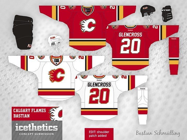
If the Flames decide to keep black on their uniforms, I hope the result will be similar to what Bastian Schmulling proposed a few years ago in his concept:
The best thing about it is that yellow and red really stand out - something that helps to distinguish us from teams such as Devils or Senators.
The white logo helps to improve the overall contrast as well. I just made the slight modification to the Bastian's concept by adding the new Flames shoulder patch ...
|

|

|
|
The Following User Says Thank You to playmaker For This Useful Post:
|
|
 02-11-2016, 03:07 PM
|
#1242
|
|
Crash and Bang Winger
Join Date: Aug 2011
Location: East of the Rockies, West of the rest
|
Quote:
Originally Posted by playmaker

If the Flames decide to keep black on their uniforms, I hope the result will be similar to what Bastian Schmulling proposed a few years ago in his concept:
The best thing about it is that yellow and red really stand out - something that helps to distinguish us from teams such as Devils or Senators.
The white logo helps to improve the overall contrast as well. I just made the slight modification to the Bastian's concept by adding the new Flames shoulder patch ...
 |
Those are really sharp. The only thing I don't care for is the italicized font. Similarly to our current threads, I find it so NASCAR. I prefer the big, bold, block type letting of the retro set. Other than that though these are outstanding.
|

|

|
 02-11-2016, 03:35 PM
|
#1243
|
|
#1 Goaltender
Join Date: Feb 2012
Location: Calgary
|
^^ Those are nice. I was rather indifferent to the white C, but those are sharp.
Seems clear that this board just wants to get rid of the piping, the flags and keep the lettering/numbering simple.
Do it, take my money, I am ready to retire the '04s.
__________________
From HFBoard oiler fan, in analyzing MacT's management:
O.K. there has been a lot of talk on whether or not MacTavish has actually done a good job for us, most fans on this board are very basic in their analysis and I feel would change their opinion entirely if the team was successful.
|

|

|
|
The Following User Says Thank You to Fighting Banana Slug For This Useful Post:
|
|
 02-11-2016, 03:45 PM
|
#1244
|
|
First Line Centre
Join Date: Oct 2009
Location: Calgary
|
Quote:
Originally Posted by Fighting Banana Slug

Seems clear that this board just wants to get rid of the piping, the flags and keep the lettering/numbering simple.
|
This is unanimous
|

|

|
|
The Following User Says Thank You to RM14 For This Useful Post:
|
|
 02-11-2016, 03:53 PM
|
#1245
|
|
Jordan!
Join Date: Jul 2009
Location: Chandler, AZ
|
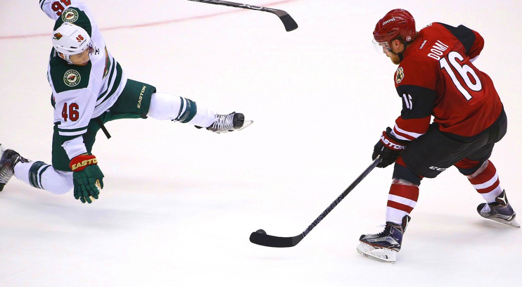
Black pants/red helmet is done already
|

|

|
 02-12-2016, 12:21 AM
|
#1246
|
|
Crash and Bang Winger
Join Date: May 2009
Location: Calgary
|
 Very nice!
Wow - I'm not sure I've seen this concept before. Made even better by the addition of the new shoulder crest (really the only good thing to come out of the current 3rds - IMHO). Lots to like - as other posters have mentioned above. I would love to see these with a more traditional numbering / lettering font - with better outlining contrast, but other than that - yessssss. I know the Flames love the black C right now, but the red jersey with a black C would look good as a 3rd with this set. Hell - even keep the current 3rds for all I care if I get these as primary's. Beautiful.

__________________
The Doctor is in
|

|

|
 02-12-2016, 12:44 AM
|
#1247
|
|
Scoring Winger
Join Date: Dec 2015
Location: Calgary via Palm Desert
|
I hope we get new thirds next year. Something totally different and new. But nothing to do with cowboys, horses or the old west please.
|

|

|
 02-12-2016, 12:49 AM
|
#1248
|
|
Franchise Player
Join Date: Dec 2011
Location: Calgary
|
Kind of OT, but I got one of those new pedestal hats from the Fan-Attic for my birthday, and the more I look at the white C, the more I love it. The black looks sharp if used minimally. I'm all in favour of returning to the white C.
|

|

|
|
The Following User Says Thank You to N-E-B For This Useful Post:
|
|
 02-12-2016, 04:48 AM
|
#1249
|
|
Franchise Player
Join Date: Oct 2006
Location: Calgary
|
Quote:
Originally Posted by playmaker

If the Flames decide to keep black on their uniforms, I hope the result will be similar to what Bastian Schmulling proposed a few years ago in his concept:
The best thing about it is that yellow and red really stand out - something that helps to distinguish us from teams such as Devils or Senators.
The white logo helps to improve the overall contrast as well. I just made the slight modification to the Bastian's concept by adding the new Flames shoulder patch ...
 |
That looks like a worse version of the young guns era white jersey.
To me, that's a big step down from what we have currently and I think the Flames have one of the worst regular jerseys in the league.
I would much prefer the retros full time than that.
__________________
Fireside Chat - The #1 Flames Fan Podcast - FiresideChat.ca
|

|

|
 02-12-2016, 08:21 AM
|
#1250
|
|
Franchise Player
Join Date: Aug 2007
Location: Vancouver
|
The white C needs some yellow around it.
__________________

|

|

|
|
The Following User Says Thank You to Coach For This Useful Post:
|
|
 02-12-2016, 02:48 PM
|
#1251
|
|
Franchise Player
Join Date: Sep 2002
Location: I'm right behind you
|
Quote:
Originally Posted by MattyC

The white C needs some yellow around it.
|
Yes, for the white C the black they added to it was not just a matter of flipping colours around. The black used was a thin outline around the white with a larger swatch of yellow than used on the black C.
__________________
Don't fear me. Trust me.
|

|

|
|
The Following 15 Users Say Thank You to Scary Eloranta For This Useful Post:
|
Da_Chief,
drewtastic,
FanIn80,
Funkhouser,
Jbo,
JonDuke,
Le Golie,
Magnum PEI,
Matty81,
MisterJoji,
normtwofinger,
ricosuave,
Sainters7,
Since1984,
_Q_
|
 03-03-2016, 03:38 PM
|
#1253
|
|
Franchise Player
Join Date: Nov 2003
Location: Calgary, AB
|
Really like #1. Would probably like it ever more without the shoulder patches
|

|

|
|
The Following 2 Users Say Thank You to Tyler For This Useful Post:
|
|
 03-03-2016, 03:38 PM
|
#1254
|
|
First round-bust
Join Date: Feb 2015
Location: speculating about AHL players
|
Quote:
Originally Posted by Scary Eloranta

After seeing the World Cup jerseys yesterday I figured I couldn't do any worse so decided to throw together some ideas for new Flames threads next year. Hoping that we at least get rid of the piping and maybe even lose the flags and use our new secondary logo on the shoulders.
 |
The first and fifth ones are decent, but the rest are pretty garish.
__________________
2026 World Junior Pool Champion
Need a deal on a new or pre-owned car? Come see me at Platinum Mitsubishi DM me to chat!
|

|

|
|
The Following User Says Thank You to TheScorpion For This Useful Post:
|
|
 03-03-2016, 03:40 PM
|
#1255
|
|
First Line Centre
|
#1 and #2 are nice for away and third jerseys. #3 is good for home too, but I would remove the white piping on the shoulders.
|

|

|
 03-03-2016, 03:43 PM
|
#1256
|
|
Franchise Player
Join Date: Oct 2003
Location: Vancouver
|
Quote:
Originally Posted by playmaker

|
These are outstanding. Nice nod to retro styling but still modernized.
Needs to be sent to the Flames for approval and manufacturing for next year so they finally look like a real team.
__________________
A few weeks after crashing head-first into the boards (denting his helmet and being unable to move for a little while) following a hit from behind by Bob Errey, the Calgary Flames player explains:
"I was like Christ, lying on my back, with my arms outstretched, crucified"
-- Frank Musil - Early January 1994
|

|

|
 03-03-2016, 03:44 PM
|
#1257
|
|
Franchise Player
|
Enough with the subtle changes. White, black and red are all over the league. Option #2.
With red pants, red helmet, orange socks.
__________________
"By Grabthar's hammer ... what a savings."
|

|

|
 03-03-2016, 03:57 PM
|
#1258
|
|
Franchise Player
Join Date: Dec 2011
Location: Calgary
|
1 and 5 are awesome, my only concern is they're pretty much a rip-off of the Boston Bruins template. I'd also remove the shoulder patches or get rid of the black in them.
|

|

|
 03-03-2016, 04:01 PM
|
#1259
|
|
Franchise Player
|
I like #s 1 and 5 as well. #6 is an abomination though
|

|

|
|
The Following 3 Users Say Thank You to Scary Eloranta For This Useful Post:
|
|
 Posting Rules
|
You may not post new threads
You may not post replies
You may not post attachments
You may not edit your posts
HTML code is Off
|
|
|
All times are GMT -6. The time now is 07:31 AM.
|
|

