Quote:
Originally Posted by tvp2003

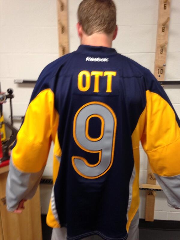
Clearly this was created by a fourth grader using MS Paint. Is there any other explanation?
|
Fourth-graders are normally more creative than that. I'm afraid this was created by a committee of highly paid, experienced, and self-confident marketing executives . . . using MS Paint.
By the way, the font on the front looks to my practised eye like Trade Gothic Bold. Trade Gothic was a very boring 1950s ripoff of a very boring 1908 typeface, News Gothic, which used to be popular for things like almanacs and department store flyers.
Arial is often used by clueless people who can't figure out how to work the font menu. Trade Gothic hasn't even got that sorry excuse for existing.
All that said, I wish the 'BUFFALO' lettering on the front of the jersey was bigger. Much bigger. As in, big enough to completely blot out the grotesque colour of the chest section, the bit that screams, 'Look at me, Ma! I puked mustard on my bib!'