|
View Poll Results: Hiow do you like the leaked jersey?
|
|
Like
|
   
|
185 |
24.03% |
|
Dislike
|
  
|
585 |
75.97% |
 10-28-2013, 02:33 PM
|
#1041
|
|
Powerplay Quarterback
|
The western yoke is subtle and it seems like a lot of people didn't even notice until it was pointed out. I don't mind it. Looks sort of interesting from all the different angles.
|

|

|
|
10-28-2013, 02:35 PM
|
#1042
|
|
Powerplay Quarterback
|
Not sure if this is a bad time or anything, but is fanattics site the most reliable source for one with proper lettering done?
__________________
Long time listener, first time caller.
|
|
|
|
|
10-28-2013, 02:46 PM
|
#1043
|
|
In the Sin Bin
|
I like it except for the dip down on the shoulders which looks really bad.
Usually I hate wordmarks but this one doesn't have the same stupid diagonal letters that some teams have rocked (NYR jerseys)
|
|
|
|
|
10-28-2013, 02:46 PM
|
#1044
|
|
Scoring Winger
Join Date: Feb 2013
Location: Lethbridge
|
You know what...I hated it when i saw the EA version, but i kinda like it in person.
|
|
|
|
|
10-28-2013, 02:55 PM
|
#1045
|
|
Lifetime Suspension
|
 Flames Third Jersey Thread
One of the best things about a new jersey is being able to watch people ask for certain things, have them delivered, and have them be hated.
Some people wanted classic, clean lines, red jersey, new shoulder patch. Got it! Like it? Nope.
Other people wanted something different and original, got it in the form of the wordmark/logo combination and the shoulders, like it? Nope.
Some people hated the EA leak and like the jersey, others were hesitant about the EA leak and hate the jersey.
Personally, I like hearing what people find great or appalling about this jersey. It's kind of interesting that something so basic can result in so many mixed reactions.
|
|
|
|
|
The Following User Says Thank You to strombad For This Useful Post:
|
|
|
10-28-2013, 02:56 PM
|
#1046
|
|
I believe in the Jays.
Join Date: Mar 2006
Location: Kitsilano
|
I like 'em.
|
|
|
|
|
10-28-2013, 03:00 PM
|
#1047
|
|
Franchise Player
Join Date: Mar 2005
Location: Van City - Main St.
|
One of the 5 ugliest jerseys in the league IMO. Very disappointed, would never buy one, or even wear it if I got it for free.
|
|
|
|
|
The Following User Says Thank You to Winsor_Pilates For This Useful Post:
|
|
|
10-28-2013, 03:11 PM
|
#1048
|
|
Franchise Player
Join Date: Oct 2002
Location: not lurking
|
For me, the lettering on the logo is just really weak. It's like a 15 minutes in adobe illustrator first-pass at a concept, at which point you'd take a black marker, highlight the dozen or so things that are wrong, and spent a couple weeks refining it until it's perfect. My list of problems:
1. Concept of the Calgary Flaming Cs or the Calgary Calgaries aside, the extra C is poorly integrated. It's totally unnecessary, but even if you did decide that you needed it, it's really poorly integrated with the rest of the lettering, the way it overlaps the descender on the g and just touches the descender on the y. I also dislike the way that when it's displayed small like this, the outlines around it make the mouth of the C really small. It changes the proportions of it completely, in a very unflattering way.
2. If you look at the topline of the small letters, they're rising at a consistent angle, and then flatten out at the 'r'. Especially with a script, a much more gradual curve would have been a huge improvement. As it is, the way the type shrinks considerably toward the right makes it look a little like someone who was signing a card with really big letters and then suddenly ran out of space and had to suddenly shrink their text, an effect that exacerbated with how busy everything on the right of the uniform is.
3. Poor execution in the lettering. Okay, so it's supposed to look like a handwritten script, right? Look at the stroke coming off of the 'a', and how it would continue into the 'l' if you were using a natural writing motion. It would need to connect to the thinner part of the 'l' loop. But it doesn't. It only makes sense as lettering if you imagine drawing the foot of the 'a', then lifting your pen, going up about a third of the 'l', and then continuing on the l. This 'l' is the sort that would make sense only if following a letter that finishes closer to the x-height, like an 'o'. So you start with this as a concept, then you give it to a professional letterer, and let them do their thing; guaranteed they'll produce something with far more sophistication than you can get from skewing a typeface.
4. The script is really boring. 'Calgary' is actually an awesome word, letter-wise. You've got good length, two different descenders and one ascender (not including the capital C), and interesting curves throughout. This logo fails to take advantage of any of that visual interest. The two descenders are overshadowed by the flaming C, and there's nothing much else going on, except perhaps for slightly enlarging the C.
Aside from the logo, I don't mind the striping, I dislike but don't hate the angles on the shoulders, and the shoulder patches look a little like a microbrewery coaster, which is to say that they're slightly derivative but probably the best part of the uniform.
I hate crapping on someone else's work, but I have a hard time believing that this is really anyone's best work; it looks like designed-by-committee or a last-minute compromise. If it is someone's best work, then it was someone who was asked to do something a little beyond their abilities. I'm not saying I could do a better job. But I could do a job equal to this, at which point I would tell my superiors that if this is the concept they want, they need to hire an expert letterer to take the concept to flawless execution.
*I should mention, all of these observations I'm making are on seeing the different photos of these on jerseys being worn. I might have different thoughts on a few of the elements (particularly the skew on the text) if I was seeing them flat.
Last edited by octothorp; 10-28-2013 at 03:13 PM.
|
|
|
|
|
The Following 3 Users Say Thank You to octothorp For This Useful Post:
|
|
|
10-28-2013, 03:12 PM
|
#1049
|
|
Franchise Player
|
Quote:
Originally Posted by Hugh Jahrmes

Not sure if this is a bad time or anything, but is fanattics site the most reliable source for one with proper lettering done?
|
They send it to Great Plains (I think that's the name), which does the actual jerseys, so yes.
Poll from the herald article:
Quote:
|
Originally Posted by Calgary Herald Online
Very classy. I simply must buy one. 17.98% (48 votes)
Too busy. Not a fan. 51.69% (138 votes)
I remain indifferent. 30% (81 votes)
|
Although judging by the comments, there's a few people out there who just dislike alternate jerseys for the sake of disliking alternate jerseys...
As far as the 'western' yolk goes, I'm not a fan - but if we stay that subtle with the whole western heritage *****, fine. Some of the cowboy themed concepts were absolutely disgusting.
|
|
|
|
|
10-28-2013, 03:24 PM
|
#1050
|
|
#1 Goaltender
Join Date: Jan 2009
Location: Calgary
|
Quote:
Originally Posted by strombad
One of the best things about a new jersey is being able to watch people ask for certain things, have them delivered, and have them be hated.
Some people wanted classic, clean lines, red jersey, new shoulder patch. Got it! Like it? Nope.
Other people wanted something different and original, got it in the form of the wordmark/logo combination and the shoulders, like it? Nope.
Some people hated the EA leak and like the jersey, others were hesitant about the EA leak and hate the jersey.
Personally, I like hearing what people find great or appalling about this jersey. It's kind of interesting that something so basic can result in so many mixed reactions.
|
I keep hearing this being thrown around by the 25% or so that love this jersey and while on the surface it seems like the Flames did everything right, the execution is wrong.
Sure we got classic lines, but we got a word mark + logo on the front. It's obviously a design by committee where one group wanted a word mark and the other didn't want to get rid of the Flaming C.
The shoulder yoke is also cheezy as hell. I'm usually not against western stuff, but this is just lame.
The secondary looks OK and I think most agree it's either awesome or OK. Nobody really hates it.
All this also doesn't even address the fact that you can't make an outfit look OK with 4 or more colours. That's the reason why the black haters hate black. It makes the jersey unnecessarily busy.
|
|
|
|
|
10-28-2013, 03:28 PM
|
#1051
|
|
Franchise Player
Join Date: Feb 2009
Location: Abbotsford, BC
|
Now that I see the yoke cowboy shirt design in the shoulders, I think that's very creative and unique. Really like that.
Also, I really like the inseam on the collar. Even though no one will ever see it, it's a cool little addition.
|
|
|
|
|
10-28-2013, 03:39 PM
|
#1052
|
|
In the Sin Bin
|
Quote:
Originally Posted by Caged Great
I didn't even notice the stupid yolk thing on it. That's really really stupid. Like those ECHL theme jerseys stupid.
|
So stupid you never noticed it? 
|
|
|
|
|
10-28-2013, 03:45 PM
|
#1053
|
|
Franchise Player
Join Date: Dec 2008
Location: Calgary, Alberta
|
Quote:
Originally Posted by Pierre "Monster" McGuire
Now that I see the yoke cowboy shirt design in the shoulders, I think that's very creative and unique. Really like that.
Also, I really like the inseam on the collar. Even though no one will ever see it, it's a cool little addition.
|
I really like the look of the shoulder yokes with the triangles added, and I'm just going to go with they are supposed to represent the mountains, not cowboy yoke, and say it's a great move that reminds me of the original Avs jersey's having the triangles to represent mountains.
|
|
|
|
|
10-28-2013, 03:48 PM
|
#1054
|
|
Franchise Player
Join Date: Feb 2007
Location: Calgary, AB
|
I will add again that IMO the jerseys are much nicer in person then they come off in photos.
|
|
|
|
|
10-28-2013, 03:52 PM
|
#1055
|
|
Crash and Bang Winger
Join Date: Apr 2008
Location: Calgary, AB
|
I wonder if the wordmark would look better if the secondary logo was there instead of the flaming C.
|
|
|
|
|
10-28-2013, 03:53 PM
|
#1056
|
|
Unfrozen Caveman Lawyer
Join Date: Oct 2002
Location: Crowsnest Pass
|
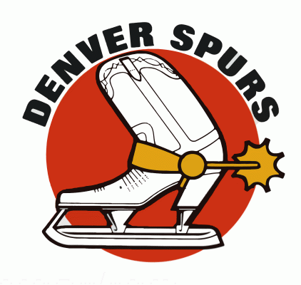
Boot has been done before:

|
|
|
|
|
10-28-2013, 03:54 PM
|
#1057
|
|
Franchise Player
Join Date: Dec 2008
Location: Calgary, Alberta
|
Quote:
Originally Posted by johnnyrocket03
I wonder if the wordmark would look better if the secondary logo was there instead of the flaming C and then it had the C's on the shoulders.
|
I would like to see someone do a mock up of that, but I think the result would end up being even more busy than the Flaming C being added, since there are quite a few elements in the shoulder patch. Would look like they are trying to squash two new logo's into 1, much like it looks like we are squashing our old logo into a script right now.
|
|
|
|
|
The Following User Says Thank You to J epworth For This Useful Post:
|
|
|
10-28-2013, 04:15 PM
|
#1058
|
|
Lifetime Suspension
|
If they had gone with the rocket-boot-skate logo that would have been so awesome.
|
|
|
|
|
10-28-2013, 05:13 PM
|
#1059
|
|
Franchise Player
Join Date: Dec 2005
Location: back in the 403
|
Quote:
Originally Posted by Joborule
I actually like the script. Funny how this jersey is really growing on me, because at first the only issue I had with it was the black shoulders, but since it's actually a yolk to add the western touch, I'm okay with it. For an alternate jersey, this is pretty solid.
|
I actually prefer it without the numbering. My initial thought when I first saw it was "no". Then I eventually warmed up to it a bit after seeing some of the pictures in this thread. But after seeing it with the numbering on official release day, I'm back to "no" again. It doesn't fit the rest of the jersey at all.
|
|
|
|
|
10-28-2013, 05:22 PM
|
#1060
|
|
First Line Centre
Join Date: Jan 2011
Location: Fort St. John, BC
|
Quote:
Originally Posted by normtwofinger
Making it look like a cowboy shirt is too much for me. I was starting to accept this jersey, but now seeing the awful pointy western yoke, no thanks. Horrible.
|
I like to pretend they are mountains
|
|
|
|
 Posting Rules
|
You may not post new threads
You may not post replies
You may not post attachments
You may not edit your posts
HTML code is Off
|
|
|
All times are GMT -6. The time now is 02:45 AM.
|
|


