|
View Poll Results: Hiow do you like the leaked jersey?
|
|
Like
|
   
|
185 |
24.03% |
|
Dislike
|
  
|
585 |
75.97% |
 10-28-2013, 10:19 AM
|
#1001
|
|
Lifetime Suspension
|
Quote:
Originally Posted by Joborule

Because they're barely going to be used. A Good portion (myself included) love them so much that they want them to become the primary jersey's; or have ones that embrace the colour and striping elements of it.
|
Oh I agree. If anything, I think it's silly as having them as thirds because they either belong as our primaries or just our retros. Thirds, to me, are for new ideas and more interesting concepts. The retros are a classic, having them be relegated to a third jersey is kind of pointless.
|

|

|
|
10-28-2013, 10:31 AM
|
#1002
|
|
Franchise Player
Join Date: Jul 2009
Location: Red Deer
|
Quote:
Originally Posted by getbak
I have nothing but time...

The left is the 2, the right is the 5 (upper right and lower left are "normal", upper left and lower right are "flipped").
The cross bar on both numbers is slightly above the middle of the number, so they are slightly different. |
Thanks for doing the work. They do have a slight style variation, but still very very close to being inverted versions of one another.
I still think the 5 looks a little funny, but I take larger issue with the wordmark/logo hybrid on the front.
__________________
"It's a great day for hockey."
-'Badger' Bob Johnson (1931-1991)
"I see as much misery out of them moving to justify theirselves as them that set out to do harm."
-Dr. Amos "Doc" Cochran
|

|
|
|
10-28-2013, 10:39 AM
|
#1003
|
|
#1 Goaltender
|
Quote:
Originally Posted by Yamer
Thanks for doing the work. They do have a slight style variation, but still very very close to being inverted versions of one another.
I still think the 5 looks a little funny, but I take larger issue with the wordmark/logo hybrid on the front.
|
Just need to crop the 5 a bit and it looks normal (ish)

|
|
|
|
|
The Following User Says Thank You to red sky For This Useful Post:
|
|
|
10-28-2013, 11:13 AM
|
#1004
|
|
Jordan!
Join Date: Jul 2009
Location: Chandler, AZ
|
The stripes on the bottom looks horrible, also seeing those concepts.. oh man. That could definitely be worse for Flames fans.
Funny jersey
|
|
|
|
|
10-28-2013, 11:21 AM
|
#1005
|
|
Franchise Player
Join Date: Jun 2011
Location: STH since 2002
|
Quote:
Originally Posted by Bouw N Arrow
The stripes on the bottom looks horrible, also seeing those concepts.. oh man. That could definitely be worse for Flames fans.
Funny jersey
|
you know your serving up a big softball coming from PHX when you say funny jersey right. Pot this the kettle calling, i'm sure someone will post a pic one of the many abomination Coyote jersey's.
__________________

|
|
|
|
|
10-28-2013, 11:44 AM
|
#1006
|
|
Franchise Player
Join Date: Oct 2001
Location: Calgary, AB
|
Quote:
Originally Posted by playmaker
yep
 |
That would make the jersey a 7 out of 10 instead of a 3 out of 10.
|
|
|
|
|
The Following 5 Users Say Thank You to Fire For This Useful Post:
|
|
|
The Following User Says Thank You to strombad For This Useful Post:
|
|
|
10-28-2013, 11:49 AM
|
#1008
|
|
Franchise Player
Join Date: Feb 2007
Location: Calgary, AB
|
One issue I have with all the new reebok jerseys is why they feel the need to cram the crest so high up on the chest.
Move the logo down a couple of inches and you would have much better spacing to fit in the Captains badges.
|
|
|
|
|
10-28-2013, 11:51 AM
|
#1009
|
|
In the Sin Bin
|
Quote:
Originally Posted by playmaker
yep
|
Truthfully, I would not be at all surprised if this becomes the basis of our next primary jersey.
|
|
|
|
|
10-28-2013, 11:55 AM
|
#1010
|
|
Franchise Player
|
It's not my cup of tea, but I thought the Winter Classic jersey was ugly and bought one just the same. Will be interesting to see how its sells.
I would trade all my jerseys for an '89 Gilmour though. That old jersey is the one that I have the fondest memories of.
|
|
|
|
|
10-28-2013, 12:02 PM
|
#1011
|
|
Franchise Player
Join Date: Oct 2001
Location: NYYC
|
Quote:
Originally Posted by Badgers Nose
It's not my cup of tea, but I thought the Winter Classic jersey was ugly and bought one just the same.
|
Why would you buy something that you find to be ugly?
|
|
|
|
|
10-28-2013, 12:10 PM
|
#1012
|
|
Franchise Player
Join Date: Aug 2008
Location: California
|
I would like to see a new poll done after the detroit game to compare numbers to. It sounds like there would be a little more even of a distribution. I am still in the no camp but I do like the cowboy shirt shaped shoulder bar. That is a nice western touch without beating you over the head with it.
I also always hope on thirds they go way off board. Its why I like things like the horse head. I didn't like the result of the horsehead jersey but I like the spirt behind it. This one is like they tried to be conventional and non offensive in every way.
By going way off board with the Retros it allows your main Jerseys to never change while still pusing jersey sales.
Last edited by GGG; 10-28-2013 at 12:12 PM.
|
|
|
|
|
10-28-2013, 12:14 PM
|
#1013
|
|
First Line Centre
Join Date: Dec 2009
Location: Haparanda
|
I like it. Then again, I'm young.

|
|
|
|
|
10-28-2013, 12:14 PM
|
#1014
|
|
Lifetime Suspension
|

Quote:
Originally Posted by Table 5
I hate the Leafs and Habs as much as the next guy, but I like how they are extremely conservative with their jerseys. They make small adjustments here and there, but it always seems like a nice evolution, as opposed to hamfisted marketing grab. They know they have a fantastic brand and know they shouldn't mess with it. Continuity helps build long-term brand equity...nobody respects a company that reinvents itself every 5 years. The Flames need to take a lesson from these clubs and realize they have a good story that doesn't need to be messed with. We don't need to start including "western" themes and fake heritage that was never there.
Btw, in my experience, people in "Marketing" always ruin everything. They are the people who aren't clever enough for Creative or smart enough for Business, yet always seem to think they can do both.
|
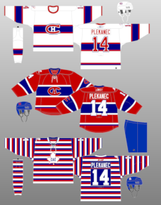
I love when Montreal went full cash grab during their 2 season, 100 year celebration. You know the owners, who understand the brand and know they can't touch it, jumped for joy at the opportunity to go buck wild and use any possible jersey and uniform they could.
Besides their normal home and away, here are the others they wore, in game, during those two seasons.

|
|
|
|
|
10-28-2013, 12:22 PM
|
#1015
|
|
Franchise Player
|
maybe they didnt get any 5s delivered and had an extra 2 they flipped for the photo shoot.
|
|
|
|
|
10-28-2013, 12:51 PM
|
#1016
|
|
Franchise Player
Join Date: Aug 2008
Location: California
|
Those Where's Waldo Montral Jerseys were the best.
|
|
|
|
|
10-28-2013, 12:54 PM
|
#1017
|
|
#1 Goaltender
Join Date: Feb 2012
Location: Calgary
|
Quote:
Originally Posted by Flames89
Don't like and shoulders make us look like NJD.
I won't be buying one
|
This for me as well. Just too old fashioned in a bad way.Take out the black shoulder treatment (leave the patch), maybe it would be better?
|
|
|
|
|
10-28-2013, 12:56 PM
|
#1018
|
|
Lifetime Suspension
Join Date: Oct 2012
Location: Halifax
|
Quote:
Originally Posted by strombad
|
That top one is a thing of beauty.
|
|
|
|
|
10-28-2013, 12:57 PM
|
#1019
|
|
Lifetime Suspension
|
Quote:
Originally Posted by $ven27
That top one is a thing of beauty.
|
Her?
|
|
|
|
|
10-28-2013, 12:59 PM
|
#1020
|
|
Crash and Bang Winger
Join Date: May 2009
Location: Calgary
|
Quote:
Originally Posted by rohara66
It's not square. There is a point on the front shoulders.
|
Aaaaaand that's what finally ruined them for me. I didn't like them on the EA leak, but they slowly grew on me - especially the new shoulder patch. I started liking the striping. Then I started seeing the new numbers and lettering, which after seeing for real, I quite like. But then they went and put a STUPID western style little 'v' in the front of the shoulder yoke. And then of course the front script logo - awful. It's like seeing your favorite meal in front of you, and then the rules are that you have to eat this bowl of vomit at the same time if you want it. SO FRUSTRATING!
The fan attic online store has a very clear view of the shoulder yoke western style awfulness:

__________________
The Doctor is in
|
|
|
|
 Posting Rules
|
You may not post new threads
You may not post replies
You may not post attachments
You may not edit your posts
HTML code is Off
|
|
|
All times are GMT -6. The time now is 09:02 AM.
|
|


