 07-27-2020, 06:42 PM
|
#81
|
|
First round-bust
Join Date: Feb 2015
Location: speculating about AHL players
|
7. Philadelphia Flyers
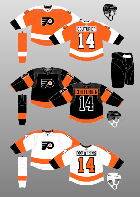
I've always been a huge fan of the Flyers' uniforms. No team uses orange more effectively. Their logo is simple and beautiful. I will say I probably prefer the three uniforms the Flyers wore in the Lindros years, but the current three are all still great.
I always flip-flop on how I feel about the namebars. Philly is the only team in the league to use them, and I appreciate any good unique design element, but are the namebars good? I would say yes to the ones on the orange jersey and maybe the black one, but I think I would prefer if the white jersey went without. That said, I love the shoulder design on both primary uniforms and I think the big arm numbers on the black jersey are appealing and distinctive. I might like to see the waist stripe on the black uniform in the same place as it is on the home and road jersey, but that's no big deal.
__________________
Need a great deal on a new or pre-owned car? Come see me at Platinum Mitsubishi 2720 Barlow Trail NE
|

|

|
|
The Following 3 Users Say Thank You to TheScorpion For This Useful Post:
|
|
|
07-27-2020, 06:49 PM
|
#82
|
|
First round-bust
Join Date: Feb 2015
Location: speculating about AHL players
|

6. Seattle Kraken
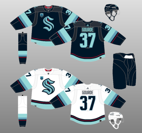
Talk about a fresh new design. The Kraken instantly shot up my "want-to-buy" list with their debut efforts, and I honestly can't decide which of their two jerseys I want to buy more. I've seen some people saying they would have preferred green as the accent colour instead of "red alert." I couldn't disagree more. I think using a small amount of red as an accent colour on a blue jersey makes the whole thing pop way more than using green. And let's face it... a red eye is way scarier than a green one.
I might have tried to include some blue in the collar of the white uniform, but when the waist and arms of the jersey are so intricate, adding colour to the collar might have made the uniform look busy.
I'm a huge fan of both logos on the jersey and both fonts being used. Not sure how I feel about two different numerical fonts being used on the same sweater (I think the arm numbers might just be a squished version of the back ones), but either way, I think they both look good individually and them being different isn't distracting.
In the end, I'm glad that Seattle went with something unique. Light blue and red is a colour combo being used by exactly zero of the NHL's 31 current teams, and I loved it when the Canucks used red as their accent colour, so I'm glad Seattle brought that concept back to the league.
__________________
Need a great deal on a new or pre-owned car? Come see me at Platinum Mitsubishi 2720 Barlow Trail NE
|
|
|
|
|
The Following User Says Thank You to TheScorpion For This Useful Post:
|
|
|
07-27-2020, 06:58 PM
|
#83
|
|
First round-bust
Join Date: Feb 2015
Location: speculating about AHL players
|
5. Carolina Hurricanes
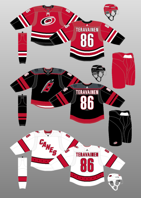
First of all, bonus points to the Canes for bringing back the Whalers jerseys. So awesome.
I love all three of the Hurricanes' sweaters. They all bring something a little bit different, and they all bring something great. The home uniform combines their great logo with some of my favourite waist striping in the league. I love the black, and the warning flags in there complete the look to perfection. And it's my least favourite of the three!
The road uniform is so corny but I love it. The diagonal "Canes" script is so silly but I think it looks great and I'm so glad the Hurricanes use it full-time. It's such a ballsy move to use that kind of silly uniform as a primary jersey despite not even having your logo on it. And right now, the Hurricanes are the perfect amount of ballsy to pull it off. Not to mention the waist striping, which IMO is an even better version of the home striping.
The alternate, though, is perfect. I love the two shades of black used in contrast with each other. The logo is unique and bold. The muted shoulder patches are sleek and badass. It's a jersey with a ton of swagger, and I want one.
__________________
Need a great deal on a new or pre-owned car? Come see me at Platinum Mitsubishi 2720 Barlow Trail NE
|
|
|
|
|
07-27-2020, 07:00 PM
|
#84
|
|
Franchise Player
|
The Canes alternate logo has really grown on me. It’s incredible.
|

|
|
|
The Following User Says Thank You to Strange Brew For This Useful Post:
|
|
|
07-27-2020, 07:02 PM
|
#85
|
|
Franchise Player
|
Yeah, there's really no excuse for praising a jersey that has a shortened version of the team name on it. Not as bad as these, but still unforgivable.

I could see them at 5 if the third jersey was all Whalers all the time. Actually, if that were the case, they might be #1. The Whalers jersey is amazing.
As for which Kraken jersey to get, the answer is white, easily.
__________________
"The great promise of the Internet was that more information would automatically yield better decisions. The great disappointment is that more information actually yields more possibilities to confirm what you already believed anyway." - Brian Eno
|
|
|
|
|
07-27-2020, 07:04 PM
|
#86
|
|
First round-bust
Join Date: Feb 2015
Location: speculating about AHL players
|
4. Arizona Coyotes
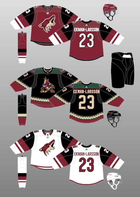
I think all three of these jerseys are delightful. The Coyotes reintroducing black into their colour scheme was such a genius stroke. I find burgundy, black, beige, and white combine to form one of the most effective and unorthodox aesthetic combinations in sports.
For the primary uniforms: the logo is great, as is the shoulder patch. But what really makes the jersey tick is all the colours. The burnt red base is stunning, and I love all the blocks on the arms. Black AND white striping? Bold. But great. And I love the slick, rounded font.
Of course, the real star of this set is the Kachina jersey, the best uniform in sports. Boasting orange, green, and purple accents, this jersey is not for purists. But I think it's gorgeous. Every individual attribute it possesses is absurdly silly, but together, they all work perfectly to create the ultimate je(rsey) ne sais quoi.
Now I just wish they'd complete the set by bringing back the white Kachina jersey, which, in my opinion, was even better. The green uniform can stay dead, though.
__________________
Need a great deal on a new or pre-owned car? Come see me at Platinum Mitsubishi 2720 Barlow Trail NE
|
|
|
|
|
07-27-2020, 07:13 PM
|
#87
|
|
First round-bust
Join Date: Feb 2015
Location: speculating about AHL players
|
3. Vegas Golden Knights
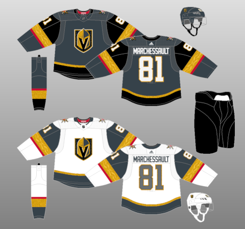
The Golden Vegans broke many of the "rules" of hockey jersey design when they revealed this design back in 2017, but I'm sure glad they did. Three years later, these jerseys still own.
This ain't your Pennsylvanian "Vegas Gold." Not only is it vibrant and unique, the gold used on these uniforms has become borderline iconic. The beautifully ornate gold stripes helped redefine what lengths uniform designers could go to in order to stand out and break new ground. Since Vegas debuted, we've seen more and more teams introduce similarly stunning and ornate design elements into both new and existing designs. We've come a long way since the flat, bland look that plagued the Reebok Edge redesign. And Vegas is a big reason for that.
These uniforms ooze "flair." The dark uniform should be a blueprint to show LA how to do a grey jersey. You need to make it pop. Small, colourful accents make everything pop. I love the red on both jerseys. Maybe LA should try it with purple!
Vegas' logo is one of my favourites in all of sports. It's so cleverly designed. Sean McIndoe once said that the key to making a good logo is designing something cool that a kid can draw, and Vegas' logo definitely fills that requirement. But the ornate gold trim also extends onto it, making it both simple and yet very detailed simultaneously. It's great.
Also, ten points for using white gloves. Love them.
Two left. I'll wait a bit before revealing them.
__________________
Need a great deal on a new or pre-owned car? Come see me at Platinum Mitsubishi 2720 Barlow Trail NE
Last edited by TheScorpion; 07-27-2020 at 07:20 PM.
|
|
|
|
|
07-27-2020, 07:59 PM
|
#88
|
|
First round-bust
Join Date: Feb 2015
Location: speculating about AHL players
|
2. Pittsburgh Penguins
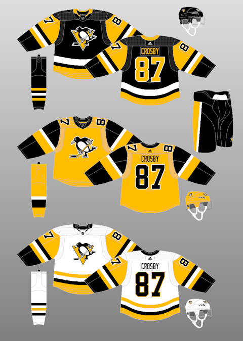
I would buy all three of these today. Take notes, Boston... this is what a good use of this colour scheme looks like.
I just now noticed that the yellow jersey has no triangle behind the penguin. It's honestly not a big deal, but I wonder how it would look with a black triangle. Probably more messy, honestly.
I think all three of these designs are iconic and beautiful. The black uniform is bold and has brilliant, bright accents. After enduring the blandness of the Vegas Gold Reebok designs for a decade, seeing the classic '80s design come back guns blazing was so refreshing. First synonymous with Lemieux, now Crosby gets to add to these uniforms' legacy.
The yellow jersey is even better. It retains largely the same template as the home and away sweaters, but with a couple interesting quirks of its own. The shoulder numbers are neat, as are the yellow helmets, and I enjoy the huge yellow stripe on the arm. But the white jersey is my favourite, by far. It's just so clean. Pittsburgh should never go away from these.
That said, if they want another suggestion for a future alternate jersey... bring these back!
__________________
Need a great deal on a new or pre-owned car? Come see me at Platinum Mitsubishi 2720 Barlow Trail NE
|
|
|
|
|
07-27-2020, 08:10 PM
|
#89
|
|
First round-bust
Join Date: Feb 2015
Location: speculating about AHL players
|
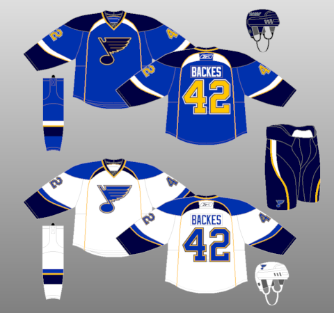
1. St. Louis Blues
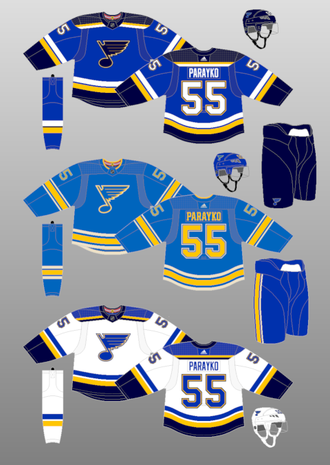
This was not a tough choice. I love all of the Blues' current jerseys.
Friendly reminder that, when the Reebok Edge takeover happened, the Blues' uniforms were subjected to this treatment:
The piping, the arched shoulders, the yellow numbers with white lettering... god, it's all so bad. But their Pronger-era designs are back... and better than ever.
Some might question why I ranked these first and Buffalo's 31st, despite Buffalo running with a similar colour scheme. First of all, Buffalo's home jerseys almost entirely omit white and I think that makes them look incredibly flat. Second, Buffalo's jerseys only use navy, which can be a very boring base colour if used improperly. St. Louis contrasts navy against a far brighter shade of blue, and the yellow striping is far better.
St. Louis uses contrast and bright colours, great striping, and a classic logo to create the ultimate primary uniforms. The home and road jerseys are mirrors of each other on the same template, which looks so satisfying when done well.
Then, there are the alternates. Yes, I'm going to talk about both Blues alternate jerseys here, even though one of them was only worn for like three games. Sue me.
The alternate jersey pictured above is amazing. The shade of blue is very unique for the NHL and, in this kind of jersey, I think the yellow lettering actually fits in tremendously. It's classic, simple, and beautiful.
And then there are these.

I have nothing more to say. They're perfect. St. Louis wins.
__________________
Need a great deal on a new or pre-owned car? Come see me at Platinum Mitsubishi 2720 Barlow Trail NE
|
|
|
|
|
The Following 7 Users Say Thank You to TheScorpion For This Useful Post:
|
|
|
07-27-2020, 08:13 PM
|
#90
|
|
Franchise Player
Join Date: Jun 2009
Location: Thunder Bay Ontario
|
good work scorp. Thanks for all of this.
__________________
Fan of the Flames, where being OK has become OK.
Last edited by Poe969; 07-27-2020 at 08:27 PM.
|
|
|
|
|
The Following User Says Thank You to Poe969 For This Useful Post:
|
|
|
07-27-2020, 08:46 PM
|
#91
|
|
Franchise Player
Join Date: Feb 2006
Location: Calgary, AB
|
Thanks for your work on this, Scorp.
I decided to do a lot less work and put my own list together. We don't agree on them all (everyone knows the Ducks suck), but I don't think we're too far off for most.
If the Flames go full retro next season, they'll jump up to near the top for me. I'm not sure if I put them ahead or behind the Habs, but they're in that range for me.
__________________
Turn up the good, turn down the suck!
|
|
|
|
|
The Following 3 Users Say Thank You to getbak For This Useful Post:
|
|
|
07-27-2020, 08:47 PM
|
#92
|
|
First round-bust
Join Date: Feb 2015
Location: speculating about AHL players
|
Not a bad list at all, although I'm not sure what makes Calgary's jerseys better than Arizona's in any way.
__________________
Need a great deal on a new or pre-owned car? Come see me at Platinum Mitsubishi 2720 Barlow Trail NE
|
|
|
|
|
The Following User Says Thank You to TheScorpion For This Useful Post:
|
|
|
07-27-2020, 09:02 PM
|
#93
|
|
Franchise Player
Join Date: Feb 2006
Location: Calgary, AB
|
Quote:
Originally Posted by TheScorpion

Not a bad list at all, although I'm not sure what makes Calgary's jerseys better than Arizona's in any way.
|
For one, the team wearing them. I'll admit I'm biased.
I never really liked the monochrome look for them and the addition of the black to the sleeves didn't improve them. It makes them look like they're in mourning.
If they had never switched from the Kachina-style, they'd be a lot higher. If they switch back, they'd jump up the list.
__________________
Turn up the good, turn down the suck!
Last edited by getbak; 07-27-2020 at 09:16 PM.
|
|
|
|
|
The Following 3 Users Say Thank You to getbak For This Useful Post:
|
|
|
07-27-2020, 09:05 PM
|
#94
|
|
Franchise Player
Join Date: Jul 2010
Location: Van Island
|
I love those St Louis thirds, my favourite jersey. But I also liked their old third, I believe the crest was in a circle. They were really nice as well.
|
|
|
|
|
07-27-2020, 09:05 PM
|
#95
|
|
First round-bust
Join Date: Feb 2015
Location: speculating about AHL players
|
I have to disagree, I love the black addition. But I do agree that their old monochromatic uniforms were tired from the day they were introduced. Kind of like Brett Hull when he wore them.
I really hope that white Kachina comes back. I own one and it's even more beautiful in person.
__________________
Need a great deal on a new or pre-owned car? Come see me at Platinum Mitsubishi 2720 Barlow Trail NE
|
|
|
|
|
07-27-2020, 09:12 PM
|
#96
|
|
Lifetime Suspension
|
I just hate the little patterning in the gold on the vegas unis, otherwise they're alright. Unlike many i am a big fan of white gloves.
Yotes and Canes are closer to 20 than top 5 for me. Just kind of bland on both sides. I dont like maroon much, nor the black on the canes jerseys (which imo kills the appeal). Also find the cane logo to be not appealing. A weird circular obscured mess that doesn't instantly scream Hurricane, when it probably should. Lacks the simplicity and iconic, eye catching nature of other logos. I do like the Yotes howl logo.
|
|
|
|
|
07-27-2020, 09:16 PM
|
#97
|
|
Not a casual user
Join Date: Mar 2006
Location: A simple man leading a complicated life....
|
Arizona would not be in my top 5. Never been a fan of the colours or logos. The same goes for Carolina.
The Blues as a #1 pick is okay. Always been a huge fan of their logo and colour combinations.
The Hawks and the Bruins have better logo's than the Flyers and would have been in my top 3. I grew up a huge fan of the Bruins and this version of their jersey. Bear head as shoulder crests and the colour combinations


__________________

Last edited by Dion; 07-27-2020 at 09:21 PM.
|
|
|
|
|
The Following 4 Users Say Thank You to Dion For This Useful Post:
|
|
|
07-27-2020, 09:17 PM
|
#98
|
|
First round-bust
Join Date: Feb 2015
Location: speculating about AHL players
|
If that was the Bruins' uniform, it would be top-3.
__________________
Need a great deal on a new or pre-owned car? Come see me at Platinum Mitsubishi 2720 Barlow Trail NE
|
|
|
|
|
The Following User Says Thank You to TheScorpion For This Useful Post:
|
|
|
07-27-2020, 09:20 PM
|
#99
|
|
Not a casual user
Join Date: Mar 2006
Location: A simple man leading a complicated life....
|
Quote:
Originally Posted by TheScorpion
If that was the Bruins' uniform, it would be top-3.
|
It's a shame the Bruins have never used that version as their 3rd jersey.
__________________
|
|
|
|
|
07-27-2020, 09:21 PM
|
#100
|
|
Farm Team Player
Join Date: Oct 2014
Exp: 
|
Switching to retros full-time next season is a must. Our retros are easily the Top 5 best jerseys in the league
Sent from my iPhone using Tapatalk
|
|
|
|
|
The Following 4 Users Say Thank You to DrDangles92 For This Useful Post:
|
|
 Posting Rules
|
You may not post new threads
You may not post replies
You may not post attachments
You may not edit your posts
HTML code is Off
|
|
|
All times are GMT -6. The time now is 12:53 AM.
|
|


