 09-04-2013, 07:03 PM
|
#81
|
|
First Line Centre
Join Date: Nov 2009
Location: TEXAS!!
|
It stings the eyes.
__________________
I am a lunatic whose world revolves around hockey and Oilers hate.
|

|

|
|
09-04-2013, 07:53 PM
|
#82
|
|
#1 Goaltender
Join Date: Aug 2011
Location: Not cheering for losses
|
Man, buffalo has had some seriously ####ty jerseys and they somehow manage to do this while having one of the best logos out there.
|
|
|
|
|
09-04-2013, 08:14 PM
|
#83
|
|
Powerplay Quarterback
|
That jersey is a disaster. How could this possibly have gotten through presumably several levels of management and design to actually being made?
__________________
"If the oceans was whiskey and I was a duck, I'd swim to the bottom and never come up, but the oceans ain't whiskey, and I ain't no duck, so I'll play the Jack of Diamonds and toast to my luck..."
|
|
|
|
|
09-04-2013, 08:20 PM
|
#84
|
|
Powerplay Quarterback
Join Date: Jul 2004
Location: At a garage sale
|
That's a train wreck of a jersey! 2 different yellows, terrible choice of silver sleaves, would not bang........
|
|
|
|
|
09-04-2013, 09:43 PM
|
#85
|
|
Draft Pick
|
Ugh, hate the little "Buffalo" above the logo and the whole front of the jersey. One and done.
|
|
|
|
|
09-04-2013, 09:56 PM
|
#86
|
|
Franchise Player
Join Date: Mar 2002
Location: Calgary
|
Atrocious. On par with the hideous Isles 3rd jerseys, probably worse, given the colors.
Odd numbers, the cape effect with the solid blue back and letters that look far too large. The two shades of yellow, Buffalo word mark, grey trim on the arms which look out of place on the front.
Only positive is that they took the numbers off the front.
|
|
|
|
|
The Following User Says Thank You to jeep991 For This Useful Post:
|
|
|
09-04-2013, 11:19 PM
|
#88
|
|
First Line Centre
Join Date: Jul 2013
Location: I will never cheer for losses
|
its not my favourite but its okay
|
|
|
|
|
09-04-2013, 11:28 PM
|
#89
|
|
Franchise Player
|
Quote:
Originally Posted by jeep991

|
__________________

|
|
|
|
|
The Following 3 Users Say Thank You to corporatejay For This Useful Post:
|
|
|
09-04-2013, 11:32 PM
|
#90
|
|
damn onions
|
that is just mindblowingly horrific.
|
|
|
|
|
09-04-2013, 11:40 PM
|
#91
|
|
Scoring Winger
Join Date: Jan 2010
Location: Calgary
|
I.don't.like.it.
__________________
You continue to talk to teams, but I look at our forward group and I would put them against anybody." Darryl Sutter - February 25th, 2010
|
|
|
|
|
09-04-2013, 11:42 PM
|
#92
|
|
damn onions
|
it's sort of confusing... Buffalo hasn't made a good jersey since their originals. Which the fans love, and demanded the return of.
Can't they just play it like the Devils, have the awesome home and away, and leave it alone??
|
|
|
|
|
09-04-2013, 11:45 PM
|
#93
|
|
Lifetime Suspension
|
Quote:
Originally Posted by Mr.Coffee
it's sort of confusing... Buffalo hasn't made a good jersey since their originals. Which the fans love, and demanded the return of.
Can't they just play it like the Devils, have the awesome home and away, and leave it alone??
|
It's called MONEY...maybe in part this is why the devils don't have any.
|
|
|
|
|
09-04-2013, 11:50 PM
|
#94
|
|
Franchise Player
Join Date: Mar 2004
Location: Chilliwack, B.C
|
At least they got rid of the stupid number on the left chest area, I think only San Jose is the lone team left doing that I was hoping with the new shark unis they would have dumped the left chest numbers as well.
As a uniform I dont mind it its a little different with so many uniform changes makes me think they make more money off uniform sales then prices for games.
|
|
|
|
|
09-04-2013, 11:58 PM
|
#95
|
|
damn onions
|
Quote:
Originally Posted by T@T
It's called MONEY...maybe in part this is why the devils don't have any.
|
Could be true. Other than the cost to build the jerseys, the design costs look like they were about $20 so I guess even if you sold a couple you're up..
|
|
|
|
|
09-05-2013, 12:06 AM
|
#96
|
|
Franchise Player
Join Date: Apr 2004
Location: Elbows Up!!
|
__________________
Franchise > Team > Player
Future historians will celebrate June 24, 2024 as the date when the timeline corrected itself.
|
|
|
|
|
09-05-2013, 12:18 AM
|
#97
|
|
Franchise Player
|
Quote:
Originally Posted by Mr.Coffee
it's sort of confusing... Buffalo hasn't made a good jersey since their originals. Which the fans love, and demanded the return of.
Can't they just play it like the Devils, have the awesome home and away, and leave it alone??
|
They were doing better too... The current home/away is close enough and looks pretty good. Why make us a laughing stock again? 
|
|
|
|
|
09-05-2013, 12:30 AM
|
#98
|
|
Lifetime Suspension
|
I can't believe how awful it is. Every off season design has been a simpler or traditional jersey. This certainly bucks the trend, but not in a good way.
Buffalo should just go back to their original jerseys, but without the numbers on the front.
|
|
|
|
|
09-05-2013, 12:33 AM
|
#99
|
|
First Line Centre
Join Date: Oct 2009
Location: Reppin' the C in BC
|
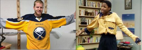
Quote:
Originally Posted by sureLoss
|
Is he wearing it backwards?
__________________
"There are no asterisks in this life, only scoreboards." - Ari Gold
12 13 14 2 34
|
|
|
|
|
09-05-2013, 01:17 AM
|
#100
|
|
Powerplay Quarterback
Join Date: Jul 2013
Location: Calgary
|
 Wtf
Wtf
The back looks kinda cool but the front is hideous. 3/10
__________________
Go Flames Go
|
|
|
|
 Posting Rules
|
You may not post new threads
You may not post replies
You may not post attachments
You may not edit your posts
HTML code is Off
|
|
|
All times are GMT -6. The time now is 02:45 PM.
|
|


