|
View Poll Results: Where would you like the Flames to go with their jerseys?
|
|
Keep with the existing set
|
   
|
9 |
2.34% |
|
go back to vintage home and away
|
  
|
229 |
59.48% |
|
go back to 2004 home and away
|
  
|
26 |
6.75% |
|
minor tweak to the existing set (piping, flags)
|
  
|
40 |
10.39% |
|
new design that adds black to the retro look
|
  
|
36 |
9.35% |
|
completely new design
|
  
|
39 |
10.13% |
|
other (elaborate)
|
|
6 |
1.56% |
 06-20-2017, 09:24 PM
|
#961
|
|
Scoring Winger
|
Vancouvers to me looks the best
|

|
|
|
06-20-2017, 09:24 PM
|
#962
|
|
Scoring Winger
|
They should have had each of LV selections audition the jersey of the team they were just selected from. Given to them as a parting gift haha.
|
|
|
|
|
The Following 2 Users Say Thank You to Fischy13 For This Useful Post:
|
|
|
06-20-2017, 09:25 PM
|
#963
|
|
Franchise Player
Join Date: Sep 2002
Location: Estonia
|
The cuffs look terrible! Lol wow. Booooo! It looks like a red t-shirt when the player has gloves on. The Isles cuffs look awful too. I'm super disappointed and won't be buying one of these.
|
|
|
|
|
06-20-2017, 09:28 PM
|
#964
|
|
Franchise Player
|
Man, the last thing I expected was for our jerseys to somehow get worse.
Unreal.
|
|
|
|
|
06-20-2017, 09:28 PM
|
#965
|
|
Franchise Player
Join Date: Feb 2006
Location: Calgary, AB
|
I don't think some people know what piping is. There is no piping on this jersey.
__________________
Turn up the good, turn down the suck!
|

|
|
|
The Following 13 Users Say Thank You to getbak For This Useful Post:
|
8sPOT,
AC,
Cole436,
darockwilder,
gargamel,
iggypop,
lambeburger,
Lord Carnage,
Mike F,
MrMike,
Regular_John,
Sutter_in_law,
topfiverecords
|
|
06-20-2017, 09:28 PM
|
#966
|
|
Lifetime Suspension
Join Date: Jul 2003
Location: Calgary, Alberta
|
The lettering is a huge improvement.
|
|
|
|
|
The Following 3 Users Say Thank You to the_only_turek_fan For This Useful Post:
|
|
|
06-20-2017, 09:29 PM
|
#967
|
|
Powerplay Quarterback
|
Everybody overreacting on here is making my night, so thanks for that. They are basically the same, and if you look across the league very few teams got any kind of redesign.
I could be wrong on this but I think Adidas was in charge of redesigning the jerseys not the teams themselves.
|
|
|
|
|
The Following 4 Users Say Thank You to JTech780 For This Useful Post:
|
|
|
06-20-2017, 09:30 PM
|
#968
|
|
First Line Centre
|
Wild and Sharks always seem to get the best out of their threads.
Still sticking with my Kipper retro.
|
|
|
|
|
06-20-2017, 09:30 PM
|
#969
|
|
Resident Videologist
Join Date: Mar 2002
Location: Calgary
|
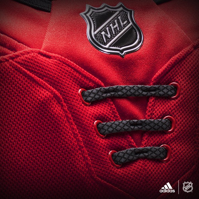
Quote:
Originally Posted by Ashasx

It's hard to believe they would actually make the piping more predominant, but wow, they did it.
|
Quote:
Originally Posted by Jimmy Stang
"Flags? WTF? But they'll surely fix the piping!"
"Larger piping? This is actually hilarious at this point."
|
There is no piping.
This is what people are talking about when it comes to piping:
|
|
|
|
|
The Following 2 Users Say Thank You to AC For This Useful Post:
|
|
|
06-20-2017, 09:30 PM
|
#970
|
|
Franchise Player
|
Coming from someone that owns both the flaming snot donkey and the pedestal jerseys, that's awful.
__________________
Quote:
Originally Posted by CroFlames
Before you call me a pessimist or a downer, the Flames made me this way. Blame them.
|
|
|
|
|
|
06-20-2017, 09:31 PM
|
#971
|
|
Franchise Player
|
Quote:
Originally Posted by AC
There is no piping.
This is what people are talking about when it comes to piping:
|
it's fairly thin vertical lines. That is piping to me.
|
|
|
|
|
06-20-2017, 09:33 PM
|
#972
|
|
First Line Centre
Join Date: Oct 2009
Location: Reppin' the C in BC
|
Hate the flags, and hate the new laces...what the hell is point of stitched on laces. No chance I buy this...wait for them to release the retros next year
|
|
|
|
|
06-20-2017, 09:33 PM
|
#973
|
|
Powerplay Quarterback
Join Date: Apr 2014
Location: Calgary
|
the overreaction in this thread is hilarious. Yes they arent great and yes we all wish they were the vintage ones but Ken King literally said earlier they were going to be very similar, but for some reason people still had their hopes up. They arent great but I honestly don't think they are as bad as people are making them out to be. Almost identical to the old ones with no piping. In 1-2 years these will probably be replaced by the vintage jerseys anyways.
|
|
|
|
|
The Following 2 Users Say Thank You to FlamesNation23 For This Useful Post:
|
|
|
06-20-2017, 09:34 PM
|
#974
|
|
First Line Centre
Join Date: Oct 2009
Location: Reppin' the C in BC
|
Quote:
Originally Posted by getbak
Laces are sewn into the jersey. Really, what's the point? Just dump 'em.
 |
pathetic
|
|
|
|
|
06-20-2017, 09:37 PM
|
#975
|
|
Lifetime Suspension
|
Piping is sewn over seams. Every white and yellow stripe on the flames jersey is technically piping. Pre Reebok Edge this was not the case.
|
|
|
|
|
06-20-2017, 09:37 PM
|
#976
|
|
Scoring Winger
Join Date: Nov 2006
Location: Calgary, AB
|
Quote:
Originally Posted by Reign of Fire
pathetic
|
3 Laces or 3 stripes? I don't know but I know it sucks!
|
|
|
|
|
06-20-2017, 09:40 PM
|
#977
|
|
Franchise Player
|
Quote:
Flames FanAttic @FlamesFanAttic
Jerseys arrive mid Sept - email presalejerseys@calgaryflames.com to register for pre buy & be entered to win a new signed Gaudreau jersey
|
<< snicker >>
|
|
|
|
|
06-20-2017, 09:41 PM
|
#978
|
|
Franchise Player
|
I'm sure that they are just banking on the 'long sleeved shirt under a short sleeved shirt' look to come back in. And when it does, they are going to look like geniuses.
__________________
"By Grabthar's hammer ... what a savings."
|
|
|
|
|
06-20-2017, 09:42 PM
|
#979
|
|
Scoring Winger
|
I don't mind the new jerseys as much as most people.. I like the black and red mix.. I just wish they would get rid of those flags. I mean yes we know Calgary is located in Alberta, Canada. Not every fan lives in Alberta though. I suppose it could be worse.. they could of plastered the word CALGARY over top the flaming C. Cause we already have a provincial and country indicator, why not add a city indicator too.
|
|
|
|
|
06-20-2017, 09:43 PM
|
#980
|
|
Franchise Player
Join Date: Feb 2006
Location: Calgary
|
The aways look naked.

__________________
The Quest stands upon the edge of a knife. Stray but a little, and it will fail, to the ruin of all. Yet hope remains while the Company is true. Go Flames Go!
Pain heals. Chicks dig scars. Glory... lasts forever.
|
|
|
|
|
The Following User Says Thank You to MissTeeks For This Useful Post:
|
|
 Posting Rules
|
You may not post new threads
You may not post replies
You may not post attachments
You may not edit your posts
HTML code is Off
|
|
|
All times are GMT -6. The time now is 01:15 AM.
|
|