 05-11-2014, 03:35 PM
|
#881
|
|
Franchise Player
Join Date: Jun 2006
Location: Calgary, Alberta
|

Quote:
Originally Posted by playmaker

Though I'm in favor of keeping a small amount of black on our jerseys (previously posted Bastian Schmulling's concept is my favorite) recently I've been playing with retro ideas for slight modifications if the Flames decide to go full retro. Here is a concept I created:
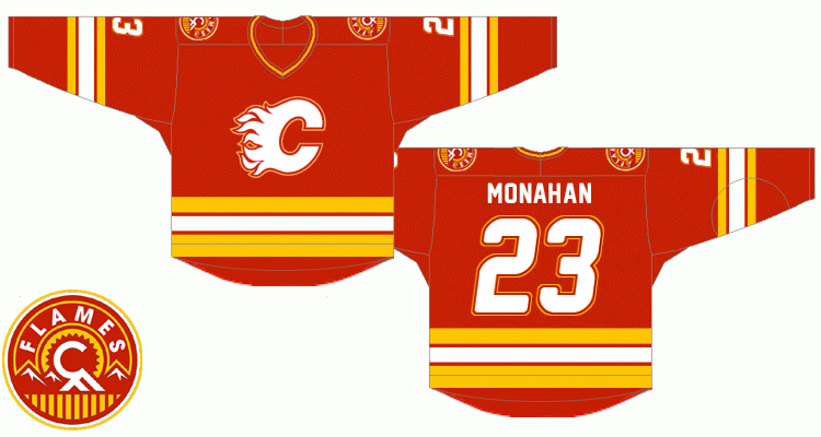
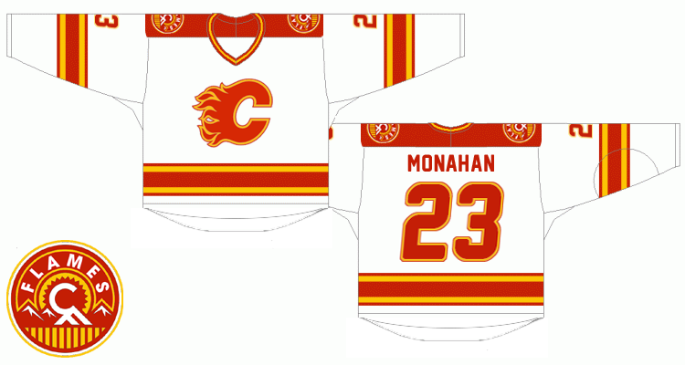
Notable changes:
* the red flaming C should be outlined the same way as it is on our current road jersey, yet using red instead of black. In order to unify the outlined look of the logo on both jerseys, the white flaming C would be quite a challenge to adapt but the red and yellow outline combo turned out to be good looking. Same for the numbers.
* Lettering - the goal was so that slighly italic and double outline numbers match the logo. As for the typeface itself, I've used the freeware 'New Athletic M54' font which IMHO combines the best of both worlds - sans-serif style from the original retro font and gently rounded corners from the new one.
* Squared off yokes are a bit contrversial but I found them perfectly fitting for Stars and Wild simplistic designs. It's one of those nice little modern touches I'd include, like them a lot.
* As for the shoulder patch, I was quite surprised when I photoshopped out the black because to me it looks sharper without it on both home and road uniforms
any thoughts ? |
Hot damn. Good job.
|

|

|
|
The Following User Says Thank You to Joborule For This Useful Post:
|
|
|
05-11-2014, 03:36 PM
|
#882
|
|
Franchise Player
Join Date: Jul 2009
Location: Red Deer
|
Quote:
Originally Posted by MrMastodonFarm
Yeah, wow.
Lost in all the ugly that is the current 3rd's are what a home run the Flames hit with that shoulder patch. Love that you've kept them and altered the colour scheme to match.
Slight criticisms...
-Prefer a bigger logo that the Flames went with instead of the classic smaller one
-Don't like the cartoon font on the number
|
Those concepts are my favorite so far. Outstanding work.
Fully agree on the shoulder patches. Would be over the moon if the Flames decided to, at the very least, drop the flags and go with the new shoulder patches across all three sets.
As for the larger logo on the front, they look better on the ice but when I am wearing my replica it feels like I have a chestplate on. Very cumbersome.
I actually don't mind the font. It's kind of a hybrid of vintage and contemporary that compliments the jersey quite well. Of course I also like the original font, too.
__________________
"It's a great day for hockey."
-'Badger' Bob Johnson (1931-1991)
"I see as much misery out of them moving to justify theirselves as them that set out to do harm."
-Dr. Amos "Doc" Cochran
|

|
|
|
05-11-2014, 04:19 PM
|
#883
|
|
#1 Goaltender
Join Date: Aug 2011
Location: Not cheering for losses
|
Looks great, but don't love the font. Improvement over the current font though for sure. Dig the squared shoulders.
Ken King, please read.
|
|
|
|
|
The Following 3 Users Say Thank You to sun For This Useful Post:
|
|
|
05-11-2014, 04:23 PM
|
#884
|
|
Franchise Player
Join Date: Nov 2009
Location: Kelowna, BC
|
Quote:
Originally Posted by playmaker
Though I'm in favor of keeping a small amount of black on our jerseys (previously posted Bastian Schmulling's concept is my favorite) recently I've been playing with retro ideas for slight modifications if the Flames decide to go full retro. Here is a concept I created:
Notable changes:
* the red flaming C should be outlined the same way as it is on our current road jersey, yet using red instead of black. In order to unify the outlined look of the logo on both jerseys, the white flaming C would be quite a challenge to adapt but the red and yellow outline combo turned out to be good looking. Same for the numbers.
* Lettering - the goal was so that slighly italic and double outline numbers match the logo. As for the typeface itself, I've used the freeware 'New Athletic M54' font which IMHO combines the best of both worlds - sans-serif style from the original retro font and gently rounded corners from the new one.
* Squared off yokes are a bit contrversial but I found them perfectly fitting for Stars and Wild simplistic designs. It's one of those nice little modern touches I'd include, like them a lot.
* As for the shoulder patch, I was quite surprised when I photoshopped out the black because to me it looks sharper without it on both home and road uniforms
any thoughts ? |
man.... that red concept looks familiar.....

 
playmaker - that does look sweet - i really like the should patches.
edit... found my original post: http://forum.calgarypuck.com/showpos...&postcount=734
__________________
"...and there goes Finger up the middle on Luongo!" - Jim Hughson, Av's vs. 'Nucks
Last edited by bc-chris; 05-11-2014 at 04:25 PM.
|
|
|
|
|
05-11-2014, 04:36 PM
|
#885
|
|
Franchise Player
Join Date: Oct 2007
Location: still in edmonton
|
I need to stop coming into this thread. It just makes me more upset that we don't have a jersey like those.
__________________
"Nothing Matters. Nobody Cares. We're all going to die."
- Devin Cooley
|
|
|
|
|
The Following User Says Thank You to Yeah_Baby For This Useful Post:
|
|
|
05-11-2014, 04:37 PM
|
#886
|
|
damn onions
|
Number font should be the same font it is on our home / away just sans black, that number style has become part of the Flames identity. Shoulder patches look great and all the best concepts these days have zero black. Also would like namebars to have the large font like minnesota aways have now, looks better than small namebars.
|
|
|
|
|
05-11-2014, 05:19 PM
|
#887
|
|
Franchise Player
Join Date: Nov 2003
Location: Calgary, AB
|
It will really bother me if we're forced to see our great young players stuck having to wear our ugly patch quilt monstrosities for another year
Full time retros moving forward please.
|
|
|
|
|
The Following User Says Thank You to Tyler For This Useful Post:
|
|
|
05-11-2014, 07:13 PM
|
#888
|
|
Lives In Fear Of Labelling
|
Quote:
Originally Posted by playmaker
Though I'm in favor of keeping a small amount of black on our jerseys (previously posted Bastian Schmulling's concept is my favorite) recently I've been playing with retro ideas for slight modifications if the Flames decide to go full retro. Here is a concept I created:
Notable changes:
* the red flaming C should be outlined the same way as it is on our current road jersey, yet using red instead of black. In order to unify the outlined look of the logo on both jerseys, the white flaming C would be quite a challenge to adapt but the red and yellow outline combo turned out to be good looking. Same for the numbers.
* Lettering - the goal was so that slighly italic and double outline numbers match the logo. As for the typeface itself, I've used the freeware 'New Athletic M54' font which IMHO combines the best of both worlds - sans-serif style from the original retro font and gently rounded corners from the new one.
* Squared off yokes are a bit contrversial but I found them perfectly fitting for Stars and Wild simplistic designs. It's one of those nice little modern touches I'd include, like them a lot.
* As for the shoulder patch, I was quite surprised when I photoshopped out the black because to me it looks sharper without it on both home and road uniforms
any thoughts ? |
Looks awesome! I'm actually curious what it would look like without the shoulder yokes on the aways, and just the secondary logo.
|
|
|
|
|
05-11-2014, 07:15 PM
|
#889
|
|
Franchise Player
|
Quote:
Originally Posted by playmaker
Though I'm in favor of keeping a small amount of black on our jerseys (previously posted Bastian Schmulling's concept is my favorite) recently I've been playing with retro ideas for slight modifications if the Flames decide to go full retro. Here is a concept I created:
Notable changes:
* the red flaming C should be outlined the same way as it is on our current road jersey, yet using red instead of black. In order to unify the outlined look of the logo on both jerseys, the white flaming C would be quite a challenge to adapt but the red and yellow outline combo turned out to be good looking. Same for the numbers.
* Lettering - the goal was so that slighly italic and double outline numbers match the logo. As for the typeface itself, I've used the freeware 'New Athletic M54' font which IMHO combines the best of both worlds - sans-serif style from the original retro font and gently rounded corners from the new one.
* Squared off yokes are a bit contrversial but I found them perfectly fitting for Stars and Wild simplistic designs. It's one of those nice little modern touches I'd include, like them a lot.
* As for the shoulder patch, I was quite surprised when I photoshopped out the black because to me it looks sharper without it on both home and road uniforms
any thoughts ? |
I usually think that most of these are horrible, but this one is almost perfect. The only difference I would have is a more square number lettering, I think the rounded numbers look a little out of place.
Other than that ... bad ass.
__________________
Quote:
Originally Posted by MisterJoji
Johnny eats garbage and isnt 100% committed.
|
|
|
|
|
|
05-11-2014, 09:55 PM
|
#890
|
|
Franchise Player
Join Date: Sep 2008
Location: Calgary
|
I'd buy both a home and an away of that. And I'm a cheapskate. And I'm picky about jerseys.
|
|
|
|
|
05-11-2014, 10:46 PM
|
#891
|
|
First Line Centre
Join Date: Oct 2009
Location: Reppin' the C in BC
|
Quote:
Originally Posted by playmaker
Though I'm in favor of keeping a small amount of black on our jerseys (previously posted Bastian Schmulling's concept is my favorite) recently I've been playing with retro ideas for slight modifications if the Flames decide to go full retro. Here is a concept I created:
Notable changes:
* the red flaming C should be outlined the same way as it is on our current road jersey, yet using red instead of black. In order to unify the outlined look of the logo on both jerseys, the white flaming C would be quite a challenge to adapt but the red and yellow outline combo turned out to be good looking. Same for the numbers.
* Lettering - the goal was so that slighly italic and double outline numbers match the logo. As for the typeface itself, I've used the freeware 'New Athletic M54' font which IMHO combines the best of both worlds - sans-serif style from the original retro font and gently rounded corners from the new one.
* Squared off yokes are a bit contrversial but I found them perfectly fitting for Stars and Wild simplistic designs. It's one of those nice little modern touches I'd include, like them a lot.
* As for the shoulder patch, I was quite surprised when I photoshopped out the black because to me it looks sharper without it on both home and road uniforms
any thoughts ? |
I like these, especially with no flags on the shoulder patches
__________________
"There are no asterisks in this life, only scoreboards." - Ari Gold
12 13 14 2 34
|
|
|
|
|
05-11-2014, 10:53 PM
|
#892
|
|
Backup Goalie
Join Date: Jul 2013
Location: Southern Alberta
Exp: 
|
This may have been brought up before, but how in the hell can a bunch of amateurs post about 100 different jerseys and almost everyone of them (there were a couple that were iffy) are light years ahead of the Zellers pajama tops that they picked. presumably Ken King hired someone, paid them $1000's of dollars, came up with several models and put them to a vote with some very smart business people . What went wrong? I'm pretty sure they could have all the designs on CP for a lunch with Mcgrattan. It ticks me off because I held off replacing my son's Iggie Jerseys for the thirds and when they came out even my 8 year old said no thank you
__________________
"You just got your asses whipped by a bunch of gawddamned nerds" - Coach Harris
|
|
|
|
|
05-11-2014, 11:01 PM
|
#893
|
|
Franchise Player
Join Date: Nov 2003
Location: Calgary, AB
|
Easy. Ken King knows how to sell newspapers. Not jerseys.
|
|
|
|
|
The Following User Says Thank You to Tyler For This Useful Post:
|
|
|
05-11-2014, 11:09 PM
|
#894
|
|
Lifetime Suspension
|
Quote:
Originally Posted by Pliddy
This may have been brought up before, but how in the hell can a bunch of amateurs post about 100 different jerseys and almost everyone of them (there were a couple that were iffy) are light years ahead of the Zellers pajama tops that they picked. presumably Ken King hired someone, paid them $1000's of dollars, came up with several models and put them to a vote with some very smart business people . What went wrong? I'm pretty sure they could have all the designs on CP for a lunch with Mcgrattan. It ticks me off because I held off replacing my son's Iggie Jerseys for the thirds and when they came out even my 8 year old said no thank you
|
Design by committee is usually what destroys these things.
|
|
|
|
|
05-11-2014, 11:10 PM
|
#895
|
|
Powerplay Quarterback
Join Date: Nov 2009
Location: Chair
|
I think now that even if they wanted to change the primary jerseys to the retros, they wouldn't be able to because teams need to wait three years between new jerseys. So because the Flames introduced those horrific third jerseys this season, they can't go with the retros for three years.
|
|
|
|
|
05-11-2014, 11:13 PM
|
#896
|
|
Franchise Player
Join Date: Oct 2005
Location: Calgary
|

reminds me of a jersey from the past
|
|
|
|
|
05-11-2014, 11:16 PM
|
#897
|
|
Franchise Player
Join Date: Feb 2012
Location: NC
|
I don't think we really need to change the jerseys we have right now except we need to find an alternate jersey better than the current one. I hate that jersey, I hate it even more now that we all know that it's a curse.
|
|
|
|
|
05-11-2014, 11:19 PM
|
#898
|
|
Franchise Player
Join Date: Jun 2006
Location: Calgary, Alberta
|
Quote:
Originally Posted by Day Tripper
I think now that even if they wanted to change the primary jerseys to the retros, they wouldn't be able to because teams need to wait three years between new jerseys. So because the Flames introduced those horrific third jerseys this season, they can't go with the retros for three years.
|
I don't think that would apply to the primary uniforms. Flames can't change the alternate perhaps.
|
|
|
|
|
05-11-2014, 11:34 PM
|
#899
|
|
#1 Goaltender
Join Date: Aug 2011
Location: Not cheering for losses
|
Quote:
Originally Posted by Pliddy
This may have been brought up before, but how in the hell can a bunch of amateurs post about 100 different jerseys and almost everyone of them (there were a couple that were iffy) are light years ahead of the Zellers pajama tops that they picked. presumably Ken King hired someone, paid them $1000's of dollars, came up with several models and put them to a vote with some very smart business people . What went wrong? I'm pretty sure they could have all the designs on CP for a lunch with Mcgrattan. It ticks me off because I held off replacing my son's Iggie Jerseys for the thirds and when they came out even my 8 year old said no thank you
|
I think there was a quote where King said they took bits and pieces from everyone's concepts. A little from here, a little from there type thing. The evidence is on the jersey - an unaesthetic, incohesive cluster#### that even eight year olds don't like. Embarrassing jerseys. The "curse" adds to their awfulness.
|
|
|
|
|
The Following 2 Users Say Thank You to sun For This Useful Post:
|
|
|
The Following User Says Thank You to djsFlames For This Useful Post:
|
|
 Posting Rules
|
You may not post new threads
You may not post replies
You may not post attachments
You may not edit your posts
HTML code is Off
|
|
|
All times are GMT -6. The time now is 08:01 PM.
|
|


