 10-14-2022, 07:19 PM
|
#61
|
|
Franchise Player
Join Date: Mar 2006
Location: Shanghai
|
Quote:
Originally Posted by SuperMatt18

Also I give the current group (Ryan Popowich) some credit. It wasnt them that stuck with the ugly jerseys through the 90s and 2010s, and once they entered the fray (and Ken King sadly got sick) they were able to make the required changes to the brand.
|
This is fair, and it's not the current group's fault that the NHL has pushed reverse retros while the Flames have a history with such ugly jerseys in it.
__________________
"If stupidity got us into this mess, then why can't it get us out?"
|

|

|
|
10-14-2022, 07:24 PM
|
#62
|
|
Franchise Player
Join Date: Jun 2006
Location: Calgary, AB
|
Quote:
Originally Posted by FanIn80
|
When it says prediction in the very picture, what makes you think it was leaked? Clearly it is just some random guy making stuff up.
|
|
|
|
|
10-14-2022, 07:45 PM
|
#63
|
|
Franchise Player
Join Date: Mar 2002
Location: Calgary
|
Quote:
Originally Posted by ben voyonsdonc
When it says prediction in the very picture, what makes you think it was leaked? Clearly it is just some random guy making stuff up.
|
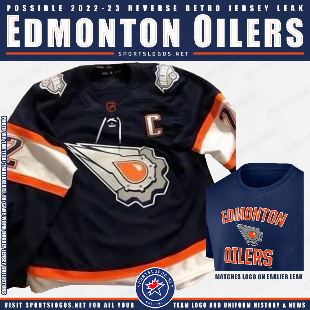
Well, from the T-shirt leak a month or so ago, its all but confirmed to be a black jersey with a white C. Just depends if its pedestal or not.
If it is a pedestal, it will compete well with the Oilers Macfarline mechano-sperm jersey, now featuring orange sperm and trim lines that look like a safety vest, for the worst jersey of the RR program this year.
Though I am sure there will be again some uninspired ones like the Leafs and Wings did last year.
Last edited by browna; 10-14-2022 at 07:47 PM.
|
|
|
|
|
10-14-2022, 07:48 PM
|
#64
|
|
Taking a while to get to 5000
|
^ Blasty has a black jersey with a white C.
|
|
|
|
|
10-14-2022, 07:54 PM
|
#65
|
|
Franchise Player
Join Date: Mar 2002
Location: Calgary
|
Quote:
Originally Posted by Toonage
^ Blasty has a black jersey with a white C.
|
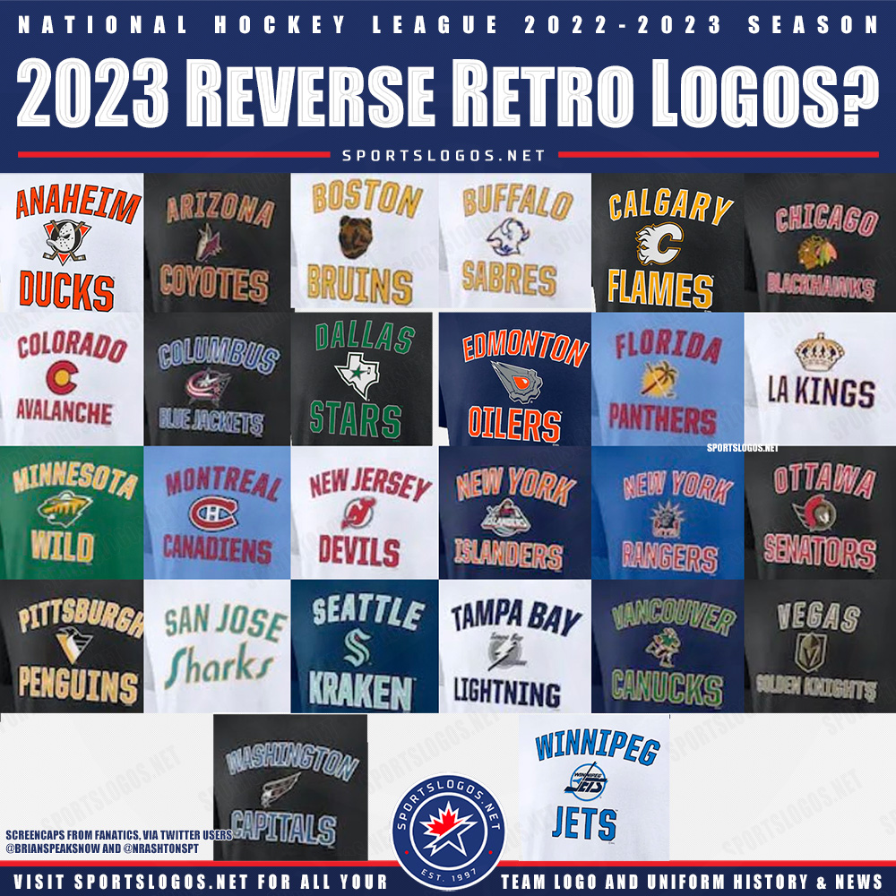
T-shirts were leaked for the RR program that gives a glimpse into the logos and colors likely to be used.
|
|
|
|
|
The Following User Says Thank You to browna For This Useful Post:
|
|
|
10-14-2022, 08:05 PM
|
#66
|
|
Franchise Player
Join Date: Mar 2006
Location: Shanghai
|
I can't recall ever having seen that Sharks logo before.
__________________
"If stupidity got us into this mess, then why can't it get us out?"
|
|
|
|
|
10-14-2022, 08:12 PM
|
#67
|
|
Franchise Player
Join Date: Mar 2002
Location: Calgary
|
Quote:
Originally Posted by JohnnyB
I can't recall ever having seen that Sharks logo before.
|
It isnt, it is the font of the California Golden Seals…my guess their RR will be California Golden Seals unis or at least colors but with “Sharks” instead of “Seals”.

Wild look to be doing the NorthStars recolouring again, but probably as a green jersey this year, not white like last year.
Other teams seem to be a lot more creative then the Flames with this program who lazily and now uselessly just dusted off Blasty as a RR (and nothing was reversed - could’ve made it white or red) last year, only to make the same jersey a full time alternate this year.
Jury is out on this year, looks to be a simple recolour of an old jersey, which is a half step forward, but how about think a bit out of the box as other teams do? Do something different with the pedestal lines. Or, like the Sharks, recolor the WHA Cowboys jerseys.
Last edited by browna; 10-14-2022 at 08:22 PM.
|
|
|
|
|
The Following User Says Thank You to browna For This Useful Post:
|
|
|
10-14-2022, 08:12 PM
|
#68
|
|
Pent-up
Join Date: Mar 2018
Location: Plutanamo Bay.
|
Quote:
Originally Posted by JohnnyB
I can't recall ever having seen that Sharks logo before.
|
Its styled like the California Golden Seals.
|

|
|
|
10-14-2022, 08:13 PM
|
#69
|
|
Franchise Player
Join Date: Feb 2010
Location: Park Hyatt Tokyo
|
|
|
|
|
|
The Following 2 Users Say Thank You to topfiverecords For This Useful Post:
|
|
|
10-14-2022, 08:19 PM
|
#70
|
|
Franchise Player
|
Would love to see more retro Golden Seals merchandise.
|
|
|
|
|
The Following 2 Users Say Thank You to Strange Brew For This Useful Post:
|
|
|
10-14-2022, 08:44 PM
|
#71
|
|
Scoring Winger
|
Quote:
Originally Posted by savardandjokinen
I dont think its terrible. Not good but not bad.
Easily better than the Ronald McDonald jersey and the calgary script alternate.
|
By definition not good is bad
|
|
|
|
|
10-14-2022, 09:14 PM
|
#72
|
|
Franchise Player
Join Date: Jun 2005
Location: Hell
|
pedestal was the worst jersey and there's no way that is the design lol
|
|
|
|
|
The Following User Says Thank You to Flames_Gimp For This Useful Post:
|
|
|
10-14-2022, 10:31 PM
|
#73
|
|
#1 Goaltender
|
As long as the team is good I could care less which second or third jerseys they wear for a few games of the year. None of them are that offensive and aren't the reverse retros supposed to be kind of dumb anyway?
|
|
|
|
|
10-14-2022, 10:33 PM
|
#74
|
|
#1 Goaltender
|
nm
__________________
Quote:
Originally Posted by Temporary_User
I will eat a pubic hair if Giordano ever plays in the NHL again  |
|
|
|
|
|
10-14-2022, 10:40 PM
|
#75
|
|
Franchise Player
Join Date: Feb 2006
Location: Calgary, AB
|
Quote:
Originally Posted by Burning Beard
As long as the team is good I could care less which second or third jerseys they wear for a few games of the year. None of them are that offensive and aren't the reverse retros supposed to be kind of dumb anyway?
|
Yeah, when you look at the group from 2 years ago, most of them are horribad. We lucked out getting one of the few decent ones.
If I were ranking them, I'd probably put Vancouver's blue-green gradient in my top-5, which tells you how bad the majority were.
__________________
Turn up the good, turn down the suck!
|
|
|
|
|
10-14-2022, 11:25 PM
|
#76
|
|
Powerplay Quarterback
|
Quote:
Originally Posted by FanIn80
|
Pretty much looks like the jerseys or hoodies that Canadian Tire or Walmart sells.
|
|
|
|
|
The Following User Says Thank You to t0rrent98 For This Useful Post:
|
|
|
10-14-2022, 11:42 PM
|
#77
|
|
Celebrated Square Root Day
|
Quote:
Originally Posted by getbak
Yeah, when you look at the group from 2 years ago, most of them are horribad. We lucked out getting one of the few decent ones.
If I were ranking them, I'd probably put Vancouver's blue-green gradient in my top-5, which tells you how bad the majority were.
|
Reverse retros? I thought the majority were actually really cool. Vancouver's blue green gradient was awful, easily in the bottom 5.
|
|
|
|
|
10-14-2022, 11:47 PM
|
#78
|
|
Celebrated Square Root Day
|
https://www.milehighhockey.com/2020/...-retro-jerseys
Look through that list. Literally the only bad ones were Vancouver, Toronto, Stars (cause they blew it and didn't add a different colour under the star) Jets and Wings. Everything else was neat at worst and really cool at best.
|
|
|
|
|
The Following User Says Thank You to jayswin For This Useful Post:
|
|
|
10-15-2022, 12:00 AM
|
#79
|
|
Franchise Player
Join Date: Feb 2006
Location: Calgary, AB
|
Yeah, looking at them again, they're even worse than I remember.
Calgary and the two New York teams are the only ones that aren't just awful and it's not surprising they're the ones that they made the least changes to from a real uniform the teams have worn.
__________________
Turn up the good, turn down the suck!
|
|
|
|
|
10-15-2022, 12:33 AM
|
#80
|
|
Celebrated Square Root Day
|
Quote:
Originally Posted by getbak
Yeah, looking at them again, they're even worse than I remember.
Calgary and the two New York teams are the only ones that aren't just awful and it's not surprising they're the ones that they made the least changes to from a real uniform the teams have worn.
|
Objectively wrong.
I really liked the last reverse retro. Lots of great colours and take on old classic jerseys.
|
|
|
|
|
The Following 3 Users Say Thank You to jayswin For This Useful Post:
|
|
 Posting Rules
|
You may not post new threads
You may not post replies
You may not post attachments
You may not edit your posts
HTML code is Off
|
|
|
All times are GMT -6. The time now is 11:31 AM.
|
|


