|
View Poll Results: Pick your favourite logo from the following (single vote)
|
|
Option B - Artsy CP with rink shape in the middle
|
   
|
116 |
16.09% |
|
Option E - CP Puck text bubble
|
  
|
186 |
25.80% |
|
Option G - Round shield (CP middle)
|
  
|
139 |
19.28% |
|
Option K - Round shield (Calgary tower middle)
|
  
|
280 |
38.83% |
 09-09-2014, 04:32 PM
|
#61
|
|
Franchise Player
Join Date: Feb 2007
Location: Calgary, AB
|
Voted for K. Never been a big fan of B, and E wasn't may favorite speech bubble idea.
After sitting on it for a while now I actually think this was my favourite:
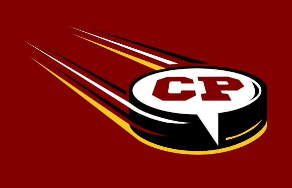
Call back to the current CP logo, clean and crisp, and probably the best at incorporating the speech bubble into the hockey puck concept.
|

|

|
|
The Following 8 Users Say Thank You to SuperMatt18 For This Useful Post:
|
|
|
09-09-2014, 06:03 PM
|
#62
|
|
Franchise Player
Join Date: Aug 2007
Location: Ontario
|
Quote:
Originally Posted by kunkstyle

^ Voted for E just because of Split's shameless use of puppies in advertising.
|
The system wor-- wait... damn it!
|
|
|
|
|
The Following 2 Users Say Thank You to Split98 For This Useful Post:
|
|
|
09-09-2014, 06:07 PM
|
#63
|
|
Franchise Player
Join Date: Aug 2007
Location: Ontario
|
Quote:
Originally Posted by Hanna Sniper
For someone like myself that needs to increase the font size on CP, the only text on the 100x100px version I can read is the CP.
|
A good point. Being a voting concept nothing is final. In the final version we could drop the 'Your 24/7...' from the bottom and ramp up a larger font size.
|
|
|
|
|
The Following User Says Thank You to Split98 For This Useful Post:
|
|
|
09-09-2014, 07:46 PM
|
#64
|
|
In the Sin Bin
|
Quote:
Originally Posted by kevman
B is certainly the cleanest, most modern and most professional.
I like the idea behind E but the random swirls turn me off a bit.
I think both G and K are far to busy to be scaled down. Forums also typically have a horizontal title bar at the top of the page and a round shape doesn't scale well to this kind of space.
|
Granted on the scaling issue, but option K could easily address this by using just the inner flame/tower circle alone as the logo, with "Calgary Puck" and other text printed horizontally.
|
|
|
|
|
The Following User Says Thank You to Resolute 14 For This Useful Post:
|
|
|
09-09-2014, 09:22 PM
|
#65
|
|
Lifetime Suspension
|
Quote:
Originally Posted by Ozy_Flame
Can you explain? Not sure I follow.
|
Aka MacDonalds. 
|
|
|
|
|
09-10-2014, 06:00 AM
|
#66
|
|
God of Hating Twitter
|
I love both E and K, its a hard decision, ended up with K although be thrilled with either as our logo.
__________________
Allskonar fyrir Aumingja!!
|
|
|
|
|
09-10-2014, 02:19 PM
|
#67
|
|
Franchise Player
|
Prefer G but would be quite happy with K. If the text is a problem you could simply get rid of the bottom text altogether and just have CALGARYPUCK across the top with the centre logo. That might even look better IMO.
|
|
|
|
|
09-10-2014, 02:46 PM
|
#68
|
|
Crash and Bang Winger
|
Since Bingo has voted in this poll, does this mean the decision has been made?
|
|
|
|
|
09-10-2014, 02:50 PM
|
#69
|
|
Franchise Player
Join Date: Mar 2012
Location: Sylvan Lake
|
Option E, the other really do suck
__________________
Captain James P. DeCOSTE, CD, 18 Sep 1993
Corporal Jean-Marc H. BECHARD, 6 Aug 1993
|
|
|
|
|
09-10-2014, 02:53 PM
|
#70
|
|
Franchise Player
|
Quote:
Originally Posted by SuperMatt18
Voted for K. Never been a big fan of B, and E wasn't may favorite speech bubble idea.
After sitting on it for a while now I actually think this was my favourite:
Call back to the current CP logo, clean and crisp, and probably the best at incorporating the speech bubble into the hockey puck concept. |
If we end up with E, it would be nice to have these puck proportions - it's much more correcter.
|
|
|
|
|
09-10-2014, 03:02 PM
|
#71
|
 Posted the 6 millionth post! |
Pasta Puck looks like it's good as a social media button.
|
|
|
|
|
The Following User Says Thank You to Ozy_Flame For This Useful Post:
|
|
|
09-10-2014, 04:18 PM
|
#72
|
|
Franchise Player
|
Quote:
Originally Posted by Ozy_Flame
Pasta Puck looks like it's good as a social media button.
|
What are you talking about? Everyone knows that Italians can't play hockey!
|
|
|
|
|
09-10-2014, 04:41 PM
|
#73
|
Posted the 6 millionth post! |
Quote:
Originally Posted by To Be Quite Honest
What are you talking about? Everyone knows that Italians can't play hockey!
|
Mike Cammalleri begs to differ
But honestly, I feel Option E is better as a social media button and not a site logo, the kind you see at the end of a webpage where it gives you the option to "retweet" or "like" the content.
Plus it has pasta on it.
|
|
|
|
|
09-10-2014, 04:42 PM
|
#74
|
|
Commie Referee
Join Date: Oct 2002
Location: Small town, B.C.
|
Just so we're all clear, you think it is either a pasta puck or has pasta on it?
|
|
|
|
|
The Following User Says Thank You to KootenayFlamesFan For This Useful Post:
|
|
|
09-10-2014, 04:56 PM
|
#75
|
Posted the 6 millionth post! |
Quote:
Originally Posted by KootenayFlamesFan
Just so we're all clear, you think it is either a pasta puck or has pasta on it?
|
It has pasta sauce spilled on it. I mentioned it in the first poll, now I can't get it out of my head 
|
|
|
|
|
09-10-2014, 05:04 PM
|
#76
|
|
#1 Goaltender
|
Ever see those posts that say 'I accidentally voted for the wrong one!' and think, 'What a dummy. Who does that?'
That used to be me... but now I understand what it's like to be one of those people...
Meant to vote 'K', accidentally clicked 'G'.
|
|
|
|
|
09-10-2014, 06:49 PM
|
#77
|
|
Not a casual user
Join Date: Mar 2006
Location: A simple man leading a complicated life....
|
We need to have another vote with option "E" and "K" as the only choices. That should give us a definative answer as to which option is best.
__________________
|
|
|
|
|
09-10-2014, 07:29 PM
|
#78
|
|
Franchise Player
|
Quote:
Originally Posted by Ozy_Flame
Mike Cammalleri begs to differ |
He's Canadian.
|
|
|
|
|
09-10-2014, 08:15 PM
|
#79
|
|
Powerplay Quarterback
Join Date: Jul 2013
Location: Calgary
|
E!
__________________
Go Flames Go
|
|
|
|
|
09-10-2014, 08:37 PM
|
#80
|
|
Franchise Player
Join Date: Mar 2002
Location: Calgary
|
K again...I don't think the logo is going to be used in a situation where it needs to be more shrunk than it is, so not worried about losing detail. A nod to the Flames, and Calgary as a city itself.
Still like the wordmark and small "flame" in option "B as an alternate wordmark-only to compliment the logo.
|

|
|
 Posting Rules
|
You may not post new threads
You may not post replies
You may not post attachments
You may not edit your posts
HTML code is Off
|
|
|
All times are GMT -6. The time now is 08:28 PM.
|
|


