08-03-2014, 01:23 PM
|
#61
|
|
Scoring Winger
Join Date: Jul 2011
Location: at home
|
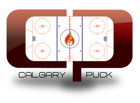
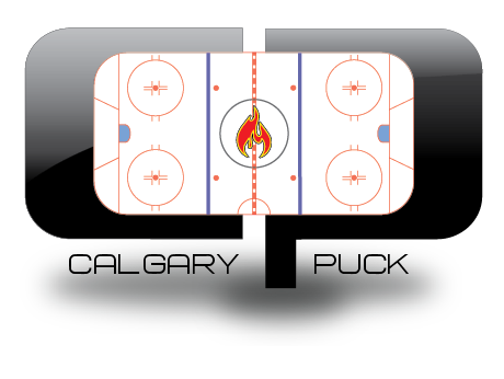
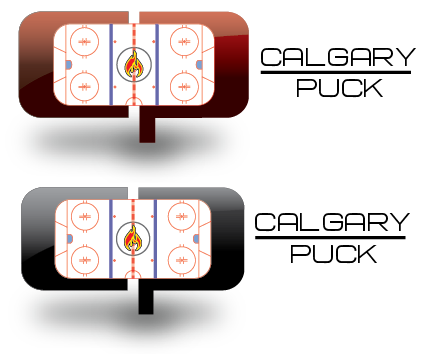
So, here's my contribution. The goal was to keep the design as simple as possible
(for better scaling and variations such as monochromatic and inverted versions)

Alternate version with yellow outline:

Logo usage example - tshirt:

in small scales ...

@Bingo:
Of course, I can provide scalable vector images as well - in SVG format (using Inkscape for my vector drawings)
The font used for the logo and wordmark is 'New Athletic M54' and according to the author it should be possible to use it freely:
http://www.dafont.com/new-athletic-m54.font
(or try to email the author first)
I hope you like it.
|

|

|
|
The Following 20 Users Say Thank You to playmaker For This Useful Post:
|
Aeneas,
Art Vandelay,
BACKCHECK!!!,
Chill Cosby,
corporatejay,
DaQwiz,
devo22,
GreenHardHat,
Itse,
jg13,
klikitiklik,
mile,
MJK,
Monahan23,
Mustache,
Neeper,
Pierre "Monster" McGuire,
pylon,
saXon,
Yrebmi
|
|
The Following 7 Users Say Thank You to saXon For This Useful Post:
|
|
|
08-03-2014, 01:47 PM
|
#63
|
|
Franchise Player
|
^ I like your first design much more. Not a fan of this one.
|
|
|
|
|
08-03-2014, 01:48 PM
|
#64
|
|
Powerplay Quarterback
|
Quote:
Originally Posted by Da_Chief

You added the wi-fi symbol? and its off. Just kidding.
|
My friends always ask what my kids wifi password is.. From his car seat haha
__________________
Long time listener, first time caller.
|
|
|
|
|
08-03-2014, 01:49 PM
|
#65
|
|
Franchise Player
|
Quote:
Originally Posted by saXon
|
I like this one better than your first one, and I liked your first one too.
|
|
|
|
|
The Following User Says Thank You to mile For This Useful Post:
|
|
|
08-03-2014, 02:32 PM
|
#66
|
|
Celebrated Square Root Day
|
Quote:
Originally Posted by To Be Quite Honest
Any prize for the logo picked! Like a Keg dinner for two or a Steam/Sony Play Station card?
Many small companies that I've worked with, or groups that I collaborated with, found a huge jump in participation when a prize was included. It's just a suggestion.
Do we just submit them to you or do you just want us to post them?
|
Quote:
Originally Posted by Tyler
How about the prize is Bingo keeps paying to keep the forum running and for free for all of us?
|
This isn't really a response to these posts, but more of a curiosity thing after reading these; Wouldn't CP actually be making a fair amount of money with a user base this large and ads and all that?
|
|
|
|
|
08-03-2014, 02:44 PM
|
#68
|
|
Franchise Player
|
Quote:
Originally Posted by Alberta_Beef
as we get closer to the playoffs the bars turn yellow
|
One bar is turned "off" (from yellow to black) for every game we lose in the playoffs. Then they are all off till the next playoffs?
|
|
|
|
|
08-03-2014, 02:57 PM
|
#69
|
|
Celebrated Square Root Day
|
I actually like the current logo, it's a very simple, recognizable logo. What I've never been able to get past is all the lines behind the puck.
There's just something about it that bugs me. I think it's because the line thingy is at an angle, while the puck is perfectly straight. Yep, actually that's exactly what it is.
EDIT: and the CP puck is a little pixelated and rough. Would be nice if it was touched up and refined.
|
|
|
|
|
The Following User Says Thank You to jayswin For This Useful Post:
|
|
|
08-03-2014, 03:13 PM
|
#70
|
|
Franchise Player
Join Date: Mar 2009
Location: The Bay Area
|
Quote:
Originally Posted by flameswin
This isn't really a response to these posts, but more of a curiosity thing after reading these; Wouldn't CP actually be making a fair amount of money with a user base this large and ads and all that?
|
What do you mean by "a fair amount"? I have no idea what CP makes in ad revenue, but is $1000/month a fair amount? And if that's eaten up by server costs...
|
|
|
|
|
08-03-2014, 03:16 PM
|
#71
|
|
Celebrated Square Root Day
|
Quote:
Originally Posted by the2bears
What do you mean by "a fair amount"? I have no idea what CP makes in ad revenue, but is $1000/month a fair amount? And if that's eaten up by server costs...
|
Not sure what I meant actually. It was a completely out of the blue thought I just had, just pure genuine curiosity.
|
|
|
|
|
08-03-2014, 03:30 PM
|
#72
|
|
Scoring Winger
Join Date: Aug 2005
Location: Down by the sea, where the watermelons grow, back to my home, I dare not go...
|
Quote:
Originally Posted by gvitaly
Not quite a logo, but I was playing with photoshop a little. Its a very quick idea so let me know what you think, and if I should polish it further.
 |
You're right - not a logo. But incredible. Nice work
|
|
|
|
|
08-03-2014, 03:32 PM
|
#73
|
|
Franchise Player
|
Quote:
Originally Posted by saXon
...and a rehash of the first ones. Also, I don't know if landmarks are considered a copyright.  |
replace with the Airdrie water tower and we are good to go
__________________
GFG
|
|
|
|
|
08-03-2014, 03:54 PM
|
#74
|
|
Franchise Player
Join Date: Aug 2007
Location: Ontario
|
Looking at it now the colours are way off, but here's the idea anyway:

Something the roundel logos let you do is gather in quote a bit of elements. We have the Tower and Saddledome represented; a varsity feel which is a nod to our heavy involvement with NCAA players (along with just looking cool); and what better way to harken in a new age than by having Sean Frikken' Monahan as a part of your logo?
|
|
|
|
|
The Following 33 Users Say Thank You to Split98 For This Useful Post:
|
4oh3,
89loobjob,
Alberta_Beef,
Art Vandelay,
badger89,
corporatejay,
HockeyKhan,
hurtin_albertan,
IgnitedSoul,
iheartmonahan,
Itse,
Iveman,
jar_e,
klikitiklik,
Lego Man,
M*A*S*H 4077,
Magnum PEI,
mile,
MJK,
Mustache,
pgsieve,
Phaneufenstein,
Pierre "Monster" McGuire,
renny,
slybomb,
StAlbertFlame,
Street Pharmacist,
Swayze11,
t0rrent98,
the2bears,
To Be Quite Honest,
Winsor_Pilates,
zukes
|
|
08-03-2014, 03:56 PM
|
#75
|
|
Often Thinks About Pickles
Join Date: Jan 2007
Location: Okotoks
|
I'm not a graphic artist but I do have an idea...
Picture a large puck flying right at you with the name CalgaryPuck written on the side... and in the background is the player who just shot the puck at the apex of his slap shot follow through.
Any good? Too difficult/busy for a logo?
|
|
|
|
|
08-03-2014, 04:12 PM
|
#76
|
|
Resident Videologist
Join Date: Mar 2002
Location: Calgary
|
Quote:
Originally Posted by gvitaly
Not quite a logo, but I was playing with photoshop a little. Its a very quick idea so let me know what you think, and if I should polish it further.
|
I like it, but we should probably avoid using stock images for copyright issues.
 http://image.shutterstock.com/displa...d-65023987.jpg
Last edited by AC; 08-03-2014 at 07:56 PM.
|
|
|
|
|
08-03-2014, 04:12 PM
|
#77
|
|
Franchise Player
Join Date: Aug 2007
Location: Ontario
|
Same idea, but keeping with the heritage of CP:

Always loved the interlocking 'CP' of the logo.
|
|
|
|
|
The Following 54 Users Say Thank You to Split98 For This Useful Post:
|
89loobjob,
ah123,
Alberta_Beef,
Art Vandelay,
BACKCHECK!!!,
Coach,
codynw,
Da_Chief,
edn88,
Flamezzz,
handgroen,
HockeyKhan,
hurtin_albertan,
iheartmonahan,
Itse,
Iveman,
JonDuke,
klikitiklik,
Lego Man,
M*A*S*H 4077,
Machiavelli,
Mass_nerder,
Mattman,
Mazrim,
megatron,
mile,
Miniac,
Monahan23,
Mustache,
Nammer403,
Neeper,
Nehkara,
Phaneufenstein,
Pierre "Monster" McGuire,
Playfair,
Redliner,
Regulator75,
renny,
Rod Hockey,
saXon,
Scoreface,
SHOGUN,
slybomb,
StAlbertFlame,
Swayze11,
t0rrent98,
The Fonz,
Tiger,
TjRhythmic,
TnT~55,
underGRADFlame,
Winsor_Pilates,
Yamer,
Zevo
|
|
08-03-2014, 04:15 PM
|
#78
|
|
The new goggles also do nothing.
Join Date: Oct 2001
Location: Calgary
|
Quote:
Originally Posted by flameswin
This isn't really a response to these posts, but more of a curiosity thing after reading these; Wouldn't CP actually be making a fair amount of money with a user base this large and ads and all that?
|
I have no idea of the actual dollar amounts since the finances are Bingo's side of things, but in general I don't think forums pay out much advertising, certainly a LOT less than a similar level of traffic on a more typical site.
Because while the forum might get a huge number of page views, most of those are generated by the same relatively small group of people viewing different pages. So the clickthrough rate is going to be a lot lower. There's maybe only 1500 registered users who use the site day in and day out.
I don't know the dollars, but I'd bet that they're a lot lower than one would think.
__________________
Uncertainty is an uncomfortable position.
But certainty is an absurd one.
|
|
|
|
|
The Following User Says Thank You to photon For This Useful Post:
|
|
|
08-03-2014, 04:16 PM
|
#79
|
|
Franchise Player
|
Quote:
Originally Posted by Split98
Looking at it now the colours are way off, but here's the idea anyway:
Something the roundel logos let you do is gather in quote a bit of elements. We have the Tower and Saddledome represented; a varsity feel which is a nod to our heavy involvement with NCAA players (along with just looking cool); and what better way to harken in a new age than by having Sean Frikken' Monahan as a part of your logo? |
This one feels like a winner. Looks completely legitimate.
|
|
|
|
|
The Following 2 Users Say Thank You to mile For This Useful Post:
|
|
|
08-03-2014, 04:19 PM
|
#80
|
|
Lifetime Suspension
|
Quote:
Originally Posted by Rerun
I'm not a graphic artist but I do have an idea...
Picture a large puck flying right at you with the name CalgaryPuck written on the side... and in the background is the player who just shot the puck at the apex of his slap shot follow through.
Any good? Too difficult/busy for a logo?
|
Nope, not at all. It's a good idea.
|
|
|
|
|
The Following User Says Thank You to djsFlames For This Useful Post:
|
|
 Posting Rules
|
You may not post new threads
You may not post replies
You may not post attachments
You may not edit your posts
HTML code is Off
|
|
|
All times are GMT -6. The time now is 04:27 AM.
|
|